The working rule for work truck lettering is simple: allow 1 inch of letter height for every 10 feet of viewing distance. Text that needs to read at 50 feet wants letters at least 5 inches tall, and a name meant to be spotted across a parking lot at 100 feet wants 10 inches. Most lettering that fails on a work truck is undersized for the distance it is actually seen at, not undersized by accident of panel space.
This guide walks through picking the right size for each part of your message, fitting it to the panel you have, and testing readability before anything gets cut. It takes maybe an hour of measuring and math the first time, and ten minutes for every truck after that.
Table of Contents
- What You Need
- Step-by-Step: What Size Lettering to Use on a Work Truck
- How Far Away Will the Truck Be Viewed?
- Choose Letter Height for Each Part of the Message
- What Size Lettering Fits the Truck’s Available Space and Proportions
- Test Readability Before Production
- Common Mistakes
- Frequently Asked Questions
- What is the best letter size for a work truck?
- How large should company lettering be on a truck?
- What size should a phone number be on a work truck?
- Can I put a website or email address on work-truck lettering?
- How much space should be left around truck lettering?
- Should work-truck lettering be installed by a professional?
- Start With the Distance, Not the Font
What You Need
Before you design anything, you need four things settled. Everything else follows from those four.
- Real viewing distance. How far away is the truck most often when someone needs to read it? A van parked in a driveway is seen from 25 feet. A box truck rolling past traffic is seen from 100 to 150 feet.
- Panel measurements. Tape off the usable area on each door and panel, then write down the width and height in inches.
- Your logo’s proportions. Marked-letter signs and full-color logos need different space budgets, and a stretched logo is the fastest way to look amateur.
- Legal marks, if you run a regulated vehicle. USDOT numbers, GVWR ratings, and MC numbers have hard minimum sizes set by federal rules, and they are much smaller than your marketing letters.
One more practical note: know whether you are ordering cut vinyl lettering, a printed decal, or a full or partial wrap. Letter height interacts with the material, because thin 2 mil cast vinyl struggles to hold very small strokes.
Step-by-Step: What Size Lettering to Use on a Work Truck
How Far Away Will the Truck Be Viewed?
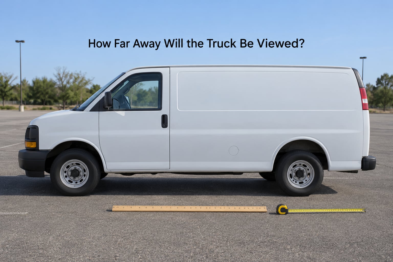
Start here, because every number after this depends on it. Pick the distance your message has to work at, not the distance you happen to be standing when you check the design in the driveway.
To get letter height, divide the required reading distance by 10. That gives you the minimum cap height in inches. Treat it as a floor, then add a little, because contrast and paint color eat into readability more than most people expect.
| Reading distance | Minimum cap height | Where that shows up |
|---|---|---|
| 25 feet | 2.5 inches | Driveway parking, jobsite arrival |
| 50 feet | 5 inches | Neighborhood traffic, small parking lot |
| 100 feet | 10 inches | Arterial road, highway on-ramp |
| 150 feet | 15 inches | Multi-lane road at speed |
Choose Letter Height for Each Part of the Message
Not every line on a truck needs the same size. Build a descending scale: who you are is biggest, what you do is smaller, how to reach you is smallest but still readable at the same distance.
| Message element | Cap height | Readable at roughly |
|---|---|---|
| Company name on a pickup | 6 to 8 inches | 60 to 80 feet |
| Company name on a cargo van | 8 to 12 inches | 80 to 120 feet |
| Company name on a box truck | 12 to 18 inches | 120 to 180 feet |
| Phone number | 4 to 6 inches | 40 to 60 feet |
| Service line (HVAC, plumbing, landscaping) | 3 to 4 inches | 30 to 40 feet |
| Website or email | 2.5 to 3 inches | 25 to 30 feet |
| USDOT, GVWR, MC and unit numbers | 2 inches minimum | 50 feet, legally required |
One term worth getting straight, because it causes more bad orders than anything else here: cap height is the height of a capital letter from baseline to top. Point size is a typographic measurement tied to the full font, including the body of lowercase letters and the spacing around them. A font listed as 72 point comes out around 1 inch of cap height, not 10 inches. Plenty of people order at the point size they see on their screen and end up with lettering a fraction of the size they pictured.
A practical comparison from Facebook groups dedicated to signage and truck graphics: owners repeatedly land on about 4 inches tall by 40 to 50 inches wide for a pickup door or bed panel, and often cite Highway Gothic, the road-sign typeface, as a trusted shape. That is a reasonable working norm for a panel seen at close range. It is not a standard, and for anything seen at highway speed you need to go bigger.
What Size Lettering Fits the Truck’s Available Space and Proportions
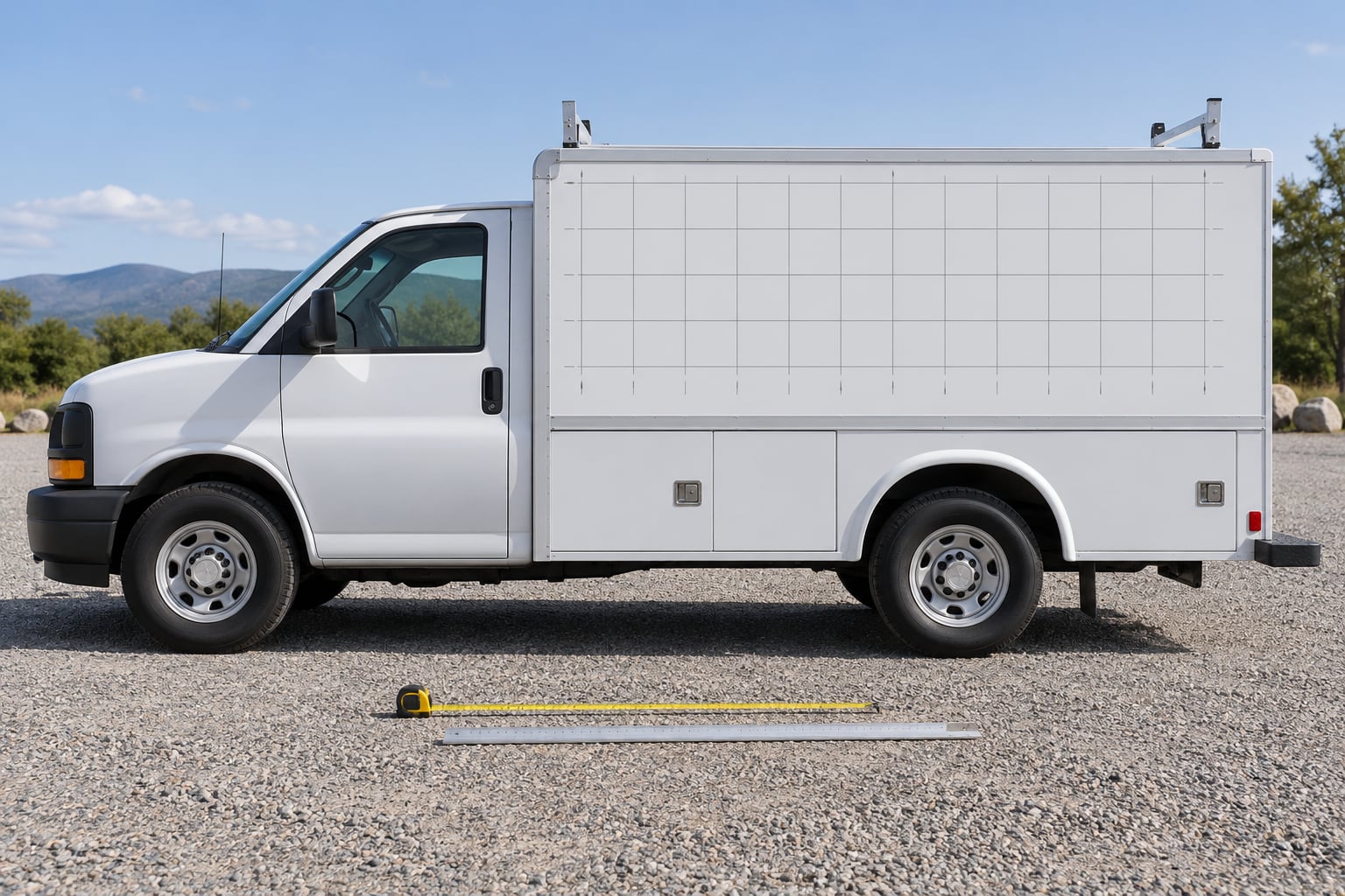
Once the numbers are chosen, check they physically fit. Mask the panel corners with low-tack tape, pull the tape to mark where the design should sit, and measure that rectangle. Record both dimensions to the nearest 1/8 inch and photograph it from a few angles.
Leave margins of 3 to 6 inches on a pickup and 6 to 12 inches on a van or box truck. Lettering that runs panel edge to panel edge looks pressed in and gives you nowhere to place anything else.
Three vehicles to sanity-check your layout against:
- Compact pickup. Front doors give you roughly 20 to 26 inches of usable width. Six-inch letters fit a short name; anything longer needs a four-inch height or a move to the bed side panel.
- Cargo van. The side panel runs about 9 to 10 feet long with a usable height near 4 feet. That panel comfortably holds an 8 to 12 inch name with a 4 inch phone line under it.
- Box truck. Side panels run 10 to 12 feet long and about 6 feet tall, so there is room for 12 to 18 inch letters and a full service block without crowding.
Watch the obstacles: door seams, handle pockets, window frames, bed rails, rivets, hinges, and panel curvature. A panel that is 48 inches wide at the top and 42 inches at the bottom will distort any design you stretch across it.
Test Readability Before Production
Print or plot the design at true size, tape it to the panel, and check it before the vinyl gets cut. Squint test first: if you can read the squint-test, it reads at a distance.
Then check contrast in real conditions. White or pale yellow lettering on a dark panel and dark lettering on a light panel both work. Mid-tone colors against mid-tone paint disappear by mid-morning, which is the version of this that catches people out.
Look at it from the distance you sized for, ideally while moving. Lettering that reads fine when you stand still beside it often fails completely at 40 mph. For night work, consider reflective sheeting rated under ASTM D4956 and FMVSS 108, since standard vinyl needs headlights pointed right at it to read.
Common Mistakes
Sizing letters by how big they look on screen. The fix is to size from reading distance and confirm on a printed proof at 100 percent scale. Never trust a point size alone.
Filling every empty inch. Empty panel is not wasted space. It is what makes the name findable, and crowding is the top complaint people have about lettering on trucks they see daily.
Stretching a logo to fill the panel. Scale the logo proportionally and let the leftover width sit there. A distorted mark costs you credibility every time the truck is parked.
Low-contrast color pairings. Test the exact colors on the actual paint. If contrast is weak, change the lettering color, not the size.
Listing every service you offer. Four to six services in one block beats twenty crammed lines. If a line would be under 3 inches tall, cut it.
Using script or thin serif faces at distance. Fine strokes and open counters break down as soon as letters shrink. Bold sans-serif styles in all caps hold up far better.
Letting the legal numbers shrink to match the design. USDOT and GVWR markings have their own minimums and they do not move to suit your layout.
Frequently Asked Questions
What is the best letter size for a work truck?
For most work trucks, the company name works best at 6 to 8 inches of cap height on a pickup, 8 to 12 inches on a cargo van, and 12 to 18 inches on a box truck. Pick the size from viewing distance first: divide the distance the message must read at by 10, and that result in inches is your minimum letter height. Treat it as a floor rather than a target.
How large should company lettering be on a truck?
Large enough to be read at the distance a passerby first notices the truck, usually 50 to 100 feet for a vehicle working in traffic. That means 6 to 10 inches of cap height on a pickup or van. Keep the service descriptor roughly half the height of the name and the phone number about two-thirds of it, so the eye lands in the right order.
What size should a phone number be on a work truck?
Four to six inches of cap height is the practical range for a truck phone number, and six inches is the safer choice for anything that drives in traffic. Below four inches the digits start merging at 30 to 40 feet. Use a plain typeface with even stroke weight, keep the digits spaced consistently, and place the number on its own line so it does not compete with the name.
Can I put a website or email address on work-truck lettering?
Yes, but keep it small and simple. All-caps websites and short email domains read at 2.5 to 3 inches of cap height on a pickup or van. Avoid long email addresses, script fonts, and underlining, since those details vanish at distance. If your business name is hard to spell, a short domain printed at 3 inches is a much better bet than a full URL.
How much space should be left around truck lettering?
Leave 3 to 6 inches of margin on a pickup and 6 to 12 inches on a cargo van or box truck. That breathing room keeps the design from looking squeezed against the panel edges and gives you somewhere to put a second element later. Keep the same margin on all four sides so the layout does not look off-center, and check that door seams and handles stay clear.
Should work-truck lettering be installed by a professional?
For anything above about 4 inches tall, a professional installer is worth it. Large letters need two people, a hinge method with transfer tape, and a wet application so the film lays flat without bubbles. Letters in that range flex and lift at the corners when pulled on dry. Small door lettering under 3 inches is a reasonable weekend job for a careful first-timer.
Start With the Distance, Not the Font
Decide how far away your truck needs to be read, divide that distance by 10, and you have your minimum letter height for what size lettering to use on a work truck. From there, step down the scale for the phone number and service line, check the panel has room with margins to spare, and proof it at real distance before cutting anything.