How to choose colors for a vehicle wrap comes down to two decisions that have to agree with each other: the color family and the finish. Pick a color that fits how the vehicle is used, then check it against real daylight, a real vehicle shape, and your brand materials before you sign anything off.
Screens lie about color. A swatch under showroom light and a wrapped van in a parking lot at noon are two different objects, and most of the disappointing wrap stories I’ve read start with someone approving the first one and never seeing the second.
Last updated: October 2026
Table of Contents
- What You Need to Choose Colors for a Vehicle Wrap
- Step-by-Step
- Set the Goal for Your Vehicle Wrap
- Audit the Brand Colors
- Check Contrast and Legibility
- Test Your Shortlist: How to Choose Colors for a Vehicle Wrap Digitally
- Compare the Finish and Material
- Review the Wrap Under Real Lighting
- Get a Final Proof Before Production
- Common Mistakes
- Frequently Asked Questions
- How many colors should I use on a vehicle wrap?
- What colors make a vehicle wrap easiest to notice?
- Should vehicle wrap colors always match my logo?
- How do I compare colors before ordering a vehicle wrap?
- Do matte and glossy finishes change the colors?
- Can I use light colors for text on a dark vehicle wrap?
- Conclusion
What You Need to Choose Colors for a Vehicle Wrap
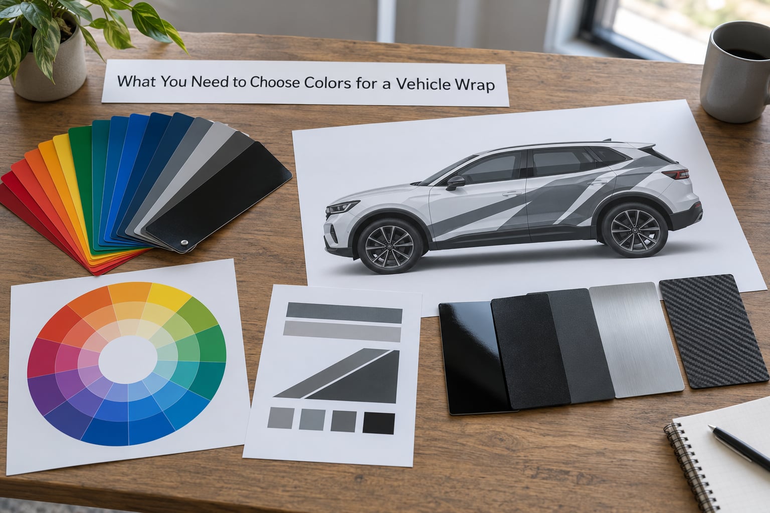
Gather these before you start comparing palettes, and the color decision gets much faster. Most of the back-and-forth people describe in car wrap forums disappears once the inputs are on one table instead of in someone’s head.
- Brand color references. Your logo files, the PDF style guide, business cards, uniforms, and any vehicle graphics already in use. Screen values are not color references; get Pantone, CMYK, or RGB values where you can.
- Vehicle type and its job. A sedan driven to client meetings, a box truck on a service route, a show car on a weekend, or a daily driver parked in a salty lot each want something different.
- Material and finish options. Ask which vinyl brands and finishes the installer actually stocks. The same color name exists in gloss, satin, and matte, and each one reflects light differently.
- Logo and typography files. Vector artwork, outlined type, and the minimum sizes the installer can actually cut in vinyl.
- Color references or paint codes. If you want a factory color match, the paint code from the door jamb or trunk label is the single most useful piece of information you can bring.
- A design mockup on the actual vehicle. Flat artwork on a rectangle hides the fact that a door seam, a wheel arch, or a roof curve can eat half a logo.
- Viewing conditions. Where the vehicle spends its life: full sun, shade, dust, road salt, night parking under a lot light.
Matching the wrap palette to the vehicle and its intended use before you fall in love with a color is what prevents the expensive revision. Once a design is printed and cut, changing your mind costs material and labor twice.
Step-by-Step
Seven steps, in order. Each one narrows the field, so resist the urge to jump straight to swatches and start shopping names.
Set the Goal for Your Vehicle Wrap
Decide what the wrap is actually for, because the purpose dictates how much contrast you can afford. Brand recognition in a crowded parking lot, wayfinding at an intersection, telling a service van from a delivery van, promoting something seasonal, or a balanced mix of all of them are five different design problems.
Strong contrast suits recognition. A restrained palette with one clear focal area suits professionalism. If a customer needs to identify your vehicle from fifty feet away in traffic, decoration is a liability, not a feature.
Audit the Brand Colors
Open your logo file and separate it into a primary, a secondary, and an accent. Most small-business logos only have two real colors, and forcing a third one in is where palettes start to look busy.
Preserve established brand colors whenever the wrap is the main brand surface. Add a neutral such as white, black, or a warm gray when the two brand colors need breathing room. Choose wrap-specific colors when your print references cannot be reproduced: a saturated blue on screen often needs a manufacturer code matched on a physical sample before it survives vinyl.
One honest note from installers worth repeating: brand guidelines describe ink on paper, not film on a curved panel. Colors that fight on a business card can sit comfortably on a van, and colors that look great printed can go flat under gloss laminate.
Check Contrast and Legibility
Contrast is the whole game for a business wrap, and you can check it before anyone cuts film. Put your lettering color beside your background color and ask whether the text survives at a distance, at an angle, and in bright sun.
Watch the geometry too. Curved panels, panel gaps, door seams, and wheel arches interrupt a block of color, and a logo that crosses a seam reads as two mistakes instead of one mark. Wide vehicle bodies have more uninterrupted surface, so a bold horizontal band can work on a box truck that would look striped on a coupe.
Windows, tinted glass, and dark interior shadows can swallow contrast that looked strong in a flat mockup. Never hang a phone number, a service list, or a required notice on a low-contrast pairing. If the information matters, give it its own high-contrast zone.
Test Your Shortlist: How to Choose Colors for a Vehicle Wrap Digitally
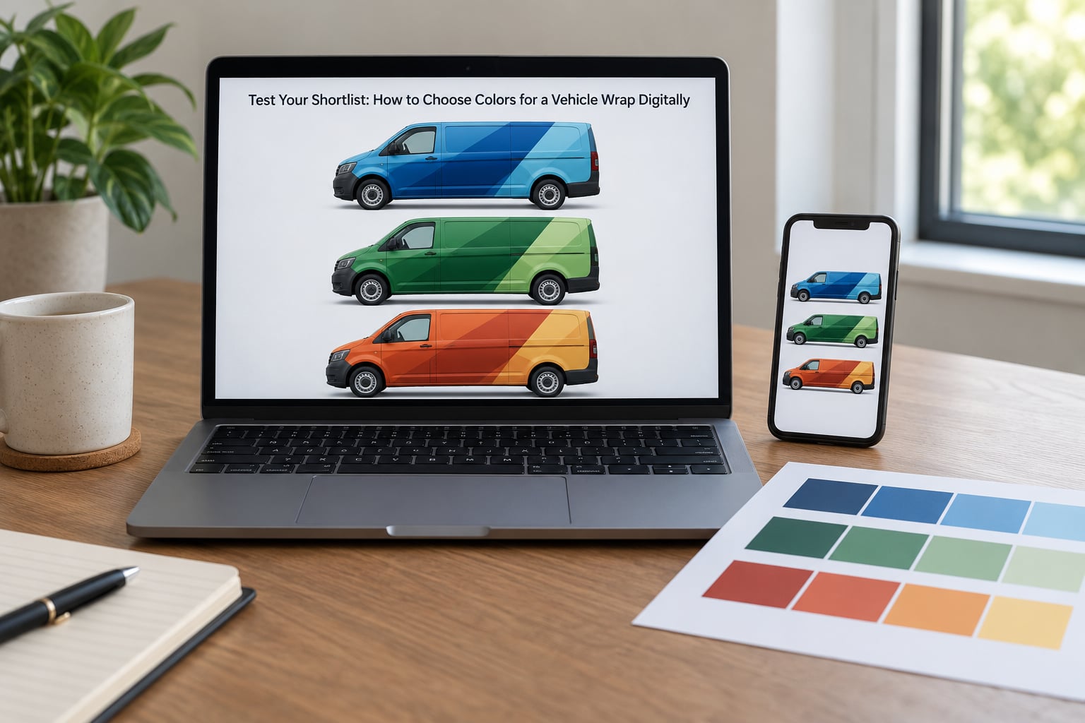
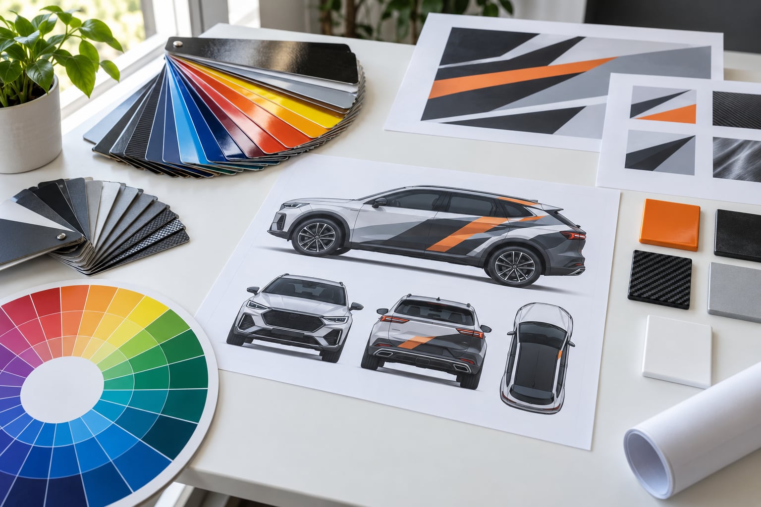
Take your two or three shortlisted palettes and apply each one to the same accurate mockup of your vehicle. Then shrink the mockup to a thumbnail, because that is roughly how people will meet your vehicle in a search result, a map listing, or a photo of a full lot.
If the vehicle still reads clearly at thumbnail size, you have a workable palette. If it collapses into an indistinct smudge, the problem is usually too many hues competing, not the wrong single hue. Trim one color and test again.
For how to choose colors for a vehicle wrap with any confidence, compare your shortlisted options in the real contexts: a bright midday photo, an overcast photo, and a night shot under artificial light. A color that only works in one of the three is a color that will disappoint you.
Compare the Finish and Material
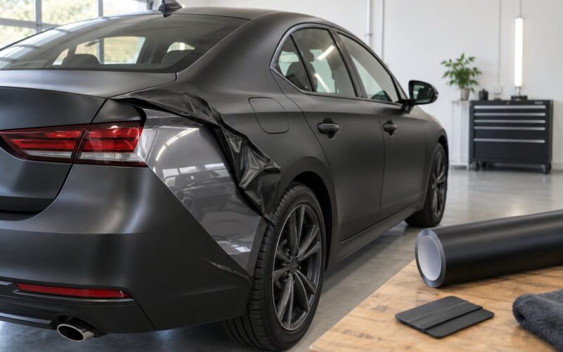
Finish changes the color more than most people expect. Gloss reflects a sharp image of the sky and the road, which deepens a dark color and makes a light color look cold. Satin splits the difference, softening reflections. Matte scatters light instead of reflecting it, so the same hue reads flatter, warmer, and more muted, and it also makes body lines and hood contours look more pronounced than gloss on the same car.
| Finish | How it looks | Shows swirl marks | Hides small dents and panel flaws | Cleaning | Best for |
|---|---|---|---|---|---|
| Gloss | Deep, reflective, paint-like | Yes, easily | No | Standard detail products work well | Paint-like finish, dark and jewel tones |
| Satin | Soft sheen between gloss and matte | Moderately | Somewhat | Standard products, no special soap | Dark colors that need less shine |
| Matte | Flat, powdery, muted | No | Yes | Matte-specific soap; shows water spots | Hiding imperfect bodywork, stealth looks |
| Textured | Rough grain, carbon or sand texture | No | Yes | Careful brushing, no gloss products | Off-road builds, aggressive styling |
Specialty color families add their own behavior. Metallic and pearl films rely on a base coat and a clear layer, which is why they read differently at night. Color-shifting and color flip films are dramatic at an angle in direct sun and often settle into a single darker base color in shade or under a parking structure, which surprises a lot of first-time buyers.
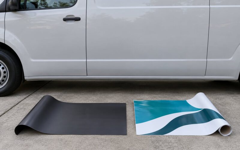
Ask the installer for a sample of the actual film in your candidate colors, held in your own light, and for a production proof before full material is cut. Gloss and matte versions of one color should be compared side by side, not from memory.
Review the Wrap Under Real Lighting
Take the approved proof, or better the installed vehicle, into daylight, shade, and artificial light. Full sun washes out light and mid-tone colors, and deep shade swallows dark colors, so a design checked only in one setting can lose the very element you wanted people to notice.
Check the logo first, then the phone number, then the tagline. If the logo holds in all three conditions, the design is doing its job. Test from a distance too, since a logo that reads at arm’s length on a mockup can disappear across a parking lot.
Photograph the wrap in those same three conditions and keep the shots. They are useful for your own records and for anyone who asks later whether the color matched the approved proof.
Get a Final Proof Before Production
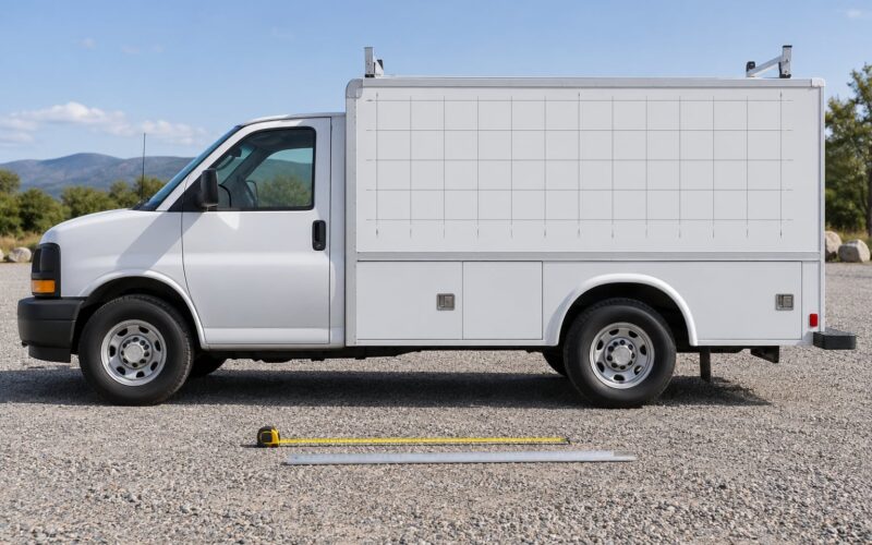
The last check happens on vehicle-specific files rather than on a flat design. Confirm the measurements, the logo placement on each panel, the color references in writing, the typography, the panel breaks, the door seams, the window coverage, and any production notes the installer needs.
Approve the proof in writing and keep a copy. Most disagreements about a finished wrap are not about taste; they are about which version was signed off and nobody remembers agreeing to it.
Common Mistakes
Choosing a color from a screen. Phone screenshots and monitor colors are unreliable, and buyers regularly report approving a color online and being surprised on delivery. The correction is simple: view a physical sample in daylight before approving.
Ignoring brand guidelines. Free-rolling on a work van can make the vehicle look like it belongs to a different company. Keep your primary brand colors exact and get the values in writing.
Using too many competing hues. Five or six saturated colors on one vehicle read as noise, especially at distance. Two strong colors plus a neutral almost always looks more intentional, and a thumbnail test catches the problem immediately.
Straddling important details across panel breaks. A logo split by a door seam, or a phone number crossing a wheel arch, reads as a printing error. Move the element to a clear panel or reduce its size to fit.
Never checking it in sunlight. Proofs approved in a shop’s indoor light are the single most common reason a finished wrap looks different than expected. Ask to see the proof outdoors, in shade, and at dusk.
Skipping the maintenance conversation. Matte and satin trap dirt, water spots, and grime, and they need matte-specific products that most owners never buy. Gloss shows swirl marks instead. Decide which tradeoff you can live with before the install, not after.
A few habits that make the rest easier. Name the exact brand, finish, and color code rather than a descriptive name like “dark blue,” since two brands sell very different films under similar names. Keep a small sample of the approved film so a future touch-up or panel replacement can be matched. And if your goal is low-key, the saturated colors people gravitate toward online are the hardest to live with quietly in a residential parking space.
Frequently Asked Questions
How many colors should I use on a vehicle wrap?
Most successful wraps use two colors and one neutral. A strong primary, a supporting secondary, and a neutral background give you room for a logo, a phone number, and a graphic without the vehicle turning into a paint chart. Three colors can work when one of them is a neutral used across a large panel. More than four usually means something has to shrink, and detail work is the first thing to suffer.
What colors make a vehicle wrap easiest to notice?
High contrast against the background beats brightness. A light vehicle with dark lettering, or a dark vehicle with light lettering, reads at distance in a way that a mid-tone color never does. Warm saturated hues such as orange, red, and yellow also read well against the muted greens, grays, and blues of most parking lots. The thumbnail test is the fastest check: shrink the mockup and see what survives.
Should vehicle wrap colors always match my logo?
Your primary brand color should match, ideally with a manufacturer code confirmed on a physical sample rather than matched from a screen. The rest of the palette does not have to. Many effective business wraps use a neutral body with the brand color reserved for the logo, lettering, and accent panels, which keeps recognition high and maintenance simpler. Treat any deviation from brand guidelines as a decision to document, not an accident.
How do I compare colors before ordering a vehicle wrap?
Ask for physical samples of the actual film in your candidate colors, then view them outdoors in both sun and shade, and again after dark. Put your two or three finalists on one accurate vehicle mockup and shrink it to thumbnail size. For how to choose colors for a vehicle wrap with real confidence, also request a production proof on vehicle-specific files, since panel gaps and door seams change how a layout reads.
Do matte and glossy finishes change the colors?
Yes, noticeably. Gloss reflects a sharp image of the environment, which deepens dark tones and can make a light color look cold. Matte scatters light, so the same hue reads flatter, warmer, and more muted while making body lines look more pronounced. Satin sits between the two. Always compare the same color in both finishes before deciding, and remember matte shows water spots while gloss shows swirl marks.
Can I use light colors for text on a dark vehicle wrap?
Light text on a dark wrap is one of the most reliable high-contrast pairings available, and it stays readable at distance in bright sun. The exception is dust and road grime, which show far more on light lettering over a dark panel, so plan for more frequent cleaning. If a light color will cover a large area, confirm it does not wash out in direct sunlight before approving the proof.
Conclusion
Color choice gets easier once you stop browsing names and start working through decisions: define what the wrap has to do, audit the colors you already own, test contrast on the real vehicle shape, compare the same color across finishes, and check the approved proof in sunlight, shade, and artificial light before production.
Start with three things this week. Write down the wrap’s single most important job, gather your brand colors and any paint code, and put your two or three candidate palettes on one accurate mockup. If the design still reads at thumbnail size and holds up outdoors, you have a palette worth approving.