A sidewalk sign message works when a passerby can read it in about three seconds and know exactly what to do next: one short headline that earns the glance, one concrete offer, one plain instruction. Everything after that is decoration. Writing one takes an afternoon, and no design skill is required.
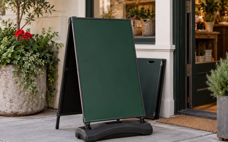
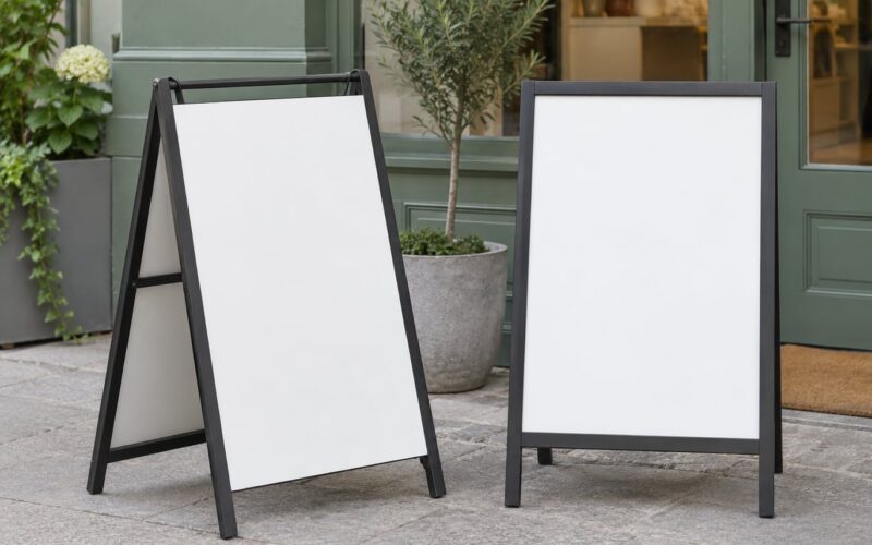
A sidewalk sign, also called an A-frame sign or sandwich board, is a freestanding, double-sided board that stands at the curb outside a shop, café, or office. It catches people who are already walking past, which makes it one of the cheapest ways to turn existing foot traffic into walk-ins. A FedEx Office survey found that 76% of consumers have gone into a business they had never visited before because a sign outside caught their eye. Most of those signs still fail at the one job, because they say too much, in lettering that is too small, and leave the reader guessing what happens next.
Below is the process I use: pick one action, lead with what the customer gets, cut it down to four lines, choose plain words, add the instruction, then test it from where customers actually approach. That is how to write a sidewalk sign message that works, and the whole thing takes less time than most people spend choosing a font.
Table of Contents
- What You Need
- Step-by-Step: How to Write a Sidewalk Sign Message That Works
- 1. Identify the one action you want customers to take
- 2. Write the benefit before the business details
- 3. Keep the message short enough to read at a glance
- 4. Use words customers notice and remember
- 5. Add a clear call to action
- 6. Test the sign where customers will see it
- Examples for common sidewalk sign messages
- Common Mistakes
- Frequently Asked Questions
- What makes a sidewalk sign message eye catching?
- How long should a sidewalk sign message be?
- What should a sandwich board sign say?
- How many words fit on an A-frame sign?
- How often should I change my sidewalk sign message?
- Are sidewalk signs legal to put outside?
- Conclusion
What You Need
Five things, and nothing else. If you are missing one of them, the sign will not do its job no matter how good it looks.
One clear offer. A specific thing with a specific condition attached: 20% off haircuts this week, free coffee with any lunch, same-day key cutting, free estimate on any kitchen remodel. Offers with a number, a day, or a condition attached get read; vague ones get walked past.
A handful of memorable words. Twelve to twenty words on the front face is plenty. A sandwich board sign is not a poster, and the person reading it is moving.
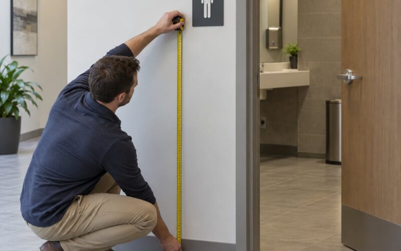
Readable lettering. Plain block capitals, high contrast against the background, nothing decorative. A common rule of thumb is roughly one inch of letter height for every ten feet of viewing distance, so a 40-foot view needs four-inch letters. Most signs that fail are not short on words, they are short on letter size.
One call to action. A verb and a direction. Come in today. Ask about your repair. Scan for a quote. Stop in for a free estimate.
A sense of what people need at that moment. A commuter at 8am wants coffee and speed. Someone at 5pm wants dinner. A parent at 3pm wants something for a kid. The same business needs a different message at each of those hours.
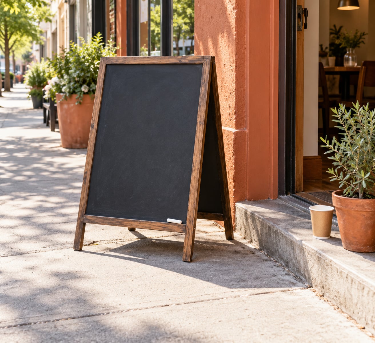
Then pick a surface. Chalkboard suits a café or a bistro and lets you rewrite daily. Dry-erase suits a retail shop that changes wording weekly. A printed insert panel suits a business that wants the same message out every day and needs it to look consistent. That last choice answers the worry I hear most often about hand-lettered signs looking homemade: a printed insert for the permanent message, chalk for the changing one.
Step-by-Step: How to Write a Sidewalk Sign Message That Works
Six steps, in order. The order matters, because the later steps are much easier once the first one is settled.
1. Identify the one action you want customers to take
Pick a single goal for this particular sign: walk inside now, order today, book an appointment, ask for a free estimate, or scan the code. Not three. People deciding in a two-second glance cannot hold two instructions in mind, so a sign that asks for an appointment and a purchase at the same time usually delivers neither.
Write the goal down as a verb before you write anything else. If your goal sentence is “get people to come in for a haircut,” the sign has no job yet. “Get Saturday walk-ins to book a colour appointment” has one.
2. Write the benefit before the business details
The first line should describe what the customer gets, not who you are. Nobody on foot is looking for your business history. They are looking for a reason to change direction.
So “Maria’s Family Salon, est. 2009” loses the glance, and “20% off colour this week” keeps it. Your name and your credentials can go lower on the board, where someone who has already decided to stop will read them. Put the offer where the eye lands first and the identity underneath.
3. Keep the message short enough to read at a glance
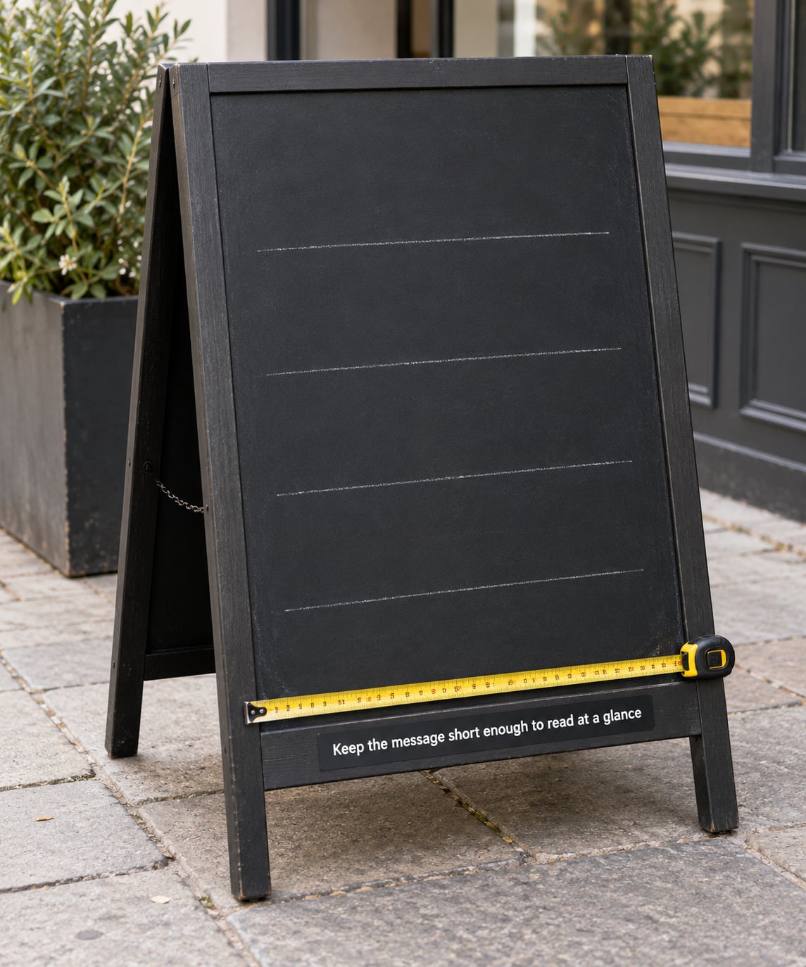
A person walking past at normal speed gives a sidewalk sign about three seconds. Drivers give it less, and they only catch the biggest line. Work backwards from that and the limits fall out on their own.
| Viewing distance | Headline | Whole message | Letter height |
|---|---|---|---|
| Up to 10 feet, people walking toward the door | Up to 6 words | Up to 20 words | 2 inches |
| 10 to 25 feet, the sidewalk either side | 4 to 5 words | 10 to 14 words | 3 to 4 inches |
| 25 to 50 feet, cars and bikes | 2 to 3 words | 6 to 8 words | 5 inches or more |
Those numbers are the whole method in one table. A chalkboard A-frame outside a small shop is usually read from 10 to 25 feet, which is why 12 words is a realistic target and 40 words is not.
Cut anything that repeats, anything decorative, and any line that only exists to say what kind of business you are. If you remove three lines and the offer is still clear, those lines were costing you the offer.
4. Use words customers notice and remember
Plain, short, concrete words travel. Jargon does not. “Orthodontic consultation” means nothing to someone walking past; “free smile check” means exactly what it says. “Bespoke tailoring solutions” reads as a company talking to itself.
Give the message one or two power words rather than a wall of bold. The one big line is what people photograph and repeat to a friend. If everything is emphasised, nothing is. Skip the exclamation mark pile and skip stacked blocks of capitals: they slow the eye down instead of speeding it up.
Puns work when the shop already has a loose personality, and they die on the board of a business that is trying to sound more established. That tension comes up constantly on owner forums, the argument about whether a sign should stand out from its neighbours or blend in with them. My rule: stand out in the offer, blend in on the design. A plain black board with clean lettering in your brand colours reads as professional precisely because it is not shouting.
5. Add a clear call to action
The call to action is the line that turns a reader into a visitor. Say what to do in a verb and two or three words: Come in today. Ask for Marco. Scan for a quote. Book at the counter.
Skip anything that assumes the reader already knows your process. “Enquire within” means nothing on a sidewalk. “Ask us about your repair” works, because it names the moment when someone would ask.
If you use a QR code, treat it as the call to action rather than an extra. One code, at the bottom, printed at least three inches square so a phone camera finds it from a step back. A social handle belongs on the board only when posting there is genuinely something you do.
6. Test the sign where customers will see it
Write the message, then go and stand where your customers stand. Read it from the sidewalk side, from across the street, from an angle, and again after dark if the board will be lit. If you cannot read the headline in the time it takes someone to walk past, rewrite it. That is the whole test.
Then watch for a day rather than a minute. Stand inside near the door and count how many people look at the sign and turn toward it. Ten people is enough to tell you whether the top line is doing anything. After a week, swap the offer and repeat the count. Two counts is a real answer; one guess is not.
Examples for common sidewalk sign messages
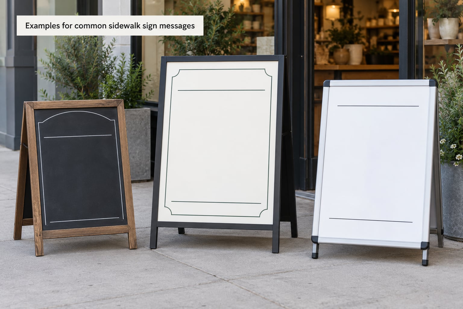
Most sign copy fails for the same reason: it describes the business instead of offering something. Here is what changes when you rewrite it that way.
| Weak message | Strong message | Why the rewrite works |
|---|---|---|
| Welcome to Joe’s — home of the best pizza in town since 1994 | 2 slices + a drink, 8 bucks, tonight only | Names a specific offer, a specific condition and a specific day |
| Family owned and operated since 2008 | Free first visit, walk in any time | Replaces credentials with a reason to step inside |
| Quality services at affordable prices | Free estimate on any bathroom, 48-hour reply | Removes the vagueness and adds a time promise |
| New patient welcome centre | New patients: free check-up, evenings until 7 | Names who it is for and when it is available |
Hold the structure steady and swap the middle line by business type. Each of these follows the same four parts: offer, detail, call to action, identity.
Restaurant. Tuesday pasta, 14 dollars, ends at 9. Come hungry. Osteria Bellini.
Cafe. Any large coffee, 4 dollars, before 10am. Grab one on your way in. Corner Cup.
Salon and barber shop. First cut 15 dollars, weekdays only. Walk in or book at the desk. Studio Marlow.
Gym. No joining fee this month. One free session, no card needed. Iron North Fitness.
Dental office. Free smile check for new patients. Evening appointments. Ask at reception.
Retail boutique. New knitwear just landed. 20% off before 6pm. Come see it before it goes.
Home services and contractors. Free estimate this week. Ask us about your repair. Call or scan.
Seasonal and event messages. Pumpkins on the front table, daily from now until Halloween. Follow the scent. Or for music nights: Live music Friday, doors at 7. Come early, it fills.
Common Mistakes
Saying everything. A sign that lists twelve products reads as a sign that sells nothing. Fix it by cutting to one offer. The others can live on the window.
Lettering that is too small. This is the most common failure and the least forgiving. If you wrote it with a skinny marker, it will not read from ten feet. Fix it by working from the distance table and rewriting at a larger size.
A confusing offer. “20% off selected items” needs a second sentence explaining which items, and second sentences cost you the glance. Fix it by naming exactly what is discounted.
Low contrast. Grey chalk on a dark board in shade is invisible at noon. Fix it by using the lightest chalk you have on the darkest surface, and by checking the board at the worst hour of the day rather than the best.
No call to action. An offer with no instruction leaves the reader to decide, and a person in motion does not decide. Fix it with three words at the bottom.
Bad placement. A great message on a board facing the wall, or one blocked by a parked van, reads as no message at all. Fix it by walking the approach in both directions and turning the board toward the flow of people.
A sign that does not match the local audience. A board full of industry shorthand aimed at people who already know your work is wasted on the passerby who does not. Fix it by writing for a stranger who has thirty seconds.
Leaving it out for months. Weather, sun and theft do damage, and a faded board reads as a business that has stopped caring. Fix it by bringing it in overnight in bad weather, weighting the base, and repainting the surface when it looks tired.
Skipping the permission check. This one causes real trouble. Sidewalk signs sit on public space, and many cities set rules on size, hours, and how much of the footway you can block. One salon owner on salongeek.com reports being told by her council that no signage outside was permitted at all. Home-based and treatment-room businesses hit this most often, because the property sits in a residential street. Check your local city rules and your landlord or lease before you write a word, not after.
Two habits cover most of the rest. Change the message on a fixed rhythm, weekly at minimum, because a message people have read forty times stops being read. And keep a simple count: how many people look at the board and turn toward the door, by hour. Two weeks of that beats any gut feeling about what is working.
Frequently Asked Questions
What makes a sidewalk sign message eye catching?
A sidewalk sign message catches the eye when it leads with one concrete offer in large, high-contrast lettering, and the reader can finish it in about three seconds. Bold colour alone does not work if the words are small or the contrast is low. Keep the headline to four or five words, put the offer in the top third of the board, and leave the lower third for a short instruction.
How long should a sidewalk sign message be?
Twelve to twenty words is the working range for a sidewalk sign read from a normal walking distance. A headline of four or five words carries most of the work, with a supporting line and a short call to action underneath. Anything over thirty words on a sandwich board tends to read as a wall of text and gets skipped by people already in motion.
What should a sandwich board sign say?
Four parts work every time: the offer, a detail that qualifies it, a call to action, and your business name at the bottom. For example, a free coffee with any lunch before 11am, stop in today, followed by the cafe name. Keeping the offer in the top third means it lands even on people who only glance at the board from across the street.
How many words fit on an A-frame sign?
From 10 to 25 feet, the usual reading distance, a 2 by 3 foot A-frame holds about 12 words comfortably: six for the headline and six for everything else. Beyond 25 feet, drop to six or eight words in total. Letter height matters more than word count: plan roughly one inch of letter height for every ten feet of viewing distance.
How often should I change my sidewalk sign message?
Change it at least weekly, and immediately whenever the offer expires. Regular pedestrians stop noticing a message they have read dozens of times, so rotation keeps the board earning attention. Seasonal and event messages should be swapped the day before they start, not on the day, so the board is already correct when people first pass it.
Are sidewalk signs legal to put outside?
It depends on your city, and you need to check before you put the board out. Many municipalities limit size, hours, and how much footway a sign can block, and some require a permit. Residential and home-based businesses face the strictest rules, and business owners have reported being told no outside signage was permitted at all. Your lease and landlord can also restrict it.
Conclusion
Choose one offer, write a benefit-led message of twelve readable words with a letter size matched to the viewing distance, add a two-word instruction, then walk the approach and time yourself. That single test will tell you more than any amount of brainstorming at the counter.