A sidewalk sign stops a stranger for roughly three seconds. If you know how to make a sidewalk sign stand out, those three seconds are enough to get someone through your door: one high-contrast message, set large enough to read from the far side of the street, asking for one specific action. Everything below takes an afternoon the first time and about five minutes a week after that.
I have watched small businesses park a beautiful A-frame in a shaded corner and then wonder why nobody looks twice. The problem is almost never the sign itself. It is the message competing with a dozen other things on a sidewalk: parked cars, a bike lane, a phone screen, weather, noise. The fix is subtraction, not decoration.
Here is the order I would work in. Pick the action, cut the words, raise the contrast, size the type to the distance, secure the base, then walk across the street and check it like a stranger.
Table of Contents
- What You Need to Make a Sidewalk Sign Stand Out
- A single core action
- Brand colors, limited to two or three
- A readable font
- A weather-resistant board
- A sturdy base or anchor
- Optional outdoor printing tools
- A ten-second decision between chalkboard, printed insert, and changeable frame
- Step-by-Step
- 1. Choose One Action You Want Passersby to Take
- 2. Write a Short Message That Can Be Read Instantly
- 3. Use High-Contrast Colors and a Simple Background
- 4. Create a Clear Visual Hierarchy
- 5. Build It for Outdoor Visibility and Stability
- 6. Test How to Make a Sidewalk Sign Stand Out From Across the Street
- Common Mistakes
- Frequently Asked Questions
- How far away should sidewalk sign text be readable?
- What size is best for a portable sidewalk sign?
- Should a sidewalk sign have a background color or border?
- How often should a small business change its sidewalk sign?
- Are there rules for placing a sign on a public sidewalk?
- How can a business tell whether its sidewalk sign is working?
- Conclusion
What You Need to Make a Sidewalk Sign Stand Out
You need far less than a design program suggests. Here is the working kit list I keep coming back to.
A single core action
Before anything else, decide the one thing a passerby should do: come inside, order today, book an appointment, or scan a code. Everything on the sign exists to make that one action obvious. A sign that asks for three things asks for none.
Brand colors, limited to two or three
Pick one background color and one text color that fight each other hard. Add a second accent only if it carries meaning, like a price badge or an arrow. More colors dilute the signal as the pedestrian moves past.
A readable font
A bold sans-serif in all caps for the headline, and the same family at a smaller size for support text. Avoid script, cursive, condensed faces and anything with thin strokes; they disappear at distance and in glare.
A weather-resistant board
Corrugated plastic, sealed exterior plywood, or a framed dry-erase or chalkboard surface. For printed inserts, ask for UV-resistant lamination, since a faded sign looks broken no matter how good the layout was. Corners and edges need protection because those fail first.
A sturdy base or anchor
A weighted foot, sandbags, or a frame that can be fixed to something solid. Empty frames tip in a light gust and a fallen sign on the pavement gets ignored by everyone, including the person who put it there.
Optional outdoor printing tools
A large-format printer for inserts, a marker that is rated for the surface, or a printable template you can reuse each season. Most businesses print once a month and rewrite weekly; the template matters more than the printer.
A ten-second decision between chalkboard, printed insert, and changeable frame
A chalkboard or dry-erase surface suits daily changes and casual handwriting. A printed insert suits a fixed message and looks more finished. A changeable frame with a clear pocket gives you both, which is the easiest option to run month to month.
Step-by-Step
Six steps, in order. Do not skip to the color step, because a beautiful sign with a vague message still fails.
1. Choose One Action You Want Passersby to Take
Decide on a single immediate response and write it down before you design anything. Come inside, order today, book a slot, scan for today’s menu. The more options you offer, the fewer you get.
Pair the action with a low-friction reason. Walk-ins convert far better when the barrier is low: free coffee with a signup, a cool room on a hot day, a same-day service, a twenty percent discount that ends tonight. A vague invitation to browse rarely moves anyone, because browsing asks for effort from a stranger who is already in motion.
Check the step by asking one question: if a person read only the biggest words on this sign, would they know what to do next? If not, the sign is not finished.
2. Write a Short Message That Can Be Read Instantly
Reduce your offer to three to five memorable words. Benefit first, detail second, action implicit. Most sidewalk signs fail because they are read as a small poster rather than as a headline.
Here are working templates you can copy and swap the bracketed parts.
- Restaurant: [DISH OF THE DAY] with [PAIRING] inside today
- Cafe: [FRESH PASTRIES] OUT AT [TIME]
- Bakery: ORDER BY 10 AM for same-day pickup
- Bar: HAPPY HOUR 4 TO 6 with a [DRINK]
- Retail: [NUMBER] PERCENT OFF [ITEM] this weekend only
- Gym: FIRST CLASS FREE with [CLASS NAME] at [TIME]
- Salon: WALK-INS WELCOME with [SERVICE] today
- Real estate: OPEN HOUSE SUNDAY at [ADDRESS]
A weak line and a strong line, side by side: Welcome to Our Store versus NEW SEASON SALE, 30 PERCENT OFF. The second has a subject, a number and an end date. Nobody needs a greeting.
3. Use High-Contrast Colors and a Simple Background
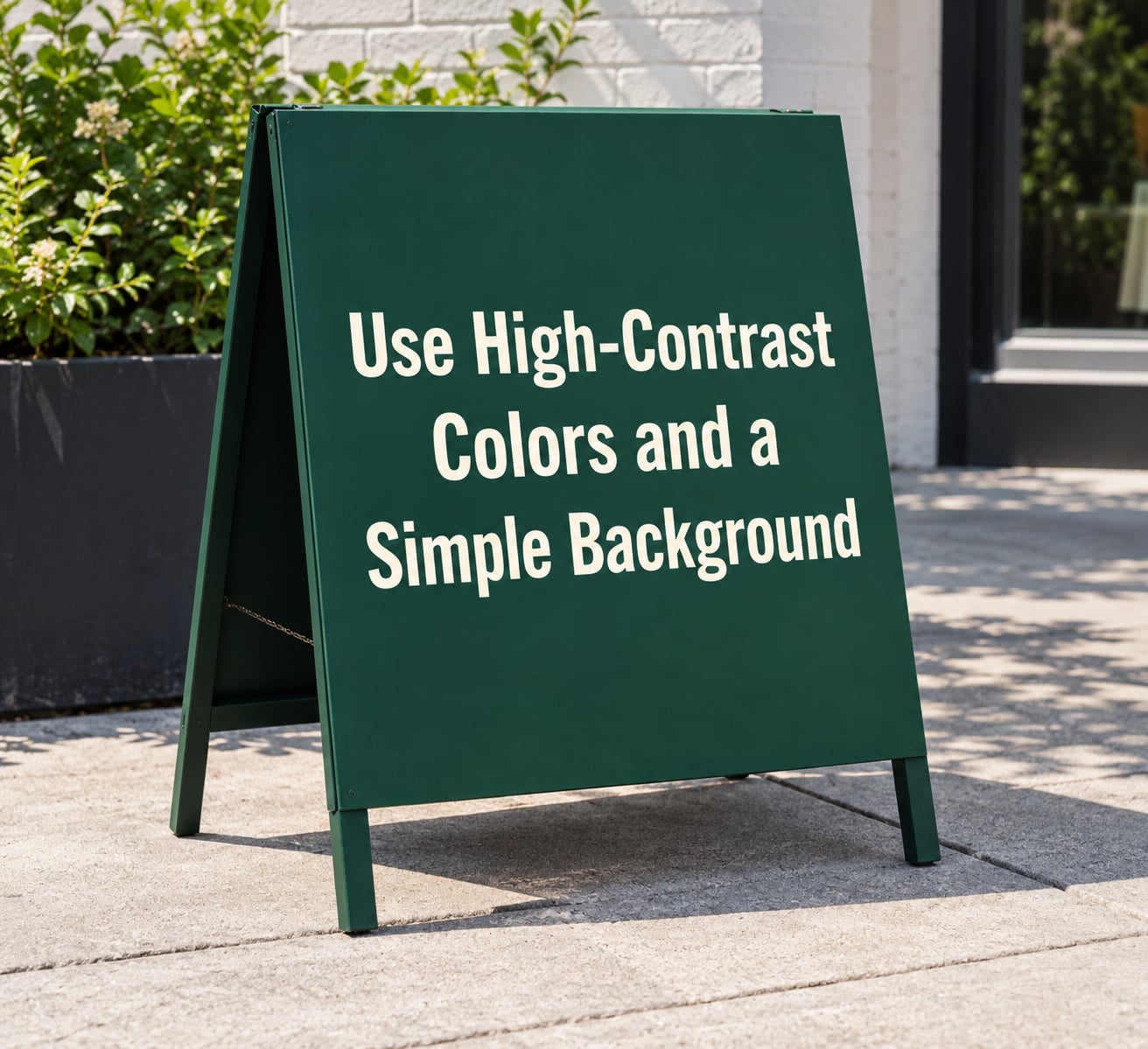
Contrast is doing most of the work here. Pick a pairing where the letters are dramatically lighter or darker than the background, and the brightness gap is large enough to read in shade, in rain, and under glare from wet pavement.
Pairings that hold up on a street include yellow lettering on black, white on red, black on yellow, and cream on a deep green or navy. What fails is anything close in value: medium gray on white, thin gold on cream, or pastel on pastel. It looks refined in a design tool and disappears outdoors.
Skip red on green and other red-green pairings. A meaningful share of pedestrians have red-green color vision deficiency, and that combination turns into soft blur at distance for them while looking fine to you.
Keep the background empty. Photos, gradients, borders with pattern, and multiple type sizes all compete for the same second of attention. A flat field of one color with one message on it is almost always stronger.
4. Create a Clear Visual Hierarchy
Make the offer or business name the dominant element, then support it with one short detail. Three levels are plenty: headline, support line, action cue.
Use size, weight, spacing and alignment to control where the eye lands first. The headline should be the biggest thing on the board by a wide margin, the support line noticeably smaller, and the two should sit flush left or centered together. A centered headline with a left-aligned support line underneath reads as two unrelated statements.
Leave breathing room around the text rather than filling the panel edge to edge. Crowding is the most common reason a small sign looks cheap. Generous margins make the same words look deliberate.
Size type to distance rather than to taste. A reliable rule of thumb is one inch of letter height per ten feet of viewing distance, so a headline read from forty feet needs roughly four-inch capitals. For a shopping street where people walk fast, add margin rather than trimming.
5. Build It for Outdoor Visibility and Stability
Choose materials that survive a season of sun and rain. Corrugated plastic and sealed plywood are the usual pairings, and printed faces should carry UV-resistant lamination. A 24 by 36 inch face is the common working size for a standard A-frame, and it matches the rule above for most storefronts.
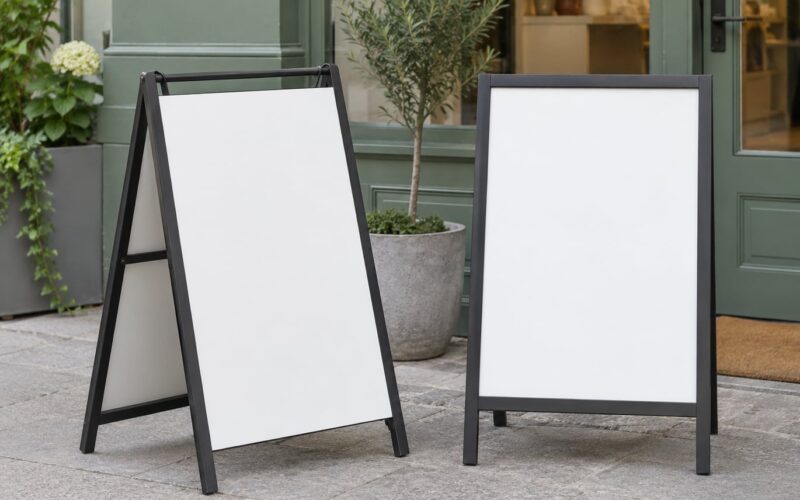
Stop it from opening too far. Builders on a Signs101 thread described the fix that keeps working: two eye hooks and a short length of chain from a hardware store to limit the opening angle. It is a five-minute addition and it prevents the splayed, tired look that makes a frame look neglected.
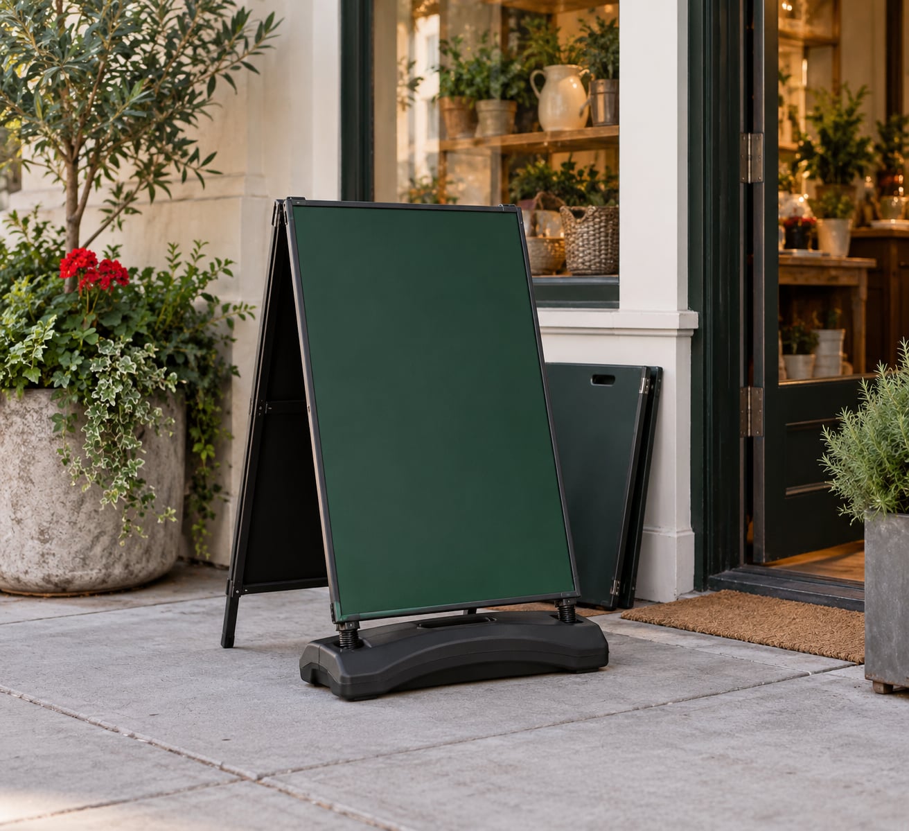
Handle the base and the wind. Add weight low and centered rather than hanging bags high on the frame, and set the sign at a slight angle to the gust direction rather than broadside to it. On genuinely windy corners, anchor to a fixed post or bring it in during gusts. Keep drainage clear so water does not pool against the feet and warp the base.
Store it overnight indoors if you can, so the sign is not theft bait and the graphics are not exposed to overnight damp. Bring it in during high wind and severe weather, and treat that as part of owning a sidewalk sign rather than as a failure.
Finally, keep the walking route clear. Leave a generous, unobstructed path for pedestrians, including wheelchair users, strollers and people with visual impairments, and place the sign where it narrows nothing.
6. Test How to Make a Sidewalk Sign Stand Out From Across the Street
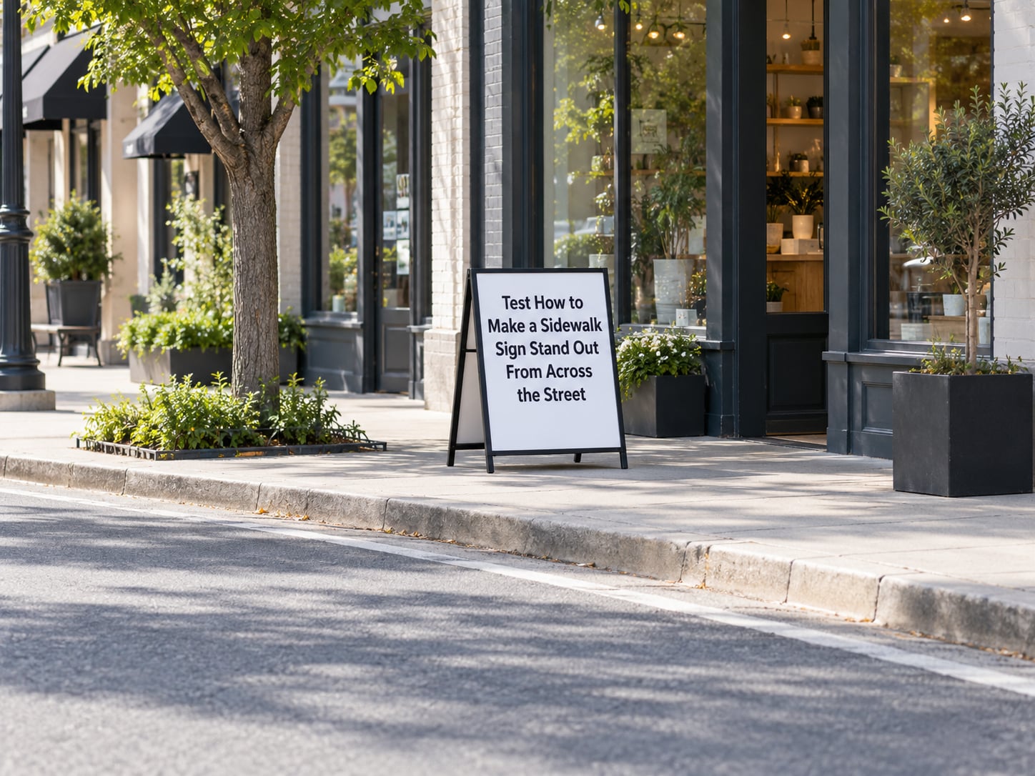
Stand at the point where a customer first sees you, which is usually well back along the foot traffic. Read the sign out loud in the time it takes to cross the street. Then walk the approach angle from the direction most of your customers arrive from, not the direction that looks best in a photo.
Repeat the test in three conditions: bright sun, overcast light, and dusk. Most unreadable signs fail at dusk, when you are depending on interior glow and street lighting rather than daylight contrast.
If the read feels slow, revise in this order: cut words, then enlarge the headline, then raise the contrast, then add spacing. Decoration is the last thing you add, and only if the sign already works without it.
Then measure whether it worked. Count passersby and walk-ins for one shift on the sign message, then repeat with the sign turned around or brought inside, and compare. For offers, put a code on the sign such as a short phrase staff can hear at the register, so attribution does not rely on memory.
Common Mistakes
These are the fixes I see most often, each with the reason behind it.
- A service list instead of one offer. Six lines of services read as nothing. One specific offer reads as a reason to stop.
- Low-contrast color pairs. Medium tones blend together at distance and in shade. Push the light and dark ends further apart.
- Text sized for the desk, not the street. Apply the one inch of letter height per ten feet rule and resize the headline first.
- A generic greeting as the headline. Welcome to Our Store spends your most valuable line of type on nothing. Use it for the offer instead.
- Several calls to action. Come in, call, scan, follow, subscribe. Pick one and give it the largest type.
- Placing it in the doorway or in shade. Doorway placement blocks the entrance and reads as an obstacle. Put it along the natural walking line, slightly ahead of your door, where light falls.
- An unstable frame. A sign that rocks or tips gets ignored and can become a hazard. Add the chain limiter, weight the base, anchor if needed.
- Faded graphics. Unlaminated printed faces bleach within a few months and read as neglected. Use UV-resistant lamination or repaint.
- Crowded layout. Decorative borders, clip art and multiple type sizes drain attention. Empty space is free and it works.
Rotate the message rather than leaving one sign up for a year. Fresh wording is the cheapest way to renew attention, and a weekly chalk change or a monthly printed insert keeps it simple.
A loose seasonal rhythm works well: a spring service offer, a summer cold drink and extended hours, a back-to-school or late-summer deal, a fall seasonal special, holiday hours and gift cards, then a winter warm-up or new-year offer. Pair each with a visibility check, and inspect the sign every week or two for fading, a loose chain, chipped edges or a shifted position.
Frequently Asked Questions
How far away should sidewalk sign text be readable?
A common rule is one inch of letter height for every ten feet of viewing distance, so a headline meant to be read from forty feet needs roughly four-inch capitals. Add margin for busy streets and fast pedestrians. Test the finished sign from the point where a customer first sees you, not from the doorway, because most unreadable signs were sized for arm’s length.
What size is best for a portable sidewalk sign?
For most storefronts on a standard shopping street, a 24 by 36 inch face is the practical default. It matches the legibility rule at about 25 to 35 feet and stays light enough for one person to reposition. Larger faces help on wide roads and plazas; smaller ones work indoors, at market stalls and in lobbies where people are already close.
Should a sidewalk sign have a background color or border?
Use a solid background color, because contrast between the text and the field is what makes the sign readable at distance. Skip decorative or patterned borders, which compete with the headline and pull the eye away from the offer. A single thin plain rule can separate a headline from a support line, but a frame around the edge should be simple and non-distracting.
How often should a small business change its sidewalk sign?
Rewriting a chalkboard or dry-erase sign weekly is enough to keep it fresh, while printed inserts usually get replaced monthly. Match the cadence to your offer cycle so a daily special rotates daily. Stale wording is ignored quickly, so set a recurring reminder rather than waiting until someone points out the sign has not changed since spring.
Are there rules for placing a sign on a public sidewalk?
Yes, and they vary by city. Common requirements cover a permit or registration, a maximum width, keeping a clear accessible path of travel, limits on placement near entrances and crosswalks, and removal at closing time. Unpermitted signs can be cited or removed. Check your city public works or licensing department, or your landlord, before you set one out.
How can a business tell whether its sidewalk sign is working?
Run a simple comparison. Count passersby and walk-ins during one shift with the sign out, then repeat with the sign turned around or brought inside, and compare the two numbers. For offers, add a short spoken code or printed phrase such as SIDEWALK SPECIAL so staff can attribute a visit. Repeat the test across several weeks before changing the design.
Conclusion
Start with one action, cut the message to a few words, and test it from the far side of the street before you spend anything on a more elaborate design. Contrast, letter height and placement fix most weak signs, and a weighted, chain-limited frame keeps it there through bad weather. Once the basics hold up, refresh the wording on a schedule and check the local placement rules before the first sign goes out.