Restroom sign placement rules come down to four numbers and one side of the door. Mount the sign on the wall beside the latch side of the restroom door, at least 3 inches from the door frame, with the baseline of the lowest tactile character between 48 and 60 inches above the finished floor, and keep an 18 by 18 inch area of clear floor space in front of it so a person can approach and read it by touch. This guide covers what changes when doors are doubled, swing inward, or have no wall left to mount on, plus the state codes that can be stricter than the federal rules.
Most small-business sign failures are not about the sign itself. They are about where it sits. A beautiful sign hung on the hinge side of the door, or measured to the top of its Braille, fails the same inspection as no sign at all.
Table of Contents
- Restroom Sign Placement Rules by Facility Type
- What Signs Are Required at Restrooms?
- Required Restroom Signs
- Accessible Toilet Room Sign Requirements
- State and Local Code Overlays
- Where Must You Place a Restroom Sign?
- Restroom Sign Placement Rules for Mounting Height
- How to Choose the Correct Sign Location
- Do Directional Signs Need to Point to the Restroom?
- What About Temporary and Out-of-Service Signs?
- Material, Size, Contrast, and Lighting Considerations
- Common Restroom Sign Placement Mistakes
- How to Check Compliance Before Installing Signs
- Frequently Asked Questions
- How high should a restroom sign be mounted in the United States?
- Are restroom signs required to have Braille?
- Should a restroom sign be installed on the door or beside it?
- What should a sign say when a restroom is temporarily closed?
- Do small businesses open to the public have to follow ADA restroom-sign rules?
- Can state or local laws require different restroom sign placement than federal rules?
- Conclusion
Restroom Sign Placement Rules by Facility Type
Placement rules depend on what kind of facility you run and which restroom a person needs to find. A restaurant with one accessible single-user toilet is a simple case. A clinic, hotel, school, or multi-tenant office building with several floors is not.
In every case, the federal baseline for permanent toilet room identification signs is the same, and it comes from Section 703 of the 2010 ADA Standards for Accessible Design. State and local codes build on top of it and can be stricter.
- Single-occupant and single-user restrooms. One permanent room identification sign on the latch-side wall. This is the simplest layout and the one most small businesses have.
- Multi-user restrooms. One sign on the wall beside the entrance door for each distinct toilet room, plus directional signage wherever the restroom is not visible from where a visitor stands.
- Multi-tenant and multi-floor buildings. Permanent signs on each floor at decision points, plus directional signs with floor numbers and arrows so nobody walks the wrong way.
- Healthcare, education, and transit facilities. These usually carry extra state or local requirements layered on the federal rules, so the local code is the document to read first.
The through-line: the sign has to be readable before a person commits to the door. Placement is a wayfinding problem before it is a legal one.
What Signs Are Required at Restrooms?
Required Restroom Signs
Four sign types cover nearly every restroom in a commercial building, and each has a different placement rule.
- Room identification signs. Permanent signs that name or show the toilet room. These carry the full federal rule set, including tactile characters and Braille.
- Directional signs. Arrows and floor identifiers that guide people to restrooms that are not in view. Placement rules are looser because these are not tactile room identification.
- Accessible toilet room notices. A sign that identifies the accessible stall or room so people do not have to enter to find out. It carries the same placement rules as any permanent identification sign.
- Temporary and changeable notices. Paper, magnetic, dry-erase, and digital signs. Federal rules treat these differently from permanent signs, which is covered later in this guide.
Men’s, women’s, unisex, family, and assisted-use rooms can each need their own label depending on how the restroom is laid out. A family restroom that doubles as an accessible toilet room usually carries both designations on the same sign.
One caution on icons. The accessibility pictogram is widely expected and often required by state code, but the pictogram by itself does not satisfy every federal, state, or local rule. Most codes want tactile characters and Braille alongside it, not instead of it.
Accessible Toilet Room Sign Requirements
For permanent toilet room identification signs serving accessible toilet rooms, the federal requirements are specific enough to build a checklist from.
- Raised tactile characters with a minimum height of 1/32 inch, so a fingertip can read the shape.
- Grade 2 contracted Braille directly beneath the tactile text.
- High contrast between the characters and the sign background, and a non-glare matte or satin finish.
- Uppercase sans serif lettering, such as Arial or Helvetica. No italic, script, or decorative faces.
- Placement on the latch-side wall or on the door itself under the narrow conditions described further down.
The Braille requirement carries a practical exception that catches people out: where the tactile characters are necessary for understanding the sign, Braille may be omitted. Check the current edition of the standards, or your state code, before relying on it.
State and Local Code Overlays
Federal ADA rules set the floor, not the ceiling. Many state building codes adopt accessibility standards that add requirements on sign design and placement.
California is the best-known example. The California Building Code Title 24, Part 2, Chapter 11B is enforced through certified access specialists, commonly called CASp, and section 11B-703.4 sets sign mounting rules that go beyond the federal minimum. Several other states have adopted ICC A117.1 or their own amendments.
Two practical notes. First, if you do not know which jurisdiction applies to your property, ask your city or county building department rather than guessing. Second, in California and a handful of other states, a private individual can bring an accessibility claim without going through the building department at all, which changes how seriously a small detail is treated.
Where Must You Place a Restroom Sign?
The decision is a sequence. Work through it in order and the placement usually resolves itself.
- Pick the side you pull from. The latch side is the side with the handle or lever, the side opposite the hinges. The sign goes there, because that is where a hand already travels.
- Offset it from the frame. Keep a minimum of 3 inches between the edge of the sign and the door frame.
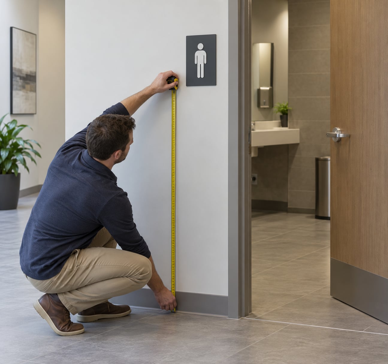
- Set the height. Measure to the baseline of the lowest tactile character, not to the top edge and not to the Braille.
- Check the approach space. An 18 by 18 inch area of clear floor space must be available for a person to stand, without the door swinging through it from closed to 45 degrees open.
- Confirm visibility. The sign should be readable from the approach before the person reaches the door, in the lighting that actually exists there.
Steps 1 through 4 are the federal rules. Step 5 is where good businesses separate themselves from the minimum.
Restroom Sign Placement Rules for Mounting Height
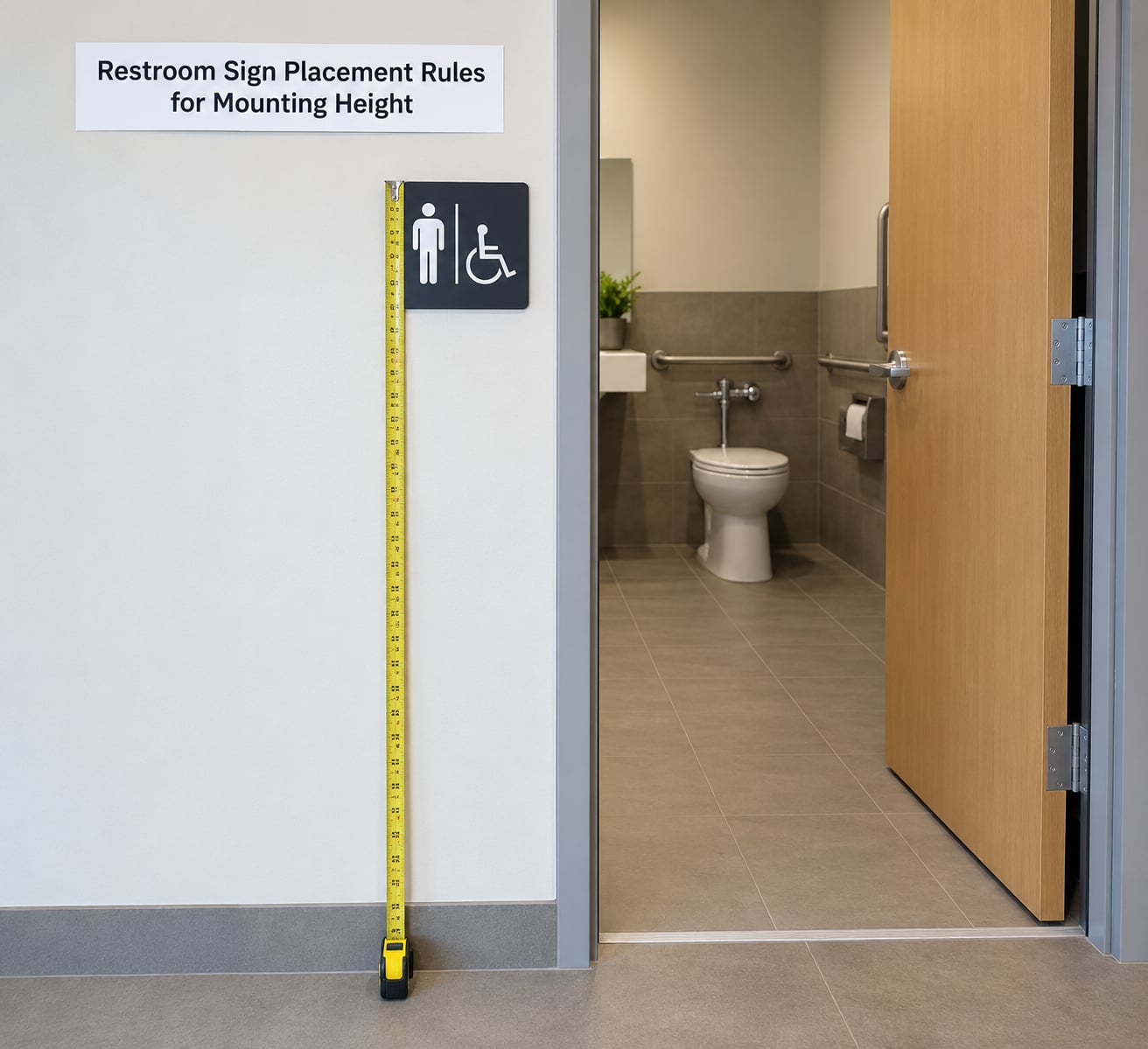
For a sign with tactile characters, the baseline of the lowest tactile character must be between 48 and 60 inches above the finished floor. That single measurement point resolves most of the arguments you will have with a sign installer.
A visual-only sign with no tactile elements is different. Those signs sit between 40 and 70 inches above the finished floor, measured to the bottom of the characters. Mixing up the two ranges is one of the most common errors in the field.
Two more heights come up when space is tight. An overhead sign must clear 80 inches at its lowest point. A projecting wall sign, which sticks out perpendicular to the wall, must sit at least 27 inches above the finished floor and may project no more than 4 inches.
| Rule | Exact measurement | Measured to or from | Code reference |
|---|---|---|---|
| Tactile sign mounting height | 48 to 60 inches | Baseline of lowest tactile character, above finished floor | ADA 703.5.1 |
| Visual-only sign height | 40 to 70 inches | Bottom of characters, above finished floor | ADA 703.5.2 |
| Offset from door frame | 3 inches minimum | Edge of sign to the door frame | ADA 703.5.1 |
| Clear floor space | 18 by 18 inches | In front of the sign, door closed to 45 degrees open | ADA 305.3 |
| Overhead sign clearance | 80 inches minimum | Lowest edge of the sign | ADA 216.6 |
| Projecting wall sign | 27 inches minimum height, 4 inches maximum projection | Bottom of sign to floor; sign out from wall | ADA 216.3 |
| Raised character height | 1/32 inch minimum | Surface relief of tactile characters | ADA 703.5.1 |
Height is the number that fails inspection most often, and it fails because of how it is measured. If your installer measures to the top of the sign, they will hang it too high.
How to Choose the Correct Sign Location
Walk the route a visitor actually takes, not the one you take because you know the building. Start at the parking lot or the street entrance and finish at the restroom door.
At each decision point, ask a few things. Where does a person stop and decide? Can they see the door from where they stand? Does the door swing into the sign or cover it when open?
Then check the surfaces. Is there a wall beside the latch side with 3 inches of clearance from the frame? Is the lighting even, or does a window glare wash the sign out at one time of day?
Door swing is the detail people miss. A door that opens toward the viewer can hide a sign mounted on the wall next to it. A door that swings away from the viewer leaves the wall exposed and the sign readable. For an outward-swinging door, the sign goes outside the swing arc so nobody backs into it.
If there is genuinely no compliant wall on the latch side, you have three options, in order of preference: use the adjacent wall just past the door, use an overhead or projecting sign, or mount on the door itself. Door-mounted signage is a last resort and only works under the narrow conditions described next.
Do Directional Signs Need to Point to the Restroom?
Directional signs are not required by accessibility rules in most cases, but they are close to mandatory by common sense in any building with more than one restroom.
You need them when the restroom is not visible from where a visitor stands, when more than one floor has restrooms, or when the accessible toilet room is in a different spot than the main ones. Restaurants, clinics, hotels, and office suites all hit at least one of these.
A few habits keep directional signage working. Use the same arrow direction you actually want people to turn, and check that an arrow on one floor does not point the opposite way from the same graphic on another. Mount directional signs where a standing person reads them comfortably, not above head height where they are wasted. Keep the wording identical to the room sign, so “Restroom” on the arrow matches “Restroom” on the door.
Directional signs get less attention than the door sign, but they are usually what a first-time visitor reads first.
What About Temporary and Out-of-Service Signs?
A closed restroom needs to be obvious, or people will stand in a hallway waiting. The practical standard is simple: put a notice at every approach and on the door itself, and tell people where the nearest working restroom is.
Federal accessibility rules treat temporary and changeable signs differently from permanent ones. A printed sheet, a dry-erase board, and a digital display are generally outside the tactile and Braille requirements that apply to permanent signage. That is not a loophole for permanent rooms, though. If your restroom is a permanent toilet room with a designation, it needs permanent compliant signage no matter how ugly the acrylic letters are.
The habit worth building: take temporary notices down the day the repair or cleaning is finished. A closed-for-cleaning sign left on a functioning restroom does more damage than a sign that was never there.
Material, Size, Contrast, and Lighting Considerations
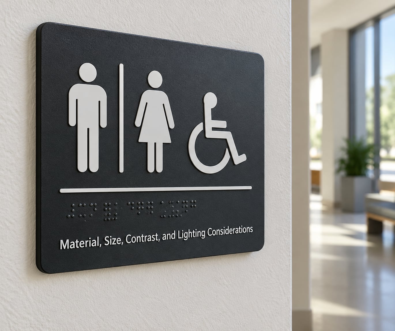
Placement only works if the sign can be read and felt in the spot you chose. A few specifications decide that.
- Pictogram field. When a pictogram is used, it sits in its own field of at least 6 inches, kept clear of other characters.
- Character size. Bigger characters read from farther away, which matters in a corridor where someone is walking, not standing still.
- Contrast and finish. High contrast between characters and background, with a non-glare matte or satin surface. Glossy finishes create reflections that disappear under overhead lighting.
- Edges. Rounded or beveled letter edges hold up to cleaning and daily touch far better than sharp square edges.
- Material. Durable materials such as acrylic, anodized aluminum, or engraved plastic survive the sanitizer, the mop, and the scuffing that come with a public restroom.
- Lighting. Even lighting supports both visual reading and tactile reading. A sign lit from below by an exit sign is often the worst spot in the hallway.
None of these fix a bad location. A beautiful sign at the wrong height is still a wrong sign.
Common Restroom Sign Placement Mistakes
These are the failures that show up over and over, in rough order of how often I see them.
- Hinge side instead of latch side. The most common error, and the one that shows up constantly in the recurring online debate about which side signs belong on.
- Centered on the door. A sign on the moving leaf cannot be found by touch before the door is opened, which defeats the purpose.
- Hidden behind a swinging door. The wall is right, but the door covers it when open.
- Measured to the top of the sign. Puts a compliant-looking sign well above the 60 inch ceiling.
- Tactile range used on a visual-only sign. Visual-only signs belong in the 40 to 70 inch range, and installers often force them into 48 to 60.
- Weak contrast or a glossy finish. Reads fine in the shop, invisible under corridor lighting.
- Damaged or filled-in Braille. Painting over Braille or letting cleaning chemicals sit on it degrades the dots.
- Inconsistent labels across doors. One door says Restroom, the next says Bath, the accessible one says nothing.
- Temporary signs nobody removed. A closed-for-repair notice still hanging on the door a week after the repair.
- No sign at all where the accessible room is. Visitors enter to check, which defeats the notice the sign was supposed to provide.
One more that is not about code: relying on a phone-based directions message because the physical sign is missing. That does nothing for a blind visitor and is a poor answer to anyone.
How to Check Compliance Before Installing Signs
A ten-minute pass with a tape measure catches most problems. Here is the sequence.
- Inventory every restroom. List each toilet room, each accessible stall, and every entrance a visitor uses. Include parking-adjacent and secondary doors; they get missed.
- Photograph each entrance. One straight-on photo per door. You will compare these later and it takes ten seconds now.
- Measure the height. Floor to the baseline of the lowest tactile character. Record the number, not a rough judgment.
- Measure the offset. Edge of the sign to the door frame. Under 3 inches means move it.
- Check the clear floor space. Open the door from closed to 45 degrees. If the door sweeps through the space, or a chair, a cart, or a mop bucket lives there, the space is not clear.
- Verify the side. Confirm the sign is on the latch side, and check it is still visible with the door open.
- Check contrast and Braille. Run a finger over the dots. Filled, smeared, or missing dots mean a replacement.
- Compare with your local code. If your state or city has its own accessibility standards, check the numbers against that document rather than the federal one alone.
- Document what you fixed. Dates, measurements, and photos. If a claim ever arrives, the record matters.
Know when to bring in help. If your space is tight, your jurisdiction has its own accessibility code, or a claim is already on the table, get a licensed sign installer or an accessibility consultant involved. In California, a CASp inspection is the recognized route. If you are a tenant, put the request in writing to the landlord, because responsibility for sign placement in a leased space is usually a lease question rather than a code one.
Frequently Asked Questions
How high should a restroom sign be mounted in the United States?
For a permanent sign with tactile characters, the baseline of the lowest tactile character must sit between 48 and 60 inches above the finished floor. The measurement point matters more than the number: measure to the baseline of the text, not to the top edge of the sign and not to the Braille. Signs without tactile elements fall in a different range, 40 to 70 inches.
Are restroom signs required to have Braille?
Permanent room identification signs serving toilet rooms generally need Grade 2 contracted Braille beneath the tactile characters. Braille may be omitted where the tactile characters are required for understanding the sign content, which is the exception most people get wrong. Temporary and changeable signs, including printed and digital displays, are generally outside the Braille requirement.
Should a restroom sign be installed on the door or beside it?
Beside it, on the latch-side wall, at least 3 inches from the door frame. Door-mounted signage is permitted only in narrow cases, such as an inward-swinging self-closing door with no hold-open device, or where no compliant wall location exists. Mounting on the swinging leaf also creates a maintenance problem, since the sign moves every time the door opens.
What should a sign say when a restroom is temporarily closed?
Say that it is temporarily out of service and point to the nearest working restroom, with enough detail to act on, such as a floor or wing name. Place a notice at every approach and on the door itself. Remove the notice as soon as the restroom reopens, and remember that temporary notices do not replace permanent accessible signage in a facility that stays open.
Do small businesses open to the public have to follow ADA restroom-sign rules?
Yes. The Americans with Disabilities Act applies to businesses open to the public, and Title III covers most private commercial facilities regardless of size. Small retail shops, restaurants, and offices are covered. Compliance with the readily achievable standard means meeting the accessibility requirements where it is not technically infeasible or disproportionately difficult to do so.
Can state or local laws require different restroom sign placement than federal rules?
They can, and several do. State accessibility codes such as California’s Title 24 Chapter 11B, section 11B-703.4, add or tighten requirements beyond the federal ADA standards, and local codes may add more. The federal rules are the baseline rather than the ceiling. Check with your city or county building department to find out which document your property is held to.
Conclusion
Start at the door. Walk to each restroom entrance, measure from the finished floor to the baseline of the lowest tactile character, check the 3 inch offset from the frame, and confirm an 18 by 18 inch clear space on the latch side. Then verify every permanent sign against the current federal accessibility standards and your state or local code before ordering replacements. Signage is the cheapest item on an accessibility checklist to get right and the easiest to fix while it is still small.
The federal standards in place as of 2026 remain the reference, but codes get adopted on their own schedule. Confirm the current edition for your property before you order.