The short answer to how big should text be on a sign to read from the street: roughly 1 inch of capital letter height for every 10 feet of viewing distance. Multiply by 72 and you have the point size for your design file. Regulatory road signs work differently, at about 30 feet per inch, so the two numbers get quoted constantly and rarely explained.
That is a rule of thumb, not a guarantee. Weather, contrast, letter weight and how fast the reader is moving all push the number up. Here is how to turn it into a specific number for your sign.
Table of Contents
- What You Need
- Step-by-Step: How Big Should Text Be on a Sign to Read from the Street?
- Measure the Farthest Useful Viewing Distance
- Choose a Letter Height for That Distance
- Letter Height for Common Sign Types
- Keep the Message Short and High-Contrast
- Common Mistakes
- Frequently Asked Questions
- How far should you be able to read a street sign?
- How big are the letters on road signs?
- What is the recommended font size for signs?
- How big should text be on a yard sign?
- How do I convert letter height in inches to a point size?
- Should I ask my sign company to check the design before production?
- Conclusion
What You Need
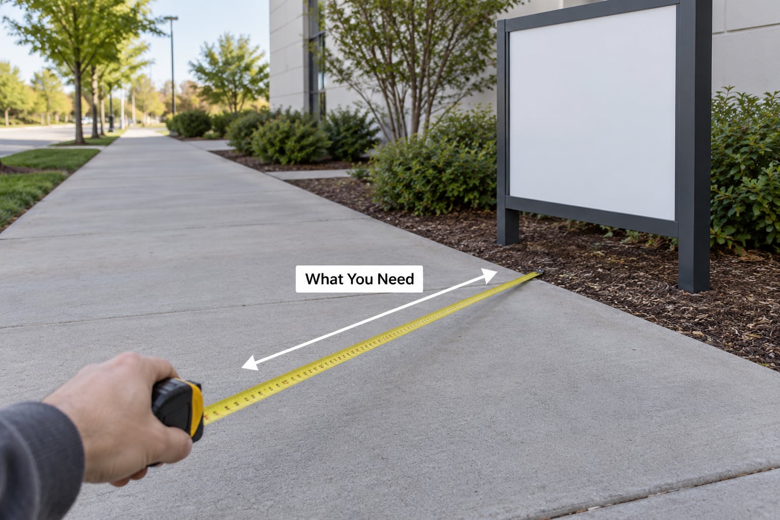
Six things decide your letter height, and only one of them is size.
- The farthest viewing distance. The point where someone driving or walking toward the sign first has a reasonable chance of seeing it. Not the length of your block, the length of the block.
- The sign face you already have, or the size you can afford. Letter height and panel size are locked together, so a 24×48 panel and a 10×40 panel give you completely different options.
- Viewing speed. A pedestrian reading from 8 feet and a car at 45 mph are different problems.
- Viewing angle. A sign you see head-on is easier than one read at an angle down the road.
- Contrast and lighting. Dark letters on a light panel, or the reverse. Then whether the sign is lit at night or relies on retroreflective sheeting and headlights.
- Local rules. Landlord restrictions, municipal sign ordinances, and ADA requirements where the sign marks an accessible entrance or parking.
The goal is not the biggest text you can fit. It is text that still reads at the exact moment the viewer needs it.
Step-by-Step: How Big Should Text Be on a Sign to Read from the Street?
Measure the Farthest Useful Viewing Distance
Walk or drive the approach to your sign and note where it first enters view. For a storefront on a two-lane road with a clear sight line, that is often further than you expect, because drivers read a sign well before they are directly in front of it.
The three viewer types behave differently:
- Pedestrians notice a sign at roughly 20 to 40 feet and can be walking toward it for several seconds.
- Slow-moving or stopped drivers, a customer pulling into your lot, cover ground slowly and get a long look.
- Through traffic at 40 to 50 mph covers about 60 feet per second. You get two or three seconds of attention at best, and possibly less if the sign enters view late.
Size for the farthest of those, not the easiest. A sign that reads perfectly from the curb and vanishes at the stop line has failed at its actual job.
Choose a Letter Height for That Distance
Divide the farthest viewing distance in feet by 10. That number is your minimum capital letter height in inches. Round up, then add one or two inches of margin, because most designers treat the calculated minimum as a floor rather than a target.
For the point-size bridge: 1 inch of capital letter height equals 72 points. That single conversion is what print-trained designers need, since point size and letter height are not the same measurement.
| Viewing distance | Minimum capital letter height | Equivalent point size |
|---|---|---|
| 10 feet | 1 inch | 72 pt |
| 20 feet | 2 inches | 144 pt |
| 25 feet | 2.5 inches | 180 pt |
| 40 feet | 4 inches | 288 pt |
| 50 feet | 5 inches | 360 pt |
| 60 feet | 6 inches | 432 pt |
| 75 feet | 7.5 inches | 540 pt |
| 100 feet | 10 inches | 720 pt |
| 150 feet | 15 inches | 1080 pt |
Road signs follow a stricter baseline. Traffic signage is generally read at 30 feet per inch of letter height, and the Manual on Uniform Traffic Control Devices sets a 6-inch minimum letter height for street name signs, with street type such as Avenue set at 3 inches minimum. A stop sign panel is 30 by 30 inches, a speed limit panel 24 by 30, warning panels 24 by 24 through 36 by 36, and guide signs 36 by 48 or larger. Federal Highway Administration alphabets such as Highway Gothic and Clearview are specified for that work.
For a commercial sign, the 10-feet-per-inch baseline is the number to use. When speed matters, plan above the calculation: through traffic at highway speeds often needs 1.5 to 2 times the baseline letter height to be reliably registered.
One sanity check catches most sizing errors. A sign readable at 100 feet needs roughly a 10-inch main line. Fit a 10-inch line plus generous margins on the sign face and you quickly find out how much copy you can actually carry.
Letter Height for Common Sign Types
These are starting points for typical placements, not standards. Adjust with the distance calculation above.
| Sign type | Typical viewing distance | Recommended minimum letter height |
|---|---|---|
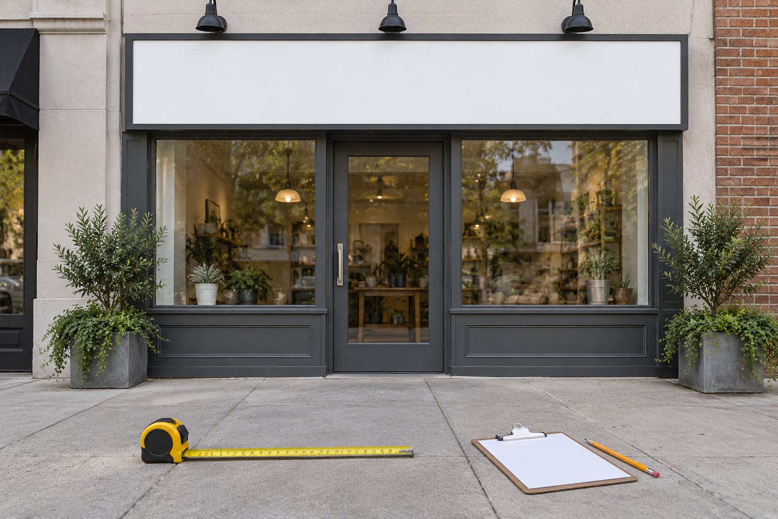
| Storefront fascia sign | 60 to 100 feet across the road | 6 to 10 inches |
| Monument or pylon sign | 100 to 200 feet from the far end of the lot | 10 to 20 inches |
| Projecting blade sign | 40 to 60 feet down the sidewalk | 4 to 6 inches |
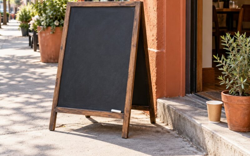
| A-frame sidewalk sign | 5 to 15 feet | 1 to 2 inches |
| Yard sign | 20 to 40 feet from the curb | 2 to 4 inches |
| Window vinyl lettering | 3 to 10 feet from the sidewalk | 1 inch or more |
| Street name sign | Regulatory, per MUTCD | 6 inches minimum |
Yard signs deserve their own note since the question comes up constantly. They are read at 20 to 40 feet by someone walking or rolling past slowly, so 2 to 4 inches of capital letter height covers the headline. Put the main word at that size, support text at half of it, and the phone number as large as will fit. A yard sign carrying a full paragraph never reads from the street no matter how big the board is.
Keep the Message Short and High-Contrast
Size buys you attention, but four other things decide whether it converts into reading.
Cut words. Every extra word pushes either the letters down in size or the line off the panel. If the message will not fit at your calculated letter height, the message is wrong, not the size.
Use capitals for the main line. Capitals are the same height throughout, which maximizes the number of edges the eye can catch at distance. Mixed case is fine for supporting copy read up close.
Go bold and wide. Choose a bold or semibold sans serif with open counters and generous letter spacing. Thin weights and script faces fill in and grey out at distance. Helvetica, Arial, Montserrat and Futura are common choices on signage for that reason.
Raise contrast. Dark on light or light on dark, with no mid-tone combinations. A white script on a photograph is the classic failure.
Then test it before anyone cuts a panel. Print the design at 1:1 on regular paper, tape it to the sign location or hold it at the sign height, and stand at your farthest viewing distance. Mark the first word you can read, then the last. If the second line fails, shorten it rather than shrinking everything.
The squint test helps too. Squint until the sign blurs. Whatever word still holds its shape is doing the work, and everything that disappears is wasted panel space.
At night, size interacts with light. A retroreflective sheeting sign lit by headlights gains apparent size because it returns light straight back to the driver. A non-reflective panel at the same letter height reads as dimmer and smaller, so night-facing signs need either reflective sheeting, front illumination, or both.
Common Mistakes
Sizing from the artwork instead of the distance. A designer opens the file, picks a number that looks balanced on screen, and it is far too small from the road. Fix: run the division before typefaces are chosen.
Cramming copy onto the panel. Nine words at 2 inches reads worse than three words at 6 inches. Fix: decide the three words that must land, then size to those.
Thin or decorative lettering. Hairline strokes and script vanish into grey at any distance once daylight, rain or dusk gets involved. Fix: bold sans serif, stroke weight around 15 to 20 percent of letter height.
All lowercase for the main line. Ascenders and descenders create an uneven silhouette. Fix: capitals for the primary message, mixed case below it.
Letter spacing set too tight. At distance, tightly tracked letters merge into blobs. Fix: open up the tracking, and keep the word space generous.
Low contrast, or testing only indoors. A design that reads on a monitor at arm’s length can fail completely on a sunlit street. Fix: test outdoors at the planned distance, in the worst light your sign actually faces.
Ignoring accessibility minimums. Distance readability and accessible signage are different requirements, and both can apply to one sign. ADA signage section 703.5 sets minimum character heights for signs designating accessible entrances and parking. Fix: ask which rules apply before you finalize the design.
Frequently Asked Questions
How far should you be able to read a street sign?
For commercial and general signage, the working rule is 10 feet of viewing distance for every inch of capital letter height. Regulatory road signs are different: about 30 feet per inch, with a 6-inch minimum letter height for street name signs under the Manual on Uniform Traffic Control Devices. Size for the farthest reader, then round up and add margin.
How big are the letters on road signs?
Street name signs use at least 6 inches of capital letter height, with street type such as Avenue at 3 inches minimum. A stop sign panel is 30 by 30 inches, a speed limit panel 24 by 30, warning panels 24 by 24 through 36 by 36, and guide signs 36 by 48 or larger. These sizes come from the MUTCD, not from vendor preference.
What is the recommended font size for signs?
Sign text is specified in inches of capital letter height, not points. Divide your viewing distance in feet by 10 to get the minimum inches, then multiply by 72 for the point size in your design file. A bold or semibold sans serif with wide letter spacing and high contrast works best. Thin and script weights should be avoided outdoors.
How big should text be on a yard sign?
Yard signs are read at 20 to 40 feet from the curb by a walking or slow-moving viewer, so the headline generally needs 2 to 4 inches of capital letter height. Support text can sit at half that size. If more than a few words are required, use a larger board or cut the copy rather than shrinking the letters.
How do I convert letter height in inches to a point size?
Multiply by 72. One inch of capital letter height equals 72 points, so 4 inches of letter height is a 288 point cap height. The catch is that point size in most software measures the whole em box, not the capital letter, so set the type and scale it until the capitals measure the height you calculated.
Should I ask my sign company to check the design before production?
Yes, and send them the number. Give the farthest viewing distance, the letter height you calculated, and the words. A shop will tell you whether that combination fits the panel you chose, and whether the fabrication method will hold the stroke weight at that size. It is a fast check that catches most problems before the panel is cut.
Conclusion
Start by walking or driving the approach and marking the farthest point where the sign is realistically visible. Divide that distance in feet by 10 to get your minimum capital letter height, round up, and add a couple of inches if anyone will be reading it from a moving car.
Then cut the message until it fits that height comfortably. Most sign sizing problems are not size problems at all, they are copy problems wearing a size problem’s clothes.
Before production, print the design at 1:1 and read it at the real distance in real light. Ten minutes of testing saves a panel.