How to number rooms and offices with signage comes down to three decisions made before anything is ordered: pick one numbering scheme, write every space into a room list, and mount each sign where a visitor reads it while walking toward the door. Get those three right and the system holds up through a renovation, a new tenant and a facilities hire who has never seen your floor plan.
Most numbering failures I see are not fabrication problems. They are numbering problems — 214 on the sign, 214 in the drawings and 2-14 in the calendar invite, so nobody can tell which one is authoritative.
Below is the process I would hand a facilities contractor, in the order I would hand it over. It works for a single-floor office, a multi-tenant building, a clinic wing or a school corridor.
Table of Contents
- What You Need
- Step-by-Step: How to Number Rooms and Offices with Signage
- How to Number Rooms and Offices with Signage at the Planning Stage
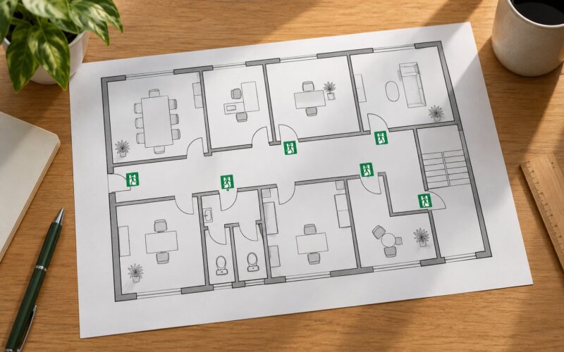
- Map Every Door and Direction of Approach
- Choose a Consistent Sign Format
- Select Materials and Contrast
- Measure the Mounting Location
- Install and Test Each Sign
- Review the System for Wayfinding Problems
- Common Mistakes
- Frequently Asked Questions
- Should I number rooms on the doors or on the wall beside them?
- What is the best way to number rooms on multiple floors?
- How large should a room or office number sign be?
- How do I update signs when offices or tenants change?
- What color scheme makes room numbers easiest to read?
- Do room-number signs need to follow ADA or local signage rules?
- Conclusion
What You Need
A complete room list is the starting point, not the signage. If you already have a floor plan with room numbers on it, use that; if not, walk the space with a clipboard and write down every door, its name and who uses it.
Beyond that list you need:
- A numbering scheme — floor prefix plus sequence, sequential room numbers, department code, or a directional system. Pick one and write it down in a single sentence.
- Sign dimensions — enough width for the longest number on the schedule plus its room name, and a height that stays readable down a corridor.
- The mounting surface — wall material, door material, whether the door swings toward you, and where the latch and hinges sit.
- A sign material and finish — matched to lighting, traffic and how often the surface gets cleaned.
- Contrast — dark characters on a light background, or light characters on a dark background. Never mid-grey on mid-grey.
- Fixings — double-sided acrylic tape for smooth drywall, standoff fixings for doors, or screws and wall plugs for masonry.
- Measuring tools — a tape measure, a pencil, a spirit level, and a tape line to mark the mounting height around a room.
- Door hardware layout — a photo of the handle and hinge positions so the sign does not land on the swing or the push plate.
One caveat worth stating early: where rooms serve a public accommodation, accessibility rules such as the ADA Standards for Accessible Design in the US usually govern what the sign must contain and where it goes. State and local codes can add to that, and Title 24 in California is stricter than the federal floor in places. Treat those rules as a constraint to check against your plan, not a set of rules that applies to every door in every building.
Step-by-Step: How to Number Rooms and Offices with Signage
The process runs in seven stages, and each one ends with the same test: stand at the approach direction, at a realistic walking distance, and confirm you can read the sign before you reach the door. A sign that only reads from three feet away has failed, no matter how well it was made.
How to Number Rooms and Offices with Signage at the Planning Stage
Define the numbering system before any production happens. The four schemes below cover almost every building I have worked on.
Floor-prefix numbering puts the floor first and the sequence second: 214 is the fourteenth room on floor two. It is the most common scheme in multi-floor offices because a number carries its location with it, so it survives a directory reprint and a visitor-management handover.
Sequential room numbering runs one unbroken sequence through the building: 1 through 180. It is simple and cheap, and it is a poor fit for anything above one floor because 142 tells a visitor nothing about where to walk.
Department codes group spaces by function — CL for clinical, ADM for administration, ST for storage. They work well in clinics and schools where room use changes more often than room location. Reception 2 is the same idea in words.
Directional numbering points a visitor toward a zone rather than labelling a door: East Wing 200s, West Wing 300s. It suits non-grid layouts such as courtyard buildings and L-shaped floors where a straight sequence would produce numbers that jump around the plan.
| Scheme | Example | Best fit | Watch out for |
|---|---|---|---|
| Floor prefix | 214, 215 | Multi-floor offices, clinics, schools | Renumbering if a floor is rezoned |
| Sequential | 1 to 180 | Single-floor buildings | Says nothing about location |
| Department code | CL-04, ADM-2 | Spaces that change function often | Guests need a directory to decode it |
| Suite number | Suite 205 | Multi-tenant buildings | Two tenants can share a suite number |
| Directional | East Wing 200s | Courtyard and L-shaped layouts | Slow on its own; needs corridor signs |
Three rules keep a scheme defensible. No duplicate numbers ever, including across floors, because two rooms called 214 will end up on the same delivery. No skipped numbers in the middle of a run, since a gap reads as a mistake and people assume a room exists when it does not. And nothing that can be misread as an emergency number — so keep 911, 101, and 000 out of the sequence or make them clearly something else, such as 121.
Map Every Door and Direction of Approach
Build the inventory before the sign order. A simple spreadsheet with the columns space, current name, proposed number, approach direction and sign type is enough, and it becomes the single list that feeds floor plans, calendars, mail routing and the CRM.
For each door, record how a visitor reaches it: main hallway, secondary corridor, elevator lobby, stairwell landing, parking area, or straight through a reception desk. That last column decides the mounting position, because a door approached from a stairwell landing may need the sign on the wall beside the door at an angle that faces the landing rather than the corridor.
While you walk, note the doors that swing toward the approach and the ones that already have a kick plate, a card reader or a window decal. Those constrain where the sign can physically go.
Free-text references are the thing to kill first. “The corner office” and “the room by the kitchen” work until someone moves. Facilities and IT people describe the same problem from the logistics side — they label cubes and offices so a moving crew can place things correctly, and a number is the only label that survives a change of tenant.
Choose a Consistent Sign Format
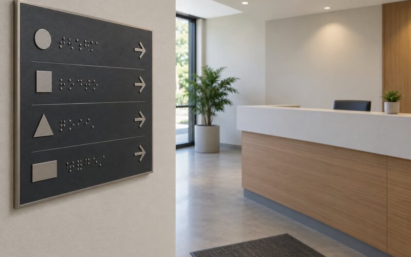
Once numbers are assigned, decide what else goes on the plate. A bare number works in a corridor where nobody visits. A name plus number works at a door someone will knock on. A floor prefix plus number and room name covers most office doors. Directional plates live at corners and lifts rather than on doors.
Consistency is what makes the system readable, and it only works if the choices are made once. Fix the typeface (a sans-serif, ideally one with a straight-sided numeral set), the character height, the colour, the icon style, the plate size, and the mounting position on the latch side of the door at a set height. Then repeat those choices in every corridor.
A workable convention for many offices: the 100 series is staff and individual offices, the 200 series is shared meeting rooms, the 300 series is storage and service. Conference Room 214 and the private office 214 then cannot be confused, even though both sit on floor two.
Two more format decisions pay off. Decide whether names change more often than numbers — if so, put the name on a separate insert panel that can be swapped without replacing the plate. And decide whether the sign is permanent or a temporary marker, because the two get different mounting treatment entirely.
Select Materials and Contrast
Material choice follows the room’s conditions, not a style preference. Lighting is the biggest factor: a glossy plate under downlights creates a reflection that hides the number at exactly the angle a walking visitor sees it.
- Acrylic — clean, light, easy to mount with tape, and available in a matte finish. The default for interior office and clinic doors.
- Aluminium — powder-coated or brushed, heavier and more durable. Worth it in lobbies, corridors with heavy traffic, and anywhere signs are handled often.
- Rigid plastic (PVC or ACM) — inexpensive and light, and the usual choice for large runs where budget per sign matters. The edge is less forgiving of repeated knocks.
- Vinyl or wall graphics — useful for large numbers on glass or for floor-level wayfinding, but they are the first thing to fail in a sunlit corridor and the hardest to update.
- Etched or painted glass — reads well on a glass partition and looks considered, but it is permanent and costly to change.
For contrast, the practical rule is simple: dark characters on a light background, or light characters on a dark background. Skip reflective metallics and satin finishes on any sign facing a light source. If you are working to ADA Standards for Accessible Design in the US, the contrast requirement is expressed as a light reflectance difference of at least 70 percent between the characters and the background, and the surface is to be non-glare, matte or eggshell.
Finish matters more than substrate in most offices. A matte plate in a clean, well-lit corridor will outlast a glossy one in every measurable way, and it is easier to wipe down, which matters in clinics, schools and food-adjacent spaces.
Measure the Mounting Location
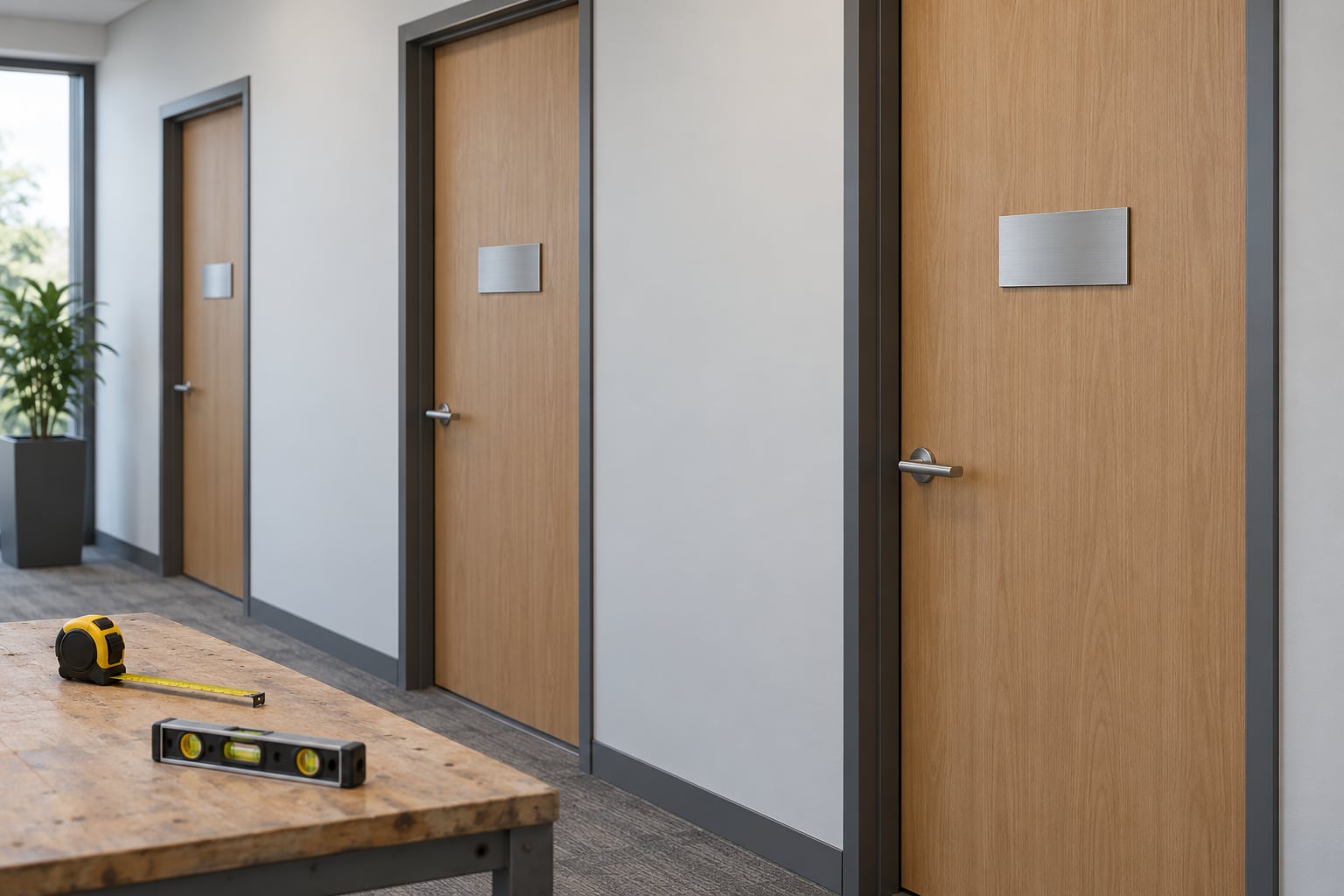
Measure before you drill or peel anything. The standard position is the wall beside the door on the latch side, so a visitor standing in the doorway can see the number without stepping into the corridor, and so someone using the door handle can read it while their hand is on the latch.
Mark the height first, then the horizontal offset. Tape a line around the room at your chosen mounting height so every sign on that floor matches. Common practice under the ADA Standards is a band from 48 inches minimum to 60 inches maximum above the finished floor, measured to the top of the tactile characters, and signs with tactile characters need 18 by 18 inches of clear floor or ground surface in front of them — so mounting a sign too low, or projecting into a walkway, can reduce the clearance a wheelchair user needs to approach it.
Then check three practical things. Is the sign clear of the door swing when the door opens fully? Is it clear of the handle, the push plate and the hinges? And does it sit where the sightline from the corridor reaches it, rather than behind a column or behind the door when it is open?
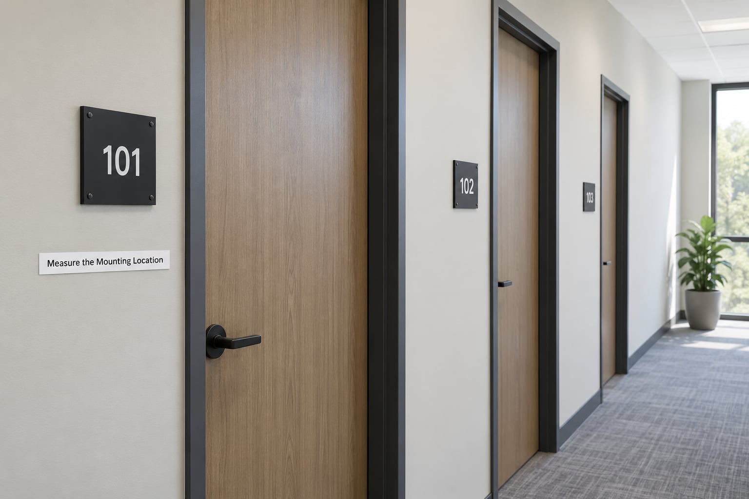
Leave the same margin from the door frame on every plate in the building. A consistent 6 inches from the frame edge reads as a designed system; 4 inches here and 9 inches there reads as a series of unrelated decisions.
Install and Test Each Sign
Before mounting anything, check the number against the room list one last time. This is the moment to catch the transposition, because after installation every sign, calendar entry and shipping label inherits the error.
Clean the surface first. Dust, paint and hand oil prevent tape from bonding and leave a permanent halo around acrylic plates. On painted drywall, follow the finish on the wall: fresh paint needs a few weeks to cure before tape will hold.
Match the fixing to the surface. Double-sided acrylic tape works on smooth painted drywall and glass. Standoff fixings give a cleaner look on doors and can be replaced without marking. Screws and anchors suit masonry and metal, and they are the only option that will survive a fire door or a heavy-use corridor.
Then test the sign the way a visitor will meet it. Is it level? Is it secure at the top corner as well as the bottom? Is the number legible from the far end of the corridor at walking pace? And most importantly, does it read as belonging to this door rather than to the next one along?
Review the System for Wayfinding Problems
The last stage is a walkthrough, and it has to be done by someone who did not design the scheme. Walk the route a first-time visitor would walk: from the parking area or main entrance, past reception, down the corridor, to a door you were given the number for on the phone.
Note where you hesitate. Hesitation is a wayfinding failure even when the sign is technically correct. Test the elevator lobby and stairwell landings separately, since those are where approach direction changes and where signs are most often mounted on the wrong surface.
Ask a colleague who does not work there to find a specific room unaided. If they walk past it once, the sign needs to move, get bigger, or gain a directional plate upstream.
Operators tend to treat numbering as a wayfinding and communications problem rather than a signage problem, because the same number has to work in the directory, the calendar invite and the mail room. Once you know how to number rooms and offices with signage properly, the walkthrough is where you find out which of those three still disagrees with the door.
Common Mistakes
These are the errors that show up repeatedly, each with the fix that solves it.
- Inconsistent formats. Room 214 on one floor, Conference 214 on the next, and a directory that uses neither. Fix: one written format sentence, applied everywhere, including in email and booking systems.
- Characters too small. Signs readable at arm’s length do nothing for a corridor. Fix: set a minimum character height for the corridor length and check it from the far end before ordering.
- Weak contrast. Dark grey on light grey disappears under overhead lighting. Fix: high-contrast pairings and a matte finish on any sign facing a light source.
- Mounted too high or too low. Above eye level and a visitor in a wheelchair reads the floor. Fix: use a taped guide line at the chosen height and follow it for every sign on the floor.
- Mounted on the wrong side. On the hinge side or on the door itself when the door swings toward the approach. Fix: latch side, wall-mounted, clear of the swing.
- Duplicate numbers. Two rooms sharing a number across floors or wings. Fix: one list, one owner, and a uniqueness check before the order goes out.
- Emergency-style numbers. A room called 911 or 101 that reads like a location for help. Fix: keep those sequences out of use, or make them unmistakably part of a longer number.
- Uneven spacing. Every plate a different distance from its door frame. Fix: measure one offset and repeat it.
- Wrong adhesive. Standard tape on a textured wall, or on fresh paint, and the plate hangs loose within a month. Fix: match the fixing to the surface and to the finish’s cure time.
- Never testing the route. Signs installed straight from the schedule without anyone walking the building. Fix: a scheduled walkthrough by someone outside the project, after installation and before sign-off.
One tip after the rest: write the numbering plan down and keep it with the room list. The next facilities manager will inherit the scheme, not the reasoning behind it, and a two-page document prevents every future decision from starting over.
Frequently Asked Questions
Should I number rooms on the doors or on the wall beside them?
Mount permanent room numbers on the wall beside the door, on the latch side, rather than on the door leaf itself. A door sign swings out of view when the door opens, sits at whatever height the hinges dictate, and hides the number from someone approaching at an angle. Wall-mounted plates stay at a consistent height and can align with the door frame across a whole corridor. Door-mounted or adhesive numbers still make sense for short-term rentals and studios where the sign changes often and the wall may be rental inventory.
What is the best way to number rooms on multiple floors?
Use a floor prefix followed by a sequence, such as 214 for the fourteenth room on floor two. Keep the digit count consistent on every floor so the numbers stay the same width on the plate. Write the prefix rule into your room list and apply it to directories, mail, calendars and visitor records as well as to the signs. Sequential numbering across the whole building is the alternative, but it tells a visitor nothing about which floor to walk toward.
How large should a room or office number sign be?
Size the characters for the viewing distance, not the door. In a corridor a visitor reads from 20 to 40 feet away, a single number character should be at least 1 to 2 inches tall, and add the room name beside it at a slightly smaller size. If you are working to ADA Standards for Accessible Design in the US, tactile characters have minimum heights tied to the mounting height of the sign. Measure your longest name and number first, then size the plate around them.
How do I update signs when offices or tenants change?
Split the plate into two parts: a fixed number panel and a swappable name or tenant panel. When someone moves, you replace one insert rather than the whole sign, and the number stays stable so nothing in your directory, mail routing or CRM has to change. Keep the old name panel in a labelled drawer rather than discarding it, because it comes back more often than people expect.
What color scheme makes room numbers easiest to read?
Dark characters on a light background, or light characters on a dark background, with strong contrast between the two and a matte or eggshell finish to kill glare. Under ADA Standards, the contrast requirement is expressed as a light reflectance difference of at least 70 percent between the characters and the background. Avoid satin metallics and mid-tone grey pairings anywhere a sign faces downlights or daylight, since those are the surfaces that disappear first.
Do room-number signs need to follow ADA or local signage rules?
Where a room serves a public accommodation in the US, the ADA Standards for Accessible Design set the baseline: tactile characters raised 1/32 inch from the surface, Grade 2 Braille beneath, character and Braille placement rules, a non-glare finish, and mounting on the latch side of the door within the 48 to 60 inch height band. State and local codes can add stricter rules, and California Title 24 is a common example. Private offices with no public access are treated differently, so check before you order.
Conclusion
Start by writing down every space in the building and giving each one a single number. Choose one scheme, put it in a sentence, and apply it to the signs, the floor plan, the directory and the calendar invites together rather than one at a time.
Then walk to each door and check that the number reads at the distance a visitor actually arrives from. That check takes two minutes per door and it catches most of what goes wrong later. Once it passes, order the signs — and keep the numbering plan with the room list so the next person inherits a system instead of an argument.