ADA sign requirements are the rules in the 2010 ADA Standards for Accessible Design that control how signs identifying permanent rooms, spaces and accessible features must be built and hung. They cover raised characters, Grade 2 braille, contrast, finish, type size and mounting height. Requirements differ by sign purpose, by what the sign identifies, and by the state and local code layered on top of the federal rule.
The federal baseline has not moved. As of 2026, the 2010 Standards remain the enforceable federal standard for signage in the United States, and no new federal ADA sign standard has replaced them. That matters because a lot of the pages ranking for this topic were written years ago and several still describe older, pre-2010 guidance.
Nothing here is legal advice, and rules change. If you are mid-project, confirm your local requirements with the building department or the accessibility specialist who reviews your plans before you order a single sign.
Table of Contents
- What Are ADA Sign Requirements?
- Which ADA Rules Apply to Business Signs?
- ADA Sign Requirements at a Glance
- Which Signs Must Comply With ADA Standards?
- What Must an ADA Sign Say?
- What Are the ADA Sign Requirements by Location?
- Where Can You Mount Signs for Proper Accessibility?
- Which ADA Sign Types Are Most Common?
- What Design Details Make a Sign Easier to Read?
- Do Digital and Changeable Signs Need to Meet ADA Standards?
- Who Must Check ADA Compliance?
- How Do You Audit and Correct Existing Signs?
- What ADA Sign Mistakes Cause the Most Problems?
- Frequently Asked Questions
- Do all business signs in the United States have to comply with the ADA?
- Does every ADA-compliant sign need Braille and raised letters?
- What is the maximum mounting height for an ADA sign?
- Can I use a digital screen instead of a permanent room-identification sign?
- Are temporary signs and banners subject to ADA requirements?
- Are ADA requirements different in every state?
- What Should a Business Do First?
What Are ADA Sign Requirements?
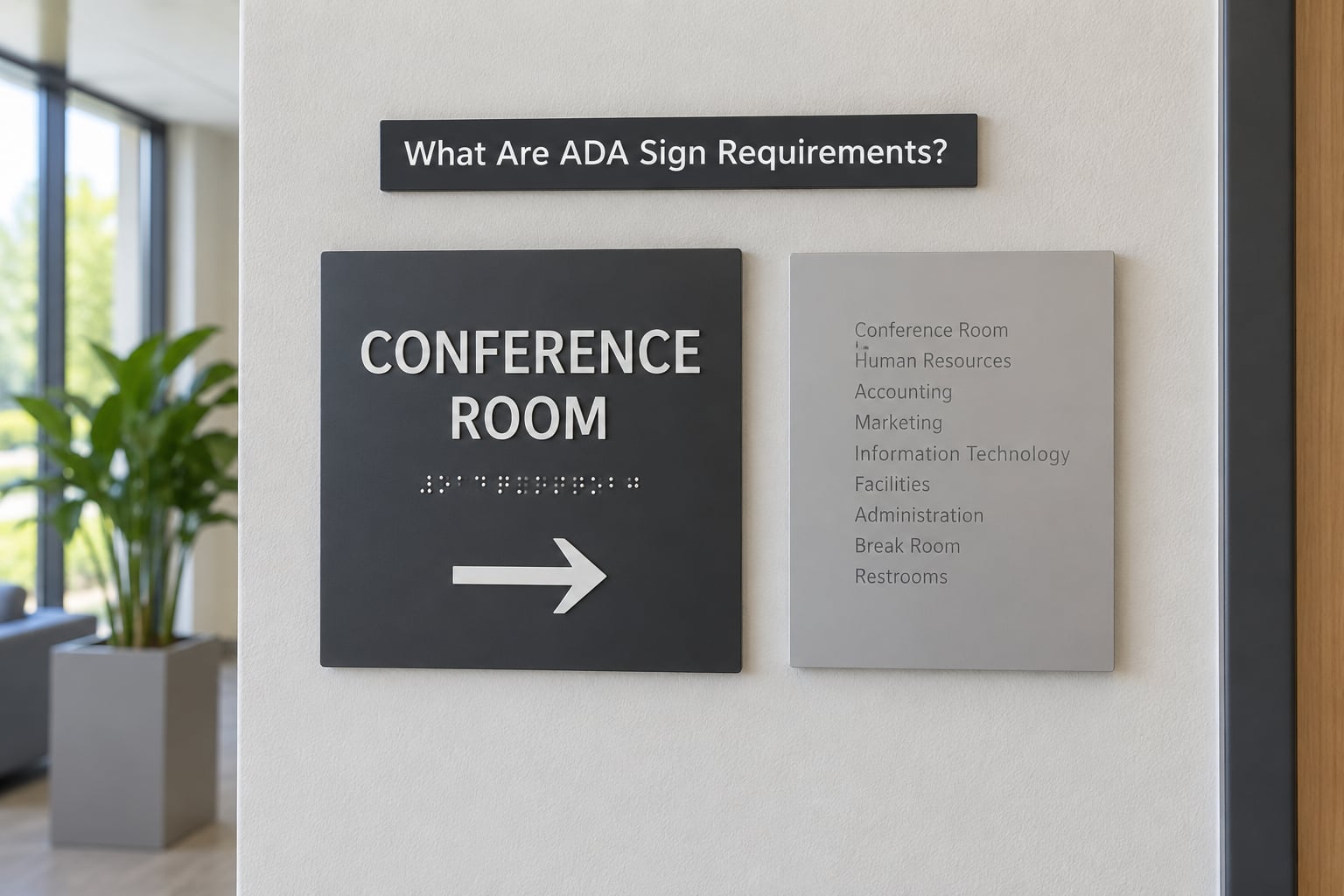
ADA sign requirements exist so a person who cannot read printed text can still find the restroom, the elevator, the office or the accessible entrance. Two categories carry most of the weight: permanent room and space identification signs, which need raised characters and braille, and directional and informational signs, which need only readable visual characters, contrast and a non-glare finish. Where the sign goes and how high it hangs matter as much as how it looks.
The Americans with Disabilities Act is federal law. The 2010 ADA Standards for Accessible Design are the accessibility rules the U.S. Department of Justice enforces, and the U.S. Access Board publishes the technical guidance behind them. Separately, most states and cities adopt their own accessibility codes, usually based on ICC A117.1, and those local codes can be stricter than the federal minimum.
So the honest answer to what the requirements are depends on three things: what the sign says, what it points to, and where in the country it is installed. A sign that is fine in one state can fail in California.
Which ADA Rules Apply to Business Signs?
The sign rules live in two places in the 2010 Standards, and most confusion comes from not knowing which one applies. Section 703 covers what a compliant sign looks like: raised characters, braille, visual characters, finish and contrast. Section 216, with its exception in 216.6, covers where signs are required and which ones can skip the tactile treatment.
Section 216.6 is the part small-business owners ask about most. It exempts certain categories outright, including signs that only name a building’s occupants, building addresses, logos and brand names, menus, seat and row designations, and signs used only in non-public areas of a correctional facility. It also exempts temporary signs used seven days or fewer.
Separately, the ADA covers three titles. Title I covers federal agencies, Title II covers state and local government services including public schools and public transit, and Title III covers most private businesses open to the public. Small-business status is not a category, so a restaurant with twenty employees is treated the same as a national retailer for signage purposes.
State overlays are real. California’s Building Code, Title 24, and its accessibility provisions in Chapter 11B add requirements, including geometric symbols on certain restroom doors and a rule that height is measured to the bottom of the braille rather than the character baseline. New York and Connecticut require a dynamic wheelchair symbol instead of the static International Symbol of Accessibility on some signage. Check your state code before ordering.
ADA Sign Requirements at a Glance
| Sign type | Tactile characters and braille | Visual character rules | Contrast and finish | Mounting | Manual signs |
|---|---|---|---|---|---|
| Permanent room and space identification | Required, per 703.2 and 703.3 | Required, per 703.5 | Light-on-dark or dark-on-light, non-glare | 48 to 60 in above finish floor, latch side of door | Not exempt |
| Directional and informational | Not required by 216.6, allowed by choice | Required, contrast per 703.5 | Non-glare, high contrast | Wherever the message is legible along the route | Not exempt |
| Parking space identification | ISA required, per 502.6 | Required, including Van Accessible text where the space is van accessible | Non-glare | 60 in minimum to the bottom of the sign | Not exempt |
| Entrance and exit identification | Required where it identifies a permanent space or element | Required | Non-glare | Per 703.4 and 216.6 | Not exempt |
| Service counters and assembly areas | Identification required; assembly signs may be visual | Required | Non-glare | Range of signs, per 216.8 and 216.6 | Not exempt |
| Names, logos, addresses, menus, seat numbers | Exempt | None under the ADA | None | Any | Exempt |
Two phrases in that table get used loosely and should not be. A permanent room or space is one that serves the same purpose for more than one week, so a pop-up shop inside a retail store for four days is not a permanent space. And non-glare finish means the surface does not produce a shiny reflection under lighting; matte and eggshell are the usual choices.
Which Signs Must Comply With ADA Standards?
Start with the rule rather than the object. If a sign identifies a permanent room or space, or an accessible element such as a restroom, elevator, parking space, service counter or assembly area, it generally needs to comply. If it does not, it usually falls under the exemptions.
Signs that normally must comply:
- Restroom and restroom-entry signs, including gender-neutral and family rooms
- Elevator and lift identification, with tactile floor numbers and car controls
- Stairwell, exit route and area of refuge signs
- Parking space and parking aisle identification
- Entrance and accessible entrance identification
- Service counter and sales counter identification
- Assembly area identification in occupancies with assembly use
- Office, conference room and classroom names that identify permanent spaces
Signs that are exempt under Section 216.6:
- Temporary signs used for seven days or fewer
- Building names, addresses and company logos and brand names
- Occupant names, such as an employee nameplate
- Directories, menus and service lists
- Seat, row and table designations in assembly and dining areas
- Signs used only in non-public areas of correctional facilities
- Tags on equipment such as a fire extinguisher or piece of furniture
- Legal notices about jury duty, voting or similar civic duties
Private homes are not covered by the ADA at all. A residential duplex with a small-business studio inside it is not a public accommodation in the same way a storefront is, though state or local rules can differ. When in doubt, ask the local building department what it considers a public accommodation in your area.
What Must an ADA Sign Say?
Say the plain thing, once, with the words people actually use. Tactile signs use uppercase letters only, spelled out rather than abbreviated, and the message should be short enough to fit without shrinking the characters below the minimum size. Visual characters can be upper case, lower case or mixed.
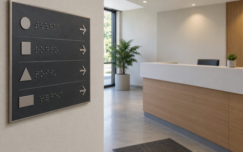
Grade 2 braille, also called contracted braille, is required on tactile signs. It sits directly below the characters it translates, separated from surrounding tactile elements by a 3/8 inch margin. Grade 1 braille, where every letter is spelled out and the common short forms are not used, is permitted in limited cases but is not what most inspectors expect to see.
The International Symbol of Accessibility is required on parking signs under 502.6 and appears on restroom signage by convention rather than by a blanket federal mandate. It does not carry meaning on its own: a person who cannot see the symbol needs the word RESTROOM beside it. The field holding the symbol is generally six inches, with the text below it.
Color carries no legal meaning. A blue door sign and a white door sign are equally legal if the contrast and the type are right, which is where two long-standing myths get in the way of sensible decisions.
What Are the ADA Sign Requirements by Location?
Entrances and accessible routes. Where an accessible entrance differs from the main entrance, a sign has to identify which entrance is accessible. Tactile and directional signs along the route to it must be readable from the approach.
Parking. Accessible parking spaces need the ISA and, on a van accessible space, the words Van Accessible. The sign mounts at least 60 inches above the parking surface, measured to the bottom of the sign, so it stays visible over parked cars. It cannot be post-mounted inside the access aisle.
Reception and service counters. Counter height signage identifying an accessible sales or service counter requires tactile characters and braille. A lowered counter that is otherwise obvious may not need a sign at all.
Corridors and elevators. Elevator signs identify the floor and direct to the car. Tactile floor identification and hoistway markings matter more than the lobby sign here.
Restrooms. The door sign identifies the room and the space type. In California, restroom doors that have an opening of more than a certain width may need a geometric door symbol mounted at a specific height, which is an extra requirement on top of the tactile door sign.
Assembly spaces. In places with assembly use, tactile signs identify assembly areas, and visual signs with instructions are posted at each space. Where signage is required at every seat or space rather than at an entrance, braille is on a sign or placard at the entrance instead.
Parking lots and site signage. Directional signs to accessible parking, passenger loading zones and accessible entrances are informational and visual, and must be readable from the approach direction.
Where Can You Mount Signs for Proper Accessibility?
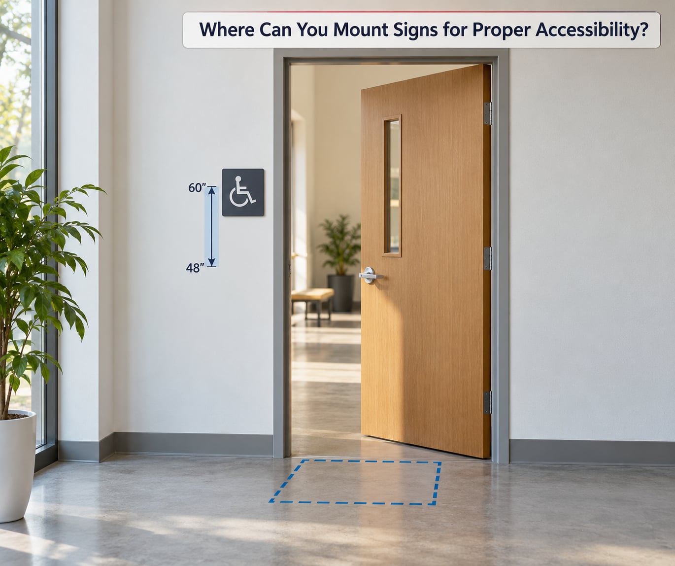
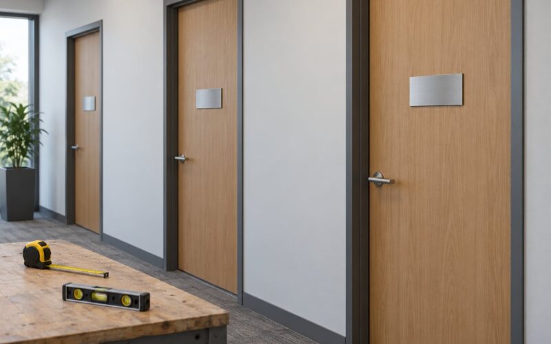
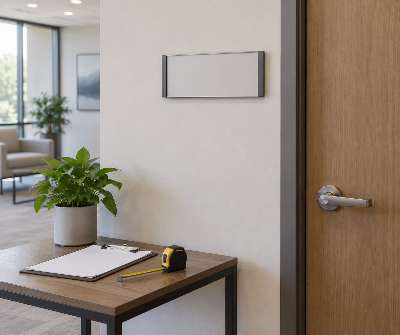
Mount tactile room identification signs on the wall beside the door, on the latch side, so a person approaching knows the room before reaching the hardware. The Standards allow a door-mounted sign as an alternative in some situations, and allow a sign above the door when the wall beside the door is too narrow or a feature blocks the clear wall space.
The 48 to 60 inch band applies to tactile characters and braille, measured from the finish floor to the baseline of the lowest tactile character. For visual characters on signs mounted between 40 and 70 inches, the baseline must sit at least 48 inches above the floor. Sixty inches is the common ceiling because people who use wheelchairs look up, and above that line it gets hard to read. Installers often aim for 54 inches as the practical middle.
Placement has to coexist with the door’s swing and with clear floor space. A sign must not be mounted where the door hardware blocks it or where it narrows the clear floor space the Standards require beside a door, which is generally 18 by 18 inches, or a 30 by 48 inch space when the door opens toward the person approaching. Mounting the sign on a swinging door surface also has limits because the sign moves and the door cannot be draped with hanging materials.
Anything unusual, such as a heavy door frame, a revolving door, a curved wall or a sign needing to project into a path of travel, deserves individual review. Projecting signs that stick out into circulation have their own limits on protrusion and edge treatment, and that is where a plan review by your architect or accessibility specialist pays off.
Which ADA Sign Types Are Most Common?
Most sign programs come down to a handful of types. They look similar but carry different requirements, which is where the mixing-up happens.
| Sign type | Tactile and braille | Placement | Typical wording | Special note |
|---|---|---|---|---|
| Room identification | Yes | Latch side, 48 to 60 in | NAME, OFFICE, CONFERENCE ROOM A | One per permanent room or space |
| Restroom | Yes on the door sign | Door, 48 to 60 in | RESTROOMS, with ISA field | California adds door symbols |
| Directional | Not required | Decision points along the route | ELEVATORS AHEAD, ACCESSIBLE ENTRANCE | Must be readable on approach |
| Parking | ISA symbol required, not a full tactile sign | 60 in minimum, post at space | PARKING, VAN ACCESSIBLE | Section 502.6 |
| Elevator | Yes on landing and in car | Car wall and landing, per 216.8 | FLOOR NUMBER, FLOOR ROOM DESIGNATION | Tactile floor numbers in the car |
| Exit and area of refuge | Yes where it identifies a permanent element | Above the door or on the wall | EXIT, AREA OF REFUGE | Exit signs may also carry tactile characters |
| Temporary notice | No, if seven days or fewer | Any | Anything | Beyond seven days, re-evaluate |
Room identification is the one people get wrong most often, because it is the only type where tactile characters are non-negotiable under federal rules. Directional signs are the type people over-buy, ordering expensive tactile versions where a clean, high-contrast visual sign would satisfy the code.
What Design Details Make a Sign Easier to Read?
These are the specs. Vendors, architects and sign fabricators argue about them constantly, and knowing the numbers lets you tell a real manufacturer from a guess.
Raised characters, per 703.2. Raised 1/32 inch minimum above the background, solid and stable, uppercase, sans serif, with no serifs. Character height runs from 5/8 inch minimum to 2 inches maximum. Stroke thickness is no more than 15 percent of the character height at the thickest point. The width of the uppercase O stays between 55 and 110 percent of the height of the uppercase I, which is how you get consistent letter proportions. Character spacing runs from 1/8 inch to four times the stroke thickness, and line spacing runs from 135 to 170 percent of the character height. Nothing comes within 3/8 inch of the tactile edge or of the sign border.
Braille, per 703.3. Grade 2, domed dots only, never flat-topped and never recessed into a cavity. Dot base diameter runs 0.059 to 0.063 inch, dot height 0.025 to 0.037 inch, and space between the dot centers within a cell is about 0.241 to 0.300 inch. Braille sits directly below the characters it translates.
Visual characters, per 703.5. Mixed case is fine. Stroke thickness runs 10 to 30 percent of character height, letter spacing is between 10 and 35 percent of character height, line spacing between 135 and 170 percent, and character height scales with viewing distance and mounting height. Sans-serif faces such as Helvetica, Arial, Futura, Frutiger or Verdana are the conventional choices.
Contrast and finish. ADA sign requirements for contrast call for a light-on-dark or dark-on-light reading, and the finish must be non-glare. The Standards do not set a number; industry practice uses a light reflective value difference of roughly 70 percent between the characters and the background as a working benchmark. Matte and eggshell finishes beat gloss because gloss under fluorescent lighting erases the message at the worst moment.
Legibility habits that help. Keep the message short, use consistent terminology across the whole building, and set a clear visual hierarchy so the important word is readable at a distance and the detail is readable up close. Put a pictogram and its word together. All of that is good practice rather than a legal mandate, but it is the difference between a sign that passes and a sign that works.
Do Digital and Changeable Signs Need to Meet ADA Standards?
Yes, in some ways, and the answer depends on what the screen does. A video wall cycling marketing images is one case. A changeable-copy panel or interactive directory that people use to find a destination is another, and it attracts more scrutiny.
If a digital sign replaces a required permanent room or space identification sign, the tactile and braille requirement does not go away. You still need a tactile sign on the door, and the screen can sit alongside it. If a screen is directional or informational, it needs to meet visual character, contrast and non-glare expectations, and the information has to be available to someone who cannot read the display or cannot see it well.
Interactive touchscreens add reach-range and clear-floor-space questions, since a screen mounted too high or protruding too far creates its own barrier. Video content needs captions and, in many contexts, audio description. Where a screen displays emergency information, the accessibility expectations are steeper because the information is critical.
Federal guidance and enforcement on digital signage is still developing, and it is the area most likely to shift in the next few years. If a screen carries required information, treat it as a required sign and design it that way from the start.
Who Must Check ADA Compliance?
The legal responsibility sits with the business, the property owner or the landlord, depending on the lease and the space. Fabricators and sign companies usually put a disclaimer in their terms precisely because they advise and supply, but they do not carry the obligation. Sign vendors who tell a business owner they are compliant without checking anything are doing the owner a disservice.
In practice the work spreads out. The architect or designer sets sign types in the construction documents and gets them through plan review. The contractor installs them at the right height. The sign vendor specifies characters, braille and finish. The property manager keeps the inventory current as rooms change. The facilities team notices when a sign is damaged or missing, which matters because a damaged sign counts as a defect, not a cosmetic issue.
A claim can come from the barrier side of the law as well as the sign side. A restroom sign pointing to a locked door, or a route sign at a dead end, is a sign problem that reads as a barrier problem. So compliance is not only about the plates on the wall.
How Do You Audit and Correct Existing Signs?
You can walk your own building in an hour and come out with a work list. Bring a tape measure, a phone and this sequence.
- Build a sign inventory. Photograph every sign, note its room or location, and mark which ones identify a permanent room or space. This list becomes your sign mapping and your record for the next inspection.
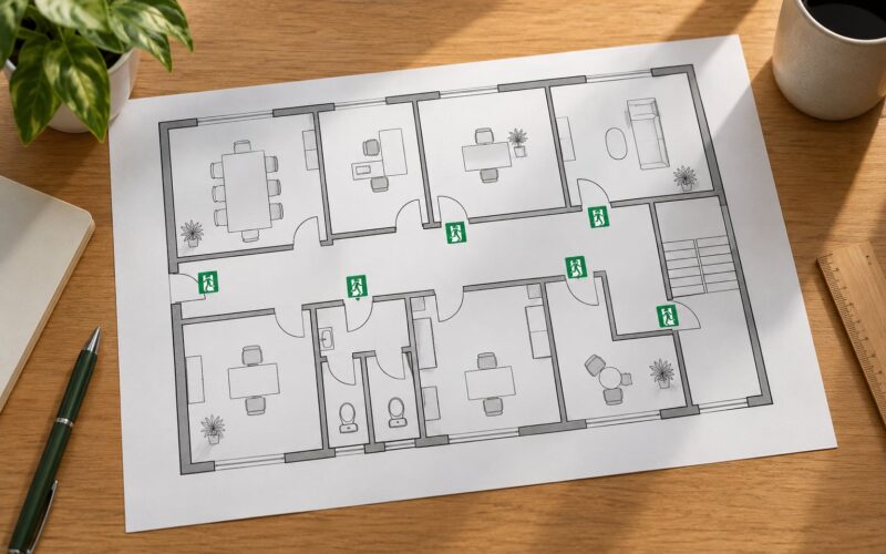
- Trace the accessible route. Walk from the accessible parking spot or public sidewalk to the accessible entrance, reception, restrooms and elevators. Mark every point where someone would need to ask for directions.
- Measure the mounting heights. Check the baseline of the lowest tactile character against the 48 to 60 inch band. Flag anything under 48 or over 60, and flag parking signs under 60 inches.
- Check placement. Confirm latch-side placement, readable approach angles, clear floor space at the door, and signs that are blocked by hardware, columns or furniture.
- Review wording and type. Look for serif fonts, all-lower-case tactile text, messages that run long enough to force tiny characters, flat-topped dots, braille recessed into a plate, and inconsistent terms for the same room across floors.
- Check contrast and finish in person. Stand where a person would stand. Glossy plates under overhead lighting are the usual culprit.
- Log the corrections and the date. Record what you found, what you fixed and what you are waiting on. That log is what you hand an inspector or a plaintiff’s expert.
- Get a professional review where it is not clear. Anything involving projections, unusual mounting, historic buildings or a renovation scope needs your architect, a certified accessibility specialist or the local building department.
One caution about renovations. Work that alters an element of an existing facility can trigger a requirement to bring that element into compliance, which is why replacing one worn sign can end up pulling the whole wall of signage with it. Ask about the trigger before you replace anything.
What ADA Sign Mistakes Cause the Most Problems?
These are the failures that come up again and again, in roughly the order they get noticed.
- Flat-topped or engraved braille. Dots must be domed. Engraved braille or a printed imitation of braille fails the moment someone puts a fingertip on it.
- Missing braille on a room sign. Every tactile sign needs Grade 2 braille below the characters. Sign vendors frequently ship plates with braille omitted.
- Low contrast. Dark grey on light grey looks tasteful and fails. Check the reflective values, not the mood board.
- Serif fonts and decorative type. Raised characters must be sans serif. Small serifs are hard to feel and easy to reject.
- Over-long messages. When a sign carries too many words, the character height drops below the minimum and the whole sign becomes non-compliant.
- Wrong height. Anything outside the 48 to 60 inch band, and parking signs below 60 inches, are the most common measurement failures.
- Decorative covers and shrink wraps. A cover over tactile characters defeats them. Protective film left on, or a sign hung on a door in a way that blocks the swing, is the same mistake.
- Color or symbol as the only message. Color alone carries no information for someone who cannot see it, and a symbol with no word beside it tells a blind reader nothing.
- Inconsistent terminology. Calling it Suite 12 on one floor and Office 12 on another is a real problem when a person is following a direction sign.
- Temporary notices that became permanent. A directional sign that has been up for eight months now functions as a permanent sign. Section 216.6’s seven-day exemption no longer covers it.
Frequently Asked Questions
Do all business signs in the United States have to comply with the ADA?
No. Under Section 216.6 of the 2010 ADA Standards, signs that only name a building, give its address, show a logo or brand, list a menu, name an occupant, or designate a seat or row are exempt. Temporary signs used seven days or fewer are exempt too. Signs identifying permanent rooms, restrooms, elevators, parking spaces and accessible entrances must comply.
Does every ADA-compliant sign need Braille and raised letters?
Only tactile signs do. Permanent room and space identification signs require raised characters plus Grade 2 braille. Directional and informational signs are exempt from the tactile requirement by 216.6 and need only meet visual character, contrast and non-glare finish rules. Parking signs carry the International Symbol of Accessibility but are not full tactile room signs.
What is the maximum mounting height for an ADA sign?
Tactile signs mounted on a wall must have the baseline of the lowest tactile character between 48 and 60 inches above the finish floor. Parking space signs must sit at least 60 inches above the parking surface. Signs mounted between 40 and 70 inches carry a minimum rather than a maximum for visual characters. Installers commonly target 54 inches as the middle of the band.
Can I use a digital screen instead of a permanent room-identification sign?
Not as a replacement. If a room or space requires tactile identification, the screen does not remove that requirement, and you still need a tactile sign with raised characters and Grade 2 braille. A digital screen can sit alongside it as a directory or directional aid, where it needs to meet visual character, contrast, non-glare and, if interactive, reach-range and clear-floor-space rules.
Are temporary signs and banners subject to ADA requirements?
Signs used for seven days or fewer are exempt from the tactile and character requirements of Section 216.6. Beyond seven days, the exemption no longer applies, and a sign that now directs people to permanent destinations is generally treated as a permanent directional or informational sign. Interior wayfinding and identifying signs must then meet the visual character, contrast and non-glare finish rules.
Are ADA requirements different in every state?
They can be. State and local accessibility codes, usually based on ICC A117.1, sit on top of the federal Standards and may be stricter. California Title 24 Chapter 11B adds restroom door symbols and measures height to the bottom of the braille. New York and Connecticut require a dynamic wheelchair symbol on some signs. Your local Authority Having Jurisdiction decides what actually applies to your building.
What Should a Business Do First?
Map the accessible route first, from the parking spot or sidewalk through the entrance to the restrooms and elevators. Then list which signs identify a permanent room or space along that route, and check those against your state and local code rather than the federal minimum alone. Fix the cheap defects yourself, starting with height, contrast and damaged or missing braille, and keep a written record with dates. Anything you cannot resolve with a tape measure goes to your architect, a certified accessibility specialist or the local building department before you order replacements.