A lobby sign is any sign in an office reception area that shows your company name, logo, or a short brand message, usually mounted on the wall behind the desk or beside the entry door. For a small office, the best lobby sign ideas are the ones that fit one wall and one glance: clear, proportionate, and readable in about three seconds.
Small space changes the job. A sign that reads beautifully across a two-storey atrium turns into clutter in a 10-by-12-foot reception area, where the sofa, a coat rack, and a plant are already fighting for the same square footage. The right sign in the wrong room is worse than no sign, because visitors register it as clutter rather than as confidence.
So this list is organized by what you are trying to do — greet, identify, direct, explain, or decorate — rather than by material, which is how most sign catalogs are organized. Each idea below includes where it belongs in a small office, what it typically costs to produce, and the one thing that usually goes wrong with it. When the wall behind reception is the wrong color, or belongs to a landlord, jump to idea 10 first.
Table of Contents
- Lobby Sign Ideas for a Small Office at a Glance
- 1. Welcoming Office Entrance Sign
- What to put on a welcome sign
- 2. Company Logo Wall Sign
- 3. Front Desk Identification Sign
- 4. Directional Sign for Key Areas
- 5. Small Office Mission Statement Sign
- 6. Decorative Wooden Welcome Sign
- 7. Services Overview Sign
- 8. Digital or Backlit Logo Sign
- Backlit or halo-lit: which one reads better
- 9. Informational Notice Board
- 10. Branded Photo or Feature Wall Sign
- Frequently Asked Questions
- How big should a lobby sign be for a small office?
- How much does a small office lobby sign cost to make?
- Do I need lighting for a small office lobby sign?
- What is the best material for a reception wall sign?
- How long does it take to make a custom lobby sign?
- What accessibility standards apply to signs in a small office lobby?
- Where to Start With Your Small Office Sign
Lobby Sign Ideas for a Small Office at a Glance
| Sign idea | Where it fits best | Budget tier | Install effort |
|---|---|---|---|
| 1. Welcoming entrance sign | Wall beside the entry door | Under one hundred dollars | Low, two screws or adhesive |
| 2. Company logo wall sign | Wall behind the reception desk | Several hundred dollars | Medium, needs a level and a stud finder |
| 3. Front desk identification sign | On the counter or the desk front | Under one hundred dollars | Very low, sits freestanding |
| 4. Directional sign for key areas | Hallway junction, door side of corridor | One to three hundred dollars per sign | Medium |
| 5. Mission statement sign | Below a logo, on a feature wall | Under one hundred dollars | Low |
| 6. Decorative wooden welcome sign | Reception wall in warm interiors | Two to five hundred dollars | Medium |
| 7. Services overview sign | Waiting area wall | One to three hundred dollars | Low |
| 8. Digital or backlit logo sign | Dim reception, evening traffic | Several hundred to over a thousand | Medium to high, may need an electrician |
| 9. Informational notice board | Beside the desk, in the waiting area | Under one hundred dollars | Low |
| 10. Branded photo or feature wall sign | Any blank wall, including a shared one | One to several hundred dollars | Low to medium |
1. Welcoming Office Entrance Sign
A welcome sign is the cheapest way to make a plain entrance look intentional: your company name plus one short greeting, mounted where arriving visitors read it without turning around.
What to put on a welcome sign
Keep the greeting to six words or fewer. “Hartley Accounting — Welcome, please check in at the desk” tells a first-time visitor everything they need: who you are, that you are expecting them, and what happens next.
Place it on the wall beside the door rather than on the glass. A vinyl or frosted panel on a door competes with reflections, street views, and a push bar, and the text ends up fighting the glare. A rigid panel on 1/8-inch foam board or dibond costs very little, and it takes two screws or a bead of construction adhesive.
Mount the center of the text around 57 to 60 inches above the floor. In a small office that doubles as the only orientation cue people get, this is the sign that answers “am I in the right place?” before they have to ask.
2. Company Logo Wall Sign
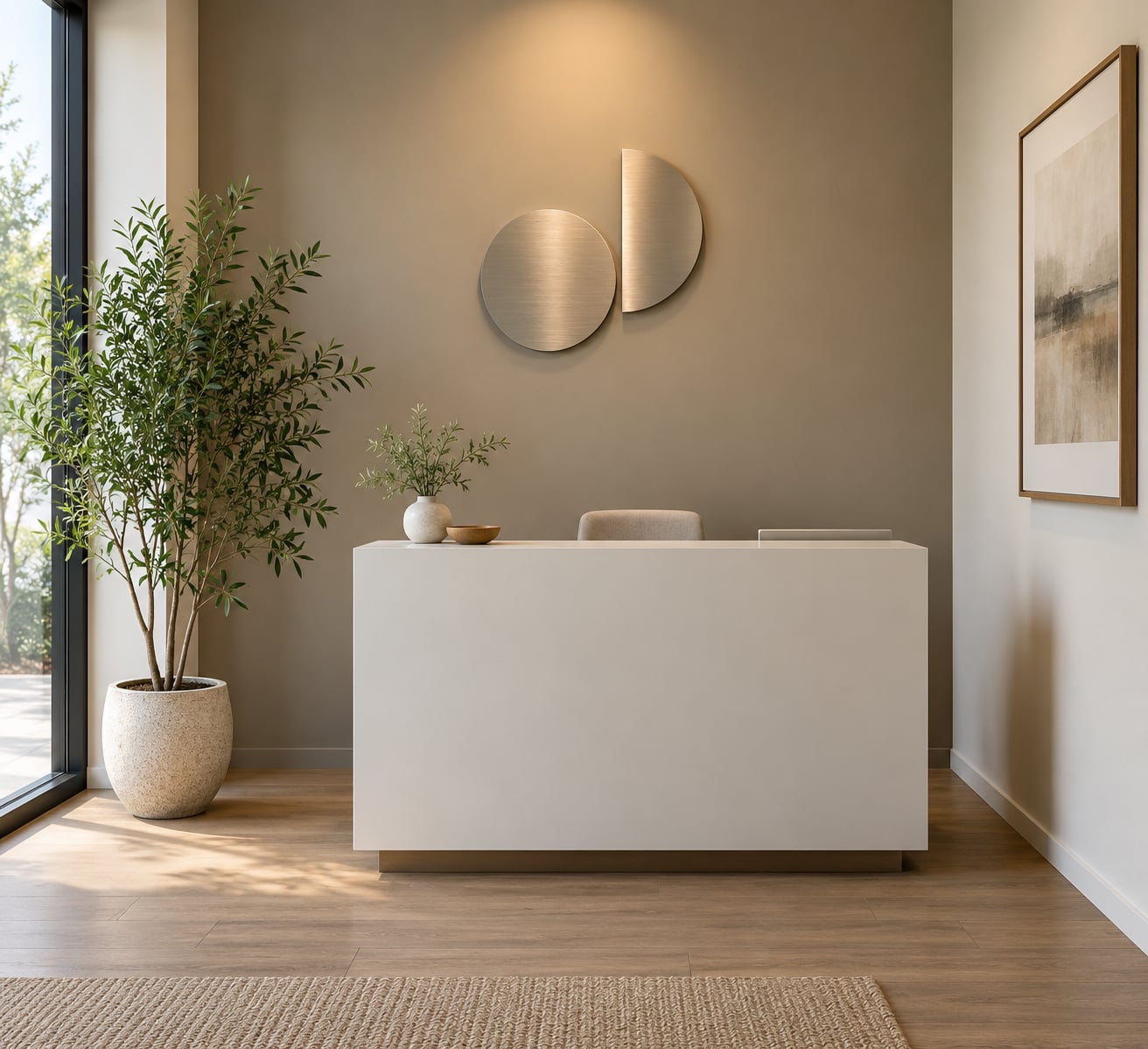
A logo wall sign is the single most effective way to reinforce your brand in a small office, because it turns the blank wall behind your desk into something that looks designed rather than leftover.
Dimensional letters mounted on standoffs project roughly three-quarters to one inch off the wall and catch light from above, which gives a small room depth it does not physically have. Flat acrylic or etched glass is the quieter alternative and reads better on a narrow wall where protrusion would crowd the furniture. Contrast matters more than style: dark letters on a light wall or light letters on a dark one, with no mid-tone gray between them.
For scale, aim for a logo sign that spans about a third to a half of the usable wall width, then check it from the door. If you cannot read it in one glance from 10 feet back, it is too small or too stylized. Avoid setting the letters in your logo font — a highly stylized mark that looks right at 2 inches on a business card turns into a smudge at 3 inches on a wall.
3. Front Desk Identification Sign
A desk sign is a small, discreet panel that tells visitors where to go and who they are meeting, and it is often the most-used sign in the room because it is read at conversational distance.
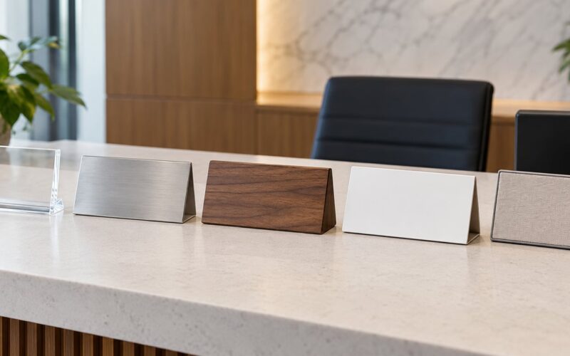
Common formats are a counter-top plaque reading “Reception” or “Please Check In Here,” and a small desk nameplate for whoever is on duty that day. Acrylic, brass-look etched acrylic, and powder-coated metal all work; acrylic is the most forgiving in a small space because it reads clean without demanding attention.
Keep it under 12 inches wide so it does not compete with a monitor or a plant. This is also the cheapest sign in the whole list, and the one visitors notice most if it is missing — people hesitate at an unmarked counter far more than they hesitate at a bare wall.
4. Directional Sign for Key Areas
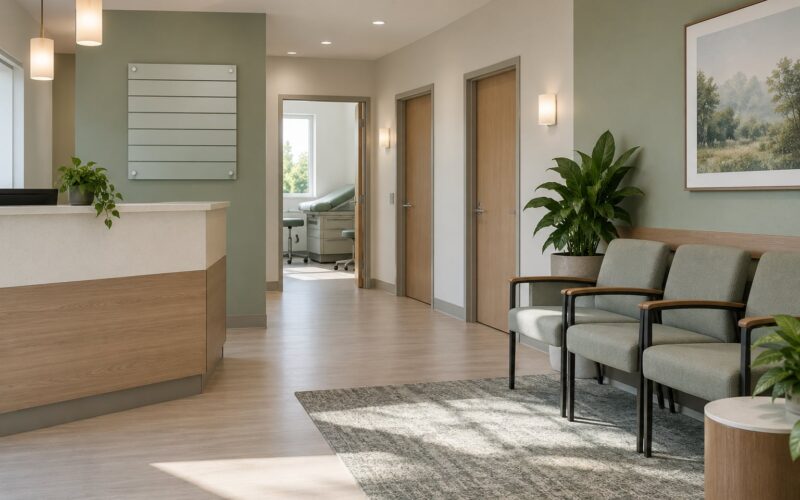
Directional signs are simple arrows and labels for restrooms, meeting rooms, exits, or a second reception point, and in a compact office they become necessary the moment you have more than two doors a visitor could mistake for reception.
Use one consistent arrow style and one typeface across every sign so the set reads as a system. A single run of three signs on the same corridor should share a size, a material, and an arrowhead; mixing three suppliers is what makes a lobby look improvised.
One accessibility note worth handling early: the 2010 ADA Standards for Accessible Design, section 216.2, cover permanent room and space identification signs, including requirements for raised characters and Braille where text is provided visually. That applies to room numbers and restroom identification, not to your lobby logo, so plan the ADA-compliant pieces as part of the same order so materials match.
5. Small Office Mission Statement Sign
A short mission or values statement on the wall gives visitors something to remember you by, and it takes the pressure off a reception area where nobody knows what you do yet.
Eight to twelve words is the working limit. Set it in three short lines, left-aligned, in a plain sans serif, with generous spacing between lines, and place it below or beside a logo rather than competing with it.
The small-space caveat is tone. A mission statement that reads like a nonprofit appeal in a dental office does more damage than no sign at all. Write the sentence you would say out loud to a client who asked what you do, then stop.
6. Decorative Wooden Welcome Sign
A CNC-routed wood sign is the warmest option on this list, and it suits offices where the work is personal: creative agencies, studios, wellness practices, hospitality, and therapy or counseling offices.
Walnut, oak, and reclaimed timber all age well and take a matte or oil finish that stays warm rather than glossy. On a pale wall, a light wood disappears, so either stain it a shade deeper or mount it on a painted panel with a small shadow gap around the edges.
The trick is coordination. Pick a wood tone that repeats something already in the room — the desk, a chair frame, a shelf — or it will read as a separate object. Wood grain also photographs well, which matters if you update your website or print materials with a photo of the room.
7. Services Overview Sign
A services sign lists what you actually do in five to seven lines, and for clients who walk in without an appointment it removes the awkward guessing game at the desk.
Build it around hierarchy: the service names in a medium weight, one short supporting phrase each underneath, and nothing else. A panel 18 to 24 inches wide, mounted at reading height near the waiting area, does more than a wall of text that visitors approach too late to read.
Resist listing everything. If your list needs more than seven lines, split it: a short sign for the waiting area and a full service page on your website. A sign that tries to be a brochure ends up being read by nobody.
8. Digital or Backlit Logo Sign
A backlit or digital sign makes sense when your reception area is dim during the hours clients actually visit, or when the entrance is at night and your business should read as open.
Backlit or halo-lit: which one reads better
Backlit signage pushes light through a translucent face, so the letters glow evenly and evenly is exactly what a dim room needs. Halo-lit signage mounts raised letters off the wall on standoffs and throws light onto the surface behind them, creating a soft outline; it looks more refined in daylight and depends entirely on the wall color working with the wash. Edge-lit acrylic is the third option, where light is captured inside the panel and exits along the letter edges.
LED systems now run cool and draw very little power, but the practical issue is installation: some illuminated signs need a nearby outlet, some a low-voltage transformer, and some a new circuit. If your reception area has no outlet within a few feet of the wall, that electrical work is what pushes the project from the hundreds into four figures.
Keep illumination to one feature. A glowing logo, a lit menu board, and a backlit directory compete with each other and flatten the room. Glare on a glass door is the other common failure, which is why illuminated signage usually belongs behind the desk rather than on it.
9. Informational Notice Board
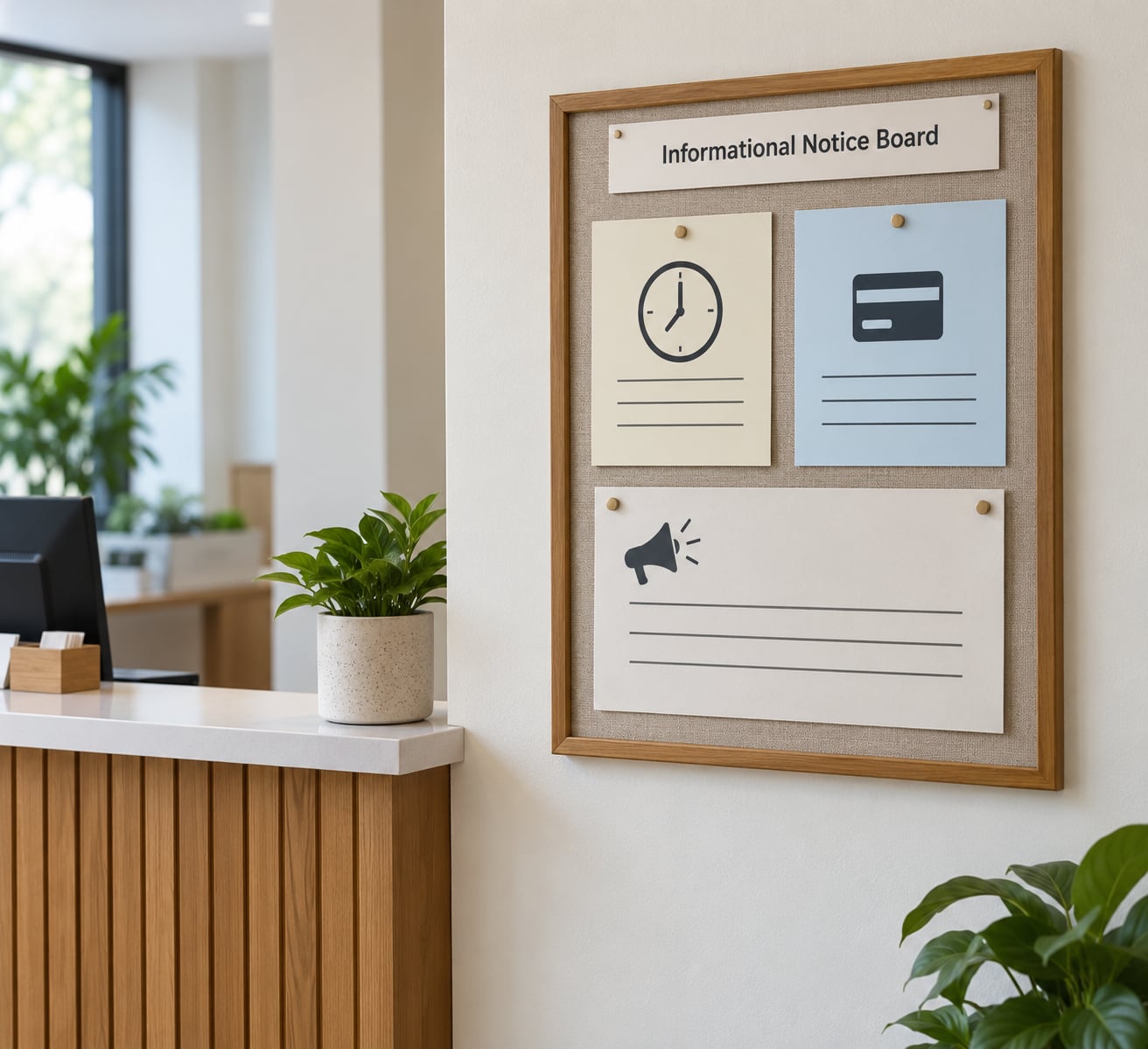
A notice board displays office hours, accepted payment methods, policies, announcements, and client resources in one visible spot, and it keeps the questions your receptionist answers all day off your receptionist.
Organize it into labeled zones with clear headings: hours, payments, policies, and a separate announcements area for dates and updates. Removable letter strips beat printed paper because you will change the content often and paper goes crooked within a week.
Designate one person to own it and set a monthly check. An out-of-date board is worse than no board, since visitors will plan around hours you closed two months ago. Mount it beside the desk rather than behind it, at a height where a seated person can read it.
10. Branded Photo or Feature Wall Sign
A feature wall panel is a single large image or graphic panel — a project photo, an abstract brand pattern, or a full-width printed panel — that fills a wall too plain or too awkward for letters.
This is the answer when you rent a multi-tenant suite, when the wall is painted a color that fights your logo, or when the area behind reception is 6 feet wide and tapering. Adhesive vinyl wall graphics and printed dibond panels solve the “cannot touch the wall” problem because they remove cleanly when you move.
Match the panel’s edges to something physical: a counter height, a door frame, or the width of the waiting area. A panel that ends in mid-wall looks temporary, and temporary is the exact impression a small office cannot afford. Choose a matte laminate rather than gloss if the wall catches overhead light, or the glare will do more damage than the artwork.
Frequently Asked Questions
How big should a lobby sign be for a small office?
A good starting point is a sign spanning roughly a third to half the usable width of the wall you are mounting it on, with the text readable from the entry door. As a rule of thumb, allow about one inch of letter height for every ten feet of viewing distance, so 3-inch letters read clearly at about 30 feet. In a small room, scale errors run large, so tape the intended outline on the wall with painter’s tape and look at it from the door before anything is fabricated.
How much does a small office lobby sign cost to make?
Printable panels, foam board, and vinyl decals fall under one hundred dollars. Acrylic or etched glass plaques and routed wood signs typically land in the low hundreds, while brushed aluminum or stainless dimensional letters commonly run from several hundred dollars into the low thousands. Illumination, a dedicated electrical circuit, and professional installation add the most. Costs vary by region and change over time, so get two written quotes that separate fabrication from mounting.
Do I need lighting for a small office lobby sign?
Only if your reception area is dim during visiting hours or your entrance reads dark at night. Most small offices manage with a single LED picture light or an adjustable track spot aimed at the wall, which costs far less than an illuminated sign and is easier to service. Backlit or halo-lit signage makes more sense in a larger lobby, or one that already has layered ambient and task lighting, since it needs enough surrounding light to look intentional rather than like a floating glow.
What is the best material for a reception wall sign?
Acrylic gives the widest range of finishes and price points and stays clean in most interiors, which makes it the safest default. Brushed aluminum or stainless steel reads the most formal and suits law, finance, and medical practices. Routed walnut or oak suits creative, wellness, and hospitality offices but shows fingerprints less gracefully. Frosted or etched glass looks refined in bright reception rooms and avoids reflections on dark walls. Match the material to your industry and to one other object in the room.
How long does it take to make a custom lobby sign?
A printed panel on foam board or dibond can often be produced in two to three business days. Dimensional letters and routed wood typically take one to two weeks from approved artwork, and etched or illuminated acrylic adds another week because of the electrical and finishing steps. Add a few days for proofing. Artwork approval is almost always the real bottleneck, so get vector artwork from your logo designer before you start, and confirm the timeline in writing before paying a deposit.
What accessibility standards apply to signs in a small office lobby?
The 2010 ADA Standards for Accessible Design, section 216.2, set requirements for permanent room and space identification signs, including raised characters and Braille where the text is also provided visually. Your company name logo on a feature wall is not covered by that section, though mounted signs still must not obstruct a clear path of travel. If you serve clients with mobility needs, confirm clear floor space and door maneuvering clearances in your reception area as well, and check your state and local rules, which can be stricter.
Where to Start With Your Small Office Sign
Measure the wall first, then stand at your entry door and decide what a visitor most needs to know in the first three seconds. For most small offices the answer is the company name, which means idea 2 or idea 1, ordered as a single flat acrylic or printed panel rather than an illuminated build.
Pick one wall, one material, and one typeface. Save the feature wall panel and the services list for after the first sign is up and you can see how the room actually reads in daylight. If you rent a shared suite and cannot drill, start with idea 10 using removable adhesive vinyl; you can always upgrade in place later.