A multi-tenant directory sign is a shared panel or display that lists the occupants of a building by floor, suite, or unit, so a first-time visitor can find the right door without asking the front desk. Learning how to design a directory sign for a multi-tenant building is mostly an accuracy problem: get the tenant data, the letter size, and the mounting height right, and the rest is layout judgment. Most small directory panels take a week to design and a few weeks to fabricate.
Table of Contents
- What You Need
- Tenant data
- Measurements and site data
- Code and lease documents
- Design and fabrication tools
- Step-by-Step: Designing a Multi-Tenant Directory Sign
- 1. Confirm the tenant list and sign requirements
- 2. Measure the installation area and viewing distance
- 3. Choose a layout that fits the tenant information
- 4. Select readable typography and visual hierarchy
- 5. Add colors, symbols, and wayfinding elements
- 6. Check durability, accessibility, and installation needs
- 7. Proof, approve, fabricate, and install
- Common Mistakes
- Frequently Asked Questions
- How large should a directory sign be for a multi-tenant building?
- Should tenants be listed alphabetically, by floor, or by suite number?
- Do I need to include every business logo on a building directory?
- What material is best for an outdoor tenant directory sign?
- How do I keep the directory readable for people with low vision?
- How often should a multi-tenant building directory be updated?
- Start With a Clear, Accurate Tenant List
What You Need
Before you open a design file, collect four things: an accurate tenant list, real measurements from the installation area, the applicable code and lease rules, and a decision on materials and lighting. Skip any one of those and the project goes back a step later, usually at proof stage when the panel is already priced.
Tenant data
- Legal tenant name for every suite, exactly as it should read on the sign
- Floor or suite number, and the unit numbering scheme the building actually uses
- Logo files in vector format, or a clear statement that a tenant has none
- Spelling preference, ampersand or “and,” and any punctuation the tenant insists on
- Hours, phone numbers, or reception instructions, if you intend to include them
- A named approval contact per tenant, and a deadline for returning artwork
Measurements and site data
Measure the wall, monument, pedestal, or panel bay you are working with, and note the closest and farthest a viewer will stand from it. Also record mounting height above finished floor, nearby light sources, and the width of any door or window that constrains placement.
Code and lease documents
You need three reference documents: the local sign code, the ADA Standards for Accessible Design (2010), and the signage clause in your lease or management agreement. The lease matters as much as the code, because it decides who pays for a panel swap and whether a tenant can remove their name.
Design and fabrication tools
A vector editor such as Adobe Illustrator or Inkscape, a second pair of eyes for proofing, and a way to export printer-ready PDFs. If the sign is fabricated, send artwork with outlined fonts and embedded logos. Leave time for a physical or on-screen proof; directory errors are almost always proofing failures rather than design failures.
Step-by-Step: Designing a Multi-Tenant Directory Sign
1. Confirm the tenant list and sign requirements
Verify every tenant name, suite number, and spelling with a written source rather than a memory of the current lobby board. Ask the property manager which suites are vacant, which are under offer, and whether ground-floor retail is listed separately from office tenants above.
You know this step worked when you have a spreadsheet with one row per unit, an approved name string in every row, and a checkbox confirming that no tenant has supplied artwork. Anything left unconfirmed should appear on the proof as a placeholder line, never as a guess.
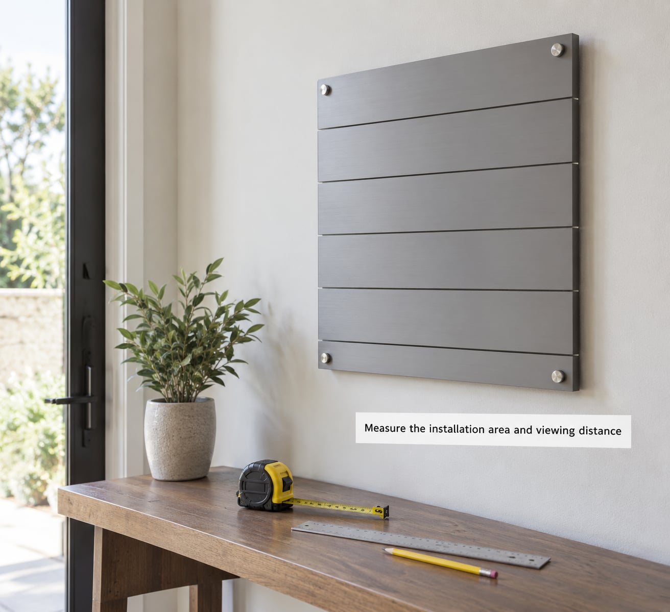
2. Measure the installation area and viewing distance
Measure the actual panel area, not the wall. Subtract standoffs, mounting rails, and the frame, then work out the distance a visitor stands at: roughly 6 to 10 feet at a lobby panel, 20 to 40 feet at a monument sign, and further for a pylon seen from a street.
A common sizing rule of thumb is about 1 inch of cap height for every 10 feet of viewing distance, and most designers work above that floor rather than at it. Interior panels usually run 0.75 to 1.5 inches for tenant names; exterior monument text runs 3 to 6 inches.
| Typical viewing distance | Where it happens | Minimum cap height for tenant names |
|---|---|---|
| 6 to 10 feet | Lobby panel, reception wall | 0.75 to 1.25 inch |
| 10 to 20 feet | Entry vestibule, elevator bank | 1.25 to 2 inches |
| 20 to 40 feet | Monument or podium sign | 2.5 to 4 inches |
| 40 feet and beyond | Pylon sign read from the street or a drive | 4 to 6 inches |
Check this step by squinting at the panel from the farthest point and confirming you can still read the smallest tenant name. If you cannot, add a second panel or drop detail rather than shrinking type.
3. Choose a layout that fits the tenant information
Match the layout to how the building is actually organized, not to how it looks best in a mockup. Four options cover most properties, and each has a clear use.
- Alphabetical suits a lobby with no clear floor logic, such as a small medical center or coworking floor. Visitors search for a name, not a number.
- Grouped by floor suits office towers and anything with strong vertical stacking. Floor number leads, tenant names sit under it in suite order.
- By suite number suits buildings where tenants navigate by number rather than by brand, including warehouses, labs, and industrial leasing.
- Directory style with directional detail suits mixed-use buildings: a short list per floor plus a lobby strip showing ground-floor retail with its street-facing entrances.
Whichever you pick, the visual hierarchy is fixed: building name first, then floor, then suite number, then tenant name, then any arrow. Vertical stacking with generous leading beats a dense grid every time, and one typeface in two weights beats four fonts.
4. Select readable typography and visual hierarchy
Use one sans serif typeface with a clear open counter and a true italic if you need emphasis. Frutiger, Myriad, Avenir, and Helvetica are common in wayfinding for good reason, and all have uppercase forms that stay legible at small sizes. Avoid script, condensed display faces, and any typeface whose letterforms blur when reduced.
On fonts for wayfinding, the practical tests are simple: can a visitor read the smallest line from 10 feet, does the capital letter hold its shape at that size, and do numbers like 8, 3, and 5 look different from one another at a glance. Keep suite numbers in a slightly heavier weight or a contrasting color so they can be matched to a door sticker.
Contrast does the heavy lifting. A common target is roughly 70 percent of the visual area in one value and 30 percent in the other, so dark letters on a light panel or the reverse. Specify a matte or anti-glare finish, because gloss under lobby lighting produces glare exactly where people need to read.
5. Add colors, symbols, and wayfinding elements
Use color to organize, not to decorate. Two or three colors across the whole property is enough, and the same color should mean the same thing on the directory, the door numbers, and the elevator floor indicator.
Elements worth including: a floor band or number for every level, an arrow beside any tenant with a separate entrance, a step-free entrance or accessible route symbol where it applies, a reception marker, mail and loading directions, and a last-updated date. Keep arrows identical in shape and size everywhere, and give every symbol a plain text label next to it so it still works for people who do not read the symbol.
6. Check durability, accessibility, and installation needs
Match the material to the location. Indoor lobby directories live inside and are usually aluminum with a sign grade acrylic or polycarbonate face. Exterior directories face ultraviolet light, salt air, and freeze-thaw cycling, so aluminum, HDU, or powder-coated steel is the sensible choice, and stainless steel is worth the cost in coastal markets.
| Material | Typical service life | Best use |
|---|---|---|
| Stainless steel | 10 to 20 years | Coastal and high-exposure monument signs |
| Aluminum | 7 to 15 years | Cabinet frames, exterior panels, powder-coated |
| Sign grade acrylic | 5 to 10 years | Interior faces, illuminated cabinets |
| Polycarbonate | 5 to 10 years | High-impact or vandal-exposed areas |
| PVC foam | 3 to 7 years | Short-term or covered interior panels |
Accessibility basics under the 2010 ADA Standards: tactile characters on permanent room and space identification signs must have a minimum cap height of 1 inch, with the baseline of tactile characters between 48 and 60 inches above the finished floor. Visual characters must contrast strongly with their background, and glare is a readability problem as much as a compliance one. A building directory that lists where a tenant is sits in a gray area depending on how your local code treats it, so confirm with the authority having jurisdiction and the property’s accessibility consultant before fabricating.
For mounting, decide whether panels are magnetic, slide into a modular track, or are fixed. A modular track system is what makes a tenant swap cheap: one new printed panel goes in, and the cabinet stays. Also confirm the wall structure can carry the cabinet, use a dielectric barrier between dissimilar metals to prevent galvanic corrosion, and specify fasteners rated for the substrate.
7. Proof, approve, fabricate, and install
Produce a full-size proof with every tenant detail live, not placeholders, and get written approval from the property manager and each tenant whose name or logo appears. Then order the finished sign, confirm the mounting hardware and any electrical work for illuminated cabinets, and install it.
After installation, stand at the intended viewing distance and read every line. Check that the panel is level, that logos were not stretched, that the accessible route symbol points somewhere real, and that the last-updated date is present. This is the moment to catch a transposed suite number, because fixing it later means a second panel.
Common Mistakes
Most directory problems are not design problems. They come from rushing the data or overloading the panel, and each one has a straightforward fix.
- Overcrowded layout. Too many tenants on one panel. Split the list across two panels, or move secondary detail such as phone numbers to a second board. The fix is editing, not shrinking type.
- Inconsistent tenant styling. Each logo in its own color at its own size. Give every logo the same maximum height and a common baseline, and let the panel, not the tenant branding, set the visual tone.
- Too many typefaces. Four fonts on a board with 20 names. Cut to one family in two weights, and reserve a second family for the building identity only.
- Weak contrast or glossy finish. Low-contrast gray text, or gloss that mirrors lobby lighting. Push the value difference apart and specify matte.
- Inaccurate suite numbers. A number that does not match the door sticker. Verify every row against the current leasing record and the existing door numbering, and use a written sign-off.
- Inadequate mounting. A panel screwed into drywall or an unlevel cabinet. Anchor into structure, shim to level, and confirm the substrate with the installer before the sign is delivered.
- No plan for the next tenant. A fixed sign that has to be replaced entirely when someone moves out. Specify slide-in or magnetic panels and a track system so a swap is one printed panel.
- Ignoring the shared framework. Tenants treated as separate signs rather than one system. Define one sign family for the whole property, with the same typeface, material, and mounting language, so the building reads as one place.
Frequently Asked Questions
How large should a directory sign be for a multi-tenant building?
Size it from the number of tenants and the viewing distance, not from the available wall. Interior lobby panels usually run 24 to 48 inches wide, and tenant names want about 1 inch of cap height for every 10 feet of viewing distance. A monument sign may need 3 to 6 inch letters to read from the sidewalk. If the list does not fit at a readable size, add a second panel instead of shrinking the type.
Should tenants be listed alphabetically, by floor, or by suite number?
Use whichever way the building is already navigated. Group by floor when floors are strongly defined, such as an office tower. Use alphabetical order where tenants are found by name rather than location, such as a clinic or coworking floor. Sort by suite number in warehouses, labs, and industrial buildings. Mixed-use properties usually need both: a per-floor list plus a separate ground-floor retail strip.
Do I need to include every business logo on a building directory?
No, and a crowded logo band is the most common reason a directory stops being readable. Include logos when tenants require them, but set one maximum logo height and a common baseline so the directory looks like a single designed system. Give every logo the same amount of space, and provide a name-only line for any tenant that does not supply artwork by your deadline.
What material is best for an outdoor tenant directory sign?
Aluminum is the most common answer because it is light, easy to fabricate, and takes a powder coat well. Stainless steel lasts longer and resists salt air, which matters near the coast. Sign grade acrylic or polycarbonate works for the face of an illuminated cabinet. High-density urethane is a solid, stable substrate for painted or routed panels. Match the finish to the exposure and check how panels separate from the frame, since galvanic corrosion between metals is the usual long-term failure.
How do I keep the directory readable for people with low vision?
Start with contrast: dark characters on a light field, or the reverse, with most of the surface in one value. Keep type large, avoid glossy finishes that create glare, and never compress the panel to fit more rows. Mount the board so the main list sits within a comfortable reach and viewing range, and add tactile characters and braille where the sign is required to identify a space. A published phone number or reception direction on the panel helps more people than any single type change.
How often should a multi-tenant building directory be updated?
Update it the day a tenant moves in or out, and review the whole list every six months. Vacancies accumulate quietly, and a panel showing three empty suites undermines the whole board. Put a last-updated date at the bottom of the panel so the age is visible, and keep a spreadsheet as the single source of truth. Modular slide-in or magnetic panels make each change a single printed panel rather than a full replacement.
Start With a Clear, Accurate Tenant List
Start with the tenant data, not the artwork. Build one accurate row per unit with a legal name, a suite number, and an approval contact, and everything after that becomes layout rather than guesswork. Measure the panel and the viewing distance, set letter height to match, choose one typeface with strong contrast, and keep the whole building on a single sign family.
Design, approve, fabricate, and then read the installed panel from where visitors will actually stand. If that is how to design a directory sign for a multi-tenant building works in practice, the board earns its keep every time someone walks in without stopping at the front desk.