Good menu board design tips for small restaurants come down to three things: a clear reading order, type large enough for the distance your customers actually stand at, and a layout you can update yourself on a Tuesday afternoon. A plain board in good shape beats an expensive screen that shows last season’s specials, and that is true at every budget.
This guide is written for the person who wears every hat. If you run a café, a bakery, a food truck, a neighbourhood bar or a small independent restaurant, you are about five minutes away from designing or fixing the board that sells your food, and you almost certainly don’t have a designer on call.
One thing worth settling before the tips: a menu board is not the same thing as a menu. The menu is the document — the paper handout, the QR code, the printed menu inside a frame. The menu board is the display a customer reads standing up, usually in under a minute, usually while other people are queueing behind them. That difference drives every design decision that follows.
Another: a board is a system, not a poster. The best ones I have seen in working cafés all have the same quiet property — a named person owns it, and updating it takes five minutes rather than an afternoon. Design that ignores that reality falls apart within a month.
Here is the short version before the detail.
Table of Contents
- Menu board design tips for small restaurants at a Glance
- 01. Choose a board size that fits the service area
- Measure before you measure anything else
- 02. Create a clear visual hierarchy
- 03. Keep text readable from the ordering line
- 04. Use a restrained color palette
- 05. Organize the menu into short sections
- 06. Make prices and promotions unmistakable
- 07. Feature a small number of profitable or popular items
- Working out what to feature
- 08. Write short, useful item descriptions
- 09. Design for quick updates
- Free and printable templates
- When to move beyond a printed or hand-written board
- 10. Test the board before and after installation
- Frequently Asked Questions
- How big should menu board text be?
- How many items should a menu board have?
- Is a chalkboard menu better than a printed or digital menu board?
- How can I create a menu card online for free?
- What are the most common menu design mistakes?
- Do restaurants have to show calories on menus?
- Conclusion
Menu board design tips for small restaurants at a Glance
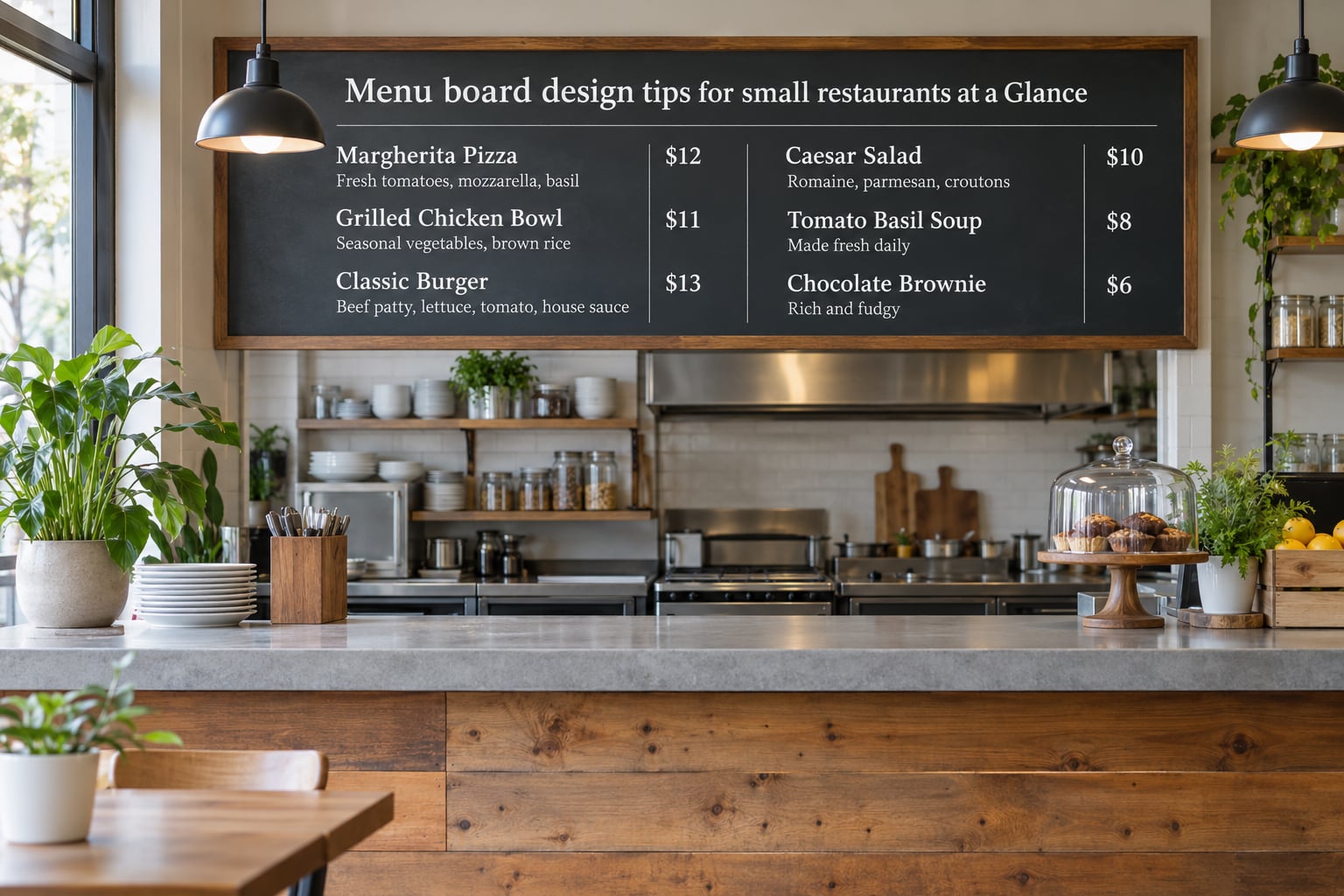
| Design tip | Problem it solves | Action to take |
|---|---|---|
| Size the board to the reading distance | Customers strain, give up, and order the familiar thing | Measure where the queue stops, then size type for that distance |
| One focal item per panel | A board where everything shouts reads as clutter | Pick a single hero and give it visual weight |
| Two typefaces, no more | Competition for attention inside every line | One display face for headings, one plain face for items |
| Right-aligned price column | Eyes hunting for numbers slows the whole scan | Align every price on the same decimal |
| Two or three colours plus one accent | Brand colour everywhere means brand colour nowhere | Set the accent aside for the item you want pushed |
| Twenty-five to thirty-five items per board | Decision paralysis when the list runs long | Move the long tail to a printed menu |
| Descriptions of five to eight words | Fine print nobody reads at the counter | Cut adjectives, keep ingredients and method |
| Limited-time offers in their own block | Dead specials hide inside the main list | Give them a labelled strip with an end date |
| Matte finish on anything under direct light | Glare washes out the half nearest the window | Matte laminate for wall boards facing light |
| One named owner and a weekly check | Sold-out items and stale promotions signal neglect | Put the update on a recurring calendar slot |
01. Choose a board size that fits the service area
Size your menu board to the distance from which it gets read, and that distance is set by where your customers physically stop. Not where you would like them to stop, but where they actually stop — usually the front of the queue, which on a good day is six to ten feet from the counter.
Two constraints pull against each other. The counter footprint decides the maximum board, and the viewing distance decides the minimum readable type size. When they conflict, the footprint wins and you solve legibility another way: fewer items, bigger type, higher contrast. Cramming thirty items onto a board meant for twelve is the single most common failure I see.
Measure before you measure anything else
Stand where the queue stops and note the distance to the wall in front of you. Then tape a sheet of paper with your largest planned word on it at that exact spot and walk back. If you squint, the type is too small and no amount of good layout will save it.
Footprint varies more than owners expect. A six-foot counter against a side wall might support a single horizontal panel. A food truck with a two-foot service window has a genuinely hard problem, and the honest answer for most trucks is a small board above the window plus a QR code menu for the full list. The constraint there is physical space, not taste.
A bakery case is a different situation again. Customers are already standing still, reading at close range, so the board behind the case is closer to a printed menu in function. Give it more items than a counter board would get away with.
02. Create a clear visual hierarchy
Hierarchy is the order a customer’s eye moves through your board, and you get to decide what that order is. Aim for: restaurant name, then menu sections, then the item you most want to sell, then the rest of the items with their prices, then anything promotional at the bottom edge.
Within that, three levels of text size are plenty. A heading for sections, a larger line for the hero item, and a slightly smaller but still readable line for everything else. Owners who add a fourth and fifth size end up with a board that flattens into visual static.
Give the board a focal point — a single item or section that pulls the eye first. On a panel showing sandwiches, bowls and drinks, the sandwich you are proudest of can sit in its own band with a rule above and below it. That is the whole trick. A board with two focal points has none.
Section labels should be visual objects, not just text. A rule, a coloured band, a small icon or a change of typeface does more work than making the words bigger. Reserve your one accent colour for the section you want noticed, and use plain dividers everywhere else.
03. Keep text readable from the ordering line
Type should be readable at your real reading distance without a customer moving closer, and the rest of legibility follows from contrast and spacing rather than from size alone. A large but low-contrast grey word on a pale background is harder to read than a smaller black one.
Skip script, thin weights and anything with texture inside the letters. One plain sans-serif with a medium weight handles item names, prices and descriptions without any trouble. If you want character, put it in the section headings rather than in the items people are actually ordering.
Keep lines short. An item name, a short description and a price on one line works when the line runs maybe 40 characters; past that, the eye struggles to get back to the left margin. Breaking into two lines is better than one very long one.
One technique worth knowing is spacing each letter and word slightly wider. It genuinely improves reading speed at a distance on hand-lettered boards, and it is the quickest visible upgrade available to anyone working with chalk or a marker.
Finish matters too. Gloss laminate throws glare across the portion of a board nearest a window or an overhead light, and that glare lands exactly where the prices are. Matte laminate for anything facing a light source, and replace it when it starts clouding.
Then run the test that matters: stand at the front of the queue at the normal time of day and read every price without leaning in. Do it at night too, with the lights you actually use. If the board only works in a photograph taken at noon, it does not work.
04. Use a restrained color palette
A small restaurant menu board reads better with two or three colours plus one accent, and that accent should be reserved for the item or section you want attention drawn to first. Everything else stays neutral so that the accent has somewhere to land.
Contrast does the real work. Item names and prices need strong separation from whatever sits behind them, and a busy photograph background will defeat even large type. If you want a photo behind a section, put it behind the heading, never behind the items.
Do not encode meaning with colour alone. An item priced in one colour to signal a deal is invisible to a customer with a colour vision deficiency, and it is ambiguous to everyone else. Use a word, a badge shape, or a position that says “special” rather than relying on a hue.
Match your existing brand colours rather than inventing a second identity for the board. If your brand colour is dark and saturated, it makes a strong background and a poor text colour. Inverting that relationship is often all a plain board needs to look considered.
05. Organize the menu into short sections
Group items into categories a customer would name themselves — breakfast, sandwiches, bowls, drinks, desserts — and give each category a clear band with its own label. Categories should follow the order most people actually think in, so put your highest-margin category early rather than alphabetically.
Keep each section short. Roughly four to eight items per category is the range most boards stay inside, and total items across one board usually land somewhere between twenty-five and thirty-five. Past that, customers stall rather than order, and they usually end up choosing whatever they recognize from somewhere else.
Move the long tail off the board. A twenty-item list of sauces, add-ons and variations belongs on a printed menu or behind the counter, not on the surface a customer is trying to read while someone waits behind them.
Give each section a fixed position and keep it there. A layout where breakfast always sits top-left and desserts always sit bottom-right lets a regular customer find their order without reading, which is worth more than any novelty.
06. Make prices and promotions unmistakable
Align every price in a single column on the right and let the numbers share a decimal point. This sounds trivial and it is the fastest way to make a home-made board look designed, because the eye can run straight down the column instead of bouncing around the board.
On dollar signs, operators genuinely disagree. A 2009 Cornell study by Yang, Kimes and Sessarego found that diners in a table-service lunch setting spent around eight percent more when prices were shown as numerals without currency symbols. The caveat matters: it was full table service, not a counter queue, and it has not been repeated at scale for walk-up ordering. Plenty of owners drop the signs anyway and find it reads cleaner. Try both for a couple of weeks and keep whichever your customers read faster.
Put limited-time offers in their own labelled block, away from the main list, and include an end date. Offers buried among regular items stop being noticed, and a promotion that never ends reads as a permanent price, which quietly trains customers to wait for deals.
Keep fees and modifiers unambiguous. If there is a service charge or an upcharge for a size, say so on the board in the same place every time. A customer who discovers an added charge at the till does not come back, and the board is what they will blame.
07. Feature a small number of profitable or popular items
Feature two or three items per board, no more. The point is to steer attention toward what you want sold — your signature dish, your best-margin combo, whatever you would rather sell than the default — using position and weight instead of persuasion.
Three techniques work. Visual weight surrounds the hero item with space while everything else is packed. A written marker such as “bestseller” or “house favourite” gives a social cue you would otherwise have to earn. And placement puts the hero where the eye lands first, which on a horizontal board is left of centre and on a vertical board is near the top.
Working out what to feature
Feature the item you would rather sell than the one people default to, which is usually not the same as the one that makes the most money per minute. A dish with a high margin that needs two extra minutes of prep is a different proposition from a fast item with a thin margin, and only one of those suits a rush.
Check your own numbers before you guess. Most point-of-sale systems will show you item mix over the last month, and the top three sellers are rarely the three you would have picked on instinct. If the item you want to feature is already selling well, the real gain is in making it easy to find, not in persuading anyone.
For a food truck or a bakery counter where space is tight, feature two items rather than three. Vertical space is the scarcest thing on a small board, and two well-placed heroes read better than three that compete.
There is healthy scepticism about this on restaurant owner forums, and honestly it deserves some. Ordering attention toward an item is normal retail practice; hiding prices or disguising costs is not. The line is whether a customer could still find what they came for and understand what they are paying. Most operators land well inside that line.
One failure mode to avoid: featuring everything. If four items carry a badge, none of them is featured and the board looks like it is negotiating with the customer.
08. Write short, useful item descriptions
A menu board description should be five to eight words and should tell the customer something they cannot infer from the item name alone. Ingredient, preparation method, portion, or the one thing that makes it different from the obvious choice.
Compare: “House Burger” alone says almost nothing. “Dry-aged beef, aged cheddar, brioche” tells a customer whether it is the burger they want. Compare a second: “Avocado Toast — multigrain, lemon, chilli flakes, poached egg” works because the additions are the decision.
Test each description against three questions. Would a first-timer understand it? Does it contain a word they would search for? Is there anything here you could cut without losing meaning? That last one does most of the work, because descriptions bloat by adding adjectives nobody needed.
Put allergen information where the law requires it and keep it visually separate from the descriptions, so a customer reading a dish is not scanning past a wall of legal text. If your descriptions end up longer than eight words more than once, the item probably needs a shorter name instead of a longer note.
09. Design for quick updates
A menu board has to be updatable by a tired person at the end of a shift, and that requirement shapes the layout more than any aesthetic preference. Modular layouts with labelled sections are the answer: one menu section per panel or per clearly bordered block, so an item can be edited without re-typesetting the whole thing.
Give the board a version number and a date in one corner, small enough not to distract. When a customer points at something that is not on the board, you want to be able to tell them which version they are looking at and when it was last changed.
Name an owner. This is the failure forum discussions keep returning to: the person who set the board up leaves, nobody knows how the file works, and within two months the board has quietly reverted to a taped printed sheet. A board with one named owner and a five-minute weekly check survives; a board with shared ownership does not.
Have a sold-out procedure before you need it. On a digital board, remove the item or mark it unavailable immediately. On a chalkboard or magnetic board, the equivalent is a small blank card or a written “sold out” tag in the same style as the rest of the board, so the board still looks deliberate.
Free and printable templates
You can create a menu card online for free, and the tools below cover most small restaurant needs without a designer. Canva has the widest set of restaurant menu board templates and a free tier with print-ready downloads; Adobe Express is a solid free alternative with straightforward typography tools; PosterMyWall runs a free tier built specifically around signage sizing, which saves you the resizing step.
Two free-tier checks before you commit. Look at the export resolution — for print you want 300 dpi at final size — and check whether background removal or your brand fonts sit behind the paid tier. If either does, you can often work around it with a free background and a system font.
When you send a file to a print shop, ask about bleed, matte versus gloss lamination, and whether they will proof it before the full run. A single-item price change later still means a full reprint, so keep the print-ready file somewhere obvious and note the shop and settings with it.
When to move beyond a printed or hand-written board
A physical board is genuinely good enough for a lot of small restaurants, and operators consistently report that a well-kept chalkboard outperforms a neglected screen. Move up when your prices change weekly, when you need different menus at different hours, or when sold-out items are causing real arguments at the counter.
If a screen is the right call, spend the difference on a commercial panel rather than a consumer television, and budget for the software and the time to keep the content updated. Operators describe digital signage as an ongoing operational commitment, not a one-time purchase, and that expectation is where most disappointing results come from.
10. Test the board before and after installation
Test the board from the customer’s position, not the designer’s. Print or draw the layout at full size, prop it in position, and check four things: readability of the smallest price from the queue, glare or reflection at the worst time of day, whether the focal item is actually noticed, and whether staff can update it in under five minutes.
Take a photo from where a customer stands and look at it on your phone. Photos flatten contrast and usually reveal that a mid-tone price you thought was fine is nearly invisible at real contrast ratios. It is the fastest honest check available.
Then observe rather than ask. Stand back during a busy stretch and watch what customers actually do — where their eyes stop, which items they point at, whether they read the whole board or only the top. People rarely tell you the truth about legibility, but their behaviour is honest.
Have the staff who work the counter read the board before you finalise it. They are the people answering the resulting questions, and a description they would have to explain is a description that needs rewriting.
After it goes up, check back in two weeks with a simple measure: the mix of items ordered, whether questions about the board have dropped, and how long the counter queue actually feels at peak. Most owners can see the change within a month without any software at all, just by asking the one question a regular customer would ask.
Write down the version number and the date each time you change something substantive, and resist rebuilding the whole layout for a single price edit. A board people recognise from last month is doing its job, and churn on the design side undoes the familiarity that made it easy to read in the first place.
There is one measure worth adding if you have never tried it. Take a count of the items customers point at before and after the change. It takes a slow afternoon and it tells you whether the new focal point actually reached anyone, which is the only question a redesign is supposed to answer.
Frequently Asked Questions
How big should menu board text be?
Match type size to the distance from which the board is read, not to the board itself. A customer standing six to ten feet from your counter should be able to read every price without leaning in. Test it by taping a full-size print at the queue position and standing where the customer will stand. If you squint, the type is too small, and the fix is fewer items rather than larger boards.
How many items should a menu board have?
Roughly twenty-five to thirty-five items across a single board is the working range, spread over four to eight categories with four to eight items each. Past that, customers stall instead of ordering and usually default to whatever they recognise from elsewhere. A digital screen reads slightly faster than a printed board because the eye settles on it immediately. Move the long tail of variations and add-ons onto a printed menu or a QR code.
Is a chalkboard menu better than a printed or digital menu board?
For most small restaurants, a well-kept chalkboard, pegboard or magnetic board is the better choice. It updates in minutes, costs almost nothing, and carries a handmade character that customers read as fresh rather than dated. A printed insert looks more finished and never needs rewriting. A digital screen wins when prices change weekly or you need different menus at different hours. A neglected screen is the worst of the three options.
How can I create a menu card online for free?
Canva, Adobe Express and PosterMyWall all have free tiers with restaurant-ready templates, and Canva has the widest selection for menus specifically. Start from a template sized to your actual board rather than a standard page, then swap in your own items and colours. Before printing, check the export resolution is 300 dpi at final size and confirm whether the fonts and background removal you want sit behind the paid tier.
What are the most common menu design mistakes?
The recurring ones are a board crammed past thirty items, prices that are too small or misaligned, low-contrast text, and type set too small for the reading distance. Also common: photographs behind item names, promos buried in the main list instead of their own block, colour used to signal a deal, and boards nobody owns so sold-out items linger. Every one of those has a five-minute fix.
Do restaurants have to show calories on menus?
It depends entirely on where you operate. In the United States, federal menu labelling requirements apply to chains of twenty or more locations under the same name offering a substantially the same menu, with calories shown alongside each standard item. Several states and cities go further with their own requirements. Small independents are often outside these thresholds, but rules differ by country, state and city, so confirm your position with your local health authority before relying on it.
Conclusion
Start with the distance. Stand at the front of your queue, decide how far back a customer actually stands, and let that number set your type size and your item count before anything else goes on the board. Then arrange what you already sell in a fixed order with one focal item and a properly aligned price column, and leave room on the board for the specials that come and go.
One last thing, and it matters more than any font choice. Give the board a name and a weekly five-minute slot in the calendar. A board that is out of date tells every customer in the room that nothing else here is being looked after either, and that is expensive in a way a slightly crooked price column never is.