If you want to know how to choose a font for a business sign, start with a clean, sturdy sans-serif set in a bold weight with generous letter spacing, then confirm it works at your sign’s real size from your real viewing distance. A passer-by gets about three seconds with your sign, so letterforms, spacing and contrast decide whether they read your name at all. The rest is refining that choice to fit your brand, your fabricator’s process and your budget of space.
I’ve watched shop owners fall for a beautiful alphabet specimen and then struggle to read their own business name from across the parking lot. The type that looked elegant on screen turned into a grey blur once it was 24 inches tall and lit by a floodlight at dusk. That gap between screen and sign is where most font decisions go wrong, and it’s exactly what the process below closes.
Table of Contents
- What You Need
- How to Choose a Font for a Business Sign: Step by Step
- 1. Define the Sign’s Viewing Conditions
- 2. Match the Font to the Brand’s Personality
- 3. Check Every Letterform at Actual Sign Size
- 4. Test Readability from a Distance
- 5. Confirm Compatibility with the Sign-Making Method
- 6. Create a Small Set of Font Options
- 7. Get a Mockup and Final Signage Proof
- Common Mistakes
- Font-Choosing Tips
- Frequently Asked Questions
- What are the best fonts for readable business signs?
- Are serif or sans-serif fonts better for business signs?
- How much text should appear on a business sign?
- Are script fonts suitable for business signage?
- What font do billboards and large outdoor signs use?
- When should I consult a sign maker or designer before ordering?
- Conclusion
What You Need
Before you open any font library, pin down seven things. Each one changes the answer.
- The purpose. Identification at the front door, a monument sign at the road, window graphics, a directional panel inside, or a message you want remembered.
- The exact words. Business name, tagline, address, phone number, licence number. Count the characters, because the longest one dictates your letter height.
- The sign’s dimensions. Overall width and height, and how much room the sign designer has left around the text once the logo and borders are placed.
- Viewing distances. The closest a customer stands and the farthest they read from — the doorstep, the far pavement, or the far lane of the car park.
- The installation environment. Direct sun, shade, backlit at night, rain and dust, a wall colour behind the letters, nearby visual clutter like trees or parked vans.
- The fabrication method. Cut vinyl, channel letters, painted or printed panel, LED display, or vehicle wrap. This decides which strokes survive.
- Your brand guidelines. If you have a logo, a colour palette and a typographic standard, those narrow the field before you start.
Choosing the font first means solving size, contrast and production problems after you’ve already committed to a look. Reverse the order and most of those problems never happen.
How to Choose a Font for a Business Sign: Step by Step
1. Define the Sign’s Viewing Conditions
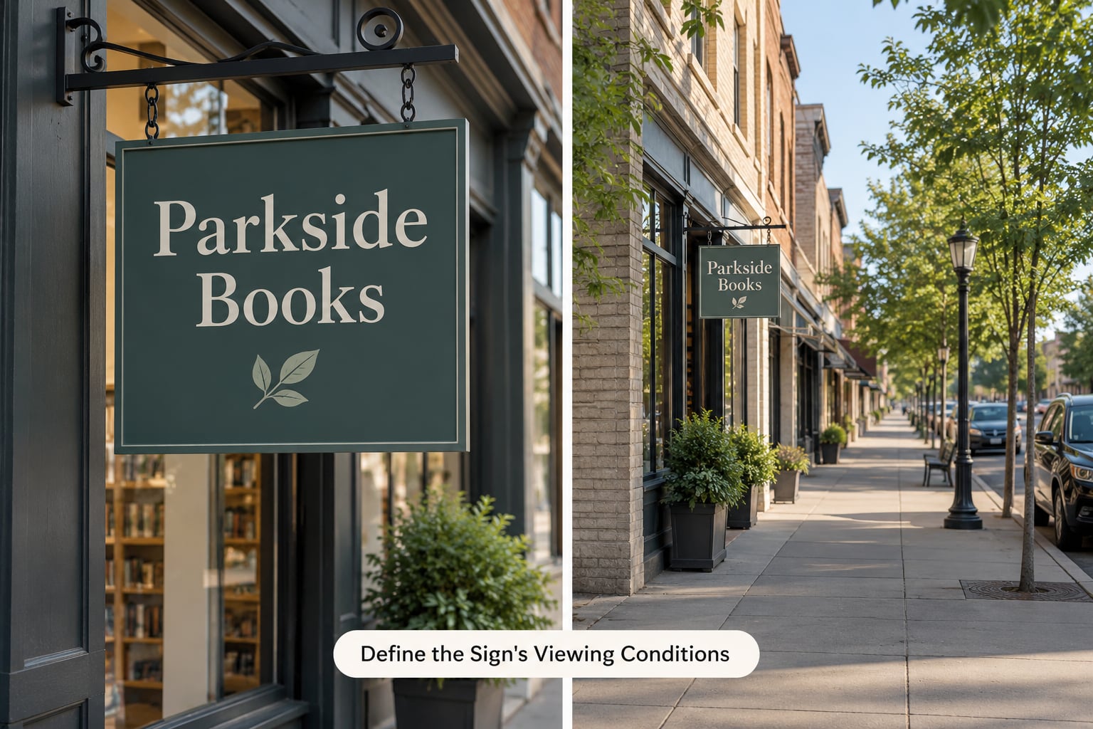
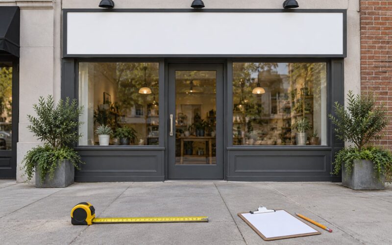
Start by measuring, not guessing. Walk to the point where someone leaving the site would first be able to make out your sign, and note the distance in feet. Do the same for the nearest reader standing at the counter or the doorstep.
Next, decide how the sign gets read. A monument sign beside a road is scanned by a moving reader in a couple of seconds at an angle, often in low light or through rain. A reception panel is read by a stationary person at two feet. Moving readers need heavier weight and wider spacing; stationary readers can tolerate more refined letterforms and tighter detail.
Note the light. A wall in full afternoon sun bleaches colour and flattens contrast, so a face that reads well in shade may vanish at noon. An illuminated sign has the opposite problem at night: halo lighting eats the interior of thin strokes and closed counters, so slightly heavier weight survives the lighting better than a delicate face.
Finally, look at the surroundings. A sign surrounded by visual noise needs a plain, high-contrast treatment. A quiet wall can carry something more characterful. Confirm the choice by squinting at your mockup from across the street: if the word disappears into a grey mass, the weight is too light or the background contrast too low.
2. Match the Font to the Brand’s Personality
Type carries temperament, and customers read temperament before they read words. Pick the category first, then the face inside it.
- Clean sans-serif — Helvetica, Arial, Avenir, Frutiger, Futura. Reads as modern, clear and confident. The safest default for retail, tech, clinics and trades.
- Refined serif — Garamond, Baskerville, Rockwell, Georgia. Signals tradition, craft and premium service. Good for law offices, restaurants, salons and heritage brands.
- Slab serif — sturdy, mechanical, confident. Fits manufacturing, brewing, construction and anything that wants to look built rather than designed.
- Geometric sans-serif — Montserrat, Gotham, Proxima Nova. Circular, even and contemporary; popular with wellness, hospitality and design-led retail.
- Condensed sans-serif — Bebas and similar narrow faces. Solve a long name in a narrow space, or give a tall sign a poster-like scale.
- Script — a signature effect. Keep it to short text at close range, and never as the only thing carrying a long business name.
Apply one test: the font should support the brand without making the wording harder to read. If the choice only works because it’s attractive in a sample, or because it matches an unrelated logo you liked, it will disappoint you on the wall.
3. Check Every Letterform at Actual Sign Size
A font that behaves on screen often fails at sign scale. The reason is proportion: at physical size, the differences between thick and thin strokes, the size of the counters inside letters like a, e and o, and the width of the aperture all become visible rather than theoretical.
Typeset the whole message at approximately final size — the business name, address, phone number and any tagline — not a single letter. Then inspect it properly.
Look at the uppercase forms for flat-sided characters. A capital O, D and B built from near-perfect circles stack into an uneven white column when they sit beside flat-bottomed letters like A and H. Look at the numerals, since phone numbers and addresses are all numerals: a zero and an O must not be identical, and a one must not resemble a lowercase l. Check punctuation too, particularly commas and periods, which are the first things to fill with water or paint.
Confirm by checking the file, not the screen: open the typeface’s glyph set for anything missing. No ampersand, no euro symbol or no numeral in your message means a substitution at the fabricator, and a substitute letter is exactly the kind of small mistake a customer notices.
4. Test Readability from a Distance
Give the design to someone who has not seen it before, show it at the intended size and contrast, and ask them to read the main wording after two seconds, then five, then ten. A design that only lands at ten seconds has already failed for anyone driving past.
The most useful working rule is roughly one inch of letter height for every ten feet of reading distance. On that basis, a 4-inch letter reads at about 40 feet, an 8-inch letter at about 80 feet, and a 12-inch letter at about 120 feet. Treat it as a starting point that the fabricator can adjust, not gospel, and always test from the actual approach.
Two adjustments fix most readability problems. Add letter spacing, because generous tracking gives each letter its own clear patch of background and stops the word reading as a texture. And prefer lowercase or a mixed case with a high x-height, since lowercase letters carry more identifying shape than all caps — a row of capitals gives the eye nothing but flat-topped forms to separate.
The squint test catches the same problem instantly: blur your eyes until the text is illegible, and whatever shape remains is what a driver actually sees. If the word has no surviving silhouette, thicken or space it. To find out more about how to choose a font for a business sign at the sizing stage, work backwards from your viewing distance to the letter height, then measure the longest word in your name at that height and check it still fits the panel.
5. Confirm Compatibility with the Sign-Making Method
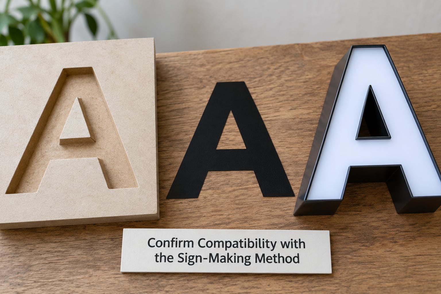
Your fabricator’s process will veto fonts that look fine on screen. Find out what they can produce before you fall in love with a face.
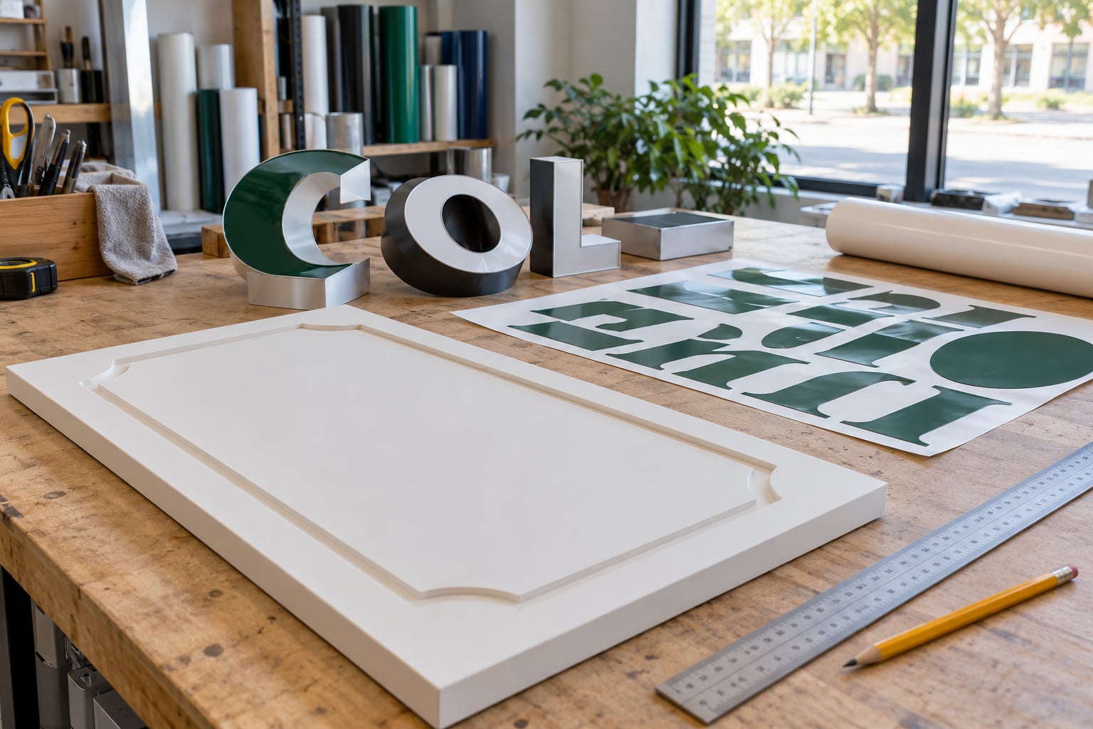
- Cut vinyl needs a minimum stroke width, usually around a quarter inch for exterior work. Hairline strokes, very thin serifs and letters with tight internal joins lift, tear or bridge together. Small internal gaps like the gap in a capital A fill in.
- Channel letters are routed or fabricated in metal, so stroke weight becomes letter depth and return depth. Very fine detail still costs more to machine and can look fragile from the side. A modest depth reads better on a facade than an exaggerated one.
- Painted panels favour fonts with open counters and smooth transitions. Narrow slots and hairline serifs are hard to keep clean with a brush or spray gun.
- LED and digital displays are a pixel grid, so any face with hairline strokes breaks up. Blocky sans-serifs in a medium-bold weight hold up at low pixel pitch.
- Vehicle graphics get washed, sun-faded and viewed at a sharp angle. Wide letter spacing and higher contrast matter more here than anywhere else.
Stroke consistency is the other half of this. A high-contrast face such as Bodoni has a thick vertical and a hairline horizontal, which is elegant in print and a liability in metal, vinyl or paint. Ask your sign maker what their minimum stroke is, and check every letter of your message against it before approving anything.
Also ask what file format they want. Most shops want vector artwork — outlined text, converted to curves, with no live fonts to substitute — and many prefer a PDF or a specific brand file. Provide a correctly licensed font: a typeface that isn’t licensed for commercial or physical signage use can force the shop to redraw your lettering or replace it.
6. Create a Small Set of Font Options
Two or three contrasting typefaces beat twenty judged from a specimen sheet. Pick one strong sans-serif, one characterful option and one deliberate contrast — a serif, a condensed face or a slab — and set them all against the same words, the same background colour and the same layout.
Judging them in parallel surfaces the real trade-offs. The sans-serif will usually win on distance reading and lose on character. The serif will win on personality and need a heavier weight and wider spacing to match the sans-serif’s clarity. The condensed face may be the only one that fits without shrinking the letters to an unreadable size.
Narrow the set against three criteria in this order: legibility at the real distance, fit with the brand’s personality, and whether your fabricator can produce it. Rank legibility first, because a sign nobody reads does no work for the business, no matter how well it photographs.
7. Get a Mockup and Final Signage Proof
Place the preferred type in a full-size or accurately scaled mockup, add the real logo, and view it in the actual location and lighting. Daytime and after dark are two different tests, and if the sign is illuminated, check it with the lighting on.
Ask the sign maker to return a vector proof or a production proof before anything is fabricated. Then check the things that are cheap to fix on paper and expensive to fix on metal: spelling of every word and digit, alignment to the panel edges, consistent margins around the block, colour contrast against the background, and any detail that will not survive the production method you agreed in step 5.
Stand at the real viewing distance and read it one more time before you approve the file. Once it’s approved, get the font file, the outline artwork and a note of the colours in one folder, so a future reordering of a single letter doesn’t start the whole design process again.
Common Mistakes
Falling for the alphabet specimen. A font’s own sample always flatters it, and it’s set in ideal conditions at ideal size. Fix: judge candidates on your own words, at your actual size, on your actual background.
Ornate scripts at long distances. Cursive faces depend on thin joins and flourishes that disappear the moment the sign is more than a few feet away. Fix: use a script only for short text, close range, or as a decorative line under a readable name.
Hairline strokes and high stroke contrast. Faces like a very light weight or a Didone serif look refined on screen and fail in vinyl, paint or metal. Fix: choose a medium or bold weight with even strokes, and check it against your fabricator’s minimum stroke width.
Ignoring the sign’s real dimensions. A long business name squeezed onto one line produces small letters that no amount of clever type fixes. Fix: allow two lines, or choose a condensed face, before you start adjusting size.
Never testing contrast and lighting. Dark grey letters on a dark wall look fine in the studio and disappear outdoors. Fix: check the mockup at the location in daylight and at night, and increase the contrast between the letter colour and its background.
Choosing a typeface the fabricator can’t reproduce. Complex scripts, very tight kerning and very fine details cost more and often come back looking wrong. Fix: send the font file with the artwork and ask the shop to confirm production before the order.
Font-Choosing Tips
Preview the full message rather than isolated letters, because legibility lives in words, not single glyphs. Favor clear hierarchy over novelty: if the sign has a name, a descriptor and hours, decide which one matters most and let type size and weight do that work instead of adding effects.
Get contrast from the relationship between typeface and background rather than from shadows, outlines or bevels, which fill in at distance and complicate production. Test a simplified version in real conditions before committing to the detailed one, because a simple design that reads beats a clever design that doesn’t.
Keep your logo and supporting copy coordinated, but not competing. When the logo already carries a distinctive letterform, matching it too exactly in the supporting text looks like a font family rather than a sign, and the extra letters usually reduce legibility.
Frequently Asked Questions
What are the best fonts for readable business signs?
A clean, sturdy sans-serif in a medium-bold weight is the most reliable starting point for a readable sign. Helvetica, Arial, Frutiger, Avenir and Futura all hold their letterforms well at distance. What matters more than the specific face is even stroke weight, open counters and generous letter spacing. Add tracking, keep the weight up and test at real size before you commit to anything else.
Are serif or sans-serif fonts better for business signs?
Sans-serif fonts usually win for outdoor and distance reading because their even strokes and simple shapes give nothing away to the weather or the viewing angle. Serif fonts are the better choice when the sign is close to the reader or positioned to signal tradition, craft or premium service. Either works, as long as you pick a heavier weight for a serif and widen its letter spacing to match the clarity of a sans-serif.
How much text should appear on a business sign?
As little as possible. The primary sign should normally carry the business name and nothing more, with any tagline, address or phone number moved to a secondary panel, window graphic or the reverse of the sign. Every extra character forces the letter height down, and letter height is what determines how far the sign can be read. Try the name alone on a mockup first and add text only if it still reads from your farthest viewing distance.
Are script fonts suitable for business signage?
Yes, in narrow roles. A script face works well for short text at close range, such as a name on an interior wall, an award line or a short tagline under a readable main name. It fails as the only typeface on a roadside or monument sign, because the thin joins and flourishes vanish past a few feet. If a script is essential to your brand, set it in a heavier weight and keep it to a few words.
What font do billboards and large outdoor signs use?
Billboards use bold, widely spaced sans-serif faces designed for viewing at speed and long distance. Blocky forms such as Futura Bold Extra Black, Helvetica Black, Impact and Franklin Gothic are typical choices, and heavy condensed faces are used when the message has to fit a narrow height. Letter height follows the rule of roughly one inch per ten feet of viewing distance, so a billboard read from 300 feet needs letters close to 30 inches tall.
When should I consult a sign maker or designer before ordering?
Any time the sign is large, illuminated, permanently installed, mounted on a facade or subject to local sign regulations. A sign maker will tell you their minimum stroke width, maximum character count per line, preferred file format and whether your chosen typeface can be produced at all. For a small interior panel, choosing the font yourself and supplying outlined vector artwork is usually enough.
Conclusion
Write down your sign’s exact words, its dimensions, its farthest viewing distance, how it will be made and the personality you want it to carry. Then test two or three simple typefaces at actual size, in real light, before ordering. Once you know how to choose a font for a business sign, the rest is checking numbers and spacing rather than chasing a typeface that merely looks good.