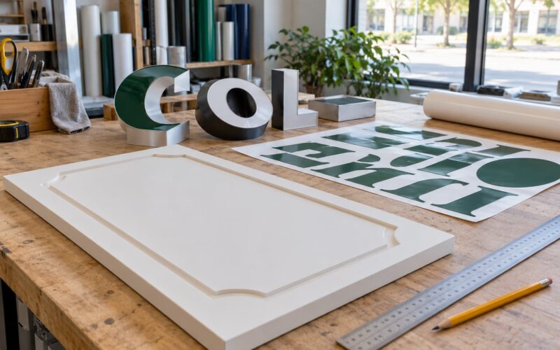
Script fonts fail on signs because the details that make them elegant up close — hairline strokes, looping ascenders, small lowercase bodies and joined letters — vanish at viewing distance, cost extra seconds to decode, and fall below the thinnest stroke a sign fabricator can reliably cut, weed or mount. A sign only gets two or three seconds of attention.
I have watched the same argument play out in shop after shop: the client loves the lettering on the business card, the sign shop says it will not cut it, and the file goes back for a redraw. Nobody is being difficult. The script really is harder to make, read and keep alive outdoors.
Here is what actually breaks, and what to pick instead.
Table of Contents
- Why Script Fonts Fail on Signs at a Glance
- What Makes Script Fonts Difficult to Read on Signs?
- Why Script Fonts Fail on Signs at Typical Viewing Distances
- Why script fonts fail on signs at the letterform level
- How Viewing Conditions Make Script Lettering Worse
- When Script Fonts Can Work on a Sign
- How to Choose a Readable Font for Your Sign
- Which Fonts Are Better for Signs Than Script?
- Bold sans serif
- Slab serif
- Sturdy display faces
- Pairings that keep personality
- Frequently Asked Questions
- Can script fonts be used on signs?
- Are script fonts always bad for signage?
- What is the most readable font style for signs?
- How far away should sign lettering be readable?
- Should a business logo keep its original script font?
- Conclusion
Why Script Fonts Fail on Signs at a Glance
Each script-font problem below shows up as a specific, fixable symptom on a finished sign.
| Script-font problem | What it does on a sign | The fix |
|---|---|---|
| Hairline strokes that taper to nothing | Thin parts drop out, snag during weeding, or fall off after a season outdoors | Use a face with even stroke weight and no taper |
| Small lowercase x-height | Text reads smaller than its point size, so you have to enlarge everything | Choose a large x-height sans serif so the same nominal size gives more readable height |
| Joined letters and ligatures | The eye must trace across a connection before it can read the word | Separate letters with clear spaces; no cursive joins |
| Ambiguous characters | A capital I reads like a lowercase l, a script s reads like a c, m reads like rn | Pick letterforms with distinct shapes and open counters |
| Looping ascenders and descenders | Neighbouring letters collide, and thin tails disappear at distance | Flat, simple silhouettes with generous line spacing |
| Weak hierarchy | Every word carries equal weight, so nothing tells the eye where to start | One bold message, one supporting line, clear size difference |
| Thin-thick stroke contrast | Low-contrast strokes merge into a grey blur against a busy background | Flat, high-contrast letters on a quiet background |
What Makes Script Fonts Difficult to Read on Signs?
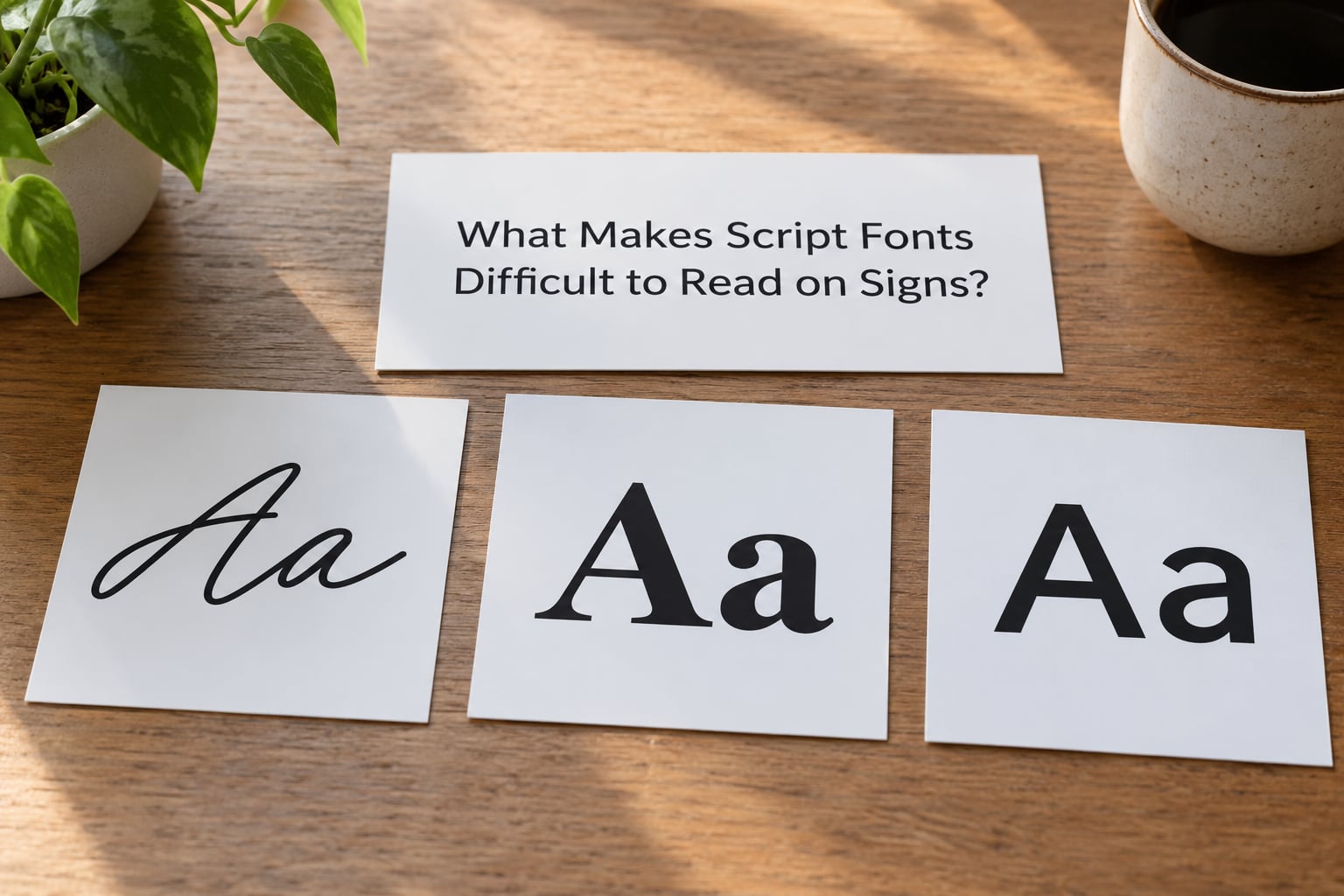
Joined letters force the reader to slow down. In a word set in connected script, each character starts before the previous one finishes, so recognition runs as a chain rather than as a single shape you can grab at once.
Ambiguous characters are the part that actually changes meaning. A capital I in many scripts looks identical to a lowercase l. A numeral 1 becomes a third option. In a name like Jill or a street address, that is not a style problem, it is a wrong letter.
Decorative strokes add work with no payoff. Flourishes, swashes and underlines that look elegant on a printed invitation give a sign fabricator extra fragile edges and give the viewer extra marks to ignore before reaching the word.
Inconsistent spacing is quieter but just as damaging. Script is drawn around idealised pen movements, so kerning pairs that look right on paper can open visible gaps or overlap when the same word is set at eight inches tall.
Visual clutter follows. Backgrounds with texture, photography or competing graphics leave the thin strokes nowhere clean to sit, so the eye picks up the background instead of the words.
Weak hierarchy closes the list. Script rarely carries a bold weight, so a headline and a subhead set in it end up the same size and the same voice, and the sign ends up saying nothing first.
Why Script Fonts Fail on Signs at Typical Viewing Distances
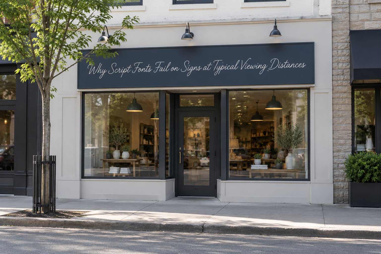
Legibility on a sign is mostly arithmetic: letter height against viewing distance, stroke thickness against letter height, and how many words have to be processed in the seconds you have.
A passerby moving at a normal pace gives a sign roughly two to three seconds. At thirty feet, a driver has even less. Within that window the eye has to spot the sign, separate letters from background, resolve the words, and decide what they mean — and script fonts add decoding time at the second step, which is exactly the step they cannot afford to lose.
The table below is a starting reference for planning, not a fabrication standard. Your sign maker may have different minimums based on material, fabrication method and local rules, so confirm before you commit.
| Sign use | Typical viewing distance | Letter height to start planning around |
|---|---|---|
| Door and window lettering | 2 to 5 feet | 2 to 3 inches |
| A-frame or sidewalk board | 5 to 10 feet | 3 to 4 inches |
| Storefront panel or wall sign | 15 to 30 feet | 6 to 10 inches |
| Roadside or monument sign | 40 to 80 feet | 10 to 16 inches |
| Overhead highway-facing message | 100 feet and beyond | 18 inches and up |
Why script fonts fail on signs at the letterform level
Because the strokes are thin and the lowercase bodies are short, script needs far more height to deliver the same readable area as a block face. A script word set at eight inches still gives the eye far less solid ink than a bold sans serif set at eight inches.
That gap widens fast outdoors. Weathering, dust and sun attack the narrowest strokes first, so a script sign starts legible and degrades into a row of blobs long before a bold one does. Those thin strokes are also the first parts to lift off a panel and come back for a remake.
How Viewing Conditions Make Script Lettering Worse
Glare is the fastest way to lose thin lettering. A flat-matte bold letter holds its edge under a bright sky; a hairline script stroke reflects light back at the viewer and simply vanishes.
Low contrast does the same damage without the glare. Cream letters on a white panel, or dark grey on a dark photo, leave the thin strokes with almost nothing to hold onto.
Weather attacks the weak points. Ultraviolet exposure bakes vinyl, and the narrow, stretched parts of a script letter curl and release at their edges before the thick parts ever fade.
Motion removes your second chance. A parked reader can squint and decode; a moving one gets one pass, so anything that needs re-reading is already lost.
An oblique angle stretches your message sideways. If the sign is read from a driveway rather than head-on, thin strokes compress toward each other and gaps inside letters close up.
Faded vinyl and uneven illumination finish the job. A sign lit from below or from a single weak lamp never gives every letter the same background, and script needs a consistent one.
Visual clutter is the last multiplier. Busy backgrounds, too many colours and more than one message style together mean no part of the sign gets read cleanly.
When Script Fonts Can Work on a Sign
Script is defensible when it is an accent doing a small job, not the message carrying the sign.
- Large size and close range. A script word eight inches tall on a door panel, read from three feet, is fine.
- Short words. One or two words, not a sentence. Decorative lettering cannot carry information density.
- High contrast. Flat white on flat dark, with no photograph behind the letters.
- Generous spacing. Wide letter spacing and line spacing give thin strokes air.
- A supportive body face. Set the actual message in a plain face and let the script sit above it as a signature-style accent.
Residential welcome signs, wedding signage, boutique shopfront names and craft-product labels all fit that description. Wayfinding inside a lobby at arm’s length is another. Roadside, overhead and high-traffic panels are not on the list.
The test I use: if a stranger had to act on the message from thirty feet away, the script is in the wrong place.
How to Choose a Readable Font for Your Sign
Run this in order and the choice stops being a matter of taste.
- Write the message down. Decide the one thing a passerby must know. Everything else is secondary or cut.
- Measure the real viewing distance. Stand where your customers actually stop, not where the sign looks best photographed.
- Set letter height from the table above. Treat it as a floor for planning, then confirm the fabricator’s minimum.
- Pick a weight, not a style. Bold or semibold, with stroke width that stays constant across the whole word.
- Check the letterforms in all caps. Many script fonts are drawn for lowercase only and break badly in caps. Make sure capitals are distinct from lowercase.
- Check contrast. Strong difference in lightness between letters and background, and no busy image behind the text.
- Match the font to the fabrication method. Cut vinyl and router-cut letters punish thin strokes. LED pixel grids punish anything but large, solid shapes. Ask your shop what its minimum stroke is.
- Print a full-size proof. Print the actual design at actual size, then look at it from across the street.
- Run the squint test. Squint and the sign blurs to grey shapes. If you cannot read it squinting, you will not read it in motion either.
- Run the two-second test. Give the proof to someone who has not seen it, show it for two seconds, then ask what the business does. Repeat with three strangers.
Which Fonts Are Better for Signs Than Script?
Three categories cover almost every sign a small business needs.
Bold sans serif
The default and usually the right answer. Even strokes, high x-height, open counters and clean spacing survive distance and fabrication. Names worth looking at include Helvetica, Arial, Frutiger, Gill Sans and DIN for technical or industrial settings, plus Montserrat and similar geometric faces for a modern feel.
Slab serif
Serifs on a signage face are squared off and thick, not hairline. A slab gives you a distinct personality that still holds at thirty feet, which makes it useful for craft brands, coffee, retail and anything wanting a retro or established look.
Sturdy display faces
Condensed heavy faces such as Bebas Neue and Trade Gothic Condensed let a longer word fit a narrower panel at a large height. Impact works at distance too, though it reads louder than elegant and is easy to overuse.
Pairings that keep personality
Keep the hierarchy simple: one family for the message, one for supporting detail. A script logo can stay in your signature and on your window while the roadside panel uses a plain face. If a client insists on script somewhere, put it in the position with the shortest viewing distance.
One note on the “3 font rule”: it is a designer habit about limiting typefaces, not a signage rule. On a sign, one well-chosen family almost always beats three mediocre ones.
Frequently Asked Questions
Can script fonts be used on signs?
Yes, in a narrow set of cases: large letter height, very close viewing distance, one or two short words, strong contrast, generous spacing and a simple message. Script works well on door panels, window decals, wedding and welcome signage, and as an accent above a plain informational line. It stops working as soon as the sign carries information or has to be read from across a street.
Are script fonts always bad for signage?
No. They are bad as a primary information font, especially outdoors, at speed and at distance. Decorative typefaces often look stylish up close and fall apart when scaled to a roadside panel or rendered on an LED pixel grid, because the hairlines simply do not survive the process. The rule of thumb: if a stranger must act on the message from thirty feet away, keep the script out of it.
What is the most readable font style for signs?
A bold or semibold sans serif with a large x-height, even stroke weight and open counters. Helvetica, Arial, Frutiger, Gill Sans and DIN are all widely available and proven in signage. Readability comes from letter height against viewing distance and contrast against the background more than from the name on the font file, so always judge a specimen at full size.
How far away should sign lettering be readable?
Plan the main message to read from about thirty feet and the business name from further out, around one foot of letter height per ten feet of distance as a starting point. That is a planning reference rather than a fabrication standard, so confirm minimums with your sign maker. Remember the glance window: a passerby gives a sign about two to three seconds, less from a moving vehicle.
Should a business logo keep its original script font?
Usually yes, on the items people see up close, such as letterhead, packaging and window vinyl read from a few feet. Where the logo appears large, on a flat colour and at close range, the script holds up as a mark. On a roadside panel or overhead sign, put a plain face under it so the business is still readable when the signature mark is not.
Conclusion
Start by moving your primary message off script and onto a plain, high-contrast face with bold, even strokes, then set the letter height against the real viewing distance rather than against your screen.
Print one full-size proof and test it from across the street, then with three strangers at two seconds each. If the answer survives that, the design is ready for a sign shop. If it does not, the fix is nearly always the typeface, not the panel size.