Channel letters vs flat cut letters comes down to one question: does anyone need to read your sign after dark? Channel letters are three-dimensional, hollow, and lit from inside, which makes them the right pick for nighttime branding and storefronts on busy roads. Flat cut letters are cut from a single sheet of material and mounted flat against a wall, which makes them lighter, cheaper, and often the better choice for interiors, daytime-only businesses, and tight budgets.
Neither style is the better sign. They are different tools, and picking the wrong one usually means paying for depth and lighting you never use, or buying a flat sign that disappears at 7 p.m.
This guide walks through how each format is built, how each performs day and night, what drives the cost difference, and which businesses should order which. Updated for 2026, it reflects current US fabrication practice and code considerations.
Table of Contents
- Channel Letters vs Flat Cut Letters at a Glance
- What Are Channel Letters and Flat Cut Letters?
- What is a channel letter?
- What are flat cut letters?
- Where flat cut letters sit in the lettering family
- How Channel Letters Are Built
- Where the 3 to 6 inch return depth comes from
- How Flat Cut Letters Are Built
- Five steps from file to mounted letters
- How Sign Visibility Differs at Different Times
- Appearance and Brand Impact
- Lighting and Nighttime Readability
- Non-illuminated channel letters are the option nobody mentions
- Materials, Weather Resistance, and Durability
- Substrate choices and where each one fails
- Installation, Maintenance, and Repair
- What happens when one letter breaks
- Channel Letters vs Flat Cut Letters Cost
- What actually moves the quote
- Which Should You Choose?
- Choose channel letters when
- Choose flat cut letters when
- Use both when
- Frequently Asked Questions
- Are channel letters always illuminated?
- What is the difference between channel letters and flat cut letters?
- Which type is better for a small storefront?
- Can flat cut letters be illuminated?
- Are channel letters more durable than flat cut letters?
- What should I check before ordering a business sign?
- Conclusion
Channel Letters vs Flat Cut Letters at a Glance
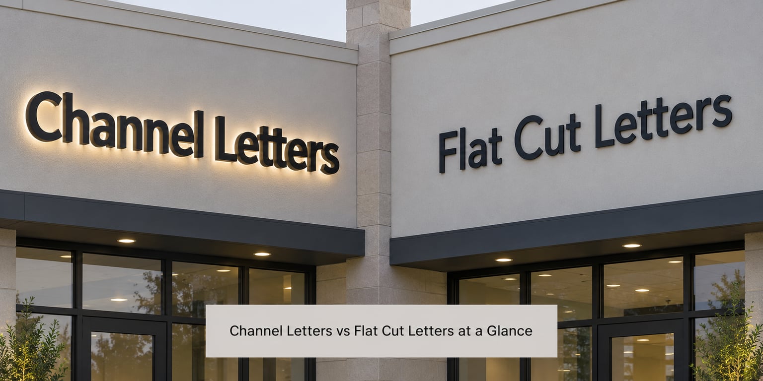
| Criterion | Channel Letters | Flat Cut Letters |
|---|---|---|
| Appearance | Three-dimensional, casts shadows, visible from an angle | Flat silhouette, even color, reads like printed graphics |
| Daytime visibility | Strong; depth and shadow catch the eye | Strong if contrast is high against the wall |
| Nighttime visibility | Built to be read at night | Needs external lighting, a lightbox, or halo glow |
| Illumination | LEDs mounted inside the letter | None built in; lit from outside or halo-lit on stand-offs |
| Depth or thickness | Returns typically 3 to 6 inches (75 to 150 mm) | Equals sheet thickness, roughly 1 to 10 mm |
| Common materials | Aluminum cabinet, acrylic or polycarbonate face, PVC or aluminum returns | Acrylic, PVC, Dibond, ACM, aluminum, stainless steel, foam |
| Weight | Heavier; each letter is a fabricated can | Light; useful for light walls and interior partition work |
| Installation | Raceway, direct mount, or backer panel; wiring usually needed | Screws, adhesive, or stand-off studs; wiring optional |
| Maintenance | Clean faces, check drivers and power supplies | Simple wipe-down; watch for edge lifting and UV fade |
| Relative cost | Higher per letter | Lower per letter, and cheaper to install |
| If one letter is damaged | Replace that single letter | Replace that single letter, though matching fades can show |
| Best used for | Primary storefront signage, night visibility, premium brand presence | Interiors, lobby and reception walls, monument panels, secondary locations |
What Are Channel Letters and Flat Cut Letters?
What is a channel letter?
A channel letter is a three-dimensional, hollow letterform built from sheet metal, most often aluminum. A router cuts the back panel, aluminum or PVC returns form the sides, LEDs sit inside the cavity, and a translucent acrylic or polycarbonate face covers the front. A thin trim cap hides the seam. Common lighting styles are front-lit, reverse-lit halo, and combination-lit.
What are flat cut letters?
Flat cut letters are letter shapes cut from a single flat sheet of material and mounted directly on a wall or on a secondary panel. They have no cavity, no returns, and no internal lighting. A CNC router, laser, or waterjet cuts the outline, so the letter’s thickness is simply the thickness of the sheet. That is why flat cut letters run about 1 to 10 mm deep while channel letters run 3 to 6 inches deep.
Where flat cut letters sit in the lettering family
Sign people sort letters into a few families. Flat cut or laser cut letters come from sheet material. Fabricated or built-up letters are bent and welded into shape from metal. Cast letters are poured in a mold. Formed plastic letters are thermoformed from a flat sheet into a curved shape. Channel letters are the illuminated member of that group. Flat cut letters are the simplest and lowest-cost member.
How Channel Letters Are Built
Channel letter construction runs in a fixed order, and it is the reason for the price tag. The fabricator starts with a flat sheet of aluminum and runs it through a computer-controlled router to create the back of the letter and the shape of the letter itself.
Next come the returns, which are the sides of the letter. They are cut strips of aluminum, PVC, or acrylic that get welded or riveted around the perimeter to form a hollow can. That depth is what turns a flat shape into something that casts a shadow and reads from an angle.
Inside that can goes the light source, usually 12-volt LED modules or neon tubing. The front gets a translucent face, commonly 3/16-inch acrylic or polycarbonate, bonded to the returns. A trim cap finishes the seam around the edge. LED modules are usually rated well beyond 50,000 hours of run time, which is why most modern channel letters use them instead of neon.
Where the 3 to 6 inch return depth comes from
The depth of a channel letter is the width of the return strip the fabricator wraps around the back. Anything from about 3 to 6 inches is normal, and the choice is about proportion, not quality. A shallow letter looks clean on a modern glass facade. A deep letter looks heavier and more permanent, and on older brick or stone it reads as traditional.
Cap height, the height of the letter measured from the top of the capital to the baseline, is the other number that drives everything. Bigger cap height means more material, more labor, and more weight on the wall.
How Flat Cut Letters Are Built
Flat cut letters start with a vector file of the name and a decision about substrate. Acrylic gives a glossy, color-matched face. PVC and foamed PVC are light and easy to cut. Dibond and ACM are two thin aluminum skins bonded to a plastic core, which gives a rigid panel that holds its shape outdoors. Cut aluminum and stainless steel give a brushed metal look with no coating to chip.
The outline is then cut with a CNC router, a laser, or a waterjet. Because the depth of the letter equals the thickness of the material, a 3mm Dibond letter and a 10mm acrylic letter behave very differently on a wall. The thicker option stands off the surface more and throws a small shadow, which reads as slightly more dimensional.
Five steps from file to mounted letters
- The designer finalizes the artwork and confirms the font is available as a production font, not just a screen font.
- The shop picks the substrate, thickness, and finish, including PANTONE color matching if the brand standard requires it.
- The sheet is cut, then the edges are cleaned and any adhesive backing or mounting holes are added.
- If the letters are halo-lit, small holes are drilled for the LED modules and the wiring is run to a remote power supply.
- Installers mount the letters with screws, adhesive, or stand-off studs, positioning them so the shadow reads evenly across the name.
Colors can be matched across both sign types from the same artwork file, so a flat cut letter at a secondary location and a channel letter at the main storefront can look like the same brand.
How Sign Visibility Differs at Different Times
Daytime is where flat cut letters hold their own. A high-contrast flat letter on a contrasting wall is perfectly readable at 100 feet in full sun, and there is no glare to fight. Depth adds a shadow, and a shadow does the same job as an outline: it separates the letter from the background.
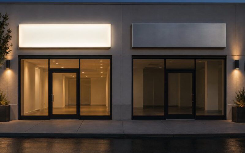
Nighttime is where the two formats separate completely. An unlit flat letter against a dark wall simply disappears. A channel letter is designed to be its own light source, which is why illuminated lettering is the single most cited reason businesses choose it. A lit storefront reads as established after dark in a way an unlit one does not, and that is not a small detail for a business whose hours run past sunset.
Distance changes the calculation too. Along a road, a driver gets a few seconds of attention at long range, and light carries much further than unlit dimensional relief. At a reception desk or a lobby wall viewed from five feet, nobody needs a light source at all, and depth is wasted weight on a partition wall.
One more factor is shadow. A channel letter on the side of a building throws a hard shadow at some angles and disappears into its own shadow at others. A flat letter keeps the same appearance from every angle, which makes it more predictable on a busy facade with several light sources.
Appearance and Brand Impact
Channel letters signal permanence because they are physically heavier and more involved to build. Buyers read an illuminated sign as a cue that a business is legitimate and plans to stay. That perception has real value when you are competing with a chain that has a bigger budget.
Flat cut letters signal restraint, which suits a lot of modern brands. On a clean stucco or painted brick facade, a slim acrylic letter looks intentional rather than flashy. Architects working on contemporary retail often specify flat cut letters precisely because the building is the visual event and the sign should not fight it.
Logo reproduction is a genuine trade-off. Thin strokes and small counters, the tight gaps inside letters such as B, E, or R, can clog in a shallow flat cut sheet and in a narrow channel letter alike. Fabricators widen counters by hand or simplify the font, which is normal but worth confirming in a proof before you approve the run. Complex script is the hardest case for both types.
Lighting and Nighttime Readability
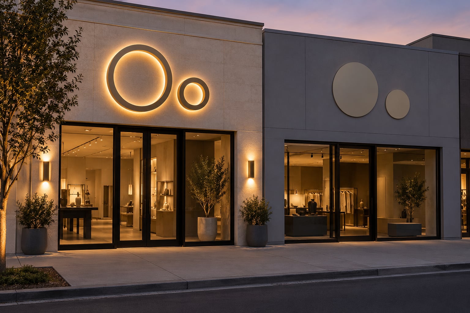
Channel letters come in three standard lighting configurations. Front-lit letters send light forward through the colored acrylic face and give an even, bright glow across the whole letter, which works when a sign faces a street or a parking lot. Reverse-lit, or halo-lit, letters block the light so it spills only around the edges onto the wall behind, producing a soft outline with no glare. Combination-lit letters use both, with a lit face and a halo behind.
Non-illuminated channel letters are the option nobody mentions
Channel letters do not have to be lit. A non-illuminated channel letter is simply a dimensional fabricated letter with a solid or painted face, no LEDs, no wiring, and no electrician. It looks identical to an illuminated letter in daylight and costs much less. This is the honest middle ground for a daytime business that still wants the shadow and the weight of a three-dimensional letter.
Flat cut letters can be illuminated too, just not from inside. Three approaches are common. Trough lighting aims downlights or gooseneck lamps at the wall from above. Backlighting pushes light through the wall or panel behind perforated letters, similar to a lightbox. Stand-off mounting puts the letters on studs away from the wall so LED modules behind them spill outward and produce a halo effect. That stand-off retrofit is also why flat letters can be lit later without replacing them.
A practical note on brightness: LEDs are cheap to dim and cheap to run, and a sign that can be turned off at 11 p.m. is easier to get permitted. Illumination does pull your sign into more jurisdictions for review, so check local sign code before ordering a lit sign on a leased facade.
Materials, Weather Resistance, and Durability
Channel letters are built around rust-proof aluminum, which is why they are the default for exterior use in most of the US. Aluminum will not corrode the way steel does, and powder coating on the cabinet adds years. Stainless steel is chosen for a premium brushed or polished look and needs almost no maintenance. Plastic-faced channel letters in PVC are lighter and cheaper for smaller sizes.
Flat cut letters have a wider substrate menu and a wider failure list. Acrylic looks premium and UV-stabilized acrylic holds up for years, but standard acrylic can yellow and crack under prolonged sun exposure. PVC and foamed PVC are fine indoors and in shade but can warp in heat. Dibond and ACM are the safest exterior flat options because the bonded core resists warping and the aluminum skins handle weather well. Cut aluminum and stainless steel are the most durable flat materials and the heaviest to mount.
Substrate choices and where each one fails
- Acrylic, 3 to 10 mm — glossy and color-matched, best indoors or in low direct sun.
- PVC and foamed PVC, 3 to 10 mm — light and cheap, warps if heat builds behind the letters.
- Dibond and ACM, 3 mm — rigid composite panel, the safest exterior flat choice for most climates.
- Cut aluminum, 1 to 3 mm — no coating to chip, holds an edge outdoors, heavier to install.
- Stainless steel, 1 to 2 mm — the longest-lived flat option, and the most expensive per letter.
- Foam board, 10 to 20 mm — interior and temporary use only, not for exposed facades.
Expected service life for a well-made exterior channel letter sign is measured in decades. Flat cut letters vary far more by material: exterior-rated composite and metal signage can match that, while thin acrylic or PVC outdoors may need attention within a few seasons as edges lift or color fades. Match the material to the sun exposure on that specific wall, not to the price list.
Installation, Maintenance, and Repair
Channel letters go up in one of three ways. A raceway is a metal channel mounted on the wall with the wiring inside it, and each letter clips on, which is the cleanest look from the side. Direct or flush mounting attaches the letters straight to the wall. A backer panel is a full panel behind the whole name, which gives a very finished result on uneven brick. All three usually mean a licensed electrician and possibly a separate electrical permit.
Flat cut letters use screws, adhesive, or stand-off studs. Screws into masonry or framing are permanent, so plan the layout carefully. Adhesive is fast and renter-friendly. Stand-offs hold the letters off the wall by a set distance and create the halo gap. If a flat letter needs to move later, stand-offs and removable fasteners are the easy option.
What happens when one letter breaks
This comes up constantly, and the honest answer is that both types are modular. A damaged channel letter is unhooked from the raceway or backer and a new one is ordered and clipped in. A damaged flat cut letter is unscrewed and replaced. The difference is cosmetic: a fresh channel letter matches its neighbors exactly because the cabinet, face, and color are reproduced to the same spec. A replacement flat letter cut from a different sheet, or from the same sheet years later, can sit a shade off in tone, especially with painted or powder-coated metal.
Both sign types are worth asking about in one specific way: keep the artwork file, the color reference, and the material spec. That single document turns a future single-letter replacement from a guessing game into a ten-minute order. Ask any shop for it in writing.
Maintenance is mostly cleaning. Channel letters need the acrylic faces washed, the drivers and power supply checked, and the raceway kept sealed. Flat cut letters need a wipe-down and, outdoors, a look at edge lifting and fastener corrosion. Neither type needs much beyond that for many years.
Channel Letters vs Flat Cut Letters Cost
Channel letters vs flat cut letters cost differences come down to how many separate parts have to be made and installed. That is why the answer here is the variables rather than a number, because a quote that publishes fixed prices becomes wrong within a season.
What actually moves the quote
- Cap height and total square footage — bigger letters use more material in every category, so this drives everything else.
- Font complexity — script, fine serifs, and tight counters need hand work and hand finishing.
- Number of letters — a short name spreads setup cost over fewer pieces.
- Material and finish — acrylic faces, powder coating, brushed stainless, and PANTONE matching all add labor.
- Lighting — LEDs, a remote power supply, dimming, and the wiring to reach them.
- Mount type — a raceway or backer panel is more fabrication and more install time than flush mounting.
- Wall access and height — lifts, scaffolding, and working around tenants cost money on every sign type.
- Permits, electrician, and removing the old sign — the three items most often missing from a low quote.
Small-business buyers most often complain that quotes arrive per letter with no published baseline, so two shops quoting the same sign can look wildly different. The fix is simple: ask each shop for an all-in number that names the cap height, material, lighting, mount type, permit, electrical work, and removal of the existing sign. Then the quotes are comparable. A quote that hides permit and electrical costs is not a cheaper sign, it is a surprise waiting for you.
Ask in writing whether the permit and the electrician are included. It is the fastest way to compare two bids honestly.
Which Should You Choose?
Choose channel letters when
- You are open after dark and passing traffic matters.
- The sign faces a road, a parking lot, or a walkway at night.
- You want the premium cue that illuminated signage sends.
- Your wall can carry the weight and the sign area can take the projection.
- You are signing the primary location and want the strongest presence.
Choose flat cut letters when
- Your business closes before dusk.
- The sign is inside, on a lobby wall, a reception desk, or an interior feature wall.
- The mounting surface is light, like a partition or a soffit, and weight is a concern.
- You are working with a short budget or a short timeline.
- The sign sits on a monument panel, a fence, or a secondary location.
Use both when
Many multi-location brands do exactly this: channel letters anchor the main storefront, and flat cut letters carry the same font and PANTONE color to secondary sites, a monument sign, and the interior. You get one brand standard without paying illuminated-letter costs at every address. If you plan to grow into lighting later, specify stand-off mounts now so the halo retrofit is possible.
The single most useful question before you call a shop is simple: are you open after dark? If the answer is no, you have budget to spend elsewhere on materials and installation quality.
Frequently Asked Questions
Are channel letters always illuminated?
No. A channel letter can be built as a non-illuminated dimensional letter with a solid or painted face, no LEDs, and no wiring. In daylight it looks identical to a lit channel letter and costs considerably less to make and install. Illumination is optional, not structural. Decide it early though, because retrofitting LEDs into an existing letter means opening the cabinet or replacing the letter outright.
What is the difference between channel letters and flat cut letters?
Channel letters are three-dimensional hollow forms with 3 to 6 inch returns, an aluminum cabinet, and a translucent acrylic face that can house LEDs inside. Flat cut letters are cut from one flat sheet of material, so their depth equals the sheet thickness at roughly 1 to 10 mm, and they have no cavity or internal lighting. Channel letters are readable at night and cast shadows; flat cut letters are lighter, cheaper, and evenly readable from every angle.
Which type is better for a small storefront?
For a small storefront that closes before dark, flat cut letters are usually the better buy. They cost less per letter, weigh far less, install without an electrician, and still read well in daylight. Pick channel letters for a small storefront only if the sign faces a road, the hours run past sunset, or the illuminated look is central to how you want to present the business. Size the letters to the wall rather than to the budget.
Can flat cut letters be illuminated?
Yes, but the light has to come from outside the letter. Common methods are trough lighting aimed down from above, backlighting through the wall or a panel behind the letters, and halo lighting made possible by stand-off studs that leave a gap behind each letter. That stand-off gap can also be planned at installation time and lit later, which makes it a practical retrofit path rather than a rebuild.
Are channel letters more durable than flat cut letters?
Channel letters are more durable as a category, because the standard exterior build is powder-coated rust-proof aluminum with an acrylic or polycarbonate face. Flat cut letters vary enormously by substrate: cut aluminum and stainless steel last as long as channel letters, while thin acrylic, PVC, and foam outdoors can fade, warp, or lift at the edges within a few seasons. Judge flat cut durability by material and sun exposure on your specific wall.
What should I check before ordering a business sign?
Four things. Measure the sign area and confirm the wall can carry the weight and the projection. Decide whether the sign must be read at night, which settles the lighting question before you compare quotes. Check local sign code and your lease, since illuminated signs pull in more jurisdictions. Then ask every shop for an all-in quote naming cap height, material, lighting, mount type, permit, electrical work, and removal of the old sign.
Conclusion
Channel letters win on night visibility, shadow, and the premium signal they send. Flat cut letters win on cost, weight, installation simplicity, and consistency of appearance. Pick channel letters for a primary storefront that needs to be read after dark; pick flat cut letters for daytime businesses, interiors, monuments, and secondary locations.
Start with four concrete steps. Measure the sign area and confirm the wall can carry the weight and the projection. Decide whether the sign must be readable at night. Review local sign code and your lease, especially if the sign will be illuminated. Then collect comparable quotes that name cap height, material, lighting, mount type, permit, electrical work, and removal of the old sign, so you are comparing the same work rather than the same headline number.