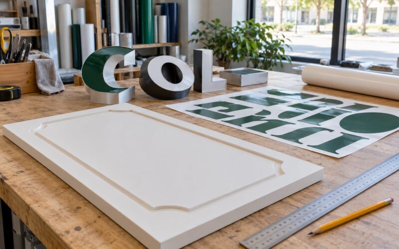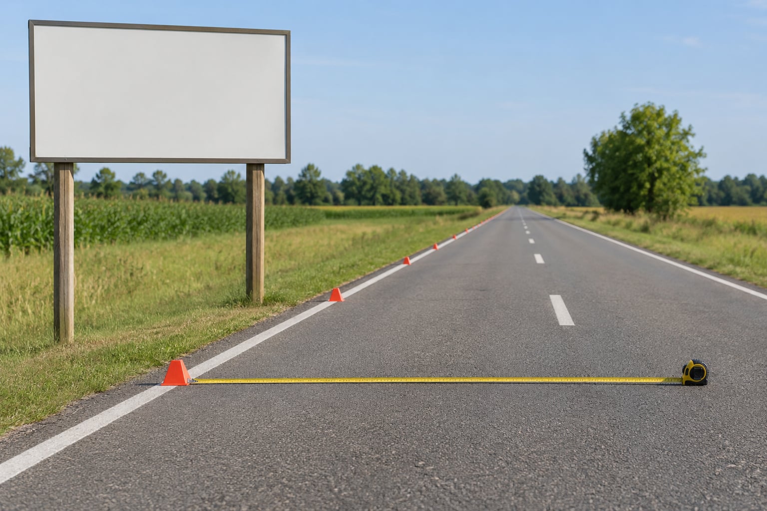
Sign viewing distance is simply how far away your sign has to be read from. The working rule most sign companies use: allow 1 inch of capital letter height for every 10 feet of viewing distance, which means a sign read from 60 feet needs letters about 6 inches tall. That rule assumes dark lettering on a light background, a plain sans-serif typeface, steady light, and a viewer who is standing still. Move any one of those and you adjust the number.
This guide covers how to measure the distance that matters, how to convert it into a letter height you can order, and which design choices quietly cut the readable distance in half. I have sat with fabricators who cut channel letters down to the last inch, and the sizing conversation almost always starts with one measurement: the farthest point anyone will realistically stand or drive.
Table of Contents
- How Far Away Should a Sign Be Read?
- Recognition distance
- Reading distance
- Maximum readable distance
- Impact distance
- Why two different ratios exist
- Sign Viewing Distance Explained for Different Reading Speeds
- What Letter Size Is Needed at Each Distance?
- How to Calculate the Required Sign Size
- How to calculate letter height for your sign viewing distance
- Field test your sign before it ships
- Why Contrast, Font, and Spacing Matter
- Contrast
- Typeface weight and shape
- Letter spacing and line spacing
- Viewing angle and mounting height
- Lighting
- Sign Viewing Distance Examples for Small Businesses
- Storefront sign
- Parking-lot direction sign
- Window decal
- Roadside monument sign
- Delivery vehicle graphic
- Frequently Asked Questions
- How far away can you see 3 inch letters?
- What size font can be seen from 10 feet away?
- Do bigger signs always work better?
- How do I size a sign that is viewed at an angle?
- What if I cannot measure the viewing distance precisely?
- What is the minimum letter height for road signs?
- Conclusion
How Far Away Should a Sign Be Read?
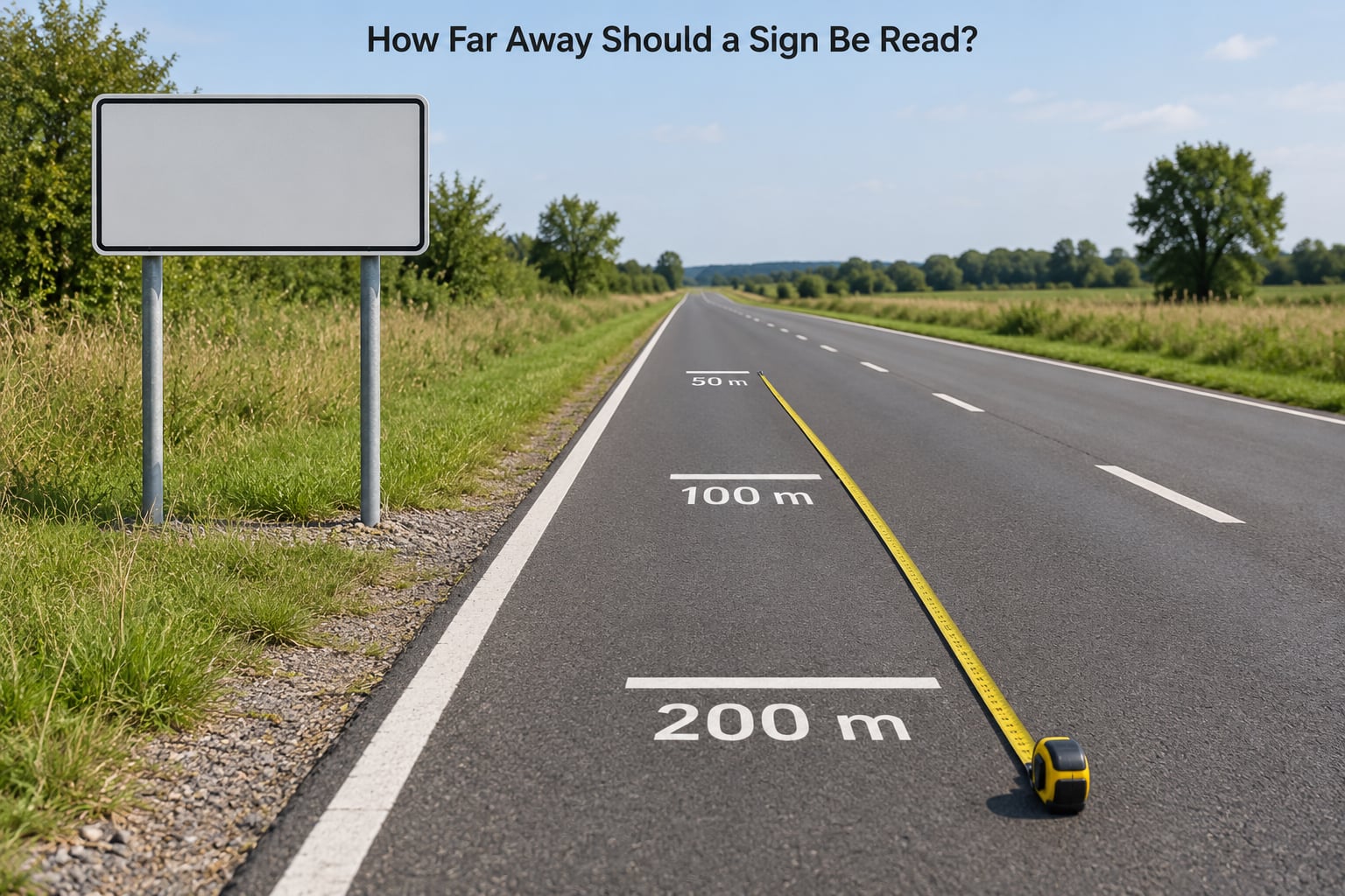
Start with the farthest distance a real viewer will be from the sign, not the distance you would like them to be. A storefront sign 30 feet from the curb is often read from 80 feet down the street by someone who has never seen your business before.
There are four distances worth separating, and most sizing arguments come from mixing them up.
Recognition distance
The point where a viewer notices something is a sign but cannot yet read the words. It is the message saying here is a business, and it is short. Below this distance your sign has failed even if the letters are technically legible.
Reading distance
The distance at which a viewer can comfortably make out the whole message without slowing down or squinting. This is the number the 10-foot rule is really about, and it is the number you should design to.
Maximum readable distance
The limit where letters are still distinguishable but effortful. The same message often stays readable at roughly three times the comfortable reading distance, which is where a lot of sizing confusion comes from. Being technically readable is not the same as being read.
Impact distance
The range where the design still carries punch, before detail is lost. A good example: 3-inch letters have real impact inside 30 feet, while staying nominally readable out to 100 feet. Those are different jobs, and the difference is what makes a sign feel large from across a street.
Why two different ratios exist
You will see 1 inch per 10 feet quoted constantly in the signage trade, usually credited to the United States Sign Council. You will also see traffic engineers quoting 30 to 40 feet of readable distance per inch of letter height. Both are legitimate; they answer different questions. The trade ratio assumes a viewer who is standing still and choosing to read. The traffic ratio assumes a driver moving at speed who has only a couple of seconds of exposure and needs to register a message shape, not words. Choose the one that matches your viewer.
Sign Viewing Distance Explained for Different Reading Speeds
Speed is the variable most people forget, and it changes the answer more than font choice does. The available reading time is simply how long a viewer is in front of your sign before passing it.
| Viewer | Typical speed | Time in front of a sign | What to design for |
|---|---|---|---|
| Pedestrian walking | 3 to 4 mph | Several seconds | Full message can be read |
| Customer in a parking lot | 5 to 10 mph | About 3 to 4 seconds | Business name and one offer |
| Arterial street traffic | 25 to 35 mph | About 2 seconds | Name and logo shape, large letters |
| Highway or ramp | 50 to 65 mph | Under 1.5 seconds | Message shape only, or road-legal guidance |
Under two seconds of exposure, extra words cost more than they add. A driver cannot process a sentence at that pace, so put the business name on the sign and the details on the window or a yard sign beside it.
Traffic volume matters as much as speed. A single car approaching an empty road reads comfortably. The same sign hit by traffic every few seconds has no recovery time for the driver who glanced away, so it needs more size and more contrast, not just the same letters.
What Letter Size Is Needed at Each Distance?
Divide the comfortable reading distance in feet by 10 to get your minimum capital letter height in inches. Below that is a minimum-recognizable figure; go one step higher when you want the sign to feel confident from a distance rather than merely function.
| Viewing distance | Minimum letter height | Comfortable letter height | Metric equivalent |
|---|---|---|---|
| 10 feet | 1 inch | 1.5 inches | 25 mm at 3 m |
| 25 feet | 2.5 inches | 3 inches | 65 mm at 7.5 m |
| 50 feet | 5 inches | 6 inches | 125 mm at 15 m |
| 100 feet | 10 inches | 12 inches | 250 mm at 30 m |
| 200 feet | 20 inches | 24 inches | 500 mm at 60 m |
Measure capital letter height, not font point size. A typeface printed at 72 points has a different capital height from another printed at 72 points, and font size is not a reliable proxy for what a viewer sees across a parking lot.
How to Calculate the Required Sign Size
How to calculate letter height for your sign viewing distance
The method takes five steps and about ten minutes. Work through them in order and you will have a number you can hand to a fabricator instead of a guess.
- Measure the farthest realistic viewing point. Walk the approach from every direction. Include the corner people turn from, not just the straight-on view.
- Divide that distance in feet by 10. This is your minimum capital letter height in inches.
- Add about 20 percent if viewers are moving or viewing at an angle. Angled mounting and passing traffic both cut your effective reading time.
- Add another 20 percent if you are using a serif, script or decorative typeface. Thin strokes and closed counters fill in at distance.
- Field test before you order. Print the message at scale, tape it to a wall, and walk backward until it blurs.
Then work out the total sign width. As a working width, allow roughly six times your letter height for a one-word message, and more if there are two lines. Add a margin of about half the letter height on every side so the type does not crowd the edge.
Field test your sign before it ships
Print a full-size proof, tape it to a wall at mounting height, and stand back in stages. Most people find their chosen size is one step too small at the intended distance, which is far cheaper to learn now than after fabrication.
Why Contrast, Font, and Spacing Matter
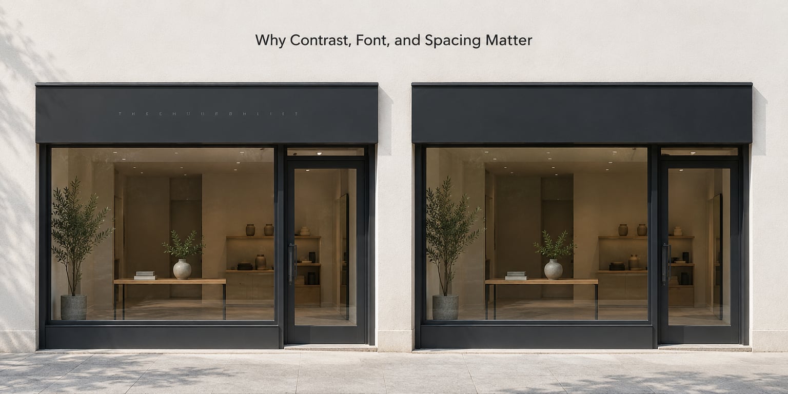
A correctly sized sign still fails when the design works against it. These are the adjustments that move the number.
Contrast
Dark lettering on a light background, or light lettering on a dark one, is the safe pair. Low-contrast combinations such as light gray on white or medium blue on dark gray can cut effective readable distance by 30 to 50 percent. If your brand palette is low contrast, the answer is a contrasting panel or outline rather than bigger letters.
Typeface weight and shape
Choose a bold or black weight sans-serif with open counters, and use mixed case rather than all caps where the message allows it. Mixed case gives you an x-height in the lowercase letters, which adds perceived size without adding a single inch. Avoid thin weights, hairline serifs, and script.
Letter spacing and line spacing
Space letters evenly and set line spacing at roughly 1.2 to 1.5 times the letter height. Tight tracking makes a word read as a blur; over-wide tracking breaks it into separate shapes. Signs running to more than two lines lose most viewers after the first line, so cut copy rather than shrinking type.
Viewing angle and mounting height
Effective distance is a straight line, not a floor measurement. A sign mounted 30 feet above the street and set back 40 feet is effectively about 50 feet away. If it is turned well off the direction of approach, add 20 percent to the letter height and accept that some viewers will see it at an oblique angle.
Lighting
Backlit channel letters, illuminated cabinet signs, and reflective sheeting extend readable distance, often by 1.5 to 2 times, because the message stays bright as ambient light falls. A matte finish reduces glare at the angles that hurt most. If your sign is unlit at night, size for the darker of your two conditions.
| Condition | Effect on required letter height |
|---|---|
| Clean background, straight-on, standing viewer | Baseline: distance divided by 10 |
| Busy background or low contrast colors | Add 20 to 50 percent |
| Viewing at an angle or from below | Add 20 percent |
| Viewers in moving vehicles | Multiply by 1.5 to 2 |
| Serif, script or decorative typeface | Add 20 percent |
| Illuminated or reflective at night | Reduce up to 30 percent, or extend range |
| Low light, sun glare, wet reflective surface | Add 20 to 30 percent |
Sign Viewing Distance Examples for Small Businesses
Here is the rule applied to five everyday situations, with the weak version and the legible version side by side.
Storefront sign
A 12-foot storefront read from across a 30-foot sidewalk plus street parking gives a realistic distance of about 60 feet. Thin 3-inch letters in a light script fail there. A business name in 7-inch bold sans-serif, plus one line of 3-inch supporting text below it, works at the same distance. Practical read range: 60 to 70 feet.
Parking-lot direction sign
A post-mounted sign at the lot entrance is read from about 80 feet by a driver turning in at 10 mph, with roughly 4 seconds of exposure. One arrow and one word such as ORDER or PICKUP in 8-inch letters is readable. Four words at 4 inches is not. Practical read range: 70 to 90 feet.
Window decal
Window graphics are read from 6 to 10 feet away by someone walking or standing. Here the trade rule gives an unhelpful 1 inch, so use 2 to 3 inch letters for the hours or the headline, since the reader is close and expects detail. Practical read range: 8 to 12 feet.
Roadside monument sign
Assume the farthest useful read is 150 feet for a driver doing 35 mph, then multiply for motion. A name in 18-inch letters with 6-inch supporting text is a realistic build. Copy that expects a driver to read a sentence at that speed will not land. Practical read range: 120 to 180 feet.
Delivery vehicle graphic
A van travels alongside and behind other vehicles, usually at 30 to 45 mph, and the message must land in a moment. Keep the logo large and simple, ideally readable within 50 feet, and resist adding a service list and phone number to the rear doors. Practical read range: 40 to 60 feet.
Two legal floors sit underneath all of this. ADA signage sets a minimum visual character height, and highway signage follows the Manual on Uniform Traffic Control Devices. Those are compliance requirements, not design targets, and they sit well below what a commercial sign needs to do its job.
Frequently Asked Questions
How far away can you see 3 inch letters?
Using the 1 inch per 10 feet rule, 3-inch capital letters give a comfortable read at about 30 feet and stay nominally readable out to roughly 90 feet. They make real visual impact inside 30 feet, which is the range that matters most for storefront and roadside work. For passing vehicle traffic, multiply the distance by 1.5 to 2, so 3 inches is a 45 to 60 foot message.
What size font can be seen from 10 feet away?
At 10 feet of viewing distance, 1 inch of capital letter height is the bare minimum and 1.5 inches reads comfortably. That means an uppercase message needs roughly a 16 to 24 point font, but measure the capital height in your artwork rather than trusting point size, since typefaces differ. On a window decal or reception sign at this distance, go larger and put less copy on it.
Do bigger signs always work better?
Not always. A larger sign with low contrast, a thin typeface or too many words can be harder to read than a smaller, cleaner one. Size only helps when the letterforms, contrast and spacing hold up at that distance. If you cannot increase letter height because of zoning or budget, a contrasting panel, a bolder weight and fewer words will improve legibility far more than adding area to the panel.
How do I size a sign that is viewed at an angle?
Measure the straight-line distance from the farthest viewer to the sign, then add about 20 percent to the letter height. Angle reduces the apparent size of the letters and shortens the time a viewer spends facing the sign. Signs turned 45 degrees off the direction of traffic often need another 20 to 30 percent on top of that. Where you can, rotate the sign to face the approach instead of over-sizing it.
What if I cannot measure the viewing distance precisely?
Measure what you can and estimate the rest conservatively. Mark the curb, the property line and the far corner of the nearest cross street, then round up to the next 10 feet. When in doubt, use the distance from the nearest public road rather than from your own lot, since strangers stop and view from further out than regulars do. A full-size taped proof settles the question in ten minutes.
What is the minimum letter height for road signs?
Public road signs follow the Manual on Uniform Traffic Control Devices, which sets letter heights by posted speed and road class rather than by a single ratio, and they are specified in feet for the primary message and smaller sizes for supplemental panels. Permanent business and building signage is governed locally by zoning and sign ordinances. Commercial signs rarely benefit from copying traffic sign minimums, because those assume a driver, not a customer on foot.
Conclusion
Measure the farthest realistic viewing distance first, work out how many seconds a viewer actually has, then divide the distance by 10 to set letter height and adjust for motion, angle and contrast. Tape a full-size proof to a wall and walk back before you order anything.