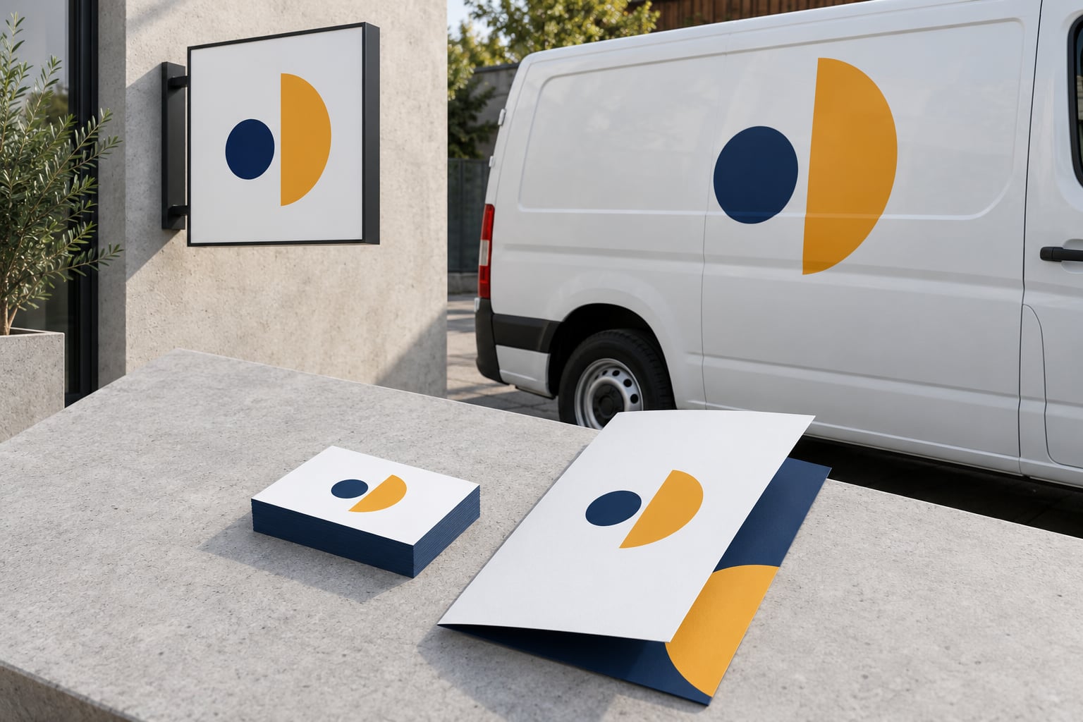
Brand consistency across signs, vehicles and print means every physical piece a business makes carries the same approved logo, the same two or three colors, the same typefaces and the same contact details. A customer should be able to see a storefront sign, a van in traffic and a business card and still read all three as one business.
That sounds simple until you count the hands involved. The sign company, the wrap installer and the print shop each receive files separately, work from their own idea of your brand, and deliver on different schedules. Consistency across signs vehicles and print is not really a design problem. It is a handoff problem, and it gets solved by writing down a few specifications once and making every vendor work from them.
Below is the system I would hand a small business on day one: what to lock down, how to adapt it per medium, and the order of operations that keeps a sign, a van and a flyer looking like they belong together.
Table of Contents
- Brand Consistency Across Signs, Vehicles and Print at a Glance
- What Is Brand Consistency and Why Does It Matter?
- How Do You Build a Consistent Visual Identity?
- Lock one logo master and define its clear space
- Define two colors twice, once for print and once for screen
- Pick two typefaces and fix a size floor for each medium
- Write the rules down before you need them
- How Do You Keep Signs and Vehicle Wraps on Brand?
- Signs: design for viewing distance, not reading distance
- Vehicles: build the layout like road signage
- What to send the sign and wrap vendor
- How Do You Make Print Materials Match Your Brand?
- Where Pantone, CMYK, RGB and HEX fit
- Templates beat new files every time
- Brand Consistency Across Signs, Vehicles and Print: A Simple Workflow
- The five things every vendor needs before production starts
- What Mistakes Make a Brand Look Inconsistent?
- Frequently Asked Questions
- How many colors should a small-business brand use across signs, vehicles and print?
- Should the same logo appear on every sign and vehicle graphic?
- How do you make a logo readable on both a storefront sign and a business card?
- What is the best way to share brand guidelines with sign and printing vendors?
- Can a small business create consistent marketing materials without a designer?
- How often should a business review its signage and print materials for consistency?
- Conclusion
Brand Consistency Across Signs, Vehicles and Print at a Glance
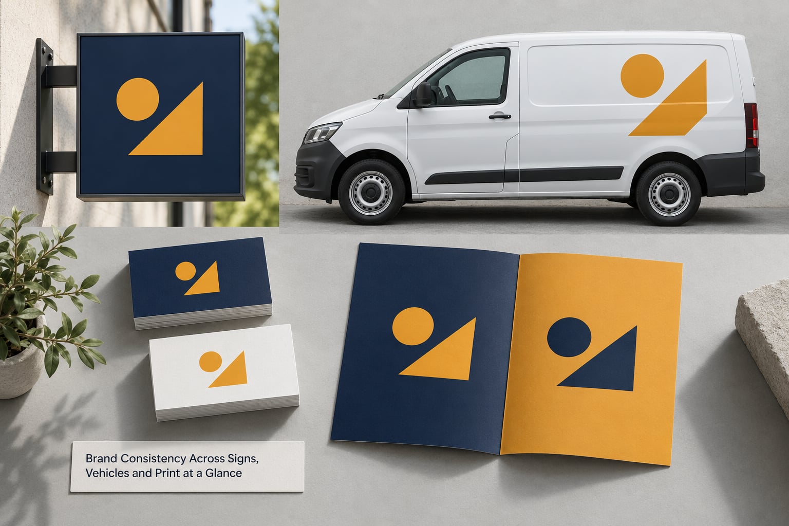
Five elements decide whether a physical item looks on-brand. They stay fixed everywhere; only their size and placement change per medium.
| Brand element | On signs | On vehicles | On print |
|---|---|---|---|
| Logo | One file, one proportion, wide clear space, never stretched to fill | Fixed position on the panel, sized for distance not for detail | Vector master at full size, never a screenshot |
| Color | Primary color dominates, contrast against the wall or fascia | Large flat fields, no gradients, no tinting of the primary | Spot color where the job allows, CMYK build otherwise |
| Typography | One face, heavy weight, readable at 40 to 60 feet | One face, minimal copy, readable in motion | Heading and body pair, sized for hand or arm’s-length reading |
| Contact path | One route to act: phone, URL or QR, never all three | Shortest legible URL or number, large enough to read while moving | Full details can appear here |
| Imagery | Usually none, or a single approved photo | Only if the photo is shot to the brand standard | Same photo library as the website, same crop rules |
Read the table by column and you see the same brand in three different jobs. The logo is never redesigned, only resized and repositioned. The primary color stays pure on everything.
What Is Brand Consistency and Why Does It Matter?
Brand consistency is the repeated use of the same colors, fonts, logo treatment, spacing and voice across every item a business produces, so that recognition builds without anyone having to stop and read.
Consistency does not mean every item looks identical. A van and a business card have different shapes, distances and jobs. Consistency means the same underlying system shows through each one.
Here is the uncomfortable part. Practitioners on r/branding describe drift as arriving slowly, one rushed decision at a time, rather than as a single bad choice. Nobody sets out to break the brand. A van gets a logo pulled from an old slide deck, a flyer gets built from a screenshot, and the two pieces now disagree.
Four patterns come up again and again. One agency reported opening a client folder containing nine different logo files with no labels. Vendors get whatever was emailed last, so a low-resolution file ends up on a storefront. Two departments pick a “close enough” blue, and neither matches the printed version because nobody named a single value. And brand guidelines that run twenty pages never get read by the people who need them, which is why the advice in that community is to keep the guide short.
Drift is invisible from inside. Each vendor sees only their own version, so the mismatch usually surfaces when a customer notices. That is also why it is expensive. A mismatch found during design costs nothing to fix. Found after a wrap is installed or a sign is mounted, it means a reprint.
How Do You Build a Consistent Visual Identity?
Build the identity from four fixed assets and one document. The document is short, specific and full of exact values, not adjectives.
Lock one logo master and define its clear space
Pick a single vector logo file and archive it somewhere everyone can reach. Then write down the minimum size it can be used at, and how much empty space must sit around it on every side. That rule is what stops a designer from dropping your mark into a crowded layout.
Delete every other version you have. If you genuinely need a second variant, give it a number, a file name and a note on when it may be used.
Define two colors twice, once for print and once for screen
Choose one primary color and one or two supporting colors. Then specify each one in both systems: a Pantone or CMYK value for anything printed, cut or wrapped, and a matched RGB and HEX value for screens, social profiles and email.
Screen light and printed ink are different physics. A saturated HEX value will not land on vinyl as the same hue, and a metallic or reflective film will read lighter again in daylight. Matching them once, in writing, beats asking three vendors to guess.
Pick two typefaces and fix a size floor for each medium
One face for headings, one for body copy. License them properly so a sign shop and a printer can both install them. Then state the smallest size allowed on a sign, the smallest on a vehicle, and the smallest in print.
Write the rules down before you need them
A one or two page brand style guide with a logo page, a color page and a typography page is enough to govern signs, vehicles and print. Longer documents go unread. The value is in the exact numbers: hex codes, Pantone references, minimum heights, clear space in inches, and the single contact path your brand uses.
How Do You Keep Signs and Vehicle Wraps on Brand?
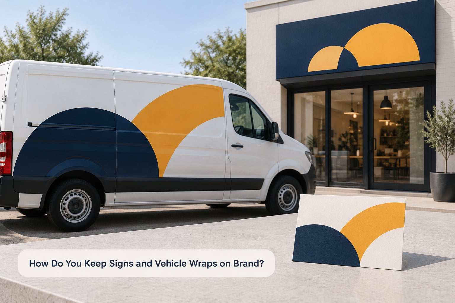
Both are seen at a distance, in motion, under daylight you do not control. Treat both as distance media, and change nothing about the assets themselves.
Signs: design for viewing distance, not reading distance
A sign has seconds to work. Test by standing at the distance you expect a passerby to be and asking whether you can name the business in one glance. If not, the type is too light or the copy is too long.
Check contrast against the surface behind it, not against white paper. Dark lettering on a light fascia works; light lettering on a sunlit wall at noon does not. If your logo is a light color, put it on a dark panel rather than fading it.
Vehicles: build the layout like road signage
A driver gets a fraction of the sign’s viewing time. Lead with the logo, then one message, then one way to reach you. A short URL that reads at speed beats a phone number, a slogan and a list of services, which reads as nothing at all.
Keep contact details above the beltline where body panels stay flatter and distortion is lower. Leave room for door handles, seams and liftgate hardware, and remember that panel breaks and curves distort artwork after installation. A wrap is not a flat sheet that happens to be bent.
Material choice changes how the color reads. A gloss finish is more saturated and more reflective; matte and satin look closer to ink on paper; reflective film is designed to catch headlights at night and will look lighter in daylight than the same color on an indoor mockup. Pick finishes once and specify them, so every vehicle in the fleet matches.
What to send the sign and wrap vendor
Send the vector logo, the exact color values, the minimum sizes, the clear space rule and a reference photo of an approved example. State whether you want a proof before production, and say who signs off. Vendors on sign-industry forums argue about wrap film brands constantly, which is fair, but no film choice rescues artwork sent without specifications.
How Do You Make Print Materials Match Your Brand?
Print is where small decisions accumulate. Paper white, ink coverage and finishing all shift the color you approved on screen.
Where Pantone, CMYK, RGB and HEX fit
HEX and RGB describe light and belong to screens. CMYK describes ink and belongs to print. Pantone is a pre-mixed spot ink matched to a numbered swatch, and it is the most reliable way to get the same color on a business card, a brochure and a banner, because it removes the guesswork from the CMYK build.
Print work that crosses from a screen file to a printer is where “close enough” gets expensive. When the design comes from a monitor, give the printer the Pantone reference rather than a hex value and hope. Ask for a physical proof on the actual stock before a full run, and compare it under the same light you saw the screen in.
Templates beat new files every time
Build one locked template per item: business card, flyer, invoice, quote sheet, thank-you card. Staff fill in fields, they do not redesign layouts. This is the single biggest consistency win most small businesses can make, because it removes the designer from the everyday workflow.
Hand the printer your logo as vector art at full size, your color values, and a marked-up proof of what you expect. Ask them to confirm in writing that they received vector artwork and your spot references. A file forwarded twice becomes a JPEG after two forwards.
Brand Consistency Across Signs, Vehicles and Print: A Simple Workflow
Run this in order. It takes an afternoon the first time and about an hour a year after that.
- Audit what exists. Walk the premises, the yard and the storeroom. Photograph every sign, vehicle and printed piece in service. List them against what your style guide says.
- Name the drift. Sort the list into wrong color, wrong file, wrong type, wrong placement and out of date. Most businesses find a handful of each.
- Write the brand guide. Keep it to two or three pages with exact values, not mood words.
- Archive approved files in one place. One folder, named clearly, no duplicates. This is what kills the nine-logo problem.
- Build master templates. One per application, locked, with editable text fields only.
- Set priorities. Fix what customers see most first: the storefront sign, then vehicles in daily use, then the collateral customers handle.
- Brief every vendor the same way. Approved files, exact colors, minimum sizes, proof required, named approver.
- Review on a schedule. Twice a year, re-shoot the same photographs and compare. Fading vinyl and sun-bleached panels drift quietly.
The five things every vendor needs before production starts
Supply the approved vector logo, not a link to your website. Supply color values in the correct system for their process. Supply minimum sizes and clear space rules in physical units. Require a proof or sample sign-off before the run. And name one person who approves, so nobody is waiting on an answer while production sits idle.
For multi-location or franchise work, add a written rule for what may vary locally. Phone number and opening hours are usually fine. Logo, color and typeface are usually not.
What Mistakes Make a Brand Look Inconsistent?
These show up in almost every audit I have looked at. Each has a one-line fix.
- Stretched logo. Lock the aspect ratio and resize from one side only.
- Two shades of the same blue. Publish one hex value and one Pantone, then retire the rest.
- A rogue typeface. Limit the brand to two licensed faces and state the fallback for signs, where fonts often go missing.
- Low contrast. Test against the real background in daylight, not on a white screen.
- Everything crammed in. Cut to the logo, one message and one contact path.
- The logo in a different spot each time. Fix the position rule per surface and reuse the same layout file.
- Different phone numbers. One number on everything, including the van.
- Low-resolution artwork. Vector files for anything cut, printed or wrapped. Bitmaps only for photographs.
- Brand drift nobody logged. Keep a shared list of every physical asset with its install date, so replacing one faded panel does not start a redesign.
Frequently Asked Questions
How many colors should a small-business brand use across signs, vehicles and print?
One primary color plus one or two supporting colors is enough for almost every small business. The limit matters more than the number: on a sign and a van, each additional color adds another chance to mismatch. Define each color once for print as a Pantone or CMYK value, and once for screen as its matched RGB and HEX value, so the same hue survives the move between media.
Should the same logo appear on every sign and vehicle graphic?
Yes, the same approved artwork every time. What changes is size and position, not the file or its proportions. Keep one vector master, set a minimum size below which the logo loses detail, and define clear space around it. If you need a second variant for a constrained surface, name it, number it and state exactly when it may be used.
How do you make a logo readable on both a storefront sign and a business card?
Design for the smallest case, then scale up. Build the layout so the logo holds up small, and the sign simply becomes a larger instance of the same mark. Avoid fine detail, thin strokes and small text inside the logo. If a sign uses a lighter weight or a simplified version, treat that as a specified exception in your brand guide rather than a rule.
What is the best way to share brand guidelines with sign and printing vendors?
Send one folder containing vector logo files, exact color values, minimum sizes, clear space rules and a photo of an approved example, then add the vendor-specific note about their process. Ask for a proof before a full run, and name the person who approves. Keep the written guide to a couple of pages, because a long document does not get read at the point of production.
Can a small business create consistent marketing materials without a designer?
Yes, if you build templates once and stop designing new layouts. Use a locked template per item, restrict staff to filling text fields, and hold one approved file folder. Spend designer time on the things that need judgment: the logo, the color specification and the sign and vehicle layouts that have to survive distance. Everything routine can then be produced in-house.
How often should a business review its signage and print materials for consistency?
Twice a year is a workable cadence for most businesses, and once a year at minimum. Walk the premises and the yard, re-photograph every sign and vehicle in the same positions, and compare them against the current guide. Fading film, sun-bleached panels and outdated phone numbers drift quietly, so the review only works if you take fresh photographs each time.
Conclusion
Start with the folder, not the redesign. Put one approved logo file, two color values in both print and screen systems, two typefaces and your contact path into a single document, then rebuild the storefront sign, the vehicle graphics and your main printed pieces from that one source.
Consistency across signs vehicles and print does not mean identical pieces. It means one system underneath, adapted to what each surface has to do, so a customer who meets your brand on the road, at your door and in their inbox still recognizes the same business each time.