Contrast rules for readable signage are the standards that set how much visual difference must exist between a sign’s text and its background so the message can be read quickly, usually expressed as a contrast ratio of at least 4.5:1 for normal-size text and 3:1 for large text. Contrast decides whether a sign registers at all, because a storefront message is often read for two seconds, at an angle, in glare or at dusk.
Most signage problems are not font problems. They are contrast problems wearing a font costume: light grey letters on a white panel, a colour scheme that looks tidy on a screen and disappears the moment it is printed and mounted.
Table of Contents
- What Are Contrast Rules for Readable Signage?
- Color contrast and brightness contrast are not the same thing
- Typographic contrast is about weight and spacing, not hue
- How Do Contrast Ratios Work?
- What is a good contrast ratio for signage?
- Which Contrast Rules Apply to Different Sign Types?
- ADA room and space identification signs have their own numeric rule
- What Color Combinations Make Signs Easier to Read?
- How Do Lighting, Distance, and Sign Size Affect Contrast?
- How Can You Test Contrast Before Ordering a Sign?
- What to do when brand colors cannot change
- Frequently Asked Questions
- What are the best color combinations for signage?
- What contrast ratio is required for signs?
- Do ADA signs have to be high contrast?
- Is red on green bad for signage?
- What is the minimum letter size for a sign?
- Do NEC electrical code requirements set sign contrast rules?
- Conclusion: Start With Contrast, Then Test in Context
What Are Contrast Rules for Readable Signage?
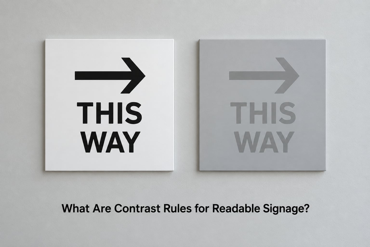
In plain terms, these are the guidelines that decide how distinguishable the lettering on a sign is from its background. The working unit is the contrast ratio, a number between 1:1 and 21:1. A ratio of 1:1 means identical tones, so the text disappears entirely.
It helps to separate three things people lump together under the word contrast.
Color contrast and brightness contrast are not the same thing
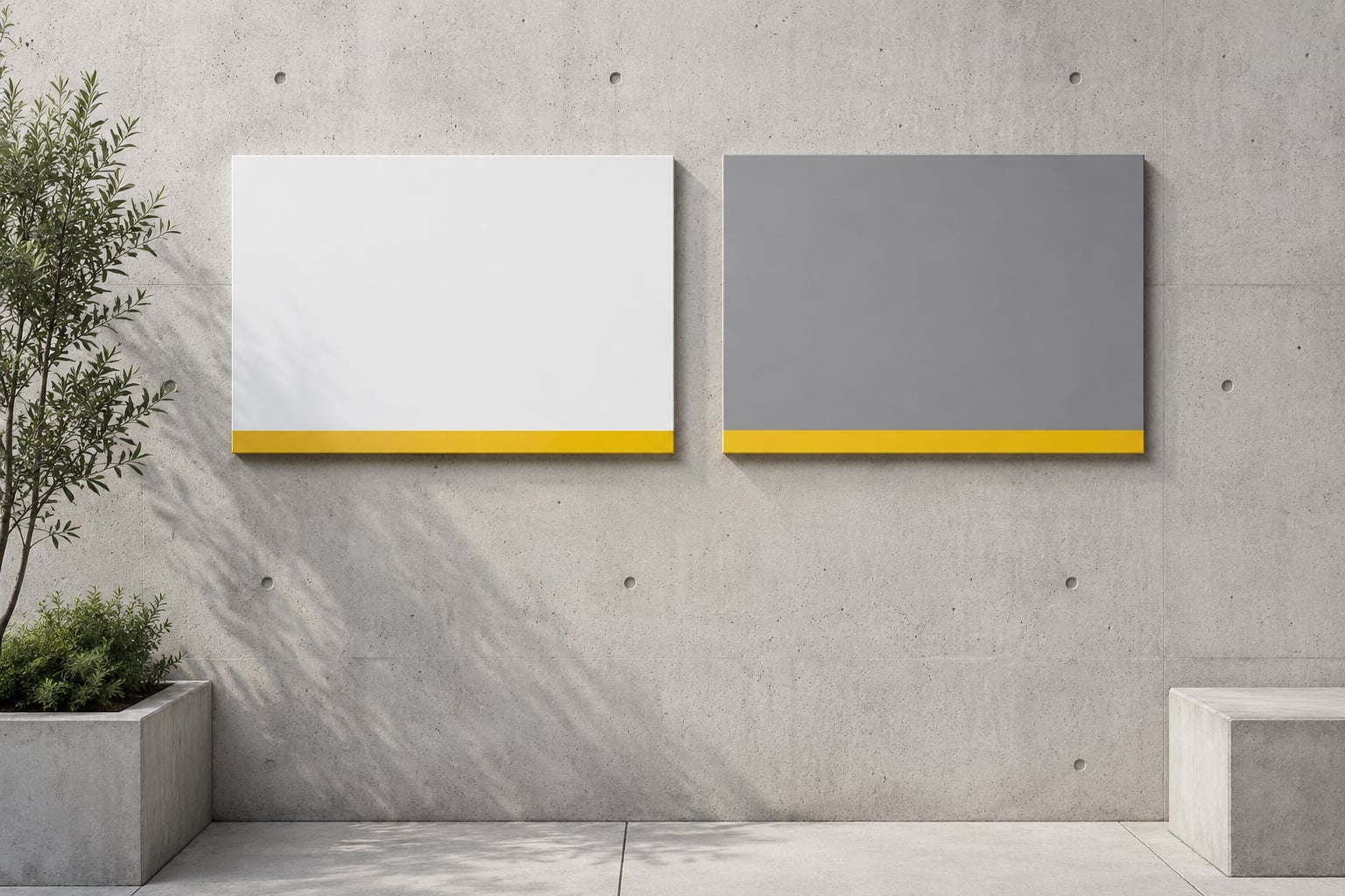
Colour contrast asks whether two hues separate from each other. Brightness contrast, sometimes called luminance contrast, asks how much light one returns versus the other. A pure blue and a pure red can look unrelated while sitting at nearly the same brightness, which is why some colour pairs fail even though they look strong side by side on a monitor.
This matters outdoors. Under bright sun, everything bright washes toward white and everything shaded drops toward grey, so a pairing that clears the bar indoors can collapse in afternoon glare.
Typographic contrast is about weight and spacing, not hue
Typographic contrast is the visual separation between the letters themselves: a bold sans-serif against a lighter weight, generous letter spacing, or a wide stroke against a dense background. A sign can have a superb colour contrast ratio and still be hard to read if the type is thin, tightly tracked, or squeezed against the edge of the panel.
Weight, stroke width and spacing matter more at distance than most designers expect. When letters shrink in the viewer’s retina, thin strokes fade before colour does.
How Do Contrast Ratios Work?
A contrast ratio measures the brightness difference between two colours. Every colour gets a relative luminance value from 0 for absolute black to 1 for absolute white. Divide the lighter value by the darker one, add 0.05 to each, and you get a ratio from 1:1 to 21:1. Black on white is the maximum at 21:1.
What is a good contrast ratio for signage?
The thresholds come from the Web Content Accessibility Guidelines, and they are the numbers most sign designers borrow because they are the ones with tooling behind them. WCAG 2.1 was written for screens, not signs, but the ratio itself transfers well because it measures the same thing: how far a letter separates from its background.
| Contrast ratio | Applies to | Why it exists |
|---|---|---|
| 21:1 | Black on white, maximum possible | Highest separation available; use it when the sign is small, distant, or badly lit |
| 7:1 | Enhanced (AAA) contrast, normal text | For readers with reduced vision, glare, or a low-contrast viewing environment |
| 4.5:1 | Standard minimum (AA), normal text | The usual working minimum for body-sized lettering on business signage |
| 3:1 | Standard minimum (AA), large text | Applies once text is roughly 18pt bold or 24pt regular and up |
| Below 3:1 | Decorative or supporting text only | Fails every accessibility standard; fine for a background texture, not for a message |
The large-text allowance is not a loophole. Bigger letters present more strokes to the eye and survive blur and low light, so the standard drops to 3:1. A roadside pylon sign with two-foot-tall letters can pass at 3:1; a window decal with three-quarter-inch lettering cannot.
Which Contrast Rules Apply to Different Sign Types?
The minimum ratio is the floor, not the goal. The harder the viewing conditions, the further above the floor you should sit.
| Sign type | Working contrast target | Conditions that make it harder |
|---|---|---|
| Roadside pylon or monument | 7:1 or higher | Long distance, moving traffic, sun behind the viewer, 40-plus eyes |
| Storefront fascia or blade sign | 4.5:1, higher if lettering is small | Shade from awnings, reflections from parked cars, evening light |
| Interior wayfinding | 4.5:1 standard, 7:1 preferred | Backlit panels, dim corridors, glossy laminate reflections |
| Window graphics and decals | 4.5:1 against whatever is behind the glass | Changing backgrounds, interior shadows, reverse-reading from outside |
| Vehicle wraps | 4.5:1, plus simplified messaging | Motion, partial obstruction, changing light angles, distance |
| Temporary or yard signs | 4.5:1 minimum | Weather, fading, low-cost substrates |
| Illuminated or digital | Measured on-screen at final brightness | Halo lighting washing the letter edges, screen brightness in daylight |
ADA room and space identification signs have their own numeric rule
The ADA Standards for Accessible Design require characters and background to contrast and require a non-glare or matte finish, but they do not publish a single numeric ratio for room identification signs. What they do specify is measurable: character height from 5/8 inch to 2 inches, a minimum of 1/8 inch between characters, Grade 2 Braille, tactile characters raised a minimum of 1/32 inch, and mounting between 48 and 60 inches above the finished floor to the baseline.
Traffic and on-premise guide signs sit under a separate system, the Manual on Uniform Traffic Control Devices, which uses its own contrast criteria. If you need a compliance answer for a specific sign, ask the authority having jurisdiction over your building rather than relying on a web contrast checker.
What Color Combinations Make Signs Easier to Read?
High contrast color combinations for signage come down to one idea: separate the brightness of the two colours, then worry about hue. The ratios below are approximate values computed with the WCAG luminance formula, and they treat the pair as flat colours before printing.
| Foreground on background | Approximate ratio | Verdict |
|---|---|---|
| Black (#000000) on white (#FFFFFF) | 21:1 | Best available, works at any distance |
| Black on safety yellow (#FFD100) | 14.4:1 | Strong, and reads well in low light |
| White on navy (#003366) | 12.6:1 | Professional look with real separation |
| Navy on white | 12.6:1 | Same ratio, easier to fabricate |
| Dark grey (#4A4A4A) on white | 8.9:1 | Clean and softer than pure black |
| Dark green (#1B5E20) on white | 7.9:1 | Pairs well with landscaping and food |
| White on red (#C8102E) | 5.9:1 | Passes for large text, thin for small |
| Muted grey (#808080) on white | 3.9:1 | Fails normal text, passable for large lettering only |
| Red (#C8102E) on dark green (#1B5E20) | 1.3:1 | Unreadable, avoid entirely |
| Dark navy on black | 1.9:1 | Effectively invisible outdoors |
| Dark purple (#4B2E83) on black | 2.0:1 | Fails, and disappears faster as light drops |
| Pale yellow (#FFF200) on white | about 1:1 | No separation at all, a common yard sign error |
Red on green deserves its own note because it comes up constantly. It fails for two separate reasons at once: the luminance gap is tiny, and roughly 1 in 12 men has a red-green colour vision deficiency. A pairing that fails on both counts cannot be rescued by bolder type.
The same caution applies to brown on green, dark purple on black, and any blue-on-yellow scheme used for small text. On r/graphic_design, designers keep hitting the same wall with muted brand greys that look perfectly legible on a monitor and drop below the minimum once printed.
How Do Lighting, Distance, and Sign Size Affect Contrast?
Contrast is a starting value that real conditions edit. Four variables matter most.
Viewing distance and letter height. The most common rule of thumb in the trade is roughly one inch of letter height for every ten feet of readable distance, with higher-speed and multi-lane roadside signage needing considerably more. Measure to the farthest point where someone should be able to read the message, not to the nearest car at the kerb.
Finish. Gloss and reflection destroy approved contrast. A high-gloss laminate can mirror a sky, a shop window, or a car headlight across the letters at exactly the angle a driver is looking from. Matte or satin finishes are the safer choice for anything read at an angle, and non-glare finishes are required for ADA room and space identification signs.
Illumination. Halo lighting, where the sign glows behind cut letters, reduces contrast because the light bleeds into the letter face and softens its edges. Front-lit or internally illuminated channel letters hold their edge better. For digital displays, check contrast at full brightness outdoors, not at the dimmed setting that looks comfortable in the shop.
Age and condition. Ultraviolet exposure fades vinyl and paint unevenly, and the colour that fades first is usually not the one you expected. Inspect outdoor signage annually and compare a current sample against the original colour value. Separately, contrast that works for a 25-year-old will not work for a 60-year-old, which is why roadside signage usually out-specifies interior ones.
How Can You Test Contrast Before Ordering a Sign?
Checking contrast takes about ten minutes if you do it before artwork goes to the fabricator rather than after the truck arrives.
Here is the order that works, and the keyword to search is how to check sign contrast before printing.
Step 1: Get the exact colour values. Pull the foreground and background hex values from your design file rather than eyeballing them. If you only have a photograph of an existing sign, sample it with an eyedropper tool, but treat that number as approximate since cameras and screens shift colour.
Step 2: Run both colours through a checker. WebAIM’s Contrast Checker and the TPGi Colour Contrast Analyser are free and work in a browser. Enter the lighter value first. A pass at 4.5:1 for normal text and 3:1 for large text is your screen-side baseline.
Step 3: Convert to print values and re-check. This is the step most people skip. Screens render in RGB and print in CMYK, and saturated blues, bright greens and purples shift noticeably in conversion, usually losing brightness and therefore losing contrast. Ask your printer for the CMYK build, or design in CMYK from the start, then run the converted pair through the checker again.
Step 4: Judge letter size and distance together. If the ratio sits between 3:1 and 4.5:1, it only passes if the lettering is genuinely large, so measure the cap height and compare it to the intended viewing distance.
Step 5: Print a physical proof and view it in place. Hold the printed proof at arm’s length, then look at it from across the street. Then check it under the actual lighting at different times of day. No checker models glare, dirt, fade, or a busy background behind glass.
What to do when brand colors cannot change
Locked brand colours are the most common real-world constraint, and there is a workable answer. Keep the brand hue and move everything around it: darken or lighten the field colour until the ratio passes, place the brand colour in a solid panel with a high-contrast border, or invert the panel to light-on-dark, which changes the luminance relationship without changing either colour. If a hue simply cannot reach the minimum against any neutral, set it on a white or black plate and let the plate carry the contrast.
Avoid gradients, photographic backgrounds, and texture behind text. Design teams on r/graphic_design describe the same failure repeatedly: text that passes every screen check and then vanishes against a busy image at print stage.
Frequently Asked Questions
What are the best color combinations for signage?
Black on white gives the highest possible contrast at 21:1 and works at any viewing distance. Other reliable pairings include black on safety yellow, white on navy, navy on white, dark green on white, and white on red for large text. Choose pairs with a wide brightness gap rather than pairs that merely look different, and re-check the values after CMYK conversion.
What contrast ratio is required for signs?
Most sign designers work from the WCAG 2.1 thresholds because they have measurement tools behind them: 4.5:1 for normal-size text, 3:1 for large text of roughly 18pt bold or 24pt regular, and 7:1 for enhanced contrast. Roadside and illuminated signage should sit at 7:1 or higher because viewing conditions are far worse than on a screen.
Do ADA signs have to be high contrast?
The ADA Standards for Accessible Design require characters and background to contrast and require a non-glare or matte finish, but they do not set one numeric ratio for room identification signs. They do specify measurable values: character height from 5/8 inch to 2 inches, 1/8 inch minimum spacing between characters, Grade 2 Braille, and mounting between 48 and 60 inches above the floor.
Is red on green bad for signage?
Yes, and it fails twice over. The brightness difference between a typical red and a typical dark green is close to 1.3:1, far below any minimum, and roughly 1 in 12 men has a red-green colour vision deficiency that removes the hue difference entirely. Use white on red or white on green instead, and never rely on hue alone to carry a message.
What is the minimum letter size for a sign?
There is no single minimum for every sign, because letter height depends on viewing distance. A widely used rule of thumb is about one inch of letter height for every ten feet of readable distance, with faster traffic and multi-lane roadside locations needing more. ADA room and space identification signs specify 5/8 inch as the smallest character height.
Do NEC electrical code requirements set sign contrast rules?
No. The National Electrical Code covers wiring, grounding, listings, and installation of illuminated and electrical signs, not colour contrast or legibility. Contrast guidance comes from the ADA Standards for Accessible Design, WCAG ratios, and the Manual on Uniform Traffic Control Devices for traffic and on-premise guide signs. If a sign is both illuminated and accessible, you may need to satisfy the NEC and the ADA on the same installation.
Conclusion: Start With Contrast, Then Test in Context
Pick a foreground and background pair with a wide brightness gap, target 4.5:1 for ordinary lettering and 7:1 for anything read at distance, then re-run those values after CMYK conversion. Hold a printed proof at the distance the sign will actually be read from, in the light it will actually be read in, before the artwork is approved.