To pick sign colors that match your brand, start with the exact color values in your brand guidelines, then confirm each pairing has enough contrast to read from the distance your sign will be seen, and finally check how that color actually renders on your material under your lighting. Most businesses get the brand half right and the visibility half wrong. This takes about an hour of planning plus one trip to the sign location.
The gap between those two jobs is where most sign projects go wrong. A palette that looks perfect on a laptop is not the same color once it is cut from vinyl, printed on a panel, or lit from behind with LEDs at night.
I have watched owners pick a soft pastel logo, approve it, then stand in the parking lot at dusk unable to read their own business name. Nothing was wrong with the brand. The pair just failed in the real conditions, and nobody had checked.
Table of Contents
- What You Need Before You Choose Colors
- How to Pick Sign Colors That Match Your Brand: Step by Step
- Start With Your Brand’s Core Colors
- Check Contrast Before You Choose Combinations
- Consider Distance, Lighting, and Sign Material
- Keep the Palette Simple and Memorable
- Test Sign Colors That Match Your Brand at the Real Location
- Common Mistakes That Break the Match
- Frequently Asked Questions
- What are the best color combinations for signage?
- How many brand colors should a sign use?
- Can a sign color match my Pantone swatch exactly?
- Why do my brand colors look different on my sign?
- Which colors work best for ADA compliant signage?
- Conclusion
What You Need Before You Choose Colors
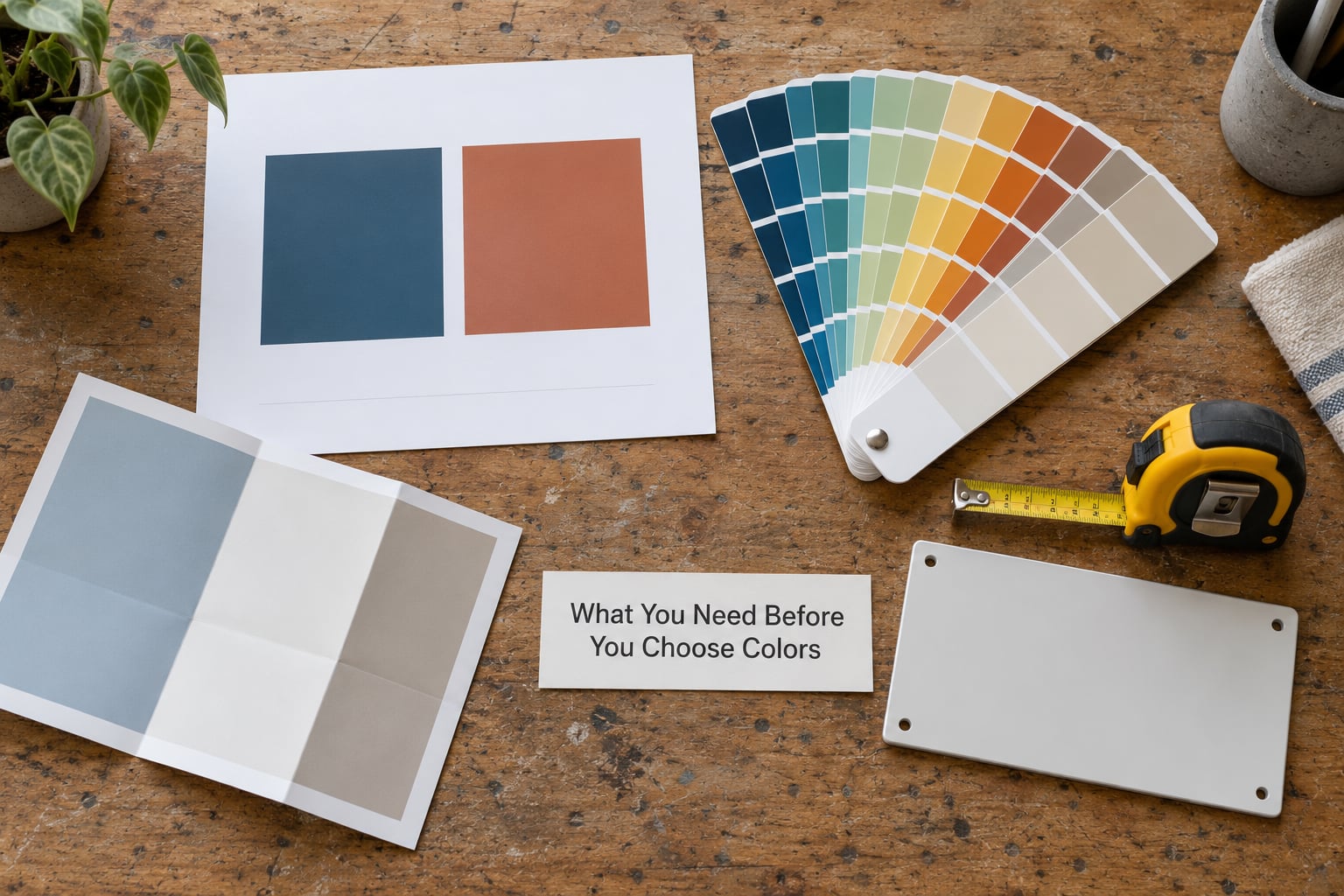
Gather these before you open a color picker. Everything else in this guide depends on having them.
- Logo files in the formats you actually have. Vector first, then whatever raster version lives in your website files. Screenshots of a logo are not a spec.
- Brand guidelines, if they exist. Look for Pantone or PMS numbers, CMYK build values, HEX or RGB screen values, and any rule about which color leads.
- Sign dimensions. Height, width, and letter size. A color that works on a 6-foot monument sign can disappear on a 24-inch door panel.
- Material samples or color charts. Your sign shop should have the manufacturer’s vinyl or acrylic color book. Ask to see yours before you commit.
- Placement details. Where the sign goes, how high it mounts, what angle the traffic approaches from, and roughly how far away people first see it.
- What surrounds the sign. The wall color, the sky, the landscaping, the building next door, and any nearby signs in the same sightline.
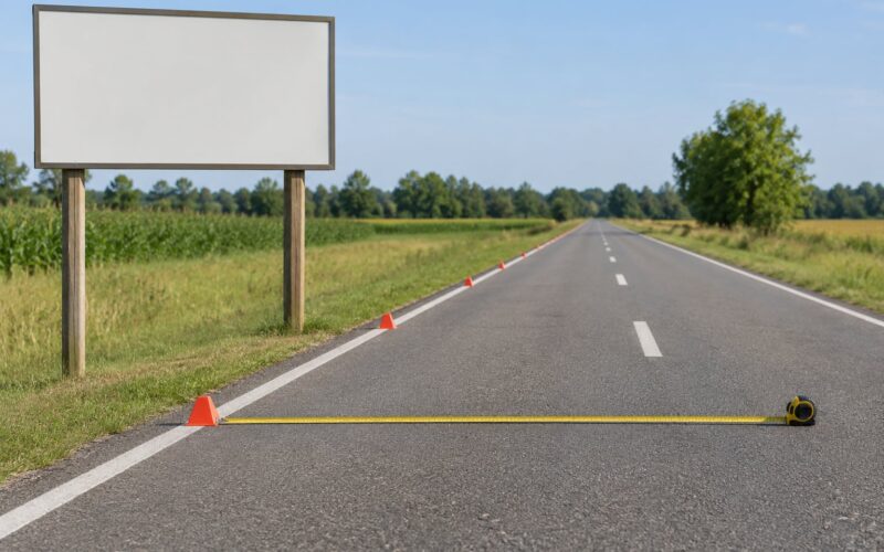
Write the viewing distance down. Ten feet, forty feet, two hundred feet from the road. That single number decides more about your sign than the rest of this list combined.
How to Pick Sign Colors That Match Your Brand: Step by Step
Start With Your Brand’s Core Colors
Every brand has a primary color, usually the one in the logo, and a secondary or accent color. Identify both before you combine anything. If you have no written guidelines at all, pick your logo color as the primary and choose one accent that already appears somewhere in your materials.
Next, get the values, not just the look. Pantone and PMS numbers come from a physical swatch book and are the closest thing signage has to a standard. CMYK is the print build used on paper and printed panels. HEX and RGB are the screen values, which is what you have been approving on your monitor all along.
Screen values and physical values are different systems, and that mismatch is the source of most disappointed sign owners. A rich blue on screen is defined by light it emits. A blue vinyl has no light of its own; it is a pigment that reflects whatever hits it.
Decide which color leads. The dominant color should carry most of the sign’s area, roughly 60 to 70 percent, with the accent used for the business name, a border, or a logo mark. Doing the reverse, a mostly accent-colored sign with your main brand color as trim, is a valid look, but it should be a decision rather than an accident.
Check Contrast Before You Choose Combinations
Contrast is the brightness gap between your text and its background. It matters more than hue preference, and you can measure it. The WCAG 2.1 standard used for web accessibility gives a usable scale for signage too: a contrast ratio of 4.5 to 1 or higher for normal-sized text, 3 to 1 for large text, which is anything roughly 24 pixels or bold 19 pixels and up.
Some real-world pairs, using common standard color values:
| Color pair | Approximate contrast ratio | Reads well for | Brand fit note |
|---|---|---|---|
| Black on white | 21:1 | Maximum legibility at any distance | Safe neutral, but reads generic if it is your only color |
| Black on yellow | About 19:1 | Long-distance roadside and safety-adjacent use | Strong attention color; rare as a full brand palette |
| White on navy | About 14:1 | Storefront and monument signs | One of the most reliable brand pairs there is |
| White on green | About 5:1 | Wayfinding and directional signs | Passes for normal text, check it at distance |
| White on red | About 4:1 | Short viewing distances only | Falls below 4.5:1 for normal text, use larger letters |
| Red on black | About 5:1 | Illuminated or night signs | Numerically fine but both colors go muddy in daylight |
| Blue on green | Low | Nothing, avoid it | Common near-miss that looks fine on screen |
| Dark gray on white | About 8:1 | Interior and office signage | Calmer than pure black, still very legible |
Run your own pair through any free contrast checker before you commit. Then do a grayscale test: convert the proof to black and white on your phone. If the letters and the background merge into the same gray, your sign has failed for anyone with a color vision deficiency, and probably for half your customers in low light too.
Consider Distance, Lighting, and Sign Material
Rule of thumb for letter height on a sign read from a distance: about one inch of letter height per 10 to 15 feet of viewing distance. A name meant to be read from the street at 150 feet needs letters around 12 to 15 inches tall, which changes your color options because larger, thicker letters show color better than small thin ones.
Lighting shifts color more than most people expect. Light color temperature is measured in Kelvin. Warm white around 2700 to 3000K makes colors read yellower and richer. Neutral around 4000K is close to accurate. Cool daylight white at 5000K and above reads cooler and can wash out warm tones. A red that looks correct in a daylight-lit parking lot can look noticeably darker and duller under warm LEDs at night.
Material changes color next:
- Cut vinyl on panel or acrylic. Closest to a solid, predictable result because the vinyl is dyed through. The shop’s own vinyl color chart is the authority, not the Pantone book.
- Printed graphics on panel. CMYK output, so saturated blues, deep purples, and bright reds are where you lose accuracy first. Expect a slight softening on anything near the edge of the CMYK gamut.
- Painted or powder-coated metal. Very durable, but a gloss finish adds glare that washes out color in direct sun. Matte or satin finishes hold color and readability better outdoors.
- Acrylic faces. Colors come through bright and saturated, which works well for illuminated letters and halo lighting.
- Channel letters with LED illumination. Front lighting shows the face color as daylight does. Halo lighting spills light around the edge and washes the face color toward white, so a pale brand color can disappear almost completely.
Outdoor vinyl and paint also fade. Ultraviolet exposure shifts saturated colors, typically yellows and reds first. A sign that matches on install day can drift noticeably in a few seasons of direct sun, so pick finishes and colors with some fade tolerance rather than chasing a perfect match you will never have.
Keep the Palette Simple and Memorable
Two or three colors is the working limit for a business sign, plus white. The popular branding rule of thumb, often called the 60-30-10 ratio, says your dominant color takes about 60 percent of the visual weight, the secondary about 30, and the accent about 10. On a sign the split is even easier to keep clean because you control exactly how much area each color occupies.
Give every color a job and the sign becomes intentional. One assignment that works well: dominant color as the background, secondary color for the business name, accent color for a border, an arrow, or a small logo mark. Leave white space around the composition. A sign with breathing room reads faster than a sign where every surface is filled.
One thing worth doing now: write down a short note that the sign uses your brand’s second color on its darkest or most saturated form. Designers call this a variant, and it means the sign shop is reproducing a documented decision instead of guessing. It also stops your signage from quietly drifting away from everything else you print.
Test Sign Colors That Match Your Brand at the Real Location
Proofs and mockups exist for a reason, and they are the last cheap step before an expensive order.
- Ask for a physical proof. A printed or vinyl-swatched sample in the actual color, not a screen mockup. Phone screens lie about saturated colors more than people expect.
- Step back 15 to 20 feet and read it. This is the standard check for simulating viewing distance before approval. If you cannot read the business name, neither can someone driving past.
- Look at it in daylight, at dusk, and at night. Ideally two visits, one during the day and one after dark if the sign is lit. Note which condition is weakest and fix that one.
- Test it on site. Hold the proof or a full-size mockup against the actual wall, in the actual surroundings, at the actual mounting height. Surroundings change apparent color more than most people expect, especially with brick, greenery, or a neighboring sign.
- Check it against the block. Stand where a customer stands. If a competitor’s sign in the same sightline is louder than yours, your color pairing needs more contrast, not a different hue.
Expect a small difference between the swatch and the finished sign, and treat it as normal rather than as a defect. Practitioners in sign and design forums reach the same conclusion constantly: no Pantone number and no printed swatch will ever match a production vinyl color exactly. What you can control is that the difference stays small and consistent, which is exactly what specifying a written value buys you.
Common Mistakes That Break the Match
- Choosing colors from a screenshot. Every screen renders color slightly differently, and the one you approved on is not the one your customer sees. Use written values.
- Low contrast pairs that read fine up close. Pastel on white, light gray on white, dark blue on black. They look fine in the shop and vanish at 40 feet.
- Using color as the only way to convey meaning. For ADA compliant room and directional signage, never rely on red and green alone to distinguish a restroom, an exit, or a room type. Pair color with a symbol, a word, or a shape and a tactile finish.
- Adding colors to fill space. A third and fourth color rarely add information. They usually add clutter and shrink the effective letter size.
- Ignoring the substrate color chart. The shop’s vinyl or acrylic book is what the finished sign will actually match. If your Pantone is not in that book, the shop will substitute something close, and you should pick the substitute with them rather than after.
- Specifying gloss in direct sun. A glossy face under a south-facing wall can glare badly enough to erase your carefully chosen contrast.
- Designing for the office, not the street. Interior lobby signage and exterior storefront signage have different jobs. Interior signs get read at close range under even light, so smaller type and softer palettes work there. Exterior signs have to fight glare, weather, and distance.
If you only fix one thing, fix contrast. It is the single change that makes the largest difference to whether anyone reads your sign at all.
Frequently Asked Questions
What are the best color combinations for signage?
The strongest sign color combinations pair very different brightness levels: black on white, black on yellow, white on navy, or white on dark green. Those pairs clear a 4.5:1 contrast ratio and stay readable at distance in daylight. Avoid combinations with similar brightness, such as blue on green or dark gray on black, and avoid white on red for small text since it lands near 4:1.
How many brand colors should a sign use?
Two or three colors plus white is the practical limit for a business sign. Give each color a role, such as a dominant background color, a secondary color for the business name, and an accent color for a border or arrow. The widely used 60-30-10 branding ratio, meaning about 60 percent dominant, 30 percent secondary, 10 percent accent, maps cleanly onto sign area.
Can a sign color match my Pantone swatch exactly?
Rarely, and expecting an exact match causes disputes. Vinyl is dyed through, printed panels are built in CMYK, and paint and powder coat reflect rather than emit light, so each shifts your brand color slightly. What you can achieve is a small, documented tolerance. Specify the Pantone number, ask the shop to match from its own material color book, and request a physical proof before approving.
Why do my brand colors look different on my sign?
Three things cause it. The medium differs from the screen, so CMYK print, cut vinyl, and paint each render the same value differently. The lighting differs, since warm LEDs around 2700 to 3000K shift colors warmer than daylight. And the finish differs, because gloss adds glare and halo illumination washes the face color toward white. Ask the shop how their material renders your specific value.
Which colors work best for ADA compliant signage?
ADA signage needs contrast, not decoration. Choose a dark text color on a light background, or light text on a dark one, with a contrast ratio of at least 4.5:1 for normal-sized characters. Never use color as the only signal, so a room identification sign needs a word and symbol, not just a red door or a green exit panel alone. Finish matters too, since non-glare matte surfaces read better.
Conclusion
If you are working out how to pick sign colors that match your brand this month, start with the approved values in your brand guidelines, not a screenshot. Run your leading pair through a contrast checker, pick matte over gloss for anything facing direct sun, and take a physical proof to the actual location where you will step back 15 to 20 feet and read it in both daylight and darkness. Those three checks catch nearly every problem before the sign is made.