Learning how to design a trade show booth banner comes down to three things: one idea, big type, and a print file that matches what the printer asked for. A banner only has about ten seconds of an attendee’s attention, so every element has to earn its place. Budget a full day for the first one and half of that for each revision after.
The awkward part is not the design, it is the handoff. Wrong size, missing bleed, low-resolution photo, and the whole thing ships back. Get the specifications before you open a canvas.
Table of Contents
- What You Need
- Step-by-Step: How to Design a Trade Show Booth Banner
- 1. Define the Banner’s Job
- 2. Choose the Right Banner Size
- 3. Build a Clear Visual Hierarchy
- 4. Design for Distance and Busy Spaces
- 5. Write a Message People Remember
- 6. Prepare and Proof the Final File
- Common Mistakes
- Frequently Asked Questions
- What size trade show booth banner is best?
- How far away can people read a trade show banner?
- What resolution should a trade show banner design use?
- Should I use a retractable banner or a fixed fabric banner?
- How do I prepare a banner file for printing?
- Can the same banner design work at different trade shows?
- Conclusion
What You Need
Gather these before you start. Nothing on this list is optional, and two of them (the printed dimensions and the printer spec sheet) decide your canvas size.
- Your printed banner dimensions. The graphic size, not the hardware size. A retractable stand’s listed width usually includes a few inches of pole pocket or housing.
- Your booth footprint and the floor plan, so you know how much width you actually have and where people will stand.
- The printer’s spec sheet. Most vendors publish it: bleed amount, safe margin, preferred color profile, minimum resolution, file format.
- Design software. Adobe Illustrator and InDesign for print, Figma for layout work, Canva if you have no designer. All three can produce a correct file.
- Your logo as a vector file. EPS, AI or SVG. A PNG pulled from a website will look soft on a 33-inch-wide graphic.
- Photography at 150 to 300 DPI at print size. Your product shots, your booth being assembled, a person using whatever you sell.
- Brand guidelines, including your color values and approved typefaces.
- One written message and one call to action. Two or three words for the headline, a sentence of proof, and a single next step.
- Contact details and a scannable QR code linking to one landing page, if you want leads.
A production timeline is the item people forget. Large-format printing plus shipping eats several days, and you also need a proof turnaround. Work backwards from the show date and treat the printer’s lead time as fixed.
Step-by-Step: How to Design a Trade Show Booth Banner
Six steps, in order. Each one has a check that tells you whether you can move on, and skipping a check is how banners end up unreadable on a show floor.
1. Define the Banner’s Job
Decide what this specific banner is for before you pick a template. A banner has one job at a time: stop traffic from the aisle, explain a problem the attendee already has, show a benefit in one line, or support a conversation your rep will finish in person.
Write down the single audience it speaks to. “Operations managers at manufacturing firms” is a workable target. “Decision makers” is not.
Then pick one call to action. Scan this QR code for a demo. Book a 15-minute review. Download the spec sheet. Two calls to action split the attention and both get ignored.
Check: if you cannot finish the sentence “This banner exists so that a specific person does a specific thing,” you are not ready to design. Cut the scope until you can.
2. Choose the Right Banner Size
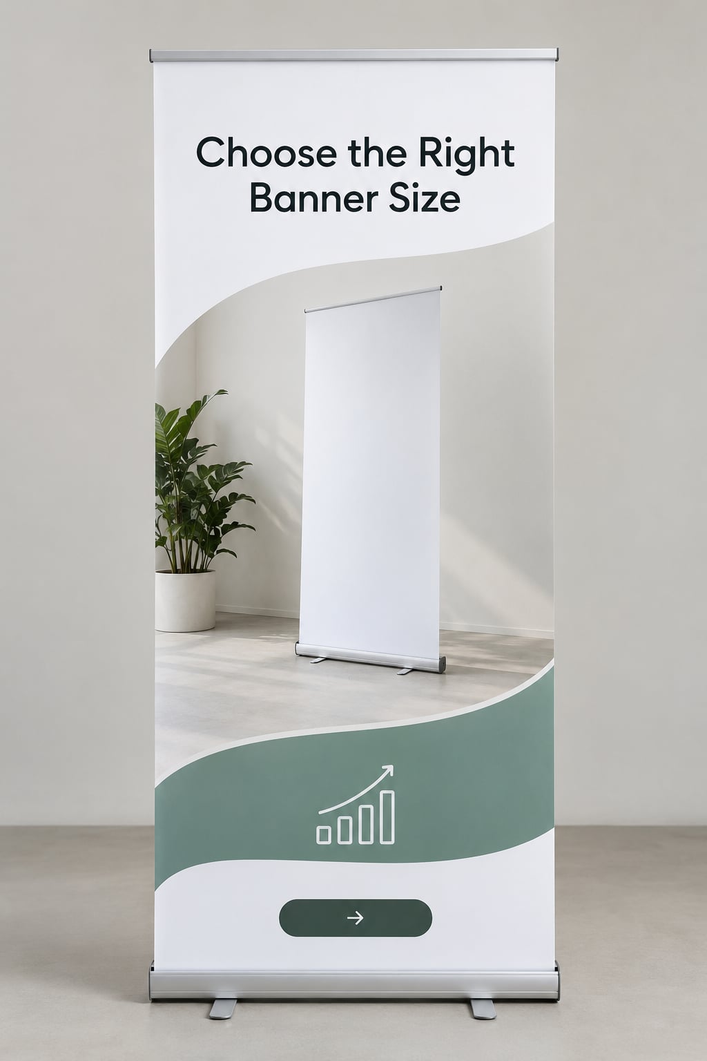
The most common banner mistake is picking the size from the stand’s product listing instead of from the booth floor plan and the viewing distance. People read a graphic from about 5 to 10 feet away in a lit hall, and a 24-inch-wide stand simply cannot carry a headline that size.
Standard sizes are wide enough for most work:
| Display type | Typical graphic size | Where it works |
|---|---|---|
| Compact vertical | 24 in x 80 in | Tabletop displays, small counters, tight 10×10 booths with tables nearby |
| Standard vertical | 33 in x 80 in | The most common inline booth size; readable from roughly 8 to 10 feet |
| Extra tall vertical | 44 in x 80 in | Taller ceilings and crowds at distance, such as convention center halls |
| Wide horizontal | 60 in to 120 in x 36 in to 60 in | Inline booth back walls, registration desks, step-and-repeat backdrops |
| Back wall panel | 8 ft to 10 ft wide | 10×10 and 20×20 booths where attendees stand several feet back |
| Table topper | 24 in to 36 in x 30 in to 48 in | Registration desks and meeting tables, seen from close up |
| Overhead hanging sign | Varies by venue | Visible over the crowd, carries only the brand name |
Two rules settle most decisions. If the banner stands within four feet of where people will stop, a compact vertical or tabletop size reads fine. If it sits at the back of a 10×10 booth, go to a standard vertical or a back wall panel so the type can grow.
Second rule: design for the graphic area, not the hardware. If the stand is listed as 36 inches wide and the graphic area is 31.5 inches, your canvas is 31.5 inches plus bleed.
Check: stand a piece of paper at your chosen size on the booth floor at eye level. Walk to where the aisle is and confirm you can read your headline at that distance.
3. Build a Clear Visual Hierarchy
A trade show booth banner works in a fixed reading order, top to bottom. Most people never read it in order, but the order still decides what they see first when they glance up from a phone.
- Headline. Top third, largest type, two to four words.
- Supporting line. Directly under the headline, one sentence that backs it up with proof.
- Image or product visual. Middle band, roughly a third of the total area. It shows the product in use, not an abstract stock pattern.
- Proof points. Three short items maximum, set as a row of three, with a number or a specific claim in each.
- Logo. Top corner or bottom center, never competing with the headline.
- Call to action. Bottom band at eye-level-adjacent height, with the QR code beside it at no less than 1.5 inches square.
Keep the headline above eye level. On a standard vertical stand, the top third of the graphic sits above the average adult’s sightline when they are ten feet out, and that is where you want the first word they land on.
Negative space is doing work here. Empty background around the headline is what makes it readable; a background image with a headline laid on top of its busiest area is the most common cause of an illegible banner.
Check: squint at the design until the details blur. You should still see a dark mass where the headline is, a lighter mass for the image, and a clear block at the bottom for the call to action. If everything blurs into one texture, the hierarchy has failed.
4. Design for Distance and Busy Spaces
Type size is not a style preference, it is a distance calculation. Use one inch of letter height for every ten feet of reliable reading distance, then round up.
| Reading distance | Headline | Supporting line | Body or proof text |
|---|---|---|---|
| 3 to 5 feet | 60 to 72 pt | 32 to 40 pt | 24 pt |
| 8 to 10 feet | 100 to 130 pt | 48 to 60 pt | 32 pt |
| 15 to 20 feet | 180 to 240 pt | 80 to 100 pt | 40 pt |
A 72-point headline works at close range and disappears across a busy aisle. Show floors are lit hard from above, which washes out low contrast, so contrast has to be stronger than it looks on your screen. Dark type on a light background survives booth lighting better than light type on a dark background.
Limit the palette to two or three brand colors plus white. Check the design in grayscale: if the headline stops being clearly darker than the background, the contrast is not enough once the hall lighting flattens it.
Photography has to be sharp at print size. A 4000-pixel-wide photo placed 20 inches wide prints at 200 DPI, which is fine. The same photo squeezed into a 40-inch-wide banner gives 100 DPI and looks soft from six feet away. Use wide images for wide layouts.
For the QR code, print it at 1.5 inches square or larger, keep a clear white margin around it, and put it on a flat light area rather than across your photo. Test it with a phone before you send the file.
Check: hold the design at arm’s length and read the headline aloud. Then set it down and walk ten steps away.
5. Write a Message People Remember
Every word on the banner competes with your headline. The fix is subtraction, and it feels wrong when you do it because you spent time writing the longer version.
A usable headline names a specific problem and a specific result. “Solutions for every industry” describes nobody’s day. “Cut month-end close from nine days to two” describes exactly one person’s Tuesday.
Supporting copy should carry proof rather than adjectives. Numbers, time saved, a named certification, a customer count you can cite. “Industry-leading platform” is noise; “SOC 2 certified, 400+ customer teams” is evidence.
The call to action names the next physical step and nothing else. Attendees cannot buy software on a show floor, so asking for a conversation or a resource is realistic.
Here is a before and after. The first version runs 34 words across three lines: “Welcome to Acme. We are a leading provider of comprehensive supply chain solutions designed to help businesses of all sizes optimize their operations and reach their goals. Visit our website to learn more.” The second runs 13: “Empty pallets, zero paperwork. Scan for the 2-week rollout plan.”
Same company, same product, same banner. The second version can be read from 15 feet; the first one is unreadable past six.
Check: a colleague who has never seen your product reads the headline and the call to action only, then says back what your company does. If they say “some kind of software,” your headline is too vague.
6. Prepare and Proof the Final File
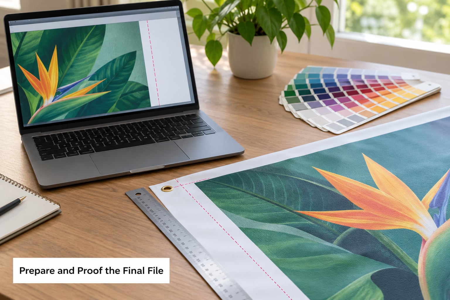
This is where banners get rejected or come back wrong. Most printer rejections come down to four things: a missing bleed, RGB color, an embedded raster logo, and an unfilled font.
Add bleed on all four sides. Most vendors want 0.125 to 0.25 inches extending past the trim line so small cutting shifts do not leave a white sliver. Keep your important content inside a safe margin, typically 0.5 to 1 inch from the trim, since grommets, pole pockets and hems eat into the edge.
Build in the printer’s color profile. Your monitor shows an RGB image, the press prints in CMYK, and bright blues and saturated oranges shift most. Convert to the vendor’s profile and judge colors from the proof, not from your screen. Ask about total ink coverage limits for dark, full-bleed backgrounds; heavy coverage is what makes banners curl or delaminate.
Use vector artwork for the logo, icons and line art. Place raster photography at 150 to 300 DPI at its final printed size. Expand or outline your typefaces, or embed them, so the file does not arrive with a substituted font.
Export a flattened PDF at the exact graphic dimensions plus bleed. Keep a working file with linked assets and guides so edits are cheap later.
Then proof before you commit to a full run. Order a single-color or small-format proof if your vendor offers one. Print the layout at 25 percent on ordinary paper if nothing else is possible, then hold it up and check the distance read at 10 feet.
Run three checks on the printed proof. The distance check: can someone at 10 feet read the headline without walking closer? The squint check: does the hierarchy still hold? The phone check: does the QR code scan from a normal arm’s length?
Send the proof to one person who was not involved in making it and ask what your company does. Corrections at this stage cost one reprint of a small test. Corrections after a full run cost a reprint of the whole banner and the freight.
Check: the file opens at the right dimensions, the bleed is present on every edge, all colors are converted, no fonts are missing, and the test print passes all three checks. Only then order the run, and confirm the ship date against your show calendar.
Common Mistakes
Almost every weak booth banner traces back to one of these.
Overcrowding. Fitting your whole website story onto one panel. Fix it by cutting to one message, one image, three proof points. Move the rest to a handout or the landing page your QR code points to.
Text too small. 10 or 12 point body copy on an 80-inch banner. Body text below 24 points disappears in a lit hall. Move the detail off the banner.
Weak contrast. Light gray on white, or a photo behind type. Fix it by putting the type on a solid area and darkening the background color.
Low-resolution images. A web-resized PNG scaled up to 40 inches wide. Fix it by using original photos at 150 to 300 DPI at print size, or replacing the image with a vector illustration.
No hierarchy. A logo at the top competing with a headline of equal weight. Fix it by making the headline the largest element and the logo clearly secondary.
Missing bleed. White slivers along the trim after printing. Fix it by extending background color 0.125 to 0.25 inches past every edge.
A generic call to action. “Learn more” tells nobody what happens next. Fix it with an action and a payoff: “Scan for a 15-minute setup guide.”
Bad placement. A banner half-hidden behind a table, or a table blocking the lower third where the call to action sits. Fix it by walking the aisle after setup and checking that the headline and the QR code are both fully visible from the aisle approach.
A few closing tips worth more than any single fix. Design the banner for the aisle, not for the booth photo. Keep the same colors and logo placement across your banner, table cover, business cards and backdrop so the booth reads as one unit. And build a master template at the right dimensions with swappable headline and image blocks, so the next show is an edit rather than a new project.
Frequently Asked Questions
What size trade show booth banner is best?
For most 10×10 inline booths, a standard vertical banner around 33 inches wide by 80 inches tall is the workhorse size, readable from roughly 8 to 10 feet. Use a compact vertical near the front of the booth where people stand close, and a wide back wall panel when attendees view the booth from several feet back. Match the size to your floor plan and to your viewing distance, not to the stand’s hardware dimensions.
How far away can people read a trade show banner?
Plan for about one inch of letter height for every ten feet of reading distance. A headline at 100 to 130 points on a standard vertical banner reads clearly from 8 to 10 feet in a lit hall. Body copy needs at least 24 points at that distance. Test by holding a printed proof at eye level, then stepping back until you cannot read the headline, and count the feet.
What resolution should a trade show banner design use?
Use 150 to 300 DPI at the final printed size for photographic images and vector artwork for logos, icons and line art. A 4000-pixel-wide photo placed 20 inches wide prints at 200 DPI, which looks sharp, while the same photo stretched to 40 inches drops to 100 DPI and goes soft. Check your images at their final size, not at their native resolution.
Should I use a retractable banner or a fixed fabric banner?
A retractable stand is portable, sets up in seconds and stores in a case, which suits people who move between shows. A fixed fabric backdrop covers a full booth wall and photographs better, but needs a frame and takes longer to install. Dye-sublimated fabric resists creasing and rolls flat for storage. If you exhibit more than two or three times a year, a fabric graphic on a reusable frame usually pays off.
How do I prepare a banner file for printing?
Set the document to the exact graphic dimensions plus 0.125 to 0.25 inches of bleed on all four sides, keep important content inside a 0.5 to 1 inch safe margin, convert colors to the printer’s CMYK profile, use vector logos and 150 to 300 DPI photography, outline or embed fonts, and export a flattened PDF. Ask your vendor for their spec sheet first and build to their numbers rather than generic defaults.
Can the same banner design work at different trade shows?
Yes, if you build a master template. Keep the headline block, image window and call-to-action area at fixed positions, then swap the content for each show without moving the layout. That preserves the visual hierarchy you already tested. If a show needs a different banner size, build the template at your most-used size and scale the type proportionally rather than redesigning from scratch.
Conclusion
Start with three moves: pick the size from your floor plan and viewing distance, cut your message down to one idea and one call to action, and order a proof before you print the full run. Build a master template at that size once and the next show becomes an edit instead of a project. Get the printer’s spec sheet on day one, since every other decision downstream depends on it.