Sign files need about 150 pixels per inch at the finished print size, and anything a person reads from a distance can run lower. Logos, lettering, and simple graphics should be vector files, and photographs need enough pixels to cover the size you are actually printing. That is the whole rule; the rest is working out what your sign’s size and viewing distance demand.
Shop requirements pages still quote the same bands in 2026 that they always have, which is why the internet disagrees with itself about whether signs need 72 DPI or 300 DPI. Both numbers are right, for different signs.
Table of Contents
- What Resolution Do Sign Files Need? Quick Reference
- How to Determine the Right Resolution for Your Sign
- What Resolution Do Sign Files Need for Different Viewing Distances?
- Sign Size, Pixel Dimensions, and the 100 PPI Rule of Thumb
- How the Printing Method Changes the Resolution Requirement
- File Format, Color Mode, and Other Sign-File Requirements
- How to Prepare and Test a Print-Ready Sign File
- Frequently Asked Questions
- What resolution do sign files need for outdoor use?
- Is 72 DPI enough for a printed sign?
- What is the difference between DPI and PPI?
- Can I increase the resolution of a low-resolution sign image?
- Should I send a printer an AI, EPS, SVG, or PDF file?
- Does a sign printer need vector artwork?
- Conclusion
What Resolution Do Sign Files Need? Quick Reference
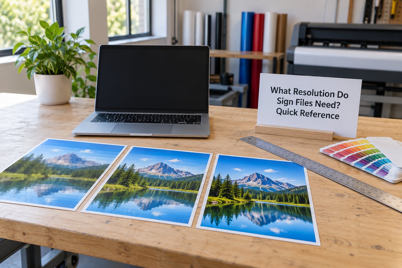
Here is the version worth memorizing: roughly 150 PPI at final size for most printed signage, 300 PPI for small rigid signs people walk up to, and 75 to 100 PPI for anything mounted where drivers or pedestrians see it from far off. Vector artwork has no resolution ceiling at all.
| Viewing distance | Useful effective PPI | Typical signs |
|---|---|---|
| Handheld, arm’s length (up to about 2 feet) | 300 PPI | Yard signs, window decals, foam board, A-frame signs, trade show panels |
| A few feet away (about 2 to 10 feet) | 150 to 200 PPI | Retractable banners, indoor wall graphics, vehicle wraps, menu boards |
| Across a storefront or parking lot (about 10 to 50 feet) | 75 to 100 PPI | Storefront banners, pole signs, building graphics, sidewalk displays |
| From a road or highway (about 50 feet and beyond) | 50 to 75 PPI | Monument signs, building wraps, highway-facing panels |
The 300 DPI figure most people remember comes from offset and small commercial printing, where a page is measured in inches and read from inches away. Large-format work scales the sign up, the eye steps back, and the pixel budget drops with it. A 20-foot banner viewed from 60 feet does not resolve detail any finer than a 20-inch poster viewed from a foot, so demanding 300 PPI there mostly produces a very large file and a very slow upload.
Two things outrank the DPI number on this chart. A vector logo has no fixed pixel count, so it stays crisp whether it is 2 inches or 40 feet tall. A photo, on the other hand, has a fixed pixel count, so its quality depends entirely on the final size you scale it to.
How to Determine the Right Resolution for Your Sign
DPI means dots per inch, the physical dots of ink a printer lays down. PPI means pixels per inch, how many pixels of your digital file fit into an inch. Your file controls PPI; the printer controls DPI. That is why a file labelled 72 DPI can print beautifully and a file labelled 300 DPI can look terrible: the label is a piece of stored metadata, not a measure of the detail you actually have.
The number that matters is effective PPI, the pixel density after your image is placed in the layout at final size.
Effective PPI = image pixel width ÷ printed width in inches
A 1,500-pixel-wide photo printed 10 inches wide gives you 150 PPI. Printed 30 inches wide, the same file gives 50 PPI, and that is where softness shows up. Change the final size or the pixel count and the math changes with it.
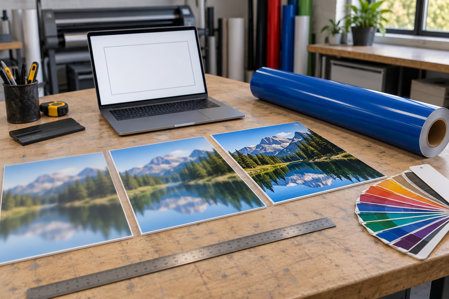
Compare an 800-pixel image placed at 5.3 inches, which is 150 PPI, then scaled up to 120 inches for a big banner. That drops to about 7 PPI and looks like gravel. Nothing went wrong with the file; the pixel count simply cannot cover the area.
Raising the resolution field in your software does not fix this. Changing 72 to 300 without adding pixels just relabels the same information, and resampling with interpolation invents intermediate pixels by guessing. It smooths the edges, makes the file look handled, and produces the slightly plastic result people recognise immediately.
What Resolution Do Sign Files Need for Different Viewing Distances?
Start with the distance, not the file. Ask where the sign hangs, how big it is, and how fast a person moves past it. A person reading a menu board stands about two feet away; a person in a car sees a pole sign from 40 feet; a driver on a highway sees a building wrap from several hundred feet.
Detail you cannot resolve at the intended distance is wasted resolution, and detail you cannot resolve never gets printed even if it is in the file. The eye’s angular resolution is the limit, and it works in your favour on big signs.
Distance is only a starting point, not the whole answer. Two things push the number up: fine or small text, and faces or logos people recognise. And the material matters. Matte vinyl scatters light and hides dithering better than glossy vinyl or glass, so a glossy storefront graphic usually wants more resolution than the same file printed on matte banner stock.
Check what your printer asks for before you build the file. Most shops publish an artwork requirements page, and it usually names a minimum PPI, accepted formats, colour space, and whether they supply finished artwork themselves.
Sign Size, Pixel Dimensions, and the 100 PPI Rule of Thumb
The second half of the calculation is size. Turn the requirement around: multiply the final dimension in inches by your target PPI to get the pixels you need.
Pixels needed = final size in inches × target PPI
| Finished sign | At 75 PPI | At 100 PPI | At 150 PPI |
|---|---|---|---|
| 18 x 24 inch yard sign | 1350 x 1800 px | 1800 x 2400 px | 2700 x 3600 px |
| 24 x 36 inch foam board | 1800 x 2700 px | 2400 x 3600 px | 3600 x 5400 px |
| 8 x 8 ft trade show panel | 7200 x 7200 px | 9600 x 9600 px | 14400 x 14400 px |
| 6 x 8 ft vehicle wrap side | 5400 x 7200 px | 7200 x 9600 px | 10800 x 14400 px |
| 10 x 20 ft vinyl banner | 9000 x 18000 px | 12000 x 24000 px | 18000 x 36000 px |
Read across a row and you see the trade-off clearly. Doubling the target PPI doubles the pixels on each side and quadruples the file size, which is why a phone photo rarely survives a banner at full width.
Read down the last column and you see why 100 PPI is a useful working number. For a 10 by 20 foot banner, 100 PPI asks for 12000 by 24000 pixels, which a decent camera or a 24-megapixel phone can deliver. Asking for 300 PPI on that same banner needs 36000 by 72000 pixels, well past what any camera records, and the sign still looks identical from the road.
That is the 100 PPI rule of thumb in one sentence: for large signs viewed from a distance, a pixel count in the tens of thousands across the width is enough, and going higher mostly inflates the file.
How the Printing Method Changes the Resolution Requirement
The output method changes what “resolution” even means, so match your file to the process.
Digital and large-format printing. Inkjet, eco-solvent, latex, and UV printers reproduce continuous tone from your raster image, so PPI governs quality directly. This is the case the tables above describe. Latex and UV inks spread slightly as they cure, so an aggressive halftone at very low PPI can show texture; asking for 100 PPI or more on large work reduces that risk.
Vinyl cutting. A plotter cuts shapes from solid coloured film. There is no image to resolve, so resolution is irrelevant. Supply vector outlines, and use a plotter font or outline your type so the curves stay clean.
Screen printing. Each colour becomes a separate halftone screen, and the printer sets the halftone frequency. Your job is the file: colour separations, correct spot colours, and enough PPI that the halftone has real tones to work with. Below roughly 100 PPI, gradients band and shadows go blotchy.
Fabrication. Channel letters, monument signs, and CNC-routed panels are built from shapes and materials, so the file is a manufacturing drawing rather than a picture. Vector outlines, exact dimensions, and material callouts matter far more than pixel density.
Different artwork types also stress different parts of the file. A simple logo scales forever. A photograph is fixed the moment you shoot it. Fine text, legal copy, phone numbers, and pricing are the weakest links on almost every sign, because small counters fall below the printer’s dot pitch first, so set them as vector type whenever the layout allows.
File Format, Color Mode, and Other Sign-File Requirements
Resolution is only one of the specs that get a file rejected. These are the rest.
Formats. For logos and lettering, send PDF/X-1a where the shop accepts it, or the native AI, EPS, or SVG. For photographs, send TIFF when the file allows it, PNG for graphics with transparency, or a JPG saved at maximum quality. PSD works only if the shop confirms it opens layered files and expects them. Avoid Word, PowerPoint, and Google Slides exports; they arrive with mangled fonts, missing bleed, and images recompressed into the background. Avoid Save for Web and any export that optimises or strips resolution, since those tools exist to make files smaller than the printer can use.
Colour. Large-format printers usually print in CMYK, but many also accept RGB files and convert them on their own RIP with a house profile. Check before converting. A blind RGB-to-CMYK conversion on a bright logo is a common cause of a neon blue or hot pink turning muddy, and it happens for reasons that have nothing to do with resolution. If a colour is critical, ask for a Pantone or spot match rather than a CMYK build.
Fonts. Either outline the type or embed the font files. Outlining converts letters to shapes, which cannot go missing on the shop’s machine, so request it when the file is final.
Bleed. If the design runs to the edge of the sign, extend it past the trim line by about 0.25 inch, or 3 mm, so cutting does not leave a white sliver. Give important text and logos a safe margin of roughly 0.25 to 0.5 inch inside the trim so a miscut does not clip them.
Specs differ between shops, so treat these as defaults and confirm anything unusual with the printer before you commit to a design.
How to Prepare and Test a Print-Ready Sign File
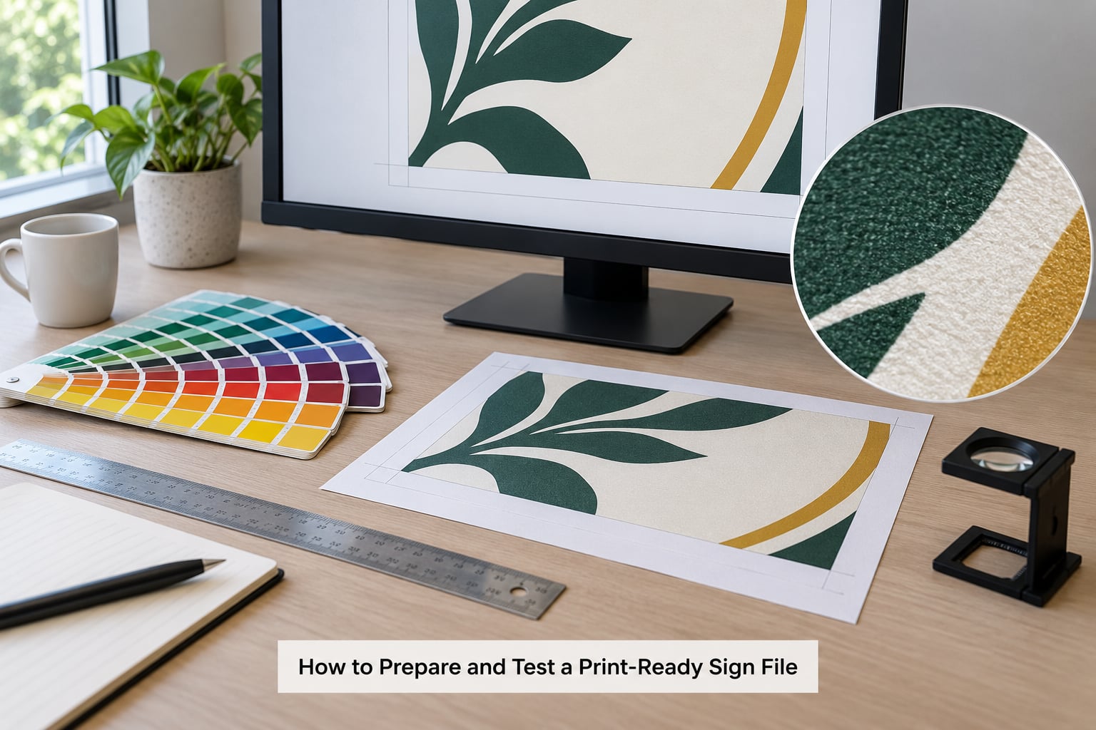
Work through this in order and most file problems never reach the printer.
1. Fix the finished size first. Decide the exact trimmed dimensions in inches before you build anything. Almost every resolution mistake traces back to a file designed at one size and printed at another.
2. Decide how it will be read. Pick a band from the quick reference table and treat it as the target PPI. This is the number you will check against in a moment.
3. Place the artwork at final size. In Illustrator or InDesign, build the document at the true finished dimensions with the artwork placed as it will print, rather than dropping it in oversized and scaling later.
4. Read the effective PPI. In Illustrator, open the Links panel and set the panel to show Effective PPI, which updates as you scale. In InDesign, the same column is in the Links panel. In Photoshop, open Image > Image Size: the dialog shows the current pixel dimensions and, with Resample Image unchecked, the resolution value reflects what you actually have. Photoshop’s Image Size dialog on a flattened web image will confirm a 72 PPI download quickly.
5. Fix what is below target. If a photo falls short, either find a higher-resolution original, crop tighter so fewer pixels cover the same area, or reduce the finished sign size. Upscaling tools built on AI produce sharper-looking results than old interpolation, and they can rescue a file for a distant sign, but they cannot invent a face that was never captured. Treat upscaled output as usable for large, distant graphics and suspect for anything read up close.
6. Convert type and colour. Outline fonts, confirm the colour mode the shop wants, and add bleed if the design bleeds off the edge.
7. Export a fresh copy and inspect it. Save a new file rather than overwriting your working version. Open the export at 100 percent on screen and look at the smallest text, then zoom the corners for stray white edges.
8. Ask for a proof or test print. A small paper proof at the correct proportions, or an inexpensive test panel, catches colour shifts and layout errors far more cheaply than the finished run. For vinyl, a taped-on mock-up at full size tells you how the sign reads in its actual setting before the full job is produced.
Frequently Asked Questions
What resolution do sign files need for outdoor use?
Outdoor signs need about 150 pixels per inch at final size as a safe default, and outdoor signs seen from 30 feet or more can drop to 75 to 100 PPI. The bigger factor is sunlight and viewing distance, which both flatten apparent detail. Keep photographic content at 100 PPI or better, and set logos and text as vector so they stay crisp at any distance or panel size.
Is 72 DPI enough for a printed sign?
For a large sign read from across a street or a parking lot, 72 PPI is usually acceptable because the eye cannot resolve detail at that distance. For an 18 by 24 inch yard sign or a window graphic someone walks up to, 72 PPI looks soft and you want 300 PPI. The honest answer is that 72 DPI works only when size and viewing distance do the work for you.
What is the difference between DPI and PPI?
DPI means dots per inch, the physical dots of ink or vinyl a printer lays down, and it is set by the machine. PPI means pixels per inch, the pixels inside your digital file, and you control that. A file labelled 72 DPI may still hold enough pixels to print well if it is used small, while a file labelled 300 DPI can look blurry when enlarged because it was resampled.
Can I increase the resolution of a low-resolution sign image?
You can enlarge the file, but you cannot add detail that was never captured. Old-style resampling guesses at missing pixels and gives that soft, slightly plastic look. Modern AI upscaling tools sharpen edges and hold up better, especially on graphics and text, which makes them reasonable for large, distant signage. For close-viewed work with faces or fine detail, find the original file or reduce the printed size instead.
Should I send a printer an AI, EPS, SVG, or PDF file?
For vector logos and lettering, PDF/X-1a is the safest choice because it travels well, and AI, EPS, or SVG work when the shop confirms it accepts them. For photographs, send TIFF, PNG, or a maximum-quality JPG. Match your layout software too: Illustrator to AI or PDF, InDesign to PDF, Photoshop to TIFF or PSD when the shop expects layered files.
Does a sign printer need vector artwork?
Vector artwork is the safest choice for anything that is not a photograph, including logos, lettering, icons, and line drawings, because it stays sharp at any size and needs no resolution. Fabricated signs such as channel letters and monument panels need vector outlines because they are cut from material. Photographs cannot be vector, so those images still depend on pixels per inch at final size.
Conclusion
Start with two numbers: the finished size of the sign in inches, and how far away a person will stand to read it. Those give you a target PPI, and the formula pixels needed = inches multiplied by target PPI tells you whether your artwork is up to the job. Logos, lettering, and simple graphics should be vector and skip the calculation entirely. Before you send the file, check effective PPI in the Links panel, confirm the format and colour space on the printer’s artwork requirements page, and ask for a proof so any surprise shows up on paper instead of on a truck.