What belongs on a business sign is the shortest version of your message a passerby can read at a glance: your business name, a short descriptor that says what you do, your logo, and one clear next step. Everything else usually belongs on a window graphic, a menu board, or your website. A sign has roughly two to three seconds to work, so copy competes with itself for attention.
That two-to-three second window is the whole design brief. The widely cited estimate is that an average viewer spends about one to one and a half seconds looking at a sign, which is why a sign crammed with services, hours, phone numbers, and a slogan ends up communicating none of it. I have watched owners spend weeks on typeface choices and then lose the message in a three-line block of text.
Table of Contents
- What Belongs on a Business Sign and What Does Not: Quick Guide
- What Essential Information Should Be on a Business Sign?
- The business name, sized for the farthest viewer
- A descriptor of two to four words
- The logo, in its approved form
- Directional information, when the choice is not obvious
- Prioritizing by distance
- What Details Should You Leave Off?
- How Do You Decide What Fits on a Sign?
- Audit the sign you already have
- Where the removed content should go
- How Do You Make Business Sign Text Readable?
- Should You Add a Tagline, Phone Number, or Website?
- How Do Local Rules and Accessibility Affect Signs?
- Frequently Asked Questions
- What should a business sign have on it?
- How many words should be on a business sign?
- Should I put my phone number on my business sign?
- What are the most common signage mistakes?
- Should a business sign have a slogan or tagline?
- Do I need a permit to change the copy on my sign?
- Conclusion
What Belongs on a Business Sign and What Does Not: Quick Guide
Put the business name on the sign. Add a descriptor of two to four words if your category is not obvious from the name alone. Keep the logo, and keep it in the approved version from your brand guide. Remove phone numbers, full web addresses, price lists, long service enumerations, mission statements, and any slogan that needs explaining. Here is the short version side by side.
| Element | Put it on the sign? | Why |
|---|---|---|
| Business name | Yes, largest element | It is the one thing a viewer must be able to read |
| Category descriptor | Yes, two to four words | Tells a stranger what you do without a second read |
| Logo | Yes, approved version only | Recognition cue that works even when the name is blocked |
| Directional cue | Yes, only if there is a choice of entrance | Saves a wrong turn at a plaza or shared lot |
| Phone number | Usually not on the primary sign | Nobody reads or dials while driving or walking fast |
| Website URL | Not on roadside signs | Same problem, plus a sign is not a browser |
| Store hours | Not on the facade sign | Changes often and belongs on the door |
| Price list | No | Turns a sign into a menu and dates it instantly |
| Service list | Only one or two items | A list reads as a wall of text at distance |
| Slogan | Only if it reads in one glance | Most slogans were written to be read slowly |
| Social handles | No | Meaningless to someone who does not already know you |
| QR code | Only on signs people stand in front of | Useless from a moving car |
One table, twelve elements, and the pattern is obvious: keep what identifies you and directs the customer, move everything that supports your business somewhere the customer is standing still.
What Essential Information Should Be on a Business Sign?
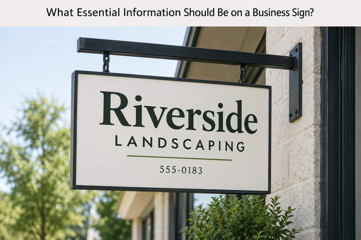
Four elements earn their place, and everything else negotiates around them. Rank them by viewing distance first, then by what a stranger needs to know in order to take the next step.
The business name, sized for the farthest viewer
Your name goes at the top of the reading path and carries the largest letter height on the sign. The working rule in the signage industry is roughly one inch of letter height for every ten feet of reading distance. A name read from 100 feet away needs letters about 10 inches tall, which sounds extreme until you stand at that distance and try to read your own shop name on a competitor’s awning.
A descriptor of two to four words
A descriptor tells people what you do when your name does not. “Cardinal Coffee Roasters” tells a driver almost nothing; “Coffee Roastery and Cafe” tells them enough to pull in or keep moving. Skip the descriptor only when your name is unmistakably a category, such as “Northside Hardware” or “Fifth Street Dental.”
The logo, in its approved form
A logo works on a sign because it survives conditions words do not: partial obstruction, a passing truck, a quick glance from an angle. Use the version from your brand guide, keep the clear space around it, and resist the urge to stretch or recolor it to fill an awkward panel.
Directional information, when the choice is not obvious
An arrow, a suite number, or “entrance around back” earns its spot only when there is genuinely more than one way in. Shared plazas, multi-unit strip centers, and businesses set back from the road are the usual cases. On a single-tenant building with one clear door, a directional line is clutter.
Prioritizing by distance
Sort your information against how far away the viewer is. Far away means the name only, and it means big. At medium range, roughly 30 to 50 feet, the descriptor joins in. Up close, under about 20 feet, secondary detail like a phone number or street number becomes readable and acceptable. The same sign can carry all three tiers if you design the tiers deliberately.
What Details Should You Leave Off?
The exclude list is where most signage goes wrong, and the failure is almost always the same: the owner treats a sign as a place to advertise everything instead of a way to be recognized. Each item below has a specific reason it fails.
- Phone numbers on roadside signs. A driver who reads your number has stopped paying attention to traffic. Nobody writes it down, and nobody dials while moving.
- Full web addresses. Long strings of letters are the least readable text you can put on a sign. “www.example.com” is fine on a brochure, useless at 60 miles an hour.
- Price lists and promotions. A discount on a permanent sign dates the sign the day it expires, and the next version usually costs more than replacing the face.
- Long service enumerations. “Plumbing, HVAC, Electrical, Roofing, Drain Cleaning, Sewer Inspection” reads as a gray block from a distance. Nobody distinguishes you from the shop across the street.
- Mission statements and about-us paragraphs. These were written to be read at a desk, at length. Nobody reads them through a windshield.
- Slogans that need context. If your slogan only makes sense after the customer is inside, it is advertising copy, not sign copy.
- Social handles. They mean nothing to a stranger and add clutter for anyone who already knows you.
- Multiple phone numbers, emails, and hours in different time zones. One contact route at most, and only where it will be read by someone standing still.
- Low-contrast color pairings. Dark blue on black, or light gray on white, looks refined on screen and disappears outdoors.
- Decorative script and thin serif typefaces. They photograph well and vanish past about 40 feet.
- Anything dated. A name you changed, an old logo, a number you retired. A wrong name does more damage than no sign at all, because it tells people the business is not paying attention to itself.
- QR codes on moving-traffic signs. A code needs a steady hand, screen brightness, and time. Fine on a door decal, useless at 45 miles an hour.
There is one honest exception to the contrast rule. A design-focused architectural firm or a boutique may deliberately choose low-contrast dimensional letters for character, trusting that its customers are arriving on purpose rather than passing at speed. That is a deliberate tradeoff, not a shortcut.
How Do You Decide What Fits on a Sign?
Use a four-question test before anything gets fabricated. It takes about ten minutes and saves the expensive mistakes, which are the copy decisions baked into a rigid panel.
- What is the one thing a viewer must understand? Write it as a single sentence with a verb. “We fix HVAC systems.” “We roast coffee on site.” If your sentence has a comma and an “and,” you have two ideas.
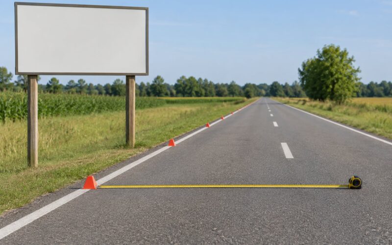
- How far away is the farthest realistic viewer? Measure it. Walk to the road, to the parking lot, to the corner. That distance sets your letter height, and letter height sets your sign size, which sets your copy budget.
- What does this viewer need to do next? Enter, park, call from the curb, or turn into the driveway. The answer decides whether you need an arrow, a phone number, or nothing at all.
- Can they read it at a walking pace? Hold the mockup at arm’s length, then move it to arm’s length across a room. Anything you have to re-read does not belong on the sign; it belongs on the window or the site.
Audit the sign you already have
Before replacing anything, check what is there now.
- Photograph it from 100, 50, and 25 feet, and from the two directions most of your traffic approaches from.
- Ask three people who do not work there to read it aloud at each distance. Note where they hesitate.
- Check the name against your current legal and trading name. Old names are the single most damaging finding in this audit.
- Squint at it. Anything that disappears when your eyes narrow is failing on contrast, not on size.
- Check illumination after dark, or check whether the sign is reflective enough for unlit night reading.
- Look for obstructions: trees, awnings, utility poles, parked delivery trucks, seasonal decorations.
- Compare it against everything else that carries your brand. Inconsistency between sign, vehicle, and print reads as sloppy rather than intentional.
- Decide, element by element, what stays, what moves to the door, and what is deleted.
Where the removed content should go
Deleting copy from a sign should not mean deleting it from your business. Move it: hours and phone numbers to a door decal or window graphic, services to a printed menu or a window list, prices to an A-frame or digital board, the full story to your website and a QR code near the entrance. Practitioners consistently note that white lettering reads best on glass storefront doors, because most doors read dark and white carries at distance.
How Do You Make Business Sign Text Readable?
Readability is arithmetic before it is taste. Set the viewing distance first, and everything else follows from the numbers.
| Farthest viewer | Letter height needed | Word budget | Typical sign |
|---|---|---|---|
| 20 feet | About 2 inches | 12 to 15 words | Door decal, window graphic, A-frame |
| 50 feet | About 5 inches | 7 to 9 words | Storefront facade sign |
| 100 feet | About 10 inches | Four or fewer words | Roadside monument or pylon sign |
| 300 feet, traffic | About 30 inches | Two words, often just the name | Pylon sign, large monument |
The word budget assumes a two-to-three second dwell. That is why the widely quoted guidance caps roadside sign copy at seven words or fewer, and why the average viewer reads the largest element first and moves across in a natural path.
Give copy about 60 percent of the space and let the remainder sit empty. White space is not wasted space; it is what makes the copy legible at speed.
Use one typeface. A simple sans-serif in regular and bold weights handles distance better than anything decorative. All caps for short lines only, since blocks of capitals slow reading.
Pair light letters with dark ground, or the reverse. Tonal color combinations that read as elegant in print fail in daylight, at night, and through a windshield.
Keep the reading path obvious. Name first, then descriptor, then the directional cue. A viewer should not hunt for where to start.
Design for night as well as day. If the sign is illuminated, check brightness levels and whether the brightness should drop at night, since many local codes limit late-night illumination.
Should You Add a Tagline, Phone Number, or Website?
Each contact element has a job, and the job decides the location. The mistake is putting a deliberate element where it cannot do its job.
Slogans belong on signs only when they are two to four words and readable in one glance, such as “Fresh Bread Daily.” Longer brand lines are fine on vans, packaging, and invoices where someone is already reading.
Phone numbers work on signs that people stand in front of: the door, the reception desk window, a service counter panel, a vehicle parked at a job site. A roadside monument is the worst possible location for one.
Web addresses work in print, on vehicles, and near a QR code people can actually scan. Keep them short. If you want the address on the primary sign, a QR code with a short domain is the more usable version.
QR codes belong on signs at conversational distance: the counter, the window beside the entrance, a yard sign near a driveway. They can be read from about 30 feet at typical print sizes, but only by a stationary person with a phone in hand.
Social handles belong where an audience already is, which means inside your other channels, not on the sign that introduces you to strangers.
How Do Local Rules and Accessibility Affect Signs?
Sign content is regulated in ways that catch owners off guard, and none of it is optional. This is general orientation, not legal advice, and your city, county, or landlord may impose stricter rules than the examples below.
Local sign codes and zoning ordinances commonly cap sign area, height, illumination levels, and how far a sign may project into a public right-of-way. Setback rules decide where a monument or pylon sign can stand on the lot at all. Most jurisdictions also require a permit before a sign is fabricated or installed, and changing copy on an existing permitted sign sometimes counts as a change that needs approval. Check with your local building or planning department before ordering, because permit timelines are a frequent cause of delayed installs.
Some content is restricted beyond design. False or misleading claims, guarantees you cannot substantiate, and health or safety claims fall under advertising rules that exist independently of your sign code. Alcohol, tobacco, cannabis, lottery, and fire-related products are prohibited or restricted in many jurisdictions and often require special licensing even when advertised at all. Rules on things like flashing lights, animated displays, and brightness after closing hours show up in many codes too.
Accessibility matters for both customers and permits. Tactile signage and character-height minimums apply to designated accessible routes, room identification, and parking signage under rules such as the ADA and state accessibility codes. If your entrance or parking spaces are involved, ask your local authority which elements of your sign package fall under those requirements.
Landlords and strip-mall associations often add their own rules on sign type, color, and lighting, and those can be stricter than city code. Your lease is worth reading on this point before the design is locked.
Frequently Asked Questions
What should a business sign have on it?
A business sign should carry four things: your business name at the largest size, a short descriptor of two to four words saying what you do, your logo in its approved version, and one directional cue if there is more than one entrance. Anything beyond that competes with the name for a viewer who has only about two to three seconds.
How many words should be on a business sign?
Seven words or fewer for a roadside or monument sign, and up to about 15 words on a storefront sign read from 50 feet. The rule of thumb is one inch of letter height for every ten feet of viewing distance, so a sign readable at 100 feet needs roughly 10-inch letters and almost no copy.
Should I put my phone number on my business sign?
Not on a roadside or monument sign, because nobody reads and dials while driving. It works well on signs people stand in front of, such as a door decal, a reception window, or a service counter panel, and on vehicles parked at a job site. Keep one contact route rather than several.
What are the most common signage mistakes?
The most common mistakes are too much copy, low contrast colors, script or thin typefaces, letters sized for the wrong viewing distance, an outdated business name, and copy that duplicates services, prices, and hours the sign was never meant to carry. Most of them trace back to ignoring the two-to-three second reading window.
Should a business sign have a slogan or tagline?
Only if it is two to four words and readable in a single glance, such as Fresh Bread Daily. Longer brand lines work on vehicles, packaging, and printed material where someone is already reading. A slogan that needs explaining is advertising copy, not sign copy, and belongs somewhere else.
Do I need a permit to change the copy on my sign?
Often yes. Most jurisdictions require a permit before a sign is fabricated or installed, and some treat a copy change on an existing permitted sign as a change needing approval. Codes also cap sign area, height, illumination, and setback from the property line. Check your local building or planning department before ordering.
Conclusion
The rule is short: put your business name, a short descriptor, your logo, and one way in on the sign, and move everything else to the window, the counter, the menu, or the website. Start by writing the single sentence a stranger must understand after two seconds of looking, then check your existing sign at 100, 50, and 25 feet and cut whatever fails at the farthest distance.