What colors mean in branding is less a dictionary of meanings than a set of expectations your customers have already learned. Blue reads as trustworthy, red as urgent, green as growth, black as premium. Those readings are real, but they are learned through repetition rather than hardwired, which is why the same hue can say something entirely different in a different market, at a different shade, or next to a different color.
This guide covers what each major color tends to signal, how context changes that signal, and how to pick a palette that still works when it hits a storefront sign, a wrapped van, a printed menu, and a phone screen. It also covers what the research actually supports, because a lot of the color psychology floating around online is weaker than its certainty suggests.
If you have already picked colors and want to know what they quietly say, jump to the testing section. That is usually the more useful place to start.
Table of Contents
- What Colors Mean in Branding
- What Colors Mean in Branding by Color
- How Context Changes Color Meaning
- How to Choose a Brand Color Palette
- Choosing Colors That Work in the Real World
- Color Combinations That Create a Distinctive Brand
- How to Test Your Brand Colors
- Frequently Asked Questions
- What color is best for branding?
- What do the main brand colors represent?
- How do I choose brand colors for my small business?
- What colors work best for business signs and storefronts?
- How many colors should a brand palette contain?
- Conclusion
What Colors Mean in Branding
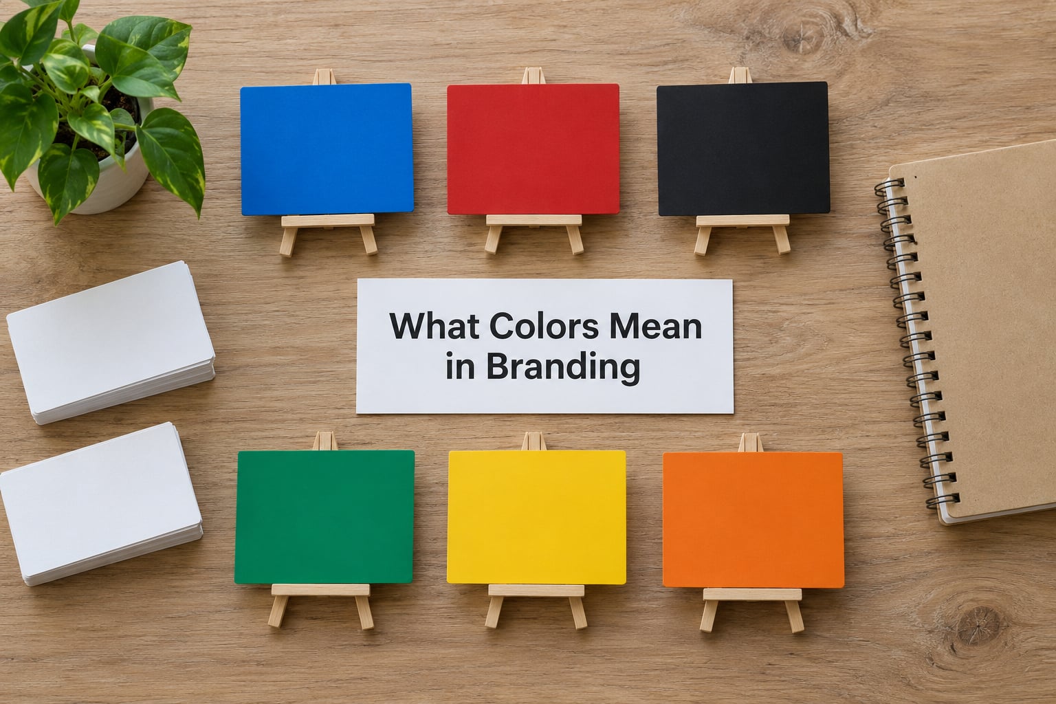
Color in branding is a signal, not a message. It is the fastest thing a customer processes about your business, usually arriving before the name, the logo, or the first sentence of copy. Blue feels dependable. Red feels urgent. Deep green feels established. Yellow feels cheap when it is applied badly and cheerful when it is applied well.
Here is the quick version most people are looking for:
- Blue — trust, stability, competence, calm professionalism.
- Red — energy, urgency, appetite, passion, a short fuse.
- Green — growth, health, nature, permission to spend money.
- Yellow — optimism, warmth, friendliness, high visibility.
- Orange — friendliness, excitement, affordability, approachability.
- Purple — creativity, luxury, wisdom, a touch of mystery.
- Pink — playfulness, warmth, care, a softer read on red.
- Black — authority, sophistication, precision, seriousness.
- White — simplicity, honesty, space, modern restraint.
- Gray — neutrality, balance, technical competence, restraint.
- Brown — craft, reliability, earthiness, tradition.
- Metallic gold and silver — premium cues, achievement, hardware polish.
Two things worth holding onto while you read. First, associations are trained, not innate. Nobody is born knowing that green means money. Second, meaning is assigned by repetition, which cuts both ways: the color you choose starts to mean something to your customers the moment you use it the same way, everywhere, for a long time.
What Colors Mean in Branding by Color
| Color | Usual associations | Fits well | Watch out for |
|---|---|---|---|
| Blue | Trust, stability, competence | Financial, health, legal, tech, trades | Extremely common; risks looking like everyone else |
| Red | Energy, urgency, passion | Food, fitness, entertainment, promotions | Overuse reads as cheap or aggressive |
| Green | Growth, health, nature, wealth | Agriculture, wellness, eco, money services | Bright lime can look like a gas station |
| Yellow | Optimism, warmth, visibility | Delivery, kids, casual food, local services | Hard to read; cheapens a premium position |
| Orange | Friendly, excited, approachable | Retail, hospitality, community events | Reads juvenile if the brand is aiming serious |
| Purple | Creative, luxurious, distinctive | Beauty, wellness, creative services, premium retail | Prints unpredictably; muddy on cheap stock |
| Pink | Playful, care, warmth, softness | Salons, pet care, boutique retail, events | Can flatten into a niche read if overdone |
| Black | Authority, sophistication, precision | Luxury, coffee, bars, tech, photography | Dark signs disappear in low light |
| White | Simple, honest, modern, spacious | Minimal brands, wellness, studios | Invisible on pale surfaces; no personality alone |
| Gray | Neutral, technical, balanced | Industrial, B2B, automotive, engineering | Reads cold and forgettable if it dominates |
| Brown | Craft, reliability, tradition | Coffee, bakery, woodworking, leather, real estate | Can read old-fashioned or unclean if the shade is muddy |
| Gold or silver | Premium, achievement, polish | Luxury, awards, premium services | Metallic ink fails on ordinary paper; imitation finish looks tinny |
Blue is the default for a reason. It reads as safe and institutional, so banks, insurers, and clinics land there without thinking. If your business is in one of those categories, blue is a reasonable, low-risk choice. If you are a brewery, a tattoo shop, or a climbing gym, it works against you, because the one thing blue communicates reliably is that you are not those things.
Black is the other default, and it pulls in two different directions. On a bar menu or a coffee bag it reads as deliberate and premium. On a contractor’s truck it reads as anonymous. The difference is usually the material and the lighting, which we get to later.
Red deserves its reputation but not its folklore. It genuinely does raise attention, and in food contexts it reads as appetite-stimulating. But a red-heavy brand communicates urgency, and urgency is a strange thing to sell a service that happens once every ten years.
How Context Changes Color Meaning
The word “context” is doing a lot of work in every honest conversation about color meaning, so it deserves its own section. Four things shift the message: the industry you are in, the shade and saturation, the colors sitting next to it, and who is looking.
Industry. A luxury brand using black and a hospital using blue are both reading correctly. The healthcare sector has trained people for decades that blue means competent and safe, and gold means clinical excellence. That expectation is not universal, it is local to a market, and it is stronger than any dictionary of color meanings.
Shade and saturation. The same hue in a lighter version feels different from the darker one, every time.
| Hue | Lighter version tends to feel | Darker version tends to feel |
|---|---|---|
| Blue | Friendly, open, modern | Authoritative, serious, established |
| Green | New, fresh, inexpensive | Mature, established, premium |
| Red | Playful, warm, casual | Intense, dramatic, serious |
| Orange | Light, friendly, sweet | Burnt, earthy, autumnal |
| Purple | Soft, gentle, decorative | Regal, mysterious, heavy |
| Yellow | Clean, bright, fresh | Mustard, vintage, earthy |
This is where most owner decisions go wrong. Someone picks “green” for a tree service and lands on a bright spring green, then wonders why the trucks look like a lawn care van they already passed on the road.
Pairing. A color’s meaning shifts depending on its neighbors. Blue next to gold reads as private banking. Blue next to bright cyan and a saturated yellow reads as a software startup. Blue next to pink reads as something friendlier, less corporate. The same hue, three different businesses.
Audience and culture. Associations move between markets. White reads as purity and minimalism in most of North America and Europe, and as mourning in much of East and South Asia. Red carries luck and celebration in China and danger or debt in several European languages. If your customers are not domestic, check before you commit. And within one market, a 22-year-old and a 55-year-old will not read the same swatch the same way.
How to Choose a Brand Color Palette
Most people do this backwards. They fall in love with a color, then go looking for a personality to justify it. The palette ends up serving the owner’s taste instead of the business, and you can tell within a year because nobody describes the brand the way the owner hoped it would sound.
Here is an order that works better. It takes maybe an hour for the first three steps.
- Write your brand personality in three words. Not adjectives about the business, adjectives about how it should feel. Warm, exact, unhurried. Efficient, plainspoken, steady. Blunt, fast, a little reckless. Colors cannot fix a brand that has not decided what it is.
- Look at what your audience already expects. If you sell insurance, most of your competitors are using blue and gray, and customers read that as competent. If you sell a kids’ party business, you have far more latitude. Knowing the category convention tells you when to follow it and when departing from it will actually read as confident.
- Check what your competitors are doing. Not to copy, but to know what you need to be distinct from. If four of five competitors on your street are navy and white, a navy sign gets you nothing.
- Pick one dominant color. This is the color that owns your sign face, your primary button, your van wrap. One. A palette with two competing dominants looks unresolved at every size.
- Add one supporting color and a neutral. The supporting color does secondary work: subheadings, panels, uniform trim. The neutral, usually white, charcoal, cream, or gray, does the heavy lifting of keeping everything readable. Some brands add a single sharp accent color for buttons and highlights, and that is the ceiling.
- Write the palette down as exact codes before anything gets made. Pick one dominant, one supporting, one neutral, and optionally one accent. Then note a HEX value, a CMYK value, and the Pantone nearest match for each. Without codes, every printer, wrap shop, and web designer will interpret your color differently.
The number is not arbitrary. A palette you can hold in your head is one a customer can recognize and your team can reproduce. HubSpot’s old one-to-four color framing lands somewhere similar, and the practical reason it holds is that more than four colors almost never survive being shrunk onto a business card, embroidered on a shirt, or read from a moving car.
Choosing Colors That Work in the Real World
A palette that looks considered on a laptop can fall apart the moment it becomes a physical object. This is the part most brand color advice skips, and for a business with a storefront or a fleet it is the part that matters.
Signage and storefronts. Sign color has to survive distance, weather, and whatever your local light does at 6pm. High-contrast combinations hold up: dark text on a light panel, or a light panel against a darker facade. Low-contrast pairings, a cream sign with a pale gray logo, basically vanish. Also check the sign at night, because LED lighting shifts color warmer or cooler depending on the temperature you choose, and a color that looked right on a screen can look muddy once it is lit from the front.
Vehicle wraps. A wrapped van is a sign that moves, so recognition matters more than detail. Large flat blocks of your dominant color read at a full city block; fine detail and thin type do not. Make sure the layout still works when the vehicle is half-obstructed by parked cars, which it usually is in a city. And expect the wrap film to print slightly differently from your screen reference. Solid saturated colors reproduce most predictably; gradients and deep blacks are where vinyl and monitor disagree most.
Uniforms and fabric. Fabric absorbs light and dulls color. A bright color on a screen goes a couple of shades deeper on cotton. Deep navy and charcoal photograph badly in dim rooms, which matters for restaurants and bars where most of the lighting is low.
Print and menus. Uncoated stock soaks up ink and shifts color, especially in deep blues and purples. If you have ever approved a proof that looked perfect and then saw the real run look duller, that is why.
Screens and social. Your darkest and most saturated colors will look harsher on a phone in daylight than on a desktop monitor in an office. Check the palette on an actual phone, outdoors, before you commit.
The cheapest test in this whole article: shrink your logo to the size of a favicon and look at it on a phone. If you still know what it is, the shape works. If it turns into a blob, your detail is doing more work than your color.
Color Combinations That Create a Distinctive Brand
Once you have a dominant color, the pairing does a surprising amount of the work. These patterns cover most of what works, and each has a way to fail.
Neutral plus one color. A charcoal, cream, or white base with a single strong color. It is the most reliable pattern there is and the easiest to hand to anyone printing on your behalf. The failure is using the neutral as a third accent, which turns a clean two-color system into mush.
Complementary contrast. Colors opposite each other on the color wheel, like blue and orange or deep green and red. It has real energy and it is very hard to get wrong at full strength. The failure is softening both colors until they meet in the middle, at which point you have two muted colors and no contrast at all.
Analogous colors. Neighbors on the wheel: blues with teals, reds with oranges. It looks polished and considered, and it rewards a brand that wants to feel calm. The failure is that adjacent hues often sit too close in value to separate cleanly, so use one dominant and let the rest be tints of it rather than four separate colors.
Bold plus restrained neutrals. One unapologetic color carried by a lot of white and gray. This is how a lot of good retail and hospitality brands stay distinctive without turning into a toy. The failure is losing nerve and diluting the bold color until it is one of the neutrals.
Monochromatic. One hue across several values, from near-white to near-black. It is elegant, prints beautifully, and scales to anything. The failure is that without one genuinely darker anchor, the whole system reads pale and washes out in sunlight.
Natural combinations. Undyed-looking browns, creams, forest greens, and muted clay. This has real warmth and reads well on wood, kraft, and linen stock. The failure is choosing shades that are muddy rather than muted, which looks dirty instead of calm.
How to Test Your Brand Colors
You can test a palette for free in about twenty minutes, before spending anything on signs or wraps. Two kinds of checking are worth separating: technical checks you can measure, and preference checks that are just opinions.
The technical check starts with contrast. Text against a background, and a logo against whatever it sits on, needs enough contrast to be read easily. Most major brands offer free contrast checkers you can paste color values into; they will give you a pass or fail ratio. Check your text, your button colors, and your logo on both a light and a dark background, because a mark that works on white can vanish on a photograph.
Next, run the grayscale test. Open your artwork, desaturate it, and see whether the logo still reads. A mark carried entirely by color will lose its identity, and roughly one in twelve men has some form of color vision deficiency, meaning a meaningful slice of your customers cannot reliably tell red from green. If your call-to-action button and your error message are separated only by red and green, some of your users will not see the difference. Never use color as the only signal.
Then check small. Screenshot your logo at favicon size, at the size it appears in a search result, and at the size it will be on a business card. Most brand problems show up here, and it costs nothing to fix them at this stage.
Finally, test on surfaces. Print the palette, or tape color chips to a wall, and look at them in daylight, in shade, and under your store lighting. Then look at them on your phone outside. Colors that pass on a calibrated monitor in a dim office fail outdoors more often than anyone expects.
Preference checking is separate and less rigorous. Show two or three candidates to a handful of people outside the business and ask what kind of company they think it belongs to. You are not polling for approval, you are checking whether the color produces the category you intended. If people describe the wrong kind of business, your palette is sending the wrong signal no matter how much you like it.
One last thing from the trenches. If someone else already picked your colors, your job is not to re-litigate it, it is to make it work. Practitioners on design forums describe the same frustration repeatedly: a client or a new boss announces the palette and the designer is left to build a system around it. Fix what you can within the constraints, document the exact codes so the next person inherits something consistent, and raise the specific problems with evidence rather than taste.
Frequently Asked Questions
What color is best for branding?
There is no single best color, because color meaning depends on your industry, your audience, and the feeling you want a customer to have in the first few seconds. Blue tends to read as trustworthy, red as energetic and urgent, green as growth and health, black as premium. The best choice is the color that matches the associations your category already trains people to expect, then stays consistent everywhere you use it.
What do the main brand colors represent?
Blue usually represents trust, stability, and competence. Red represents energy, passion, and urgency. Green represents growth, health, nature, and sometimes wealth. Black represents authority, sophistication, and precision. White represents simplicity and honesty. Gray represents neutrality and technical balance. These are learned conventions rather than universal truths, which is why shade, pairing, and industry context change how each one reads.
How do I choose brand colors for my small business?
Write your brand personality in three words first, then look at what your category already expects, then check what your competitors use so you can be distinct. Pick one dominant color for your sign and primary button, add a supporting color and a neutral, and record exact HEX and CMYK values. Test for contrast and daylight legibility before spending on anything physical.
What colors work best for business signs and storefronts?
High-contrast combinations survive distance, weather, and low light best. Dark lettering on a light panel, or a light panel against a darker facade, stays readable from across the street. Avoid pale-on-pale pairings like cream text on gray, which disappear in daylight and look worse after a year of sun. Check your colors under your actual evening lighting too, since the color temperature of LEDs shifts how the panel looks at night.
How many colors should a brand palette contain?
Most small businesses work well with one dominant color, one supporting color, and one neutral, sometimes plus a single accent used only for buttons and highlights. Fewer colors are easier to reproduce consistently across signs, wraps, uniforms, print, and screens, and easier for customers to recognize. If you find yourself unable to decide which color leads, that is usually a sign the palette has too many rather than too few.
Conclusion
What colors mean in branding is a set of expectations, not a fixed code, and the most useful thing you can know is how much context changes the reading. Start with three words describing how your business should feel, shortlist two or three colors that fit, then run them through a contrast check, a grayscale check, and a real-world look on a sign, a screen, and a phone in daylight.
Whichever color you pick only starts meaning something once you use it the same way everywhere, for long enough. That repetition is what turns a shade into an asset.