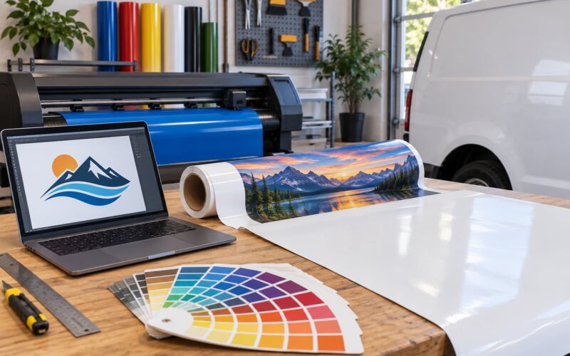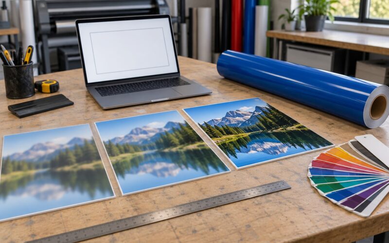
Use CMYK for any sign that gets printed, cut, wrapped or fabricated. RGB is a screen language, and a sign is read in reflected light on vinyl, acrylic or fabric, not on a backlit display. The short answer to CMYK vs RGB for printed signs is simple: build the artwork in CMYK, or at minimum hand your sign shop a CMYK file with an embedded profile so nothing shifts on the way to the printer.
That said, the answer is not as tidy as most print blogs make it sound. Some signs genuinely live in RGB — LED channel letters, digital billboards, backlit displays running a video file. And a lot of designers have noticed the same odd thing: an RGB file sometimes prints better-looking than the CMYK version of the same artwork. There is a real reason for that, and it is worth understanding before you commit a budget to a run of banners or a vehicle wrap.
This guide walks through both color systems, maps them to the sign types you actually order, and ends with a pre-send checklist you can hand straight to a printer. Updated for 2026.
Table of Contents
- CMYK vs RGB for Printed Signs at a Glance
- What Is the Difference Between CMYK and RGB?
- RGB is additive color built from light
- CMYK is subtractive color built from ink
- Why the K plate exists
- Color gamut is the gap between them
- When Does RGB Look Better on a Printed Sign?
- The objection from r/Design, answered
- Signs that legitimately use RGB
- When Is CMYK the Better Choice for Printed Signs?
- What happens when a sign shop receives an RGB file
- Gradients, photos and brand colors
- Rich black, standard black and total ink coverage
- How Do Sign Materials and Lighting Affect Color Choice?
- Matte versus gloss finishes
- Backlit and translucent vinyl
- Outdoor viewing distance and daylight
- Vehicle wrap vinyl and the cast vinyl palette
- CMYK vs RGB: Which Should You Choose?
- Pre-send artwork checklist for a sign company
- Frequently Asked Questions
- Is it better to use CMYK or RGB for printing?
- Should logos be made in CMYK or RGB?
- Do professional printers use RGB or CMYK?
- Should I convert RGB to CMYK before sending artwork?
- Why do people use CMYK instead of RGB?
- Does CMYK look brighter when printed?
- The Short Version to Remember
CMYK vs RGB for Printed Signs at a Glance
| Criterion | CMYK | RGB |
|---|---|---|
| Best use | Anything printed, cut or fabricated: vinyl banners, decals, wraps, acrylic and foam board panels, yard signs | Screens only: web graphics, email, social posts, on-screen menus |
| How color forms | Subtractive — ink absorbs light from a white surface | Additive — colored light adds up |
| Light source | Reflected light (sunlight, streetlights, shop lighting) | Emitted light from a monitor or LED module |
| Channel values | 0–100% per ink plate | 0–255 per channel, roughly 16.7 million combinations |
| Color gamut | Smaller and duller, but reliable and repeatable | Wider and more vivid, with colors ink cannot reproduce |
| Typical file format | PDF/X-4 or PDF/X-1a with embedded ICC profile, AI, EPS, TIFF | PNG, JPG, WebP, SVG on screen |
| Failure mode on a sign | Slightly flatter than the screen preview, predictable across runs | Colors converted without control, shifted neons and muddy blacks |
| Approval workflow | Soft proof on screen, hard proof for large runs | Approved on screen, then disputed after printing |
One row deserves extra attention: light source. Every color decision downstream follows from it. A monitor makes its own light, so it can be brighter than anything printed will ever be. A sign in daylight does not make light at all — it bounces whatever hits it, which is why the same artwork looks duller on a banner than it does on your monitor, even with perfect color conversion.
What Is the Difference Between CMYK and RGB?
Both systems mix color, but they mix different things. That single sentence explains almost every practical difference between CMYK vs RGB for printed signs.
RGB is additive color built from light
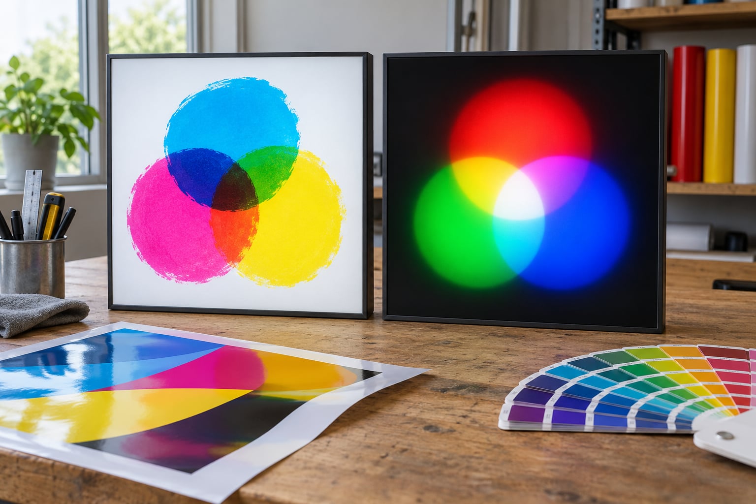
RGB starts with black — no light at all. Each channel adds light: red, green and blue, each running 0 to 255. Push all three to full and you get white. Take all three to zero and you are back to black. Screens work this way because each pixel is a small light source, and stacking three colored lights is how you fake every color a person can see.
It is also why screen colors are hard to beat in print. Each channel is a light you can turn all the way up, so saturated reds, electric blues and neon greens are cheap to display and genuinely bright.
CMYK is subtractive color built from ink
CMYK runs the opposite direction. You start with a white surface — paper, white vinyl, primed acrylic — and lay cyan, magenta and yellow ink on it. Each ink absorbs one part of the spectrum and reflects the rest. Overlap cyan and magenta and the green is gone, leaving blue. That is subtractive mixing, and it is why commercial printing uses these three inks: their combinations cover most of what people call “color.”
Why the K plate exists
Stack full cyan, full magenta and full yellow and you do not get a clean dark. You get a dull brownish black, because the three inks are transparent filters rather than true pigments. Adding a black plate gives printers a dense, opaque, neutral dark — for type, for outlines, for the flat black area behind white lettering on a storefront panel.
Black also matters for cost and detail on big runs. A sign printed with rich black lays four inks on a large area, which uses more ink, dries slower and can look slightly inky. Pure K is cheaper and sharper for small type and hairlines. More on that in a moment.
Color gamut is the gap between them
A gamut is the range of colors a device or ink set can actually reproduce. CMYK ink cannot produce a screen-bright neon orange, an electric violet or a lime green at the same intensity, because those colors live outside the printable range. When such a color gets converted for printing, the RIP has to find the nearest reachable substitute, and that substitute is never as vivid.
So the two systems are not wrong and right. They are two different ranges, and the gap between them is where most sign color disputes start.
When Does RGB Look Better on a Printed Sign?
Rarely. But there are two situations worth being honest about: the case where a sign is not really a printed sign, and the case where an RGB file genuinely outprints the CMYK version of the same image.
The objection from r/Design, answered
A long-running thread on r/Design asks why an RGB file sometimes prints nicer than the CMYK file. Designers notice that the RGB version is punchier, then ship the RGB one anyway, and the printer complains.
The physics is straightforward. Your monitor is calibrated to emit light at a brightness your eye reads as normal. Ink on matte or semi-gloss vinyl is far less reflective, so an image calibrated to look right on screen is effectively over-saturated once printed. What felt like a better file is really a file with more punch on the monitor and less on the wall.
Designers also report that Photoshop-style conversions flatten photographic content, because the default US Web Coated profile is tuned for coated paper stock, not for a vehicle wrap or a 10-foot banner. That is a genuine complaint about a bad profile choice, and it is fixed by picking a profile that matches the substrate — not by skipping the conversion.
Signs that legitimately use RGB
Illuminated and digital signage run on the additive model. LED channel letters are lit by color LED modules whose hue you choose by mixing red, green and blue at the source, not by printing ink. Digital billboards and menu boards display video files straight from an RGB pipeline. Backlit window graphics with a printed face and a light box behind it are judged differently too, because the light source changes the perceived brightness of every ink.
If your project is an LED sign or a screen, RGB is not the compromise. It is the correct model. For anything on a substrate, CMYK is.
When Is CMYK the Better Choice for Printed Signs?
For anything you print. The reasons run deeper than a rule of thumb, though, and it is worth knowing exactly what happens to your file when it reaches the shop.
What happens when a sign shop receives an RGB file
Nothing dramatic, usually. The RIP — the raster image processor inside the printer workflow — converts your file to its own ink set using a device profile, and the job prints. The problem is that you did not choose the conversion. The printer chose it, calibrated to their ink, their substrate and their viewing assumptions, which may or may not be the ones you wanted.
Because of that, shops frequently ask for bitmaps in RGB rather than CMYK. Their reasoning is sound: a press RIP is calibrated to its own inks, so letting it do the conversion from a clean RGB source is more reliable than trusting a designer-side conversion built on a generic profile. The tradeoff is you give up control of the outcome.
Convert on your side when the color is a brand color that has to match other pieces you have printed, or when you want to approve a proof against a specific look. Send RGB when the imagery is photographic and the shop knows their substrate. The most common forum argument about this exact trade-off comes down to those two lines and not much else.
Gradients, photos and brand colors
CMYK handles smooth gradients and photographic images predictably, because it is what the hardware is built to lay down. The failure modes are known and manageable: banding in a sky gradient when the file is too low-resolution, mud in deep shadows when total ink coverage runs too high, and a general dulling compared to the screen.
For logos and brand colors, the real issue is consistency. A logo rendered in RGB and a logo rendered in CMYK are different files with different values, and only one of them matches the vinyl sitting on your building. Set the master artwork in CMYK, lock it, and derive screen versions from it rather than the other way around.
Rich black, standard black and total ink coverage
- Single-color black (K 100) — the default for small type, hairline borders and anything that needs to stay sharp. Pure neutral, one plate, fastest and cheapest.
- Rich black — commonly written as C60 M40 Y40 K100. It prints a deeper, denser black with a little extra depth in large areas. More ink means slower drying, so fabricators reserve it for big flat fields.
- Warm and cool black — blacks mixed from cyan or magenta instead of pure K, used when a sign must match a photograph or a specific brand black.
Total ink coverage matters as much as the recipe. When the four plates add up past what the press or printer can lay down without drying problems, you get what printers call a set-off defect, where ink transfers to the back of the next sheet or panel. Ask your shop for their ink limit and stay under it. Most large-format printers work in the 250 to 300 percent total range.
How Do Sign Materials and Lighting Affect Color Choice?
This is where the CMYK vs RGB question stops being theoretical. The same CMYK build looks different on every substrate, and the material often constrains your palette more than the ink does.
Matte versus gloss finishes
Gloss and gloss laminate reflect light back at the viewer, which makes colors look punchier and deeper. Matte scatters light and softens everything slightly, which reads as more natural and hides dust, scratches and panel texture. If you approved your artwork on screen against a glossy reference and it lands on a matte panel, expect the saturation to drop a step. Ask for a sample of the actual finish before a full run.
Backlit and translucent vinyl
Backlit channel letters, light boxes and translucent window graphics are printed on thin white or translucent vinyl with light coming from behind. The same ink that looks dark on an opaque panel looks washed and glowing from the front when lit. Colors also shift toward whatever color temperature the LED modules run — cool white cools everything, warm white pushes it yellow. Print backlit graphics slightly heavier and slightly more saturated than the front-lit equivalent.
Outdoor viewing distance and daylight
A sign read from across a parking lot is judged on contrast, not on hue. Bright saturated colors that look great on a monitor often read as low-contrast and slightly muddy at 20 feet in full sun, because ambient light washes out the midtones. For large-format outdoor work, lean on strong value contrast — dark on light, light on dark — rather than on saturated fills. That is a design decision, not a color-space decision, but it comes up in the same conversation.
Vehicle wrap vinyl and the cast vinyl palette
Wrap film is not a full CMYK gamut. Cast vinyl comes in a fixed manufacturer palette of a few hundred colors, and the range is narrower than what a printer can put on paper. A wrap designed as pure CMYK will get pulled toward the nearest available film color, and with a full-vehicle wrap you are committed to that outcome across every panel.
Ask your installer for the film swatch book before the artwork is locked. If your brand color does not exist in the palette, the practical options are a painted or printed panel, a two-color split, or an overall design that does not depend on that exact hue. The same limited-palette logic applies to window decals, especially for perforated film seen from both sides.
Acrylic, dibond and foam board panels take ink differently from vinyl, and clear coat on acrylic deepens saturation noticeably. Those are all CMYK jobs — the point is that the target changes, so preview on the actual material.
CMYK vs RGB: Which Should You Choose?
CMYK for anything printed, RGB for anything lit or shown on a screen. Here is that mapped to the sign types people actually order.
| Sign type | Color model | Why |
|---|---|---|
| Vinyl banner or large-format graphic | CMYK (process) | Wide-gamut images, gradients and photography; standard for large-format inkjet |
| Storefront sign panel on acrylic or dibond | CMYK (process) | Full tonal range on a rigid, light-struck surface |
| Window decal or perforated graphic | CMYK or spot | Single-color decals are cheaper as spot; film palette is limited |
| Vehicle wrap | CMYK designed to the film palette | Cast vinyl carries a fixed color list; preview against swatches |
| Single-color yard sign or A-frame | Spot / one-color | No process build needed; matching a specific vinyl color is easier |
| LED channel letter or halo-lit sign | RGB LED modules | Color comes from light, not ink — the additive model is correct here |
| Digital billboard or menu board | RGB video | Displayed, not printed; calibrate to the display, not the press |
| Backlit light box face | CMYK, printed heavier | Backlighting washes out midtones and shifts hue |
Two decision rules settle most arguments. First: if the image contains a neon, a fluorescent or an electric violet, no CMYK build will reproduce it — either change the color or price in an expanded-gamut process, which most sign shops do not run. Second: if the same artwork will appear on your van, your storefront and your website, design once in CMYK and derive the RGB version from it.
Pre-send artwork checklist for a sign company
- Color mode and profile. CMYK, with an embedded ICC profile matching the substrate. Ask the shop which profile they want if they are picky — most accept the standard one for their process.
- File format. Print-ready PDF is the safest universal answer, ideally PDF/X-4 or PDF/X-1a. AI, EPS and PSD are fine if the shop works in those. Avoid linking a file to art that lives on your desktop.
- Vector where you can. Logos and type as vector so they stay sharp at any sign size. Send raster photos at 100 to 150 pixels per inch at final printed size, no lower.
- Bleed. Extend background color and imagery 0.25 inch past the trim line so a cut variation does not show white edge.
- Black type and hairlines. Pure K for small type and thin rules. Reserve rich black like C60 M40 Y40 K100 for large solid fields, and check the shop’s total ink coverage limit.
- Spot colors where brand demands it. A specific Pantone or a named vinyl color should be spot, not CMYK, and it should be named in the artwork so the fabricator matches it physically.
- Panel layout. Show how the artwork breaks across panels, seams and rivets before it goes to production.
- Proof it. Soft proof on screen for most jobs. Order a hard proof, or a physical sample of the material, for anything on a vehicle, a full storefront or a large run. Discovering a shift after a hundred panels are printed is the expensive way to learn it.
One more habit worth naming: keep a printed reference of your brand colors in the office. Screens drift, monitors are uncalibrated, and the person approving work six months from now will not have your file open on their laptop.
Frequently Asked Questions
Is it better to use CMYK or RGB for printing?
CMYK, for anything printed on a physical material. Printed signs are viewed in reflected light on vinyl, acrylic or fabric, and CMYK ink is what produces color there. RGB is built for emitted light, so it belongs on screens. The practical rule: build the artwork in CMYK, or send a CMYK file with an embedded profile so the conversion is predictable.
Should logos be made in CMYK or RGB?
Keep one master logo in CMYK and derive screen versions from it. A logo rendered separately in both color spaces produces two different files, and only the CMYK one matches the vinyl on your building. Ask your fabricator for a printed color chip or swatch of the actual film or acrylic and build your master toward that, rather than toward a screen.
Do professional printers use RGB or CMYK?
They print with CMYK inks, but many shops prefer receiving RGB bitmaps and letting their own RIP convert, because a press RIP is calibrated to its own ink set and substrate. A device profile handles the shift better than a generic desktop conversion does. Send CMYK when brand color consistency matters and you want to control the result; send RGB when the job is photographic and the shop knows their material.
Should I convert RGB to CMYK before sending artwork?
Convert before sending when the color must match other printed pieces, when you want to approve a proof against a specific look, or when the artwork contains gradients and brand colors. Leave it in RGB when the shop has told you they prefer raw bitmaps and the imagery is photographic. Set the document to CMYK before you start designing rather than converting at the end, and check the result for flattened neons before you export.
Why do people use CMYK instead of RGB?
Because CMYK describes the inks a printer can physically lay down. Cyan, magenta and yellow inks absorb parts of white light to create color, and a black plate supplies a dense neutral dark that the three inks cannot. RGB describes light leaving a screen, and it covers colors ink cannot reproduce. Printing an RGB build means asking a machine to match something outside its range, which is where color shift comes from.
Does CMYK look brighter when printed?
It can, and the difference is mostly finish. A gloss or gloss laminate reflects light back at the viewer, which makes ink look punchier and deeper. Matte scatters light and softens the same colors a step. CMYK still reads flatter than a monitor, because a screen emits light and a printed sign only reflects it. Judge brightness against a physical sample of the actual material, not against your display.
The Short Version to Remember
Start in CMYK the moment you open the file, use pure K for small type and rich black only for large fields, and preview every color on the actual material before a run goes out. Reserve RGB for the signs that emit light rather than carry ink, and let the fabricator’s profile handle the conversion when they ask you to.