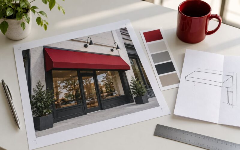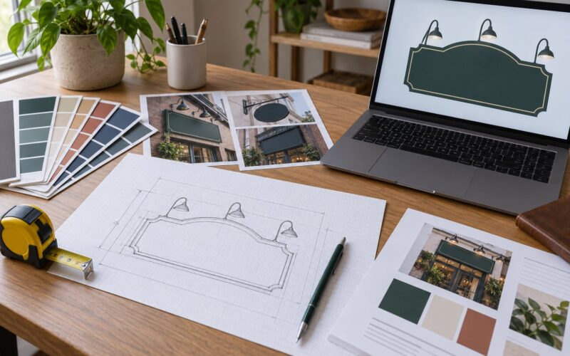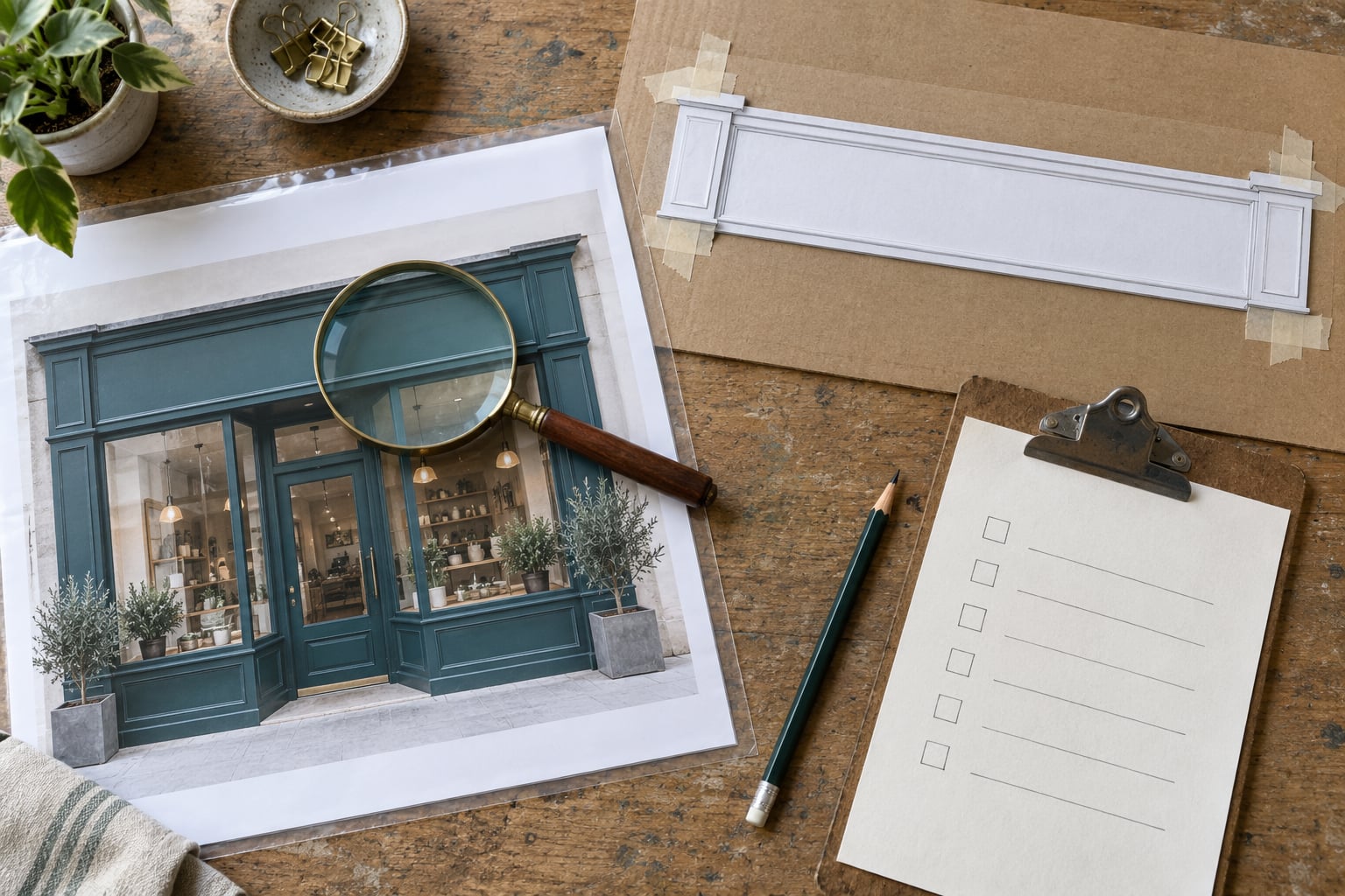
To proofread a sign before production, review the proof — the preview of how your finished sign will look — in three separate passes: a text pass for spelling and facts, a layout pass for legibility and spacing, and a production pass for size, color, and materials. Once you approve a proof in writing, responsibility for the wording moves to you, so the half hour you spend now is the cheapest insurance in the entire project.
A proof is a preview of how your sign will look once it is printed or fabricated. Proof approval is the moment responsibility for content accuracy moves from the sign shop to the person who signs off. Budget 20 to 30 minutes for a typical storefront or window sign, and add more if your office manager, franchise owner, and landlord all need to approve it.
Sign shop operators put it plainly in discussions on signs101: allow as many changes as you want before sign-off, require an electronic signature on the proof sheet, and after that it is the customer’s problem if the file has already gone to press. The proofreading is not a formality that the fabricator performs for you. It is the thing that protects you once the job is running.
Table of Contents
- What You Need
- Step-by-Step: How to Proofread a Sign Before Production
- Check the Request and Approved Wording
- Inspect the Full Sign at the Correct Size
- How to Check Color, Contrast, and Legibility
- Verify Dimensions, Placement, and Production Details
- Compare Revisions and Document Final Approval
- Common Mistakes
- Frequently Asked Questions
- Is a digital proof enough to approve a sign?
- How do I check that a sign will be readable from a distance?
- What should I put in writing when I approve a sign proof?
- When is a physical proof actually necessary?
- Can I still change a sign after I approved the proof?
- Who is responsible if there is a typo on a finished sign?
- Conclusion
What You Need
Most proofing disasters come from reviewing artwork without something to review it against. Gather these five things before you open the file and you will catch errors a browser-tab glance never would.
- The artwork or print-ready PDF, plus a rendered preview. Ask for both. The PDF is what gets fabricated; the preview is what most people actually look at.
- A written copy of the exact wording. Pull it from the request, the purchase order, or the email thread where the message was agreed. Read from this text, not from the sign, so your eyes don’t fill in gaps.
- Brand guidelines. You need the official spelling of your business name, logo clear space, approved typefaces, and the brand color values.
- Dimensions and production specifications. Finished size, material, mounting method, and whether the sign is indoor or outdoor.
- A way to record corrections and approvals. An email thread works. A shared document with a sign-off block at the bottom works better.
Keep the approved proof file itself too. Save the exact PDF you signed off on into the same folder as the order confirmation — that single file is what settles most arguments later.
Step-by-Step: How to Proofread a Sign Before Production
Run the review in three passes and do not mix them. Mixing layers is why a careful reader spends forty minutes and still misses a transposed phone number, because attention is bouncing between letterforms and mounting hardware.
Check the Request and Approved Wording
Start by comparing the sign copy against the request, purchase order, or approved message, checking spelling, capitalization, punctuation, phone numbers, URLs, hours, addresses, and required disclaimers before you look at any visual detail. This is the pass that catches the expensive errors, because the fabricator builds exactly the words on the approved proof.
Read the details the way a stranger would, not the way the author would. A designer who typed “Suite 210” all week will glance right past it. Have someone who did not write the copy read the proof aloud — this two-person rule is the cheapest safeguard in the whole process, and designers on r/graphic_design say the same thing about clients who rubber-stamp content they supplied themselves.
Check facts, not just letters. Hours, a phone number, a start date, a price, a license number, an email address. These pass a spell check without a flag and still reach the public wrong. If your sign carries parking, exit, restroom, or safety wording, treat that line as a compliance item and confirm it against the actual requirement, not against the previous sign.
Inspect the Full Sign at the Correct Size
Review the complete sign rather than isolated design elements, checking margins, alignment, hierarchy, spacing, edge safety, and whether any text stays readable at the intended viewing distance. A design that fills your laptop screen tells you almost nothing about how it looks on a wall across a parking lot.
Print the proof at actual size, or use the ruler tool in a viewer and set zoom to 100 percent. Then put the print on the floor and back away to the distance a customer will actually stand — 10 feet for a storefront fascia, 30 to 40 feet for a roadside or pylon sign. Mark the wall with painter’s tape at the finished dimensions if the shop has not already done it. That single test catches more real problems than any other step in this guide.
At that distance, check the obvious failure modes: uneven letter spacing between pairs, awkward line breaks that split a name or a number, a logo stretched out of proportion, text crowding an edge or a mounting hole, and a hierarchy where the secondary line is bigger than the business name.
How to Check Color, Contrast, and Legibility
Check color accuracy, contrast, readability, image quality, and how the design will behave in the selected sign material or printing process. Screens are backlit and emissive; vinyl, paint, and acrylic are reflective, so a bright saturated color on a monitor reliably prints duller and warmer than you expect.
Look for thin text, low-contrast combinations, and information that depends on color alone to communicate. Fine serifs, hairline strokes, and small condensed type are the first things to break when a shop converts artwork to a router-cut or printed process. A gradient that looks smooth on screen often bands on a large-format print, and low-resolution photography turns soft once it is scaled to a window graphic.
| Proof type | What it can reveal | When to ask for one |
|---|---|---|
| Digital proof on screen | Wording, layout, proportions, logo placement, and overall color intent | Always, for every job |
| Printed proof at actual size | True scale, real color on the actual stock, and small-text legibility | Any sign where size or readability matters, especially unfamiliar materials |
| Hard copy color proof | How a specific brand color behaves before full production | Strict brand color matching, coated or unusual substrates, and large solid areas of one color |
| Installed sample or one-off letter sample | How the sign behaves on the actual wall, in actual daylight | Large-format channel letters, monument and pylon signs, anything with mounting hardware |
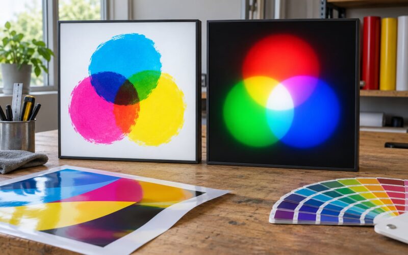
Artwork arriving as an RGB file will be converted to CMYK for print, and that conversion shifts saturated blues and purples noticeably. Files with embedded fonts can also reflow if a font is missing at the shop. Ask whether fonts are outlined before you approve, and check that images come in at a sensible resolution for their final printed size.
Verify Dimensions, Placement, and Production Details
Check that dimensions, orientation, quantity, material, finish, mounting requirements, cutlines, bleed, and other production specifications match the intended use and do not conflict with the design. A beautiful file still produces a bad sign if the artwork was drawn for a 36-inch panel and the panel is 35 inches wide.
Measure the installation site yourself and compare it to the spec sheet, not to the mockup. Verify the finished size and orientation, the number of signs in the order, the material and finish, and how the sign attaches — wall-mounted, post-mounted, or hung from a bracket. For anything illuminated, confirm the electrical spec, color temperature, where the cable exits, and the mounting-hole positions, since those are usually fixed before fabrication and expensive to change afterward.
Vehicle wraps and window graphics get their own check. For a wrap, look at the seam placement and the panel layout, because a seam running straight through a logo is visible from ten feet. For window graphics, confirm the safe margin from the edge of the glass and that no important element falls where a door frame or trim will cover it.
Compare Revisions and Document Final Approval
Compare each revision against the previous version, mark corrections clearly, avoid accidental changes, and save the final proof with a version number. When a shop sends revision two after revision one, review what changed and then check what stayed the same. Edits are exactly where clean-looking text quietly breaks.
Return corrections in one round, in writing, using a simple format: item number, location on the sign, current text, corrected text. Something like “2 — line under the phone number, currently ‘Open Mon-Sat’, change to ‘Open Mon–Sun’.” That format ends ambiguity, and it means nobody can argue later about what you actually asked for.
When the proof is right, approve it in writing and name the revision. Include your name, the date, the proof revision number, and the order reference. A reply that says “looks good, go ahead” without those specifics is the weakest possible approval, because a month later nobody can prove which file you meant.
| Check | Why it matters | Where to look |
|---|---|---|
| Business name spelling | One wrong letter reads as a business that cannot spell its own name | Compare against your brand guidelines, letter by letter |
| Phone, URL, email, address | Wrong details send customers nowhere and are easy to miss | Read digits individually against the written source text |
| Hours and dates | Frequently copied from an outdated sign | Check against the live information, not the old artwork |
| Capitalization and punctuation | Inconsistent styling on a storefront looks unfinished | Check every line for matching style |
| Required legal or safety wording | Accuracy is a compliance issue, not a style preference | Check parking, exit, restroom, and safety lines against the requirement |
| Logo proportions and clear space | Distorted logos are hard to correct after fabrication | Overlay against the official logo file |
| Letter spacing and line breaks | Uneven spacing reads as poor workmanship at any distance | Inspect at 100 percent zoom and at viewing distance |
| Readability at distance | Text that is unreadable outdoors is wasted spend | Printed at actual size, viewed from the real distance |
| Contrast and thin strokes | Low contrast or hairline type breaks up in production | Check small text against the background color |
| Color accuracy | Screen colors shift when converted for print | Ask for a printed or hard copy proof on the actual material |
| Finished size and orientation | Artwork drawn to the wrong panel crops or crowds | Compare the spec sheet to your own site measurements |
| Bleed, safe margin, and trim | Edges that look tight print with a white sliver | Check the production drawing, not just the visual |
| Mounting and electrical details | Fixed after fabrication, expensive to change | Hole positions, cable exit, brackets, power supply |
| Quantity and version | A wrong revision across a multi-location order repeats the error | Confirm revision number applies to every location |
Common Mistakes
Almost every sign typo traces back to one of a handful of habits. Each one has a straightforward fix.
Checking only spelling. Spelling the words correctly proves nothing about whether the phone number is right, whether the hours are current, or whether the suite number survived the last revision. Fix: proofread facts separately, from a written source, digit by digit.
Approving a small screen image. A proof viewed at fit-to-window looks fine and arrives unreadable. Fix: print at actual size or set 100 percent zoom and view from the real distance before approving.
Failing to verify contact details. Phone numbers and addresses get typed from memory or copied from an old file. Fix: dictate them aloud from an authoritative source and have a second person check them back.
Ignoring installation conditions. A design approved against a mockup can be wrong for the wall it lands on — wrong height, wrong orientation, dark background, existing awning. Fix: measure the site and check daylight and lighting conditions before sign-off.
Using unapproved revisions. The file that goes to production may not be the file you reviewed last. Fix: name the revision number in your approval and confirm it matches what is on the screen in front of you.
Not recording approval. A verbal yes, a thumbs-up emoji, or a quick “ship it” leaves nobody able to prove what was agreed. Fix: a written sign-off with a name, date, proof reference, and revision number takes two minutes.
Approving in seconds. The fastest approvals are the expensive ones, and rubber-stamping a proof you have not read is the single behavior that turns a small error into a reprint. Fix: build a delay into your own process — review it later the same day, not in the moment the file arrives.
One more habit worth borrowing from good production teams: proofread with the file closed, reading from your written copy, then open the file and compare. The two-method read catches errors that a single careful pass slides past.
Frequently Asked Questions
Is a digital proof enough to approve a sign?
For wording, layout, and proportions, a digital proof is usually enough. Ask for a printed proof at actual size whenever size, color, or legibility matters, or when the sign uses a material or finish your shop rarely works with. A screen cannot show true scale, real color on the substrate, or how thin type holds up in production.
How do I check that a sign will be readable from a distance?
Print the proof at actual size, tape the outline of the finished sign on the wall where it will hang, and step back to the distance your customers will be. Read it in under five seconds. If you cannot get the main line from that spot, the type is too small, the contrast is too low, or there is too much text on the sign.
What should I put in writing when I approve a sign proof?
Include your full name, the date, the proof revision number, and the order or quote reference. Say explicitly that you approve that revision for production. Keep the approved file attached to the same email or folder as the order confirmation so the exact artifact you reviewed is the one on record.
When is a physical proof actually necessary?
Ask for one when the sign carries a strict brand color, uses a coating or an unfamiliar material, features large solid areas of a single color, or depends on small text staying legible. Signs with mounting hardware, dimensional cutouts, or anything installed on a specific wall also benefit from a sample letter or a taped wall outline.
Can I still change a sign after I approved the proof?
It depends on where the job sits. Before fabrication starts, most shops will make changes, sometimes with a new revision and a revised quote. Once cutting, printing, or bending has begun, changes usually require a new order at full cost. Contact the shop the moment you spot an error and reference the revision you approved.
Who is responsible if there is a typo on a finished sign?
If you approved the proof, content accuracy is yours — sign shops typically produce the text exactly as shown on the approved proof, including errors. The shop remains responsible for its own specification failures, such as a wrong size, a defect in fabrication, or a finish applied incorrectly. Write down what the reprint policy covers before you sign anything.
Conclusion
If you do one thing differently after reading this, make the first step a straight comparison of the sign’s wording against your written copy, read by someone who did not write it. Then review the sign at actual size from the real viewing distance, verify the production details against your own site measurements, and send a final proof for written approval that names the revision number, the date, and the order reference. That sequence takes under half an hour, and it is the difference between a sign you are proud of and a reprint you pay for.